- Views 7,897
- Downloads 844
- Fans 3
- Comments 40
-
-
 70.00%(required: 65%)
 Design
Louis! 80% trav 80% Dimi 75% Cocoa 70% Liampie 70% Stoksy 70% Sulakke 70% bigshootergill 65% alex 60% Faas 55% 70.00% -
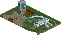
Description
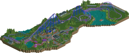
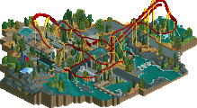
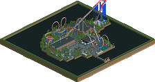
An Intamin Mega Coaster design from Six Flags Worlds of Adventure themed to Superman's alter ego Bizarro!
-for optimal viewing, use OpenRCT2 version 0.0.4-0.0.5 -
3 fans Fans of this park
-
Full-Size Map
-
Download Park
844
-
Objects
1
-
Tags
Yes, this was something I noticed looking at some European Intamin rides. All of the American ones that I know of have exposed transfer bays, while Goliath at Walibi is enclosed. Haven't check Expedition GeForce, although that has an exposed station IIRC, which is even more of an oddity.
Probably just depend on money and weather, although your think MF or Maverick would be enclosed in that case.
However, at least for CF Intamin, they move the trains indoors to a completely separate maintenance facility in the offseason, which I guess Walibi does not because theirs is enclosed.
Who knows, it's probably just random!
Expedition GeForce now has a roof (a pretty ugly one) and their transfer bay is basically in a tent.
I love these discussions G Force unintentionally adds to this site.
I think everyone above here is right. G Force chose to build a boring coaster and he succeeded. One of the most plain coasters on Earth, shrouded in the most tiresome and overdone theme of them all: superheroes. It's probably a cultural difference...
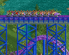
He did a good job, though, and it's a solid design in my opinion. The coaster layout was pretty good, the flow not so. Especially those helices could have been made smoother, while still remaining the right scale for the coaster. The supports were very well done.
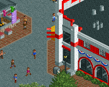
I really liked the architecture in here as well. Although not breathtaking, all buildings are well made. The only thing I didn't really like were the frills of the station that were in opposite direction, but I guess that's exactly how the station in Six Flags looks like? And just a small thing: I would watch out with the use of clocks as signs. They are getting repetitive. I'm sure you can show us some more creativity there.
The foliage was okay, but I still think you shouldn't patch your foliage this extreme. Some transitional areas would be nice. I disliked the bare rock area with the flames. It looked ugly and out of place. You could have done more with that.
My biggest complain is that it lacked the extreme realism details geewhzz, CP6 and some other elite members have shown us in the past. Right now there was nothing that made this design submission stand out from mediocre designs. Missed opportunity, as I'm sure you're capable of doing so and you finally had the chance to with this design.
Voted 70%
We've had plenty of designs which focused on nothing but layouts, station, and some supporting path and buildings, and that's perfectly fine for a design to be. If it's a well executed layout w/ good supporting details its a design. Adding anything else just makes it extra.
I enjoyed this. It wasn't mind blowing but your knowledge of real-life parks really comes through with small details that look so real they force you to take a second look. The little building cutouts are awesome and look more like a photograph of the real things than a RCT recreation, The shields are simple but perfect and honestly the support work here is being underrated. I also like how this is clearly a blend between the New England ride and the other 2 Ride of Steel clones with the long, drawn out helixes and flat sections. This subtle blending (that few people will pick up on) makes for a very believable layout.
As for things I didn't care for, the queue is definitely one of them. It seems a bit short, doesn't match the ride and most importantly I don't think it's quite ugly enough to be a Bizarro queue. The fact that it features a nice brick design is nice but we both know Six Flags would never waste their time. I also wish the ride were a little taller / larger but I get that this is the NE style and I'll never win this argument. lol
Overall though this was really nice. I like the buildings (clearly based off the surrounding area in New England), I like the colors and I like the atmosphere.
65% from me. It's not amazing but it's fun and definitely design worthy. I love your productivity.
This is super important for realism. So many rides (and occasionally entire parks) feel like they were waaay to inspired, and often time you'll see the opposite where you lose the feeling of a certain brand or manufacturer. It would be interesting to see this point discussed more in depth about other parks/designs.
I think thats what sets higher quality designs apart from others.
You have to know the make so that you can design a coaster that is the same style of the make, but not a carbon copy of others. It needs to be unique enough, but still remain realistic.
This does this well.
@Faas, I don't think a coaster need to have tons, if any "interaction" to be a good coaster. Sometimes the mystery of the layout and coaster is much more thrilling than being able to see the whole thing from the path. Granted, this is kind of in the middle, you can get some cool views from the path and queue, but you aren't literally walking under and around the coaster at the same time. To me its more of a preference thing, if you prefer to have coasters with lots of interaction that's fine, but I don't think its fair to rip a coaster for not having any.
Plus, its not like Six Flags has crazy themed and interactive queue's. It just wouldn't be realistic to build that way in this case. Seeing as this is a Six Flag's design, you should take that into consideration along with other trends of the park chain when voting, but that's just my opinion.
@Liampie, kind of like I said in Faas' reply. Part of the "design" aspect is mimicking the trends of the six flags chain. I could easily build a "chain less" realistic park, and in that case I'd agree with you. But I think this map does a decent job of following Six Flags trends with their coasters and theming. This is part of why I'm not super happy with how Worlds of Fun turned out. It doesn't really have a chain that it follows, nor is it stylistically strong enough to stand on its own. But that's a discussion for a different thread.
@Stosky, I considered adding a bit more to the map on both sides of the path. Probably would of had a train station or something and then a tracked mini-coaster on the other side. But at that point, why not just build a small park? From the beginning my goal was to keep the map small, so that's how we ended up with the map in this state.
@Sulakke, Do you thing Intamin Mega Coasters are plain? Eh, they aren't the most heavily themed or inversion heavy, I think they have a great charm and appeal. Plus, we don't see many in RCT, especially compared to Inverts or something like that. Ah well, I don't have any real issue with your opinion on the coaster or Superhero theme.
The bare rock area, was something I was never quite happy with, but I couldn't figure out what to add to it to make it more interesting. Rock texture is something I find really hard to mimic in RCT, and it shows here.
@Bill, The queue was the aspect I struggled with the most. I wanted to have a classic, large switch back area and then a long walk up to the station which seems to be the most common queue style for bigger coasters at Six Flags. Path texture wise, sure it could of been all grey tarmac, but I'm not sure how good that would look or if an all-tarmc submission would be accepted today. Seems people are pretty hellbent on injecting as much color into parks as possible, which often means completely unrealistic overuse of path textures.
Thanks for the reviews and comment's all! Not sure what make's this controversial, outside of its simplicity or theme really. I get that people are tired of the same style, but complaining about it isn't going to make people build differently, at least in my opinion.
Anyways, ONE more vote!
This one is on a weird spot for me. On the one hand, I respect the park and recognize its excellent architecture and nice layout. On the other hand, it felt a bit cold and lifeless to me, especially the (almost) empty spaces. I get that you were going for Six Flags-like realism, but this kind of style just doesn't appeal to me. The music and peeps really helped the atmosphere though.
Since it was well executed, but not too much in my tastes, I'll give it a 65%. Definitely design-worthy.
Congrats!!! Bizarro, Bizarro, Bizarro number one.
Nice work. Good score I think.
Thanks Guys! This was a really fun build and something I've always wanted to make in RCT (Intamin Mega that is), so getting a nice accolade score out of it is just icing on the cake!
I think I need to start voting lower on your parks from now on, twice in a row I've been the top vote now
Congrats on the design!
I mostly agree with Sulakke here. It's not the kind of park/design I would usually like (too plain, boring, overdone, hyperrealistic) but you did a very good job on it nevertheless, making me actually like the map, hence the 75%. The colours were great as well. Like others have said many times before, do whatever you want and have fun but I'd still like to see you build something more themed, I think you clearly have the skill.
I kinda have to agree with Faas on this one. Although technically this was well executed I did not really like this as much. Mostly because it was a bit boring. The coaster is cool and I liked the theming, but the surroundings were kinda boring and there wasn't really that much to look at.
For me a Design needs cool interaction with the terrain or some other element on the map, or it needs a good supporting ride or a custom flat ride to accompany it. Something that makes the design as a whole a bit more original and makes me go wow. I feel like that is one thing that is lacking in most of your parks. While they are all very well executed I feel like they miss some originality or new concepts that give the park a "wow" factor. I feel like if you would add things like that to your parks they could go from the 80% range to the 90% range.
For this I would probably vote 65%, I think it deserves the design accolade for the execution but I feel like this is just the absolute minimum for a design. Congrats on the accolade
A gold, spotlight and design in one year (did anyone achieve that in the history of NE?!), I would dare to bet money you get another accolade this year... Your building pace is phenomenal
I like the coaster. It looks like a classic Intamin hyper and they never disappoint. You went ham on the supporters which makes it aesthetically better. I do understand the critiques the coaster lacks a bit interaction, but that's the case for most hyper coasters. I think this point could have been solved if you made some kind of boardwalk near the lake, the side which is now blacktiled, with terraces etc. Would have made fantastic view on the coaster for the peeps from there.
Technical it's all top notch witch neat details. Must also have been the cleanest SF park I've seen since Robbie's SF Santa Fe, thanks to the great use of colors. I'm not a fan of the super hero theme, I find it and excuse for parks to not theme at all and just throw in some logos and statues.
The station's location is a bit sadly chosen. Thrown away in a corner, behind a shop and some trees... While the station should be an eyecatcher.
Overall nice and enjoyable design. I'd give it a 75%. And I still want you to some more heavily themed because I think you could blow us away with that But keep building what you like, as long as you have fun! That's all what counts.
You are incredibly productive. Do you leave the house, haha?
^ For 15 minutes