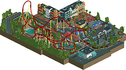
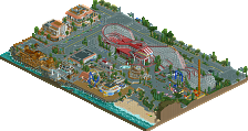
Park / Grand Prix
-
 25-August 17
- Views 3,137
- Downloads 553
- Fans 1
- Comments 18
-
 68.75%(required: 65%) Design
Cocoa 80% posix 75% bigshootergill 70% CoasterCreator9 70% Steve 70% Sulakke 70% Coasterbill 65% G Force 65% trav 65% SSSammy 60% 68.75% -
Description
Little design I threw together. Themed to Monaco and racing. Hope you enjoy.
-
1 fan Fans of this park
-
Full-Size Map
-
Download Park
553
-
Objects
1
-
Tags
Similar Parks
-
Coors Park
-
NE's Mirage Islands
-
Giari Palms Theme Park
-
[H2H7 R2] Bermuda: The Lost Colony
![park_3334 [H2H7 R2] Bermuda: The Lost Colony](https://www.nedesigns.com/uploads/parks/3334/aerialt2938.png)
-
Belmont Shores
-
Ninja
great job! Some awesome archy, and cool details. My overall favorite thing on the map was the car ride though. It didn't keep my attention for long but the first opinion of it was that it's a great ride. That bridge the car ride has over the path is a brilliant entrance for that little section of the area. The coaster layout was cool but I felt there were some parts that could've been smoother. One thing I really didn't like, or generally never like is to place fences right on the map edge like you did in that backstage section. I thought it was a cool coaster, and a great release overall. Would be brilliant in a bigger park, and the area layout makes for great park inclusion as well. But why was there a hotel inside those buildings? Or what was that supposed to be?
Good job but here's for me some points that needed more work/refinement:
- Archy was a bit too linear, needed more relief for me. But the facades are great. Also too bad the corner building was used for stairs and a sign that would have maybe been better if it was diagonal and not just black.
- Coaster layout was a bit random in my opinion, not particularly exciting. The yellow supports were a bit too bright and don't match the rest of the area for me.
- Paths were a bit too confusing, particularly in the swing ride/car ride zone, there's too much grey compared to the rest of the map.
- The swing ride: it adds even more black/white/grey to the area, I think removing it and making a more colorful ride with some green spaces around would have helped this design to breath a bit more.
I like the coaster. It's a clear focal point with a fun layout and good (Ferrari) colors. The supporting rides are nice, though the top of the swing's arches seemed a bit messy to me. The corner "building" and the way you cut off the map in a few places is a bit questionable. Overall, it's a nice little area!
I think this is nice. I agree with Fisch that the car ride was awesome. I also think it suffers a bit from following Mirage Islands and its Monaco area with a similar ride. Which is unfair to you, but it does draw comparisons. Overall I would give it a 65% as I thinks its definitely design worthy
This was lovely. Nice speediness, nice interaction, well executed theme. Just overall very skillful and being unpretentious about it. Also loved the staff choices. Really been hoping to see some new content from you for a while and this didn't disappoint.
really solid design. great layout, really fun, vibrant, colorful, etc. You are particularly good at really detailed archy that doesn't glitch everywhere or seem detailed just for the sake of it. I'd love to see some more work from you that highlights that skill! But yeah, great details and little things throughout this. Really enjoyed it.
I liked this! While it definitely feels like Ferrari Land meets Starpointe it's a very nice piece in it's own right.
The coaster itself is nice and has some nice pacing, for a Design submission a little bit more theming would have been nice but the layout is fine.
I think the best things on the map are the building facades in the corner and the car ride. Those were great and really helped bring this to a higher level. I really wish the coaster station had as much thought put into it as those buildings though. It looks like someone slapped a generic Cedar Fair station in a highly themed park where it doesn't belong at all.
While this definitely has it's drawbacks I still really like it and it's absolutely Design-worthy in my eyes. 65% from me.
what is it with you people and having rides offscreen end enter at the map edge? it always looks categorically worse than just having the ride be completely onscreen. there's implying the map continues offscreen, then there's just doing a half a job.
as for the actual content. the archy and that general area was really very pleasant. the bar and casino we can see from the back is cool. the actual ride, however, was lacking. it really seems like it could have done with a few more drafts before moving on with production. some parts are really clunky, but also some points are fun, such as the path interaction.
overall, the content showed a lot of competence. the archy in particular is the strength of this piece. i just wish you'd have considered the rest of the park more and put it through a few more drafts.
A very nicely made piece of work. I love all the details like the signage, the F1 car, all the slot machines and interiors... Glad to see the fucking peeps object again. Also glad to see the F1 miniature cars for a change. Too many people, myself included, use the oldtimers. The archy was nicely done, it's been said many times before, even though it doesn't really feel like Monaco to me.
There were however a fe niggles with this, but nothing that hasn't been said before. I think my main problems with this were the ones Julow and SSSammy talked about:
- Path might be a bit confusing and too dark.
-For such a detailed and themed area, the coaster itself feels too bare. I know race tracks are often surrounded by patches of graas, but this needed more.
It's a terrific release however, and probably one of my favorite recent design entries.
Very nice work! You showed off some great detailing skills and some great improvement compared to your previous work.
+ The coaster layout was quite goof, i really enjoyed it.
+ Love the building interiors, great work!
+ sports car, shops, small details are on point
+ Sky hawk, executed really well
+ Architecture skills in general
- The landscaping work underneath the coaster felt a little bit unrefined. I feel like you could have done a lot more with it, at least in an entry in this size.
- Junior racers, don't know why you haven't included them completely onto the map, would have been a lot better, like it is know, they are feeling a bit weird
- Confusing path
- Might be just my taste, but some of the facade work felt a little bit too busy for me, and i agree with julow that the design was a bit too linear, also that we already had a Monaco theme recently in Mirage Islands, somehow made the architecture a bit less enjoyable.
Considering how previous releases have been judged, this isn't a design for me, since i missed detailing on the actual ride and there just wasn't enough content on the map. Obviously the quality of it is much more than that, but because of the size and the comparison to other design-releases, it doesn't feels design-worthy for me, please, do not be angry with me for that. 60%.
60%.
I wonder what park you're referring to...
Congrats Bubbsy!
I think you know most of my thoughts on this, but overall it was definitely pretty solid and had some really nice moments.
The flat ride was done really well, same for the car ride. It was really quite atmospheric and colorful enough for me to overlook any awkwardness. I do think you could have expanded the map a bit more to give the ride a bit more context, especially behind the top hat. The queue and area under the ride seemed like a little potential was left on the table. The ground textures felt quite blocky and the queue wasn't that inspired, but you did a good job with it considering the space.
Maybe would of liked something a bit more original, however its still one of your first project so thats honestly to be expected here.
However, as your first true submissions its definitely quite nice. Hope this starts a long streak of productivity!
Looks really nice. Surely design worthy. Strangely, the area containing the actual coaster was lacking compared to the rest. It would have been fine, but what was there wasn't executed to perfection so I think the open look was a bit off. Mainly, the x2 footer height throughout the layout doesn't look too great imo, and I would have liked to see them all at 1 height (or 2 if you were set at that). Minimal, but still I think that aspect warrants a little perfection if its sitting out in the open.
I agree with cut-off rides, but at least here it isn't a random bit of a coaster or something.
is it me or this extremely reminiscent of the monaco thing in the NE group park? or is this a cutout of that map?
the first 3 elements are exactly the same as the one in there, the f1 car is almost a direct copy... the architecture although based off of the same real life archy feel very much the same.
I agree with this.
It was decent, but it's borderline design for me. The architecture has too much going on, it's much cleaner in Mirage Islands. The coaster has a nice layout, but there's nothing around it.
The best bit of the map was definitely the car ride...and only half of that was there, I'm not sure why?
Good map overall, but I think you can do much better.
You're indeed a skilled player but I can't find any characteristic from this park. (To be honest most of the recent works in NE looks samely to me. what the fuck is going on..)
I'll never understand the appearance of cutted rides, it always looks silly.
65%
Thanks for the comments guys. I greatly appreciate it! For some reason it won't let me quote your comments so I'll just answer them in a scattered paragraph. First of all I completely agree with all of your guys criticism because it's pretty much exactly what I thought of it too. I basically made two buildings an liked them so I decided to make a design around it. Looking back at it this wasn't the smartest decision. TBH the reason the car ride is cut off and the land under the coaster being bare is because I quite honestly got lazy and was pissed that I hadn't planned anything. For the people saying the buildings look like the Monaco area in Mirage Islands that's true because I built and helped detail half of those buildings. Thanks again for the comments and the design. Hope to get some better work out in the near future.