Park / RIOT
-
 21-September 17
- Views 4,421
- Downloads 571
- Fans 1
- Comments 14
-

-
 71.25%(required: 65%) Design
CoasterCreator9 75% Kumba 75% Liampie 75% SSSammy 75% Steve 75% bigshootergill 70% csw 70% Coasterbill 65% G Force 65% trav 65% 71.25% -
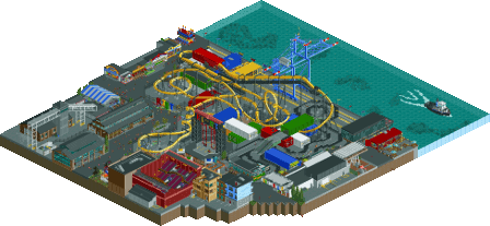
Description
I built this as a sort of realism-stream-of-consciousness, building things that came to mind as cool or interesting at the moment without giving too much forethought or planning, or even having an overall vision for the design. I hope you can enjoy.
-
1 fan Fans of this park
-
Full-Size Map
-
Download Park
571
-
Objects
365
-
Tags
Realism, but with a bigger emphasis on fun and colour! Alex is right, 4 years after Starpointe, the age of ultra-realism or pacificoasterism is slowly over. Let the era of Lagomism begin!
Riot is a great little design, which obviously focused on one thing only: having fun. And it shows. All the buildings are really well made and look like they belong in a harbour. I love how all the game stalls have a different identity as well. Good job with those! Also the colours are what I find very successful. The problem with hardcore American style realism is always the overuse of grey and tarmac path. Here, this suffers from the same problem but the liveliness of the buildings balances it out. But only just. I forgive you for this because of the setting and concept.
I don’t like the glitchiness of the water though. Something went wrong there I guess but it’s distracting. Also, even though you said every building is based off a real NY building, it doesn’t feel like NY. My guess is that you took every colourful non-typical building you could find in real life and built that in RCT. But using only non-typical NY buildings doesn’t make it feel like typical NY. It’s a nitpick though, they’re really well built and definitely fit the area and feel of the park.
Overall a really nice little design and I hope your comeback isn’t limited to this!
Hey, nice little design!
Very interesting and different. I like that.
What struck me the most is how you so succesfully integrated the coaster and all the other attractions in the environment. Everything looked like it belonged. For example you used containers for the queue lines and interaction elements. Also the way you did the structure of the screaming swing(s), makes total sense in this setting.
The amount of tarmac used didn't bother me. I think it helped that you used two different shades of grey. Also that everything else was colourful.
Good work on the architecture. The theatre was a highlight for me. The glass building near the water was beautiful as well. And those game stalls were probably some of the best I've seen. So well made...
My only nitpicks are the pacing of the coaster and quality of the crane. I'm far from a coaster expert, but the pacing was too slow in some parts of the layout (in my opionion). The blue crane looked rushed. I think you should've spent more time on it.
This is definitely design worthy in my book. I hope you'll get it!
The surroundings were quite interesting, lots of different stuff that created a pretty unique atmosphere and map. I'm glad you weren't afraid to use grey or black in your paths and archy, it really helped the contrast with coaster and some of the more colorful elements.
However, my least favorite aspect was definitely the coaster, the pacing was so-so and the layout felt a bit random at times. Pretty much everything after the loop didn't really work, although the turnaround between the corks was quite nice and placed excellently.
The swinging flat ride felt a bit weak as well, just didn't have the clean or nice look of the other content. Which for the most part was very nicely done, especially the road line theming, that was very cool.
As a result, I don't think I can give you more than a 65%. It's a design after all and when the coaster is the weakest part it just hard for me to justify a higher score. Hope this isn't the last of your comeback though!
I liked this.
The buildings widely range in quality from extremely basic to really detailed and nice and it feels very blocky in areas (thanks in large part to the shipping containers so that's kind of unavoidable) but I still like this quite a bit thanks to the fun color scheme and some of the higher quality buildings.
As for the coaster, it's awkward but for some reason it works. As I viewed it I kept thinking "I shouldn't like this, but I do", mainly with things like the roll into the brake run and awkward section between the first twist and the corkscrews.
This is a weird one, but kudos for being different. I like it. 65% from me.
Yeah everything was great. Loved all the huge crates and the little restaurants and shit inside. The huge blue crane, all the lifts and warehouses. And a brewery! This right up my alley.
The carnival games might be some of the best we have seen in the game. Very well done and very fun. The go-karts were also very charming.
Overall there was a lot to see here. Between this and Splashdown you’ve developed a very fun style with a lot of style. Almost like Kumba but more realistic? Not sure. Either way, I’m a fan. A 75% from me (fuck the haters, I don’t care if the coaster wasn’t amazing).
One of the few submissions where I don't have a score in mind intuitively. Definitely a design in my eyes, but the layout's pace wasn't right at all in my opinion.
i dunno about this one. it didn't really "complete" in my eyes. everything in there is deft and nice, but im missing the magic. there are no land elevation changes, which is way more important in my eyes than a lot of people perhaps give it credit for. it might alos be that is all very grey. i gave my score more based on respect for the competent ability but if you're going to get higher than 75 for me it really needs that spark
I really liked this release. First, Riot's entrance is incredible and a big favorite for me in rct's ideas, but the rest of the map is also interesting. The whole setting, in a harbor zone, is very original.
Combined with the lively colors of the different elements, it makes the area look very playful and alive. Almost like toys. It's very well done if it's intentional.
Not a fan of the blue crane, I think it's a bit too distracting.
I really liked this, as you already know Tim. The cluster of hipster buildings is great, the go karts and toy shop are fun, and the splashes of color on a could've-been-swamped-in-grey canvas really rock. The triple corkscrew is also daring and I'm glad it's there.
Great design. It could have had a bit more, yes, but what's there is definitely design-worthy. Excited to see more from you.
You've definitely got your own style, and I like it.
Thanks for the lengthy comments everyone; I'm super thrilled to have a lot of feedback and thought out replies!
I personally thought the coaster was a bit fast in places, so I can say I learned a bit about pacing. It was definitely gray, but I did what i could to make it bearable. For instance, the two-toned paths made zero realistic sense, but they helped break up an otherwise ocean of gray.
A lot of this was sort of a stream of consciousness, in that I just built what I wanted to build at the time in a specific corner of the map without planning anything out.
I am pretty proud of the games stalls and New York section, both of which I think I did very well on. The New York section wasn't intentionally colorful, I just grabbed a few buildings I used to frequently visit or see and re-made them in RCT (some with the same restaurants inside). I would like to point out that New York isn't entirely brownstones and skyscrapers, and that buildings like these do exist.
Thanks for the Design win! I was expecting a lower score, so I'm thrilled with this!
And thanks to ][22 for the logo!
yeah cool stuff trev. I'm not sure I fully understand the theme but it feels like a place I would have had a lot of fun in as a kid- some sort of refurbished, fun, kids thing downtown. the layout was alright, but I do appreciate straying a little from invert conventions with 3 corks and a twist, even if its not that far from the usual. but overall, good vibes and some cool details throughout. I really enjoyed the overall atmosphere.
I still think the layout is slightly odd, but the surroundings are gorgeous.
Lovely work Timmy <3 So good to have you back around here.
The fact that some have been calling this "lagomism" has been troubling me. Lagom's work is more dense recreationalism that relies more on the big picture than smaller details. I'm that vein it's just geewhzz's style in a nice, european box. This is the opposite of that. This is entirely detail-focused. Not to say that either style is worse or anything...