Park / Cannibal
-
 12-November 17
- Views 2,530
- Downloads 642
- Fans 3
- Comments 11
-

-
Description
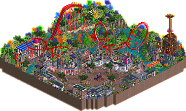
Welcome to Julow Land.
This is a private park made by Julow. He is the world's most powerful drug supplier and he decided to build a place where he could have fun and feel at home near his workplace.
Julow Land is home to one of the rarest roller coaster on earth, "Cannibal", which can be ridden only by a few selected guests.
If you don't like the place you will either finish as food for the crocodiles or as food for the other guests at Julow's Diner, the only place where you can find delicious human meat burgers.
Enjoy your stay or die. -
3 fans Fans of this park
-
Full-Size Map
-
Download Park
642
-
Objects
1
-
Tags
![park_4161 [H2H8 Semifinals] Disney's Fairytale Kingdom](https://www.nedesigns.com/uploads/parks/4161/aerialt3928.png)
![park_3134 [MM2014 R1] The Great Vilnius Hotel](https://www.nedesigns.com/uploads/parks/3134/aerialt2723.png)
![park_3167 [MM2014 R1] Europa Report](https://www.nedesigns.com/uploads/parks/3167/aerialt2725.png)
I love the premise of this creation of yours, and I feel that at least architecture wise you pulled it off well. Some secluded place in the Amazonian jungle but has the creature comforts of America? I'd believe. Foliage would have been so better if it kept to greens; even with those retarded objects I'm sure it would have looked convincing. Ride design is very weird for a B&M dive machine. Even if it's not meant to be realistic it doesn't flow and ends too abruptly. It's not well integrated with the setting either. There's not really any sightlines. It's definitely the weakest part and likely why this won't in all probability score over 60%
I gave it a 55%
- The layout was a bit of an anti climax but i do enjoy the all red colour scheme.
- There's something mysterious about this setting; you have all these flashing and moving objects and it's just complete silence... really quite an interesting mood.
- Of course I'm a big fan of the weird and quirky objects and you definitely created some interesting forms and structures. I do enjoy the colours too: all the pinks and reddish shades.
- The contrast between the structures and the foliage I found a bit too severe; didn't really harmonize too well for me. But on their own, they're both interesting; altho the foliage felt difficult to recognise as foliage and not just clumps of odd colours and textures.
- Overall, there are some weaknessess but you have incredible skill Julow and, all I can say is just continue to do you.
This is seriously awesome. Probably my favorite work from you so far, even going back to the Whiskey Station days. The use of objects is just so damn creative. I loved the satellite dishes, would never have thought to use the backs. I'm so happy you're doing all the angles again, because you have so much potential, and I can't wait to see what you build next.
Oh man I have no idea how to vote on this. The architecture is cool, the coaster layout is alright, but the object choice hurts my eyes and there's nothing here to actually look at. The coaster is just plonked in a field of randomly coloured foliage, and there's no interaction between the coaster and anything else.
I could see people vote 50% on this and understand why. I could also see people vote 75% on this and understand why. I think I'm going to settle on somewhere around 60%. I don't quite think it's design worthy, because for me a design has to be more than just a coaster in a field and a plaza of architecture. It has to have more thought put into the overall composition and how to make things more interesting to look at from a peeps point of view.
But then I feel like I should also give you an extra 5% for actually building in all angles...
Yup, this is crazy dude! Oddly enough you've done some decent work with some seriously crap expansion pack objects... perhaps this is the small beginnings of the Disaster Bench 2.0
To me it almost feels a bit like Alex's Junkyard, but not up to his standard or execution ability. But what I do love about this, and your construction in general is your desire to go "out there" into new territory, new texture, new styles. To me this falls short of brilliance, but with what you've shown this site so far, you're not too far from tipping the scales in your favor. I think you've got some amazing parks yet to be released in your repertoire. Looking forward to more!
I think you're on the edge of a breakthrough here. This is by far some of the best work you've shown thus far. There are some really cool details laced about this submission (like the peeps trying to escape the crocs).
However, I'm in agreement with trav, Poke, and Shotguns. As a whole product you have a really honestly fantastic main plaza that could be full of atmosphere, but everything is dead. Silence. Emptiness. It almost feels as though the coaster was tacked on as it's tough for the guests to view except for a few locations, but that's more of a nitpick than anything else.
I'm torn on how I'm going to vote on this one, but I'm thinking it's going to end up around 60% for essentially the same reasons trav pointed out.
Is this a French Interpretation of 1950's Americana after viewing the film King Kong? I enjoy these WW/TT objects. I didnt mind how abusive some of these colours come off, they still blended pretty well. Architecture & forms were solid. Coaster felt weak & not involved. Love the burg logo.
The major issue i have with this is the lack of peeps on a map about eating peeps. I am hungry, and there is no one to eat!
Still an enjoyable viewing experience for me.
Thanks for all the very precise comments guys.
I agree with almost all of you, the project was too experimental. The only thing I particularly like here is the Julow dinner with the buddha on the roof and some parts of the plaza. Otherwise I agree the whole thing is too toxic to look at, the drop tower and coaster's station don't fit at all, there's absolutely no sense in anything.
So I kinda agree with the votes here, it's probably between 50% and 60%. I also didn't submitted it for accolade panel for that reason.
I'm also very surprised to see there's 3 fans of the park and thanks a lot but I would have preferred them on Mammoth for example. Haha
And to answer to some people, it was mean to be dead . Nobody has enough privilege to visit Julow Land, it's only for a few VIPs !
Holy crap this is making me question whether or not I'm hallucinating. You took the WEIRDEST mix of random objects and somehow made it work! I also didn't mind the foliage as much as others did, I thought it fit the theme very well.
I do wish the coaster was a bit longer, and had more interaction with the plaza, and although you said above that you meant for there to be no peeps, I liked it better after I opened up the park and let them roam.
Overall, a really fun, eclectic, and unique project.
This burns my eyes out of my skull. And I love it.
Yes, the colours of the trees are weird. Yes, the objects are terrible. But it all works in its own ridiculous way. There is something to see in every corner. It's full of life and creativity. And again, I love it. Nothing more to say.
Alright, maybe a few. Sometimes the trees were a bit too over the top, making it actually a bit hard to look at. Also, like said before, the coaster was a bit pointless. And no peeps? Come on man!
Experiments like this are becoming less and less rare now, and we can all thank the Disaster Bench for this. I hope in the future we can see more stuff like this from you, as you do have a knack for making terrible objects work. Ceci n'est pas un parc, ceci est une pièce d'art expressioniste.
I love this so much. its ridiculous and funny and best of all its an amazing homage to all these dumb WW/TT pieces. I remember first playing rct2 and spending a lot of time messing with these pieces and scenarios back when I was really little. this brings back those memories in a great way. you have a real knack for atmosphere which is clear here, and everything is lively an detailed and lush. great job. I wish the coaster did a bit more, and the map was bigger. I'm very keen to see something bigger from you, and equally creative hopefully!