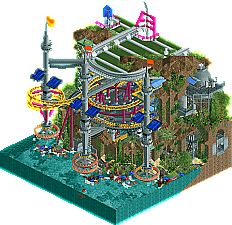
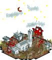
Park / Harvesting Ocean Plastics
-
 10-April 19
- Views 5,344
- Downloads 632
- Fans 1
- Comments 16
-
1 fan Fans of this park
-
Full-Size Map
-
Download Park
632
-
Objects
253
-
Tags

How to vote?Round 1 - Group P
__________________________________________________________________
dr dirt - Harvesting Ocean Plastics
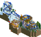
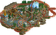
Terry Inferno - E.T.'s Driving Exam
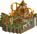
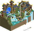
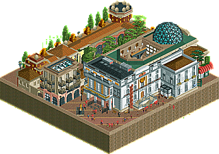
gdb - Dalí Museum and Theatre
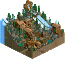
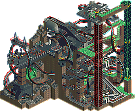
bad - Corrosion Complex
__________________________________________________________________
First of all, check out all the entries in this match. If you can't view one or more entries, for example if you don't own LL, then please, do NOT vote. Once you've viewed all 4, select your favourite and second favourite in the polls above. After 3 days, we will close the poll, the results of the two polls will be added together, with the votes from the second poll weighing only half as much as votes from the first poll, and the 2 highest scoring entries will proceed to the next round. The third placed park will place its creator on the reserves list for the next round of the contest.
Votes are public and so any cheating of the system, betrayal of honesty or mistrust will be picked up on and will be dealt with.
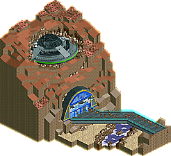
1. Harvesting Ocean Plastics: Lot of movement going on.. pretty creative idea. Loved the turbines sucking trash out of the water. Coaster was sorta meh, but the rest was solid.
2. Dali Museum: Tough choice here.. but I thought the archy here was too good. Similar to why I voted for RIP Holland.. loved the architecture.. and here being that there's a couple buildings to the complex, I think it worked well.
3. ET's Driving Exam: Toss up for 2nd.. could definitely see this moving on. The story here was cute. The cutaway into the space ship was also a nice touch. I guess this fell short for me because of the amount of detail put into gdb's entry. Still really solid.
4. Corrosion Complex: Really solid entry too! Just a tough matchup I think. I still need to learn how to do those elevator lifts.. someone teach me! Liked the theme.. the big skull was cool. Just needed more polish.
1. Plastic Soup
2. Corrosion
1. dr dirt: So I know you probably got a bit of big head on you from being NE's posterboy out of h2h8 and easily a contest favorite. But I'm still gonna just spend this chunk praising the shit out this park and your building style. Honestly, I'm in love with it- its like everything I aspire to be as a parkmaker, but with more creative ideas. firstly, space theme is a great song choice and I'm amazed I never really noticed it before- gonna use that more. Secondly, the atmosphere and organic detail here is astounding. The way the brown rocks 'spill' over the roof of the structure, the bright beaches with saturated green foliage bumping agains the lower cliff wall, and all of that contrasting against the bright greys of the structure- superb color choice and an amazing resulting atmosphere. I particularly love the interior sub view with the yellow highlights- I never think to use yellows and it works so well here. the thick grey tunnels in the rock wall are also amazing. all the mechanical stuff is really novel and object use is crazy cool- the detail is real and purposeful and not just there to trick my eye into thinking that something is going on (which I am very guilty of!) the coaster is weird but worth it for the beautifully placed helixes. Just so so good all up, and my top entry so far by a lot (even if everyone else thinks I'm crazy, whatever). I think your parkmaking is so successful because it shows a real maturity of style that I pretty much don't see in almost anyone else- maybe liampie, natelox, turtle, etc. Most people are unsure and hobble together things and hope it sticks on a compositional level- but when I read your parks, I know there is a real intent and thoughtfulness behind everything. So impressive. at some point its hard to describe, but I just get the right feeling from your park in a way I only get from a few masters. OK, enough... I swear i'm not obsessed or a lunatic
2. gdb: the rest of the parks were all viable second places to be honest. This one had some flaws- a bit too small scale for the archy I think, and some hard to read crevices and shit. But overall there was some nice work here to pull it all together. I think if you're banking on a subtle, relaxing park going through, it needs to be of a very high caliber, and this didn't quite cut it- but still was well made enough to squelch above the rest. nice job! the clocks painting is cool also
3. terry inferno: a silly park for sure. I got great spaceman spiff vibes from it, its a funny mix of retro sci fi and absolute mundane comedy. I just wish there was a bit more to keep me there, because the quality was quite high. maybe a crazy driving school ride! or something to sell the theme to me a bit more.
4. bad: I was actually close to giving this second also. Really cool vibe- nice spaghetti coaster with some strange loops that actually sort of work aesthetically and a wacky rapids ride. very likeable all around! a bit rough around the edges but the creativity and fun was spot-on, moreso than the 2 and 3 entries above.
#1. Dirt. Cool idea, and is executed convincingly. Looks like some plastic magic is going on here. Solar panels and really just those machines in general are super cool and convincing. That coaster layout is perfect for a micro, great support work. I love the interaction it has with the queue line and that helix, so good. Really good use of height here, you did something with it. No wasted space or boring blank walls to be found, everything fits in nicely. Beautiful foliage, adds a lot of colour and atmosphere. Overall awesome micro, I enjoyed this one, and a deserved first place.
#4. Bad. The coaster layout didn't do to much for me. But I really liked the rapids ride, it was fun watching that thing go around and spit out the skull. Very creative and imaginative stuff, just not enough substance to put it through for me. Could have really used some architecture.
#2. gdb. Some strong archy here. I liked how you incorporated the cinema into the roof. The ivy creeping up some of the walls is nice and atmospheric. I found it hard to see what was going on in the middle which is too bad. Good enough to advance.
#3. Terry. I was very close to voting for this as second. Purple river is fun, some nice rock work around there. That ufo was very impressive, so clean. I got a laugh when I saw the name of it too. Its a shame that the inside of the space DMV lacks. If that was more impressive its a easy 2nd vote from me. As it is, I find it hard to see in there, with not much interesting going on. I cant vote this through on the ufo alone so that's why its in third.
The ramp/entrance, cave/mountain is very good.
I do not keep looking if it has a lot of objects, I look at the idea, and its idea was the maximum, I love fiction and flying saucers.
You're creative, I just thought the interior could have more things or be more visible, like a ride going up, I do not know, maybe a similar elevator, popping up inside the flying saucer, just an idea.
Of course I'm no expert, I'm still an intern.
I loved your work.
DR DIRT) I do not need to comment too much, your works are amazing, I look like a child (lol) enjoying and enjoying.
The 3 towers with the flags stayed 10, I think I understood correctly, litter in the water was also good, and I love submarines. Height is good, in the right measure.
The structure I did at the top loved it, great work.
QDB) The buildings and the details stayed great, the path diagonally loved. The details in the roofs were well positioned, very good.
The colors are nice and the yellow details on the wall look perfect.
A charm.
BAD) It was very crazy the water in green, going down, going down and down, nice idea.
The ride was well chosen, perfect.
Everything seems very alive, the fence that used combined well with the structure in general.
That tower in green with the signs where the cars go up, was very cool and the glass tower in red too.
And yet you managed to put on a roller coaster, nice work.
Harvesting Ocean Plastics - Great idea. The central coaster was neat, if a little... unusual. Not quite sure how it integrated with the theme, but I suppose not everything has to. The broken down rides were unfortunate considering how useless staff are right now. The landscaping and foliage are pretty much without fault as far as I'm concerned. Love the interior too. All around lovely entry with a good mix of colors.
E.T.'s Driving Exam - I adored the spaceship design. Interior was great too. A little confused on what the surroundings are supposed to be though. Interior looks sort of like a mall from the 90s, exterior looks like it's supposed to be another planet.Still a great little idea, neatly executed.
Dalí Museum and Theatre - Really pleasing architecture, if a bit busy. I like that this doesn't try at all to be stupidly tall.I think you'll go far in this contest if you can take this level of detail into a more ambitious concept. I don't really like the balconies and flowerboxes hanging over the void though - that kinda crosses the line of tile usage IMO. It's only an extra ~5 tiles but still, something to be careful about.
Corrosion Complex - Now here's some proper insanity. For some reason I just love the little launch on the river rapids that pitches the rafts down through a hole in the path. I don't really have much to talk about on this one, or much in the way of suggestions or criticism. It's a lot of fun to watch.
I really like every one of these, kudos to this group! This is the group where I've spent the most time re-opening the maps and trying to decide how they compare. I don't dislike any of them... very difficult decision!
Harvesting Ocean Plastics - everything I could want in a micro, dense with cool details but very readable and everything serves the interesting theme. There is great balance here in multiple ways - natural features v. mechanical ones, vibrant colors but not silly looking, rides coexisting with scenery, fantastical but grounded. Being new to NE it feels like this plot has things to teach me and I expect I'll look at it more.
Corrosion Complex - wild stuff! i appreciate that rides are the real stars in this park. I enjoyed the elevator enclosed in glass, the coaster is great, and my favorite is the rapids that blast out of the skull and drop through the path.
ET's Driving Exam - super funny concept and execution. the names of the staff cracked me up. I like the juxtaposition of exciting space stuff with the bland bureaucracy of DMV, this vibe vaguely reminds me of Men In Black.
Dalí Museum and Theatre - stunningly accurate recreation (the eggs!), spot-on architecture and colors. i have great respect for this one but I just enjoyed exploring the rest slightly more
Terry: another micro that feels like it's lacking some rides. Luckily you still had peeps and some other things to provide movement. It was fun to explore for a little bit, but it doesn't hold my attention for too long. Execution also wasn't that good, I've seen you do better, more convincing jagged rocks. This is the start of an awesome micro, you definitely could've done more with this theme! Good effort though.
gdb: I get the complaints about the scale, but I actually really appreciate how you compressed it into a micro plot without it feeling like a miniature. That is impressive. No rides, again, but it's so well made that it sucks me in and it becomes alive anyway. Fantastic stuff, with lots of great details.
bad: Another entry I could characterise as a 'threedimensional' labyrinth, although this one is very spaceous, which I like. It's definitely quite rough around the edges, but it's not a big deal. The rides are some of the coolest of this round (MM R1, I mean!). The setpiece with the skull is just fantastic.
1. dr dirt
2. gdb
3. bad
4. Terry Inferno
Dr dirt: Absolutely stunning entry, love the coaster layout and the whole thing just looks great.
Terry Inferno: Cool concept and the execution is good too imo. The only problem with this entry is that there isn't really anything to keep your attention for very long as there are no rides.
gdb: Fantastic architecture, almost voted this second. But also suffers from the fact that there is too little going on imo.
bad: Really nice entry, on a technical level I would say its definitely not as good as the other entries, but this entry is just really fun and it kept my attention the longest. I thought the radioactive river rapids was really unique and cool. Loved the skull that the river rapids were shot out off. Voted this second just because I found this entry to keep my attention the longest and it left me wanting to explore it more.
Another collection of 4 really solid entries:
Dirt: This is absolutely the most clever use of those frisbee seats I've seen. So cool. Clever idea on the whole with this. The coaster isn't too bad-- I like how well it stands out against everything and wraps the one suction unit. The interiors are well done and very industrial. Kind of reminds me of Mekong in a way. There's so many fun little details like the sunken catbus. An easy win here and one of the better R1 entries.
Terry: This entry was pretty good and then I found the "E.T. Phone Insurance" and it suddenly became even better. It's kind of plain on the outside, but the inside DMV area is clever and funny. The staff naming really elevate this entry and probably tipped the scale for me to vote for it. I thought the saucer was quite well done and I like the lightning inside looking like broken electrical components. Some more movement on the whole would have been good (maybe a bumper boat saucer doing a test?) but I enjoyed what you came up with here.
gdb: Super impressive architecture. You pulled well from the source--it's kind of funny how easily the 3D theater works here. This is a technically great entry, though I think I found myself wanting to see some more movement in the end. The details though did give this a good boost. The "Persistence of Memory" mural on the side is great. I would love to see this quality continued onto a larger scale. This is an excellent entry.
bad: While it may have been a little unrefined technically, this was a lot of fun. I spent a lot of time watching the coaster cycle. These kind of huge fantasy rides are a lot of fun. I liked the vertical lift tube for the rapids-- that was initially my favorite thing till I saw it shoot out of the skull. Fantastic. I think on the whole this could have used some general infrastructure. Pipes, catwalks, chemical storage places, etc. You're headed that way with clever stuff like the waiver forms stall. Not too far from a potentially great entry.
__________________________________________________________
Winners
dr dirt: 40 + 7/2 = 43.5 points
gdb: 4 + 18/2 = 13 points
Eliminated
Terry Inferno: 4 + 16/2 = 12 points
bad: 3 + 10/2 = 8 points
__________________________________________________________
dr dirt and gdb proceed to Round 2.
Terry Inferno is eligible as a replacement for Round 2.
Congratulations to the winners!
Well, I officially missed voting on a group. Luckily, I would not have changed the outcome.
My first vote would have gone to dr dirt, cause this was great. Creative, tons of content and activity, and an interesting and unconventional theme. Your execution was also astounding, managing to make what should be ugly, industrial operations look gorgeous and atmospheric. Honestly, everyone expected something amazing from you, and this is what I expected. Well done and congrats on the win.
My second vote would have gone to gdb. Amazing architecture that was so creative and fresh it could overcome the lack of a ride or higher drama. If you do a simpler concept like this is MM, it essentially has to be executed perfectly, and I'd say you may have it. Love the colors, the layering, just looked awesome and the smaller Dali-inspired details are great. Well done.
Terry, I really enjoyed your micro, definitely the most humorous of the bunch, which personally I think is hard to do well in RCT. I thought you execution was great as well. What I think held this back was the overall volume of content compared to what you expect when opening the micro. With such a tall mountain of earth, my expectation was to find multiple layers of content as I cut-away, but it turned out to really just be one, maybe two with the ship, and then 6 or 8 tiles of land fill. What was there was good, but it needed a bit more activity to match gdb's archy (or dirt's entire micro). That all being said, well done, this is a high quality micro to be losing.
bad, I have to say, there were some really fun and interesting moments of this micro. I understand why it wasn't a lot of people's pick given the less conventional execution, some of the awkward and blocky elements. But, I think the coaster, the rapids, some of the other hacks you had were really fun. I hope that as you grow as a builder you can keep some of those fresh, exciting elements while polishing your composition and execution.
Thanks for the comments guys! I had fun participating in the contest. The truth is I ran out of time to polish major sections of my park (especially the top and bottom, where more supporting archy was needed and paths should have been replaced). But I'm glad people still enjoyed the rides I spent too much time on
The other parks in this group were great! Dirt's definitely would be my #1. It nailed the balance of rides to scenery, and there's tons of mechanical/technological details I'd draw inspiration from if I did any sort of industrial park again.
Choosing between Terry's and gdb's parks for second would be tough. Ultimately I think I would choose the Dali because of it's impressive mixture of architectural styles. I really liked the crashed spacecraft (as mentioned, real Calvin and Hobbes vibes), but the interior of the DMV was a bit underwhelming for me. The level of polish on both these parks was great though and put mine to shame
Brief comments from KaiBueno! (Disclaimer - I'm renewing myself to the community and know very little of you, your parks, styles, etc. My views are framed from what I see as I open it, with a twisted 2005 perspective of wazzup.)
Dali - static yet full of life, probably the best example of a still life (mostly) scenery only option in this round (of any groups). Love the corner plaza, and the way the 3D theatre is tucked in the museum.
Plastics - neat idea and that ocean sure is cluttered with would be recyclables, I just wasn't keen on the scenery at the top. The rings near the water were pretty, and the shuttle intamin clever.
E.T - neat premise, and then no rides! I like rides, land integration and while this was very funny, I kinda wished a coaster or dark ride was tucked inside the hillside.
Corrosion - liked the darker theme, use of glass and slimy water, but the coaster layout bogged down to almost a crawl in some spots, which felt precarious.
Highlights
Harvesting Ocean Plastics: solar powered thingies
E.T.'s Driving Exam: crashed spaceship
Dalí Museum and Theatre: eggs
Corrosion Complex: rapids coming out of the skull
Dali Museum - great recreation. Beautifully detailed and well constructed throughout. Definitely could use some oomph to push it above a nice piece of RCT. It edged out ET only because I love the museum you picked and you did a faithful recreation of it
ET Driving Exam - great concept too, very funny, loved all the staff names and humor in there, the UFO was well done (Im gonna steal that construction...), and again cutaway view was great. Some movement / ride would have upped the concept. Sorry that you lost my vote, I would be intrigued to see your next round as a replacement though.
Corrosion - kept me intrigued and looking throughout. Bold color choices, I thought you sold the idea well. Could use refinement on the composition / architecture with more details.