Park / Where the Sidewalk Ends
-
 29-April 19
- Views 8,271
- Downloads 419
- Fans 0
- Comments 28
-
No fans of this park
-
Full-Size Map
-
Download Park
419
-
Objects
288
-
Tags

How to vote?Round 2 - Quarter-Final 8
__________________________________________________________________
Bubbsy41 forfeits
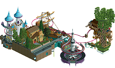
inthemanual - Where the Sidewalk Ends
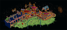
dr dirt - Blood Moon
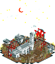
Maverix - The Dawg Pound
__________________________________________________________________
First of all, check out all the entries in this match. If you can't view one or more entries, for example if you don't own LL, then please, do NOT vote. Once you've viewed all 3, select your favourite and second favourite in the polls above. After 3 days, we will close the poll, the results of the two polls will be added together, with the votes from the second poll weighing only half as much as votes from the first poll, and the 2 highest scoring entries will proceed to the next round. The third placed park will place its creator on the reserves list for the next round of the contest.
Votes are public and so any cheating of the system, betrayal of honesty or mistrust will be picked up on and will be dealt with.
WTSE: Pretty good micro but I didn't really get it. I guess they're poems in the book? I was kinda sad peeps weren't riding the ride, I wanted to see it go.
Blood Moon: I just started BoTW so I was pretty excited to see this title. Not exactly the same, but I love it. Good archy, good ride design. Love the fade out edges, really sells the mystic nature.
The Dawg Pound: Pretty garish colors, but given the source material it's good. The layout is impressive, with or without size constraints. I didn't really get what the underground football field was for.
That the ride only runs once with a single peep is a part of the narrative. If you want to see it run again, you can re-open the park file or remove the no-entry sign a little ways off map.
1st - Maverix - Welcome to Brown Town
Dude I really loved this. And am surprisingly picking you over two of my favorite builders. Seriously man this is great. I genuinely laughed at the Lord Baker Mayfield statue, the underground training field, and Hue Jackson dying lol. The layout itself is mad impressive. I love how it doubles back on itself and has that many inversions packed in it. Not to mention the support work is top notch. A solid 1st place vote in my book.
2nd - Dr Dirt - Moon Blood
I really wanted to pick this for my first place vote, but I enjoyed Mav's entry just a bit more. The color scheme is perfect, and the little details scattered around really pull it together even more. The feathered map edge really adds a lot to this in a great way. Excellent work.
3rd - ITM - Not Cocoa's Rocket
Man I hate not voting for this one, because it's honestly really great. However, I enjoyed the other two a bit more. I like your narrative choices, and each little themed area is very well done. The black water is a great touch. I think the colors on the castle are perfect. The ship reminds me of Stoksy's ship in DFK, the tree reminds me a little of Otters R1 entry (hardly in appearance and execution, just the fact that it's a tree), and the rocket also seems a just little familiar. Not knocking you for it in any way, because there's only so many ways to execute these concepts - but I think you should just preemptively join Strangelove for H2H9.
Posix, I gotta say, it's a bummer to see you knocking a micro park for being micro. If there was one place on this site where micro parkmaking ought to shine, it would be in this contest. And it seems silly to say parkmakers should be wasting preciously few tiles on stuff that 'doesn't represent anything' and is just background noise. I agree, that is important in full parks, and often dearly missed today, but not here, not in this contest. Personally, I want fantastic dramatic creativity, not macro-focused slices of park.
My first vote went to ITM. I applaud the creativity and ingenuity throughout, and the execution was spot on. The blackwater effect was inspired, so excited to see what else can be done with that. It's too bad this will likely boil down to "I didn't get it" and "what's it supposed to be" for most viewers. I do think the micro lacked a bit in cohesion, and could have benefited from a bit more same-ness between the components to link them, but I don't know if that would have fit your narrative. Overall, held my attention the most by far. Well done.
My second vote went to dr dirty. This was the extra-crispy of aesthetic. A very clear vision, drama without height, and a very unique and well executed style. The coaster was cool, though not amazing, but I really liked the use of flying coaster trains, and I love the edges of the map that feel almost like an instragram filter, heh. I will say, I think the main thing that will stop this park from getting the 'I didn't get it" comments is a readme and an earth surface, but that ain't on you. Well done.
Maverix, in other places this may have nabbed my vote. I liked the coaster, thought it was so linear it hurt in places. Not a big sports fan, nor a Cleveland person, but I appreciate the little added bits. Execution was good, if a bit rough in places, and the supports were beautiful. Overall, this just lost due to concept. The other micros felt suited to a micro-focus and embracing the drama, fantastical flavor that is MM. By comparison, this kinda felt like a real park with the wrong aspect ratio, squished into a single line. I sound more down on this than I am, I appreciate the work overall, but it just lost out to more MM concepts imo. Well done.
1. ITM: Loved it! The treehouse puts mine to shame, first off. It's the treehouse I had pictured in my mind, but I didn't have the skill to put that into reality. The story of the rider exploring where the sidewalk ends is a cool narrative. I guess I am a bit confused how it all ties together, but if its all a dream, then that works for me! The hidden treasure room was a neat touch as well. Good use of the cutaway view. I just expect a Shel Silverstein entry next round!
2. Maverix: As a Clevelander too, this was great! Never would I expect to see a Cleveland Browns/RCT2 mashup.. this was hilarious! Hue drowning in hell? Baker Mayfield statue? Freddie Kitchens coaching the team? If only you could have John Dorsey in a sweater! Beyond the super specific easter eggs, the layout was solid and the support work was good. I think the layout is believable and looks super fun to ride. The coaster colors were hideous, but then again, we're from a city where people wear orange and brown all the time.
3. Dr Dirt: Sorry you had to be #3 for me. Loved the ride.. a bit fast paced at times.. but still solid. The support structures were amazing. The usage of ITM's grass edges made that dreamy sort of vibe that came off really well. The atmosphere was great as others have already pointed out. I just liked the other two entries a tad more.
1. ITM - an amazing idea that was extremely well executed. So many great little bits all around to keep your attention and keep you looking for more. The glittery black water is great, and the use of trackitecture naming + shapes to create intrigue was well utilized to sell the narrative. I love the idea of the one peep walking to the end of the sidewalk and jumping off into fantasyland. It's such an "ITM" concept. The tree was really well done, as was the castle, as was the pirate ship, as was the rocket. I love that each little world was a micro within a micro, and you managed to cram all of that within the limits. Kudos on a knockout entry, here's hoping you make it to the finals!
2. Maverix - What a surprise. Obviously I'm not a sports fan and had to do some googling on these names, but what really sold me was the whole atmosphere of it all. The rock music, the dirty brown and orange color, the shop stalls and food stall names, the gatorade water coolers... everything was exactly how I would imagine a "football" themed coaster. Not to mention, the layout is fantastic. I absolutely loved how compact yet still flowing and beautiful it looked. Well done, a huge step up from your round 1 entry!
3. Dr. Dirt - I'm a little surprised that this ended up as my number 3... from the overview it looks fantastic, and in game it was really nice. Loved the whole concept of some evil soul reaper, and those brown buildings will serve as good inspiration for Agencia . While the moon / stars added to concept and overall atmosphere, I'm not the biggest fan of how they look. I do love the new cloud object though. I think while the atmosphere, architecture, and concept were all great, it just didn't keep my attention long. The main attraction had an interesting layout and I liked how it wove itself into the map, but it was both too fast and also too short, and beyond that there wasn't anything else to really see. Still a stunning entry that had a fully realized vision that was well crafted and unique, but in the end both ITM and Maverix's entries had similarly strong concepts that held my attention much longer.
Overall this was a tough start to R2, all three entries were great and it'll be a hard round to predict... great job all three builders!
1. dr dirt: definitely shows a bit of rushed-ness but I still like it a lot. It has a good air of mystery to it and a strong, spooky atmosphere. The archy is good if a bit samey around the edges, and I think the coaster layout works really well. The way those objects fade into the blacktiles is a cool effect also.
2. itm: a solid entry, if a bit haywire on the composure. Each little setpiece is nice though. Unfortunately I don't know/remember the story (probably read it as a kid) but each element is strong regardless. I particularly like the palette with the sparkly black log flume track- thats a really creative and cool idea. I could imagine some applications for it...
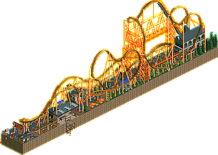
3. mav: wow what a layout. Longest micro yet? There's some pretty solid work in here, which we would have dismissed as an absolute rubbish abomination of realism if it hadn't been for the actual coaster . I laughed out loud at the "cleveland steamer" name and although I don't get the football references other than knowing the browns are shit, I can appreciate the sense of humor and self-deprecating love in the theme. Just really fun all up, I just ended up going for the slightly more refined entries of the 3. feels like a close one though!
Blood - It's a freaking live action painting. Love it. So picturesque and you sneak an invisible tower on the left, a coaster on the bottom. The texture of the scenery really works well on the bottom, and with the clouds. Like brush strokes.
Dawg - Wow, impressive to get this large of a coaster in 5 tiles wide, with all those inversions. I'm guilty in the past of a 14mph inversion as well...just not sure if this was intentional or constrained in a micro map size. I see elements here that I've done before and love to do (the switch back large loops in the middle with the cork inbetween). The one that sealed it....the Cutback! Mini DF tribute there.
Sidewalk - From the aerial, thought I'd like this more. Might still have the best of that of the three, but I guess the ride/effects don't work for me. Talented to do those, but it feels a bit off and maybe would prefer an actual coaster? I get the fantasy part though, and do like the connected islands.
Just sayin. even though no one reeeeeaaaaly copied each other.
Dr Dirt: Gorgeous work, as always. The atmosphere was really strong and the effect with the clouds and moon was excellent. Lovely layout and architecture too, with a theme that felt rather unique. I kind of wish there was some peep activity on the map but that's a small point. First choice for me.
 . The coaster however, was excellent. The layout was really impressive given the size of the map and the support work was amazing. A close third for me but I must say that this match was solid.
ITM: I really liked the concept of representing a child's imagination in different islands and you executed it very well I thought. The effect with the black sparkly water was wonderful and you pulled off the themes nicely. Chose this as my second.
Maverix: Unfortunately most of this probably went over my head and from the other comments I gather it's a reference to NFL so it's lost on me
the hardest vote of the tournament for me so far, at one point I probably had all 3 of these in each position.
1. dr dirt: a very odd atmosphere created here with the combination of the custom objects, the narrative + read me, and the colors used (blue flames, white and red tones). but odd in a great and memorable way that makes it the standout here. the tiny details were cool, like the body hanging from the coaster. the grass trims on the edges were also a nice differentiation from the normal black tiling, giving the map this weird illuminated effect, like when you lose vision of an environment outside of your field of view in an RPG or something. I do think that this has the lowest visual longevity of the three, due to it's compact size and single cycling coaster. despite this, the atmosphere is too killer and earns the 1st place vote.
2. ITM: very close between second and third. I was hesitant at first as it seemed like a pretty cool idea but with a less impressive presentation, as the separate exhibits seemed a bit visually stiff, with the styles of each exhibit seeming a little generic (bold take). what eventually sold me on it was the chronological narrative the park had, with the single peep walking off the sidewalk and going through the story, with the dragon coming in during the slowest part (chainlift), it kept me engaged in the flow of the micro. you also did a good job of rewarding closer inspection with all the little easter eggs that connected the different pieces, which is where this micro really shines, in the narrative. shoutouts to the peep getting off the ride and descending into the void
3. dawg pound: pretty much the toughest 3rd place vote i've made so far. the layout was awesome and I loved the first drop into the slow corkscrew. the self deprecating details were really great and added a lot of character to this entry. having the coaster break down not long after opening the file was a smart way to get the viewer into the flow of it, by then having it fixed by the GM. honestly a great entry, the other two just had me a bit more interested.
What a way to kick off round 2! I have opened all three multiple times and I'm struggling to decide my ranking but I have to vote at some point so might as well be now!
The Dawg Pound - I don't follow NFL but I love this. The mixture of supports for the taller section is really effective. There are so many distinct indoor and outdoor areas that have their own flavor but still mesh together beautifully across the length of the coaster. The lower sections are more surreal but still packed with details that I enjoy, like the gatorade and bottles on the tables. I'm surprised no other comments have mentioned Kennywood's upcoming Steel Curtain as a clear inspiration, but I've been intrigued by it during construction so this micro was a blast to see.
Blood Moon - the most atmospheric experience of the three, so many subtle effects and objects that contribute to a dreamlike, spooky aura. Super focused in that way as all the choices work together so coherently in terms of palette and composition. I like the coaster but it's not the standout feature. A very fun contrast to your entry last round which was so loud and bright.
Where the Sidewalk Ends - gorgeous composition/layout and some really stylish bits like the black water and treehouse. Each section has many merits but it felt like 3-4 mini micros rather than one coherent presentation. Maybe that is an accurate rendition of Silverstein's eclectic collection, but I just feel like slightly increasing the connectivity would have pushed this one over the top for me.
3 amazing works, it was difficult to choose.
01) inthemanual - Where the Sidewalk Ends
The theme was in keeping with what was built, the tree house everything I loved.
The effect in black flashing(water) was very cool, where is the rocket control panel was perfect, coupled with the use of tracks, I quite liked.
I am not a fan of ships/boats but it was good.
The mini castle is a total charm.
3 different constructions I know that it is not easy to harmonize all this and it was very good.
02) dr dirt - Blood Moon
The moon-star-cloud effect was animal, I loved it.
Blood Crescent Reader with great suports, well positioned and curves/looping is fun to watch.
Sorry my ignorance just did not understand the fire.
I had the feeling of being kind in a desert place where there are small houses, huts, the wind, with little foliagen, the bones and the cavera on the floor boomed.
The details of the buildings, paths/stone looked great.
The great charm of this work certainly was the moon/stars/clouds, nice idea.
03) Maverix - The Dawg Pound
Loved the layout long and narrow, very cool.
Gee! It must have taken a lot of work to make these supports, the orange and brown colors match.
Cleveland Steamer I spent a good time enjoying it, it is a lot of fun roller coasters.
The station is good, the football field underneath was nice.
The entrance it is ok, I really liked the bathrooms different architecture.
I call them stores, although we use a lot of word buildings, the 2 stores stayed perfect for me along the path.
Fantastic work you guys, you can all be very proud here.
ITM: What a great idea! The idea of where your thoughts wander of when walking on the sidewalk seems such a strange concept for an RCT micro, but you pulled it off. I can't imagine it was that easy. I especially love the black water effect and, of course, Joe the intern.
Dr dirt: Such a dark atmosphere. But a very well captured atmosphere nonetheless. Great archy, great storytelling and the moon looks super. This is only second because I found ITM's just that little bit visually more appealing.
Maverix: That's quite the impressive coaster! Well done! Sadly however as a European and non-sports enthousiast, all the references to football (that's what it is, right?) are lost to me. And after that I'm afraid there wasn't that much more to keep my attention.
Blood moon was a really cool idea that was sold really well, i was just dying for some more drama in the landscaping, however.
Brown Town was pretty awesome, and probably your best contest work yet, Mav. I did find that due to the map shape, the layout felt a bit boxed in, but there's nothing you can do about that. The little underground scenes were cute details, but seemed a touch out of place in such an otherwise realistic entry. Well done.
Dr dirt: is the readme written by some kind of algorithm? I can't make much sense of it.
Maverix: I wasn't totally convinced of your micro skills in your previous micros, but you got it right with this one. It's amazing how much track you managed to fit on 225 tiles, while still making it seem realistic and (kind of) pretty. I say kind of because orange and brown is a questionable colour combo, in my opinion. What is a Cleveland Steamer, anyway? It sounds like something gross you'd find on urban dictionary. A quick google shows me I'm right, it's something gross on urban dictionary. Despite the brownness of the micro there are enough hints to tell me you actually themed this to something football related. I don't know anything about football so I can't connect with any of the easter eggs and details you hid in here, but I really enjoy the micro overall anyway.
1. dr dirt
2. Maverix
3. inthemanual
Ranking these three is pretty cruel. It's a toss-up between my #2 and #3. Despite the crazy technical level of inthemanual, I think Maverix had the more complete overall package, so he gets my preference here. I'm so sorry Tim!
From the overviews thought I'd vote dirt, Mav, ITM but ended up voting the other way around.
1. ITM: While the macro is a bit of a miss, you really succeeded in creating multiple really immersive and independent scenes. And while none of these scenes on their own were unique ideas, the execution for each of them was at a really high level. There's just so much to explore everwhere.
Loved the colorfulness of the castle without it being over the top or cartoony. The mural (stained glass?) really makes it work. The boat scene might have been the least notable, but still well done. Even though we've seen similar rockets now a few times, I really loved the framing with the circular staticy stars. Treehouse is maybe the best I've seen in game too. The good use of staff too added a lot of movement and life to each area. Definitely one of the best of the contest so far.
2. Maverix: Absolutely mindblown at your use of space, proves your one of the best coaster designers (and supporters) on this site. While this type of map could easily devolve into messiness and glitichiness, the entire support job looks absolutely perfect? Would have no qualms seeing this win a 70+% design. The colors and archy felt appropriately gaudy as I imagine they would be for a sports-themed coaster. Also...small detail but that bathroom/drinking fountain was really well done.
3. dr dirt: Another great entry that could've been 1st or 2nd in a lot of other matches. You did a great job creating an entry that almost felt "flat" like a painting, and the blurred edges really helped sell that. I appreciate how much you're pushing the aesthetics of the game with details like that. It did feel a bit rushed in spots, I'm not always a fan of how the coaster blows through the buildings, and the layout itself feels way too fast and breaks some of the eerie stillness that would've otherwise been there. Also to nitpick, stuff like the exit hut poking out broke my immersion a bit, I like the idea of the sky scene but am not sure it fits the graphics of the game here, I liked your execution of it in your Japanese screen better. With a bit more time and refinement this could've been absolutely brilliant but in this match I liked the others a tiny bit better.
Where the Sidewalk Ends - As a vehicle for five crazy vignettes, this is amazing. A little rough on the connective tissue, but another stellar piece of work.
Blood Moon - This one feels like it flaunts the tile requirement pretty hard. Queues off the edge, peep amenities off the edge... even ignoring all of that, you're still like 20 tiles over. The architecture is brilliant and the supportwork is excellent. The layout is short and sweet. I love everything about this, I just don't feel it's totally fair.
The Dawg Pound - I love the layout and the supportwork is excellent. I don't quite get the little scenes under the ground layer though.