Park / The (Not So) Secret Spot
-
 13-June 19
- Views 16,099
- Downloads 665
- Fans 0
- Comments 35
-
No fans of this park
-
Full-Size Map
-
Download Park
665
-
Objects
142
-
Tags
Dynamite Dunes: The intro was spectacular. No one will be forgetting that opening any time soon. Reminds me of your Bermuda map with the crashing plane on opening. Like in your semi-finals match, you have an admirable way of finding new ways to innovate and take the game in directions that no one has seen before. Beyond the intro, the micro is cute and stylish, although it's a little messy and incoherent in parts with clashing aesthetics. I also found that the vertical levels in this one blended together, and could've used more distinction, maybe in the ways of more open spaces or upper level peep movement to separate itself from the lowest level. There are still some shining moments in here, like the awesome lift/drop section of dynamite blaster. Overall a lively and atmospheric entry from some skillful stream-of-conscious building.
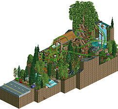
Secret Spot: in all honesty, still a well made and satisfying micro, despite your constraints. you may have mentioned this, but I think the one thing that hurts the atmosphere here is that the place is crawling with 200 guests, which seems a bit much for a cozy spot off the side of the highway. I'm not sure if you knew that you could remove guests using open cheats, but despite this, I appreciate the humor in the title of this one. This one really does have an atmosphere that starts to mesh with you, in tiny things like an entrance between trees with a tiny little river to pass over, or the swimming hole that feels like the perfect spot that only you and your friends know about. A calm entry that was a nice subversion to the grandiose expectations of this round.
My entry: I'll try my best not to talk my ass off about my own entry; I figured that by withholding a read-me, it would overall probably hurt the reception of the park, in a finals micro environment, but I realized that the micro actually might be more rewarding as a viewer experience if I didn't explicitly say what it was, or what the story was, and let people find it out on their own, or even better, come up with their own interpretations. The passing of time has been on my brain lately, in all ways, both moving forward in life and stagnating. For me, making this entry was all about depicting the passage of time, in a way that I felt was appropriately grandiose for the concept. Having a coaster start off in it's most basic, unremarkable state, and have it end in it's own demise and reach it's own mortality at the top of the tower, 12th coaster as the clock hits midnight. As for a story, I saw the tower itself as this strange location, a clock tower set up by unknown cosmic architects in a strange pocket in the edge space and reality, presenting it's abstract form in such a way that that would be comprehensible to a human observer, like in a lovecraftian sense (without the horror). There were time-related constraints (ironically) that lead to varying levels of quality, like from the golden floor to the top, or the landscaping. There were also some crazy ideas that I couldn't pull off in time, like adding a newton's cradle or a menagerie to the last floor. At the end of the day though, i'm proud of how this turned out.
Needless to say, the competition this round was truly awesome and I'd be happy to see any of these guys take the win. It's been an incredible tournament and I'm really glad to have been a part of it. Thanks to the admins for running a great tourney, and thanks to everyone else for submitting some inspiring work throughout the duration of this MM.
hoobaroo: best newcomer never leave
I agree. Listen to Sammy.
Sorry for a late review.. but here are some thoughts..
ITM: Lovely little idea here. I remember talking with you before this round about your lack of time to get a fully fledged micro done, and that's a bummer, but you put in a lot of solid work this season that you should be proud of! The concept was neat and had some tidy little details. Would be cool to see this expanded. Reminds me a bit of The Kids Next Door show.
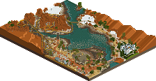
Cocoa: When I opened the park I was shocked.. what an opener. Great stuff. I agree that the smoke everywhere made viewing your entry a bit busy, but it wasn't a huge issue for me. The coaster layout was nice. But, I think your semi final entry blew this out of the water. Sorry for the pun. I'll be honest, I voted this #1, but it was a toss up between you and AVC. I think the creativity of the fuse and explosion won it for me.
AVC: Wow. I'm sorry to have to vote this 2nd! Massive structure, but it all makes sense. Steampunk vibes that you excel at, and as others have pointed out some La Reve vibes in there too. The coaster weaving in and out was a nice. Was this a city in the sky? Is it a flying fortress? I like that theres some questions that the viewer must answer and interpret themselves.
Hoobaroo: Great to have you in the community. You've pleasantly surprised everyone in every round of the contest. This entry was of great quality as well. I didn't quite get the concept at first, so thank you for explaining it here in the forums. The passage of time up the tower was so creative and I really dig your style of architecture. Excited to see what else you come up with in the future.
As I've said before, what I great competition this was. Good work everyone!!!
Wow, amazing work guys! I’m quite baffled how some of you were able to put so much content in such a small space. I find this contest interesting because it displays a lot of creativity and skill. I guess the hard part is to find the right balance between being too much and too little, and how to present something extremely dense in the best possible way for the viewer. At the same time, things don’t need to be extremely dense to be appreciated, but it might fall short due to the lack of content.
I’ve taken the time to look at the maps, but I haven’t figured out yet which the winner is for me. Maybe I’ll figure it out during the time I write the review(s).
Cocoa: Ha, I was kind of confused before all of the land blocks started to move. What a cool idea. Never seen anything like it. How much time did that take you? I’m glad you included a file without the smoldering, it made it easier to look at the map without being distracted. A really intense map. I don’t think dense or cramped are words strong enough to describe this park. There are things everywhere. I’m really impressed how you were able to squeeze everything in there, and you somehow made pretty much everything peepable. Very cool. I like the contrast between the “waterfalls” and the fire burning from the towers. I guess my only complaint is the palette. I, for some reason, like your work more with the original colours. But don’t worry, it’s not a big deal. Wherever you finish in this contest, I surely hope to see a full-scale park from you soon. I truly think you are one of the most talented players in the history of New Element. It would be a shame if we didn’t get to see a RCT2 solo from you.
AVC: Wow, that’s crazy. Just like Cocoa, you’ve been able to put a lot of cool shit into a very small space. There is quite a lot to look at. I really adore the Vox Turbine. I love the structure! Dragoon was fun to watch and I love the execution of Fighter Pods. What I appreciate about your work in general is your ability to combine strong colours. Colours that normally don’t harmonize with each other, but apparently harmonize when you use them. Not sure how you pull it off. A solid map for sure! Good job and good luck!
inthemanual: Whenever I see your name, I instantly think of my former digital technology teacher. Whenever I had a question, he would answer me frustraded: “Read the manual!”. But he was right, the answers are almost always in the manual. Sorry for the anecdote. Anyway, a quite different type of map, compared to the others. This is completely my cup of tea. I like the idea of a somewhat secret spot. A place where only a few people find. I don’t know how this will stand against the other competitors, but it’s a beautiful piece of RCT regardless. Very peaceful and pleasant. I love the big tree and the cute waterfall, and the foliage creates a somewhat mystical atmosphere which I adore. I always been a fan of your style and I’m happy to see you in the finals. Good luck!
hobaroo: Wow, where did you come from? I totally agree with SSSammy, best newcomer for sure. I’m really amazed by your work. A quite large building with some beautiful scenes. The waterfall for example is really well made. So are the interiors and all the details on the outside. I especially love the gate on the bottom floor with all the cog wheels inside. What you did really well is that you made each section of the building different and interesting. Good job. I really don’t have any complaints. I could see you winning the competition. Not sure how it all plays out, but we’ll see. I surely hope we’ll see more of you in the future. You are obviously full of potential and talent.
And the winner is...
Cocoa
28 + 10/2 = 33 points
AvanineCommuter
16 + 27/2 = 29.5 points
hoobaroo
9 + 13/2 = 15.5 points
inthemanual
1 + 4/2 = 3 points
I've already mostly said my little bit but big cheers to everyone who participated, commented, viewed, or engaged with MM in any way Its been a great competition.
And of course in particular cheers to avc, hoobs, and itm for putting up an awesome final round.
thanks everyone!
Holy shit, all four of you had incredible entries! I just want to say thank you to the admins for hosting this competition and thank you to everyone who participated in it. It was truly a pleasure to see such creative uses of 225 tiles throughout every round!
Hey guys, some of my circumstance got a bit muddled in all the discussion so I wanted to clear things up. My baby hasn't arrived yet, but I did move houses during the past two weeks, as well as having to totally clean out and stage my old house for sale. The staging meant making the room where my computer was housed look like the nursery we'd planned to have before moving, so I was without a computer until after the move was complete. Then, because my wife is pregnant and is not supposed to lift anything over the weight of a large potato, I had to do all the packing and moving and unpacking as virtually a solo effort, which meant it took quite a while to get re-established in our new home. That all being said, I only had a few small windows of time at the beginning and end of the deadline period.

I know my entry lacks the refinement, depth, and substance that the other finalists brought, and that I've shown to be capable of throughout the contest, but I hope my explanation of my circumstance helps detail why. I simply tried to capture a pleasant, unique environment as quickly and efficiently as I could manage, and hoped to get at least a few people who enjoyed it.
@Cocoa: What a gimmick! and what a great park to back it up as well. The theme was a bit muddled, but it generally worked. I found myself thinking "this is cool" a lot more than "what is this", so you did a good job regardless of whatever the theme was meant to be.
@AVC: Fantastic floating civilization. There was a solid amount of worldbuilding and thought put into this and I really appreciate it. The immense size of it all made it a bit hard to read at times, and there were things that I wasn't super sure what they were supposed to be, but it did all come together into a great overall package.
@hoob: This was fantastic as well. I thought some of the main structure was a bit blocky, but the way you hid little story points and fantastic details throughout really sold me on it despite the roughness of the overall form. Great entry to beat me with on the rematch
Congrats to everyone for wonderful entries and a wonderful drama-free competition.
Thanks to Liam and the Admin team for setting up such a fun and peaceful contest! A glorious success through and through, due to your hard work and time spent prepping everything.
Just as a small background on Airhaven: I was inspired from the sci-fi flop Mortal Engines which I watched on a plane to Seattle for work. The whole idea of a city floating in the sky suspended from giant canvas balloons sounded fun. I took the source material more as inspiration and didnt try to recreate it directly, so there are no real references to the film.
I initially had planned a second coaster, that would launch up and do loops in the air and then a second launch up the Vox Turbine track to do more high flying loops above the entire map, but unfortunately i hit some peep setback and lost time to include it, which is why the Vox Turbine wasnt utilized to its potential. I loved working on the park and though i did run out of time towards the end, im still very happy with the end product. Im glad so many of you enjoyed it!
I'm not going to talk about each work, because everyone was very good, fun, super interesting, incredible structures, great imagination and design, amazing themes, the objects used generated a very cool harmony, I spent hours enjoying and even thinking "how can you do that?".
I do not see absolutely no problem in your work in this group.
You have more than 30 screenshots (PROFILE), very good work no doubt, your skill is nice
A worthy final to such a high quality contest. Props to all four builders for delivering 4 consecutive high class micros.
AVC:
Concept+Realization: This is classic steam punk and you executed it perfectly. We have had several balloon/ flying ship themes in the past but none of them executed it as cleanly as you did. I mean it's not a super original idea,however you added some new twists to it for example making the port a flying ship on its own. You have created a great diorama with this little cutout that I really wish to explore more this world and it's a shame I can't. The cutoff on one of the sides of the let's call it main hall suggests that the airport is even bigger. That's maybe a little downside not having the piece on its own imo. A really great micro!
Visuals: First of all, that large brown balloon structure looks totally awesome, really the best thing on that micro, great job on that! That and that sexy structure on top with the two loop rides. It's a shame that both rides immediately broke down on opening. Then I have to second posix on all the curves. Everything looks so effortless, well shaped and easy. The whole micro just "flows". In both senses I guess. What I didn't like were both "tracked" rides. The coaster seemed random and didn't support the theme at all in my opinion, moreover it clipped through the structures whereever it came near, also floating parts and tracked paths in interchanged is never really a good mix imo. I think it's the worst part of the micro, although it doesn't bring it down much. The other thing is that air balloon ride. I just don't like it, it looks so unnatural by itself and thus disturbs the viewing. Fortunately you managed to only have one balloon on the ride per time. I also have to mention the colors in that micro. That palette is made for steam punk themes with those deep, desaturated colors. Overall just perfect color choices. It's vibrant without being too much. And of course that steel path texture with gold always works.
Credibility: Because of the super clean execution this piece was super immersive. I really would have liked to set my foot on there! The two bigger ships looked great and believable, too. Maybe changing the blacktile background to something brighter would have been a great chance to support the airport feeling (just assuming, might look shit eventually).
Favourite thing on the map: ballon area with that loops.
Just a great micro, AVC! I can look past the flaws in the rides. What this sold it to me were the great immersion and the super clean execution. You didn't really disappoint in this whole contest and lived up to the title contender expectations!
hoobaroo:
Concept+Realization: What a sick choreography at the beginning! Great timing with the rides. Of course it's a little a pity that the rotation doesn't work to ones benefits, but still I could follow it nicely! I get its meant to represent something with "time" but I don't get the theme very much. All in all the little scenes seem randomly put together and I can't see a structure or a connection between them ascending to the top. So for me this whole point is where the micro lacks a little. If you look past it, it's great fantasy. What I also didn't quite get was the name of the micro in connection to the content and concept. Maybe you could explain what you thought of it!
Visuals: The tower looks okay. Structually it is a little blocky, especially going to the top. At the bottom the glitching walls are a huge lackluster. All the small scene you have put there look great by themselves. It's nothing too elaborate but still nice stuff. I feel like that the whole micro is a little like a summary of upcoming/reestablished objects during Micromadness! Going to the top where the floating stuff is I think you exagerated a little with fantasy tropes. The scene with the stage and the running handymen was great, though. Cool idea and efficiently executed. The pendulum at the top was a cool idea, too. Also, thanks for finally building something that you can view properly from all angles, even though changing them is a little difficult. Once again I have to complain about the teleportation hack, the flickering trains through midair are just disturbing!
Credibility: Not much to say here. The tower itself looked structurally well crafted, it felt robust, even for fantasy standards!
Favourite thing on the map: Perfectly timed choreo.
Overall I really like how you develop your style! I still see some lent parts and styles from other builders peeking through your work. By no means this is something bad, as rookies we all have been there at some point! In the short amont of time you are at this site you've come very fast already. You have a good eye to put some grandeur into your work and surely with ongoing projects I can see that you will individualize more. I'll hope you stay true to full fantasy but by not always keeping the same archetype if you get what I mean.
Cocoa:
Concept+Realization: O wow, the opening scene it just overly stupid but also extremely awesome at the same time. That fuse burning down is a super simple and effective detail. I'm so happy that this Micro Madness brought us some of these new 'rides' like the laser beam and chain that help us to built and make cool animated stuff! Back to your micro. The idea of making a remake of Dynamite Dunes in such an explicit way is super cool. But apart from the opening scene this kind of hideout is a little to random to me. As you said in the readme you just built stuff that you thought looked cool. There's nothing wrong with it but then you also cannot expect a much coherent product in the end concept wise. For example in some parts you had broken down structures (due to the explosion) while in others everything was totally fine. I liked how you cramped in the mine ride into the micro in remembrance of the original scenario. I especially liked that double turn after the the lift hill, it was just simply unnecessary that made it cool!
Visuals: The explosion was hideous and awesome to look at the same time. Great job on that custom ride, I imagine what kind of work it takes to make even such a simple one if you have never done one before, I appreciate the effort. The micro itself was way to busy for my taste. Too much stuff going on so that it was hard to focus on things for me. There were some cool scenes such as the control room at the top. Moreover, the micro suffered from the one angle desease which means that there is just less to discover at all. As I said, I just couldn't get warm with it past the opening scene, sadly.
Credibility: Well let me say, after this massive explosion everything should be in ruins! No, just kidding, for these kind of RCT pieces (fantasy that is) this rating category makes no sense. Applies to all micros in this round actually.
Favourite thing on the map: Explosion, after that, the coaster lift hill.
So I'm writing this with the results already public. Congrats on the contest win, Cocoa. Well deserved! Even though I didn't vote for you in the finals I think you put out the best micros thoughout. For me your finals was just the weakest of yours. It was missing a clear line which is what it put back behind the ones of AVC and hoob.
ITM:
Concept+Realization: One can clearly see that this micro was an "emergency solution", kind of. You stepped back from your normally highly concept driven micros to a more standard one. As you've said you were tightly time constrained and I respect that, so nothing wrong with it. But it is more or less the H2H-deadline-approaches-tactic in the whole micro: spam everything with foliage. Unlike in H2H, where it's just the filler and you have highlight pieces to look at, here it makes the main portion of the micro. Obviously this leads to the piece being much more less exciting and interesting compared to the contenders. Nonetheless, I don't want to hate on it. What's peaking through the trees is good stuff. I like how you gave that "secret spot" idea some scope by including the road with driving cars.
Visuals: As I've said, and once again agree with posix, the micro is too much tree-d. The part around the road looks very cool, those parked cars and all make a good entrance. Also that pathway over the stream as an entrance to this more mystical part works well. I'm not a big fan of that giant tree made of giga track, we have seen better examples, even by you, two micros before! I'm also not so sure how that (latin american) ruins style of the station works with the apparent geographic setting set through the foliage. It clashes a bit. I'm also not liking the not very consistent support work on the coaster.
Credibility: There's one thing that disturbs me: The big waterfall ending in a small pond!
Favourite thing on the map: Stream disconnecting two worlds.
ITM, congrats for reaching the final. As defending champion I think that is what you aimed for at least. It's sad that you were held back to commit fully in the finals, but for very good reasons it is! I wish you all the best in the coming months with your family.
In summary I voted for AVC first and hoob second. But of course I can also very well live with Cocoa being the champion. Again, congrats to all four for reaching the final and delivering high quality work four rounds in a row. It has been a great pleasure this year!
Congratulations Cocoa on a much deserved win. You were the player to beat in this competition, and you lived up to the challenge. Every time you release something I'm amazed, as I remember how you came back after some absence, and have now won NE so securely with your skill.
AVC, I'm so happy to have someone like you represent fantasy style parkmaking. It's ever more important in this day and age. You're doing it admirably. I hope you have motivations for RCT beyond this contest, as now that you've played a little again your game should be ready to take the next step. I think that could be rather significant.
hoobaroo, you're a blessing to this community. New members like you are a big part of my motivation as an admin.
ITM, I had no idea of your circumstances. Unbelievable you still submitted something. All the best to you and your wife.
Fantastic Micro Madness! Great to see this idea still going strong, this was the best one yet.
Cocoa, awesome idea to open the map. Just an amazing effect. Beyond that, I didn't find the content appealing. The hacked coaster was hard to follow, tho had a few nicely themed elements. I honestly never considered this entry for 1st place (was really shocked to find out it won, lol) and thought it was your weakest entry. 6.1/10
AVC, I loved it. Great effect for the hot air balloons. Vex Turbine was awesome. Tho I am not a fan of floating stuff, this was pulled off really well. Narrowly gave it my vote over Hoobaroo. 8.5/10
Hoobaroo, I think this was the best idea in the round, just didn't feel like it was expressed in the best way. A giant grandfather/cuckoo clock is a genius idea. You didn't really go that way how I would have, but you still created a wonderful atmosphere on most levels. 8.3/10
ITM, very nice little entry. It was enjoyable, but clearly not a fully focused effort from you. Congrats on the baby!