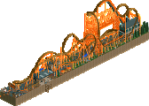
Park / 'Ironclad' RMC
-
 23-November 19
- Views 1,744
- Downloads 373
- Fans 0
- Comments 12
-

-
 57.00%(required: 65%)
Design Submission
57.00%(required: 65%)
Design Submission
Jaguar 65% CoasterCreator9 60% csw 60% RWE 60% Scoop 60% Camcorder22 55% Cocoa 55% Faas 55% G Force 55% Liampie 55% ][ntamin22 55% posix 50% 57.00% -
Description
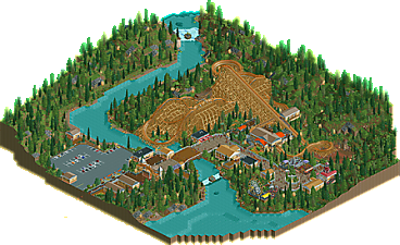
Welcome to this small project I spent a good chunk of this summer creating.
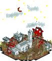
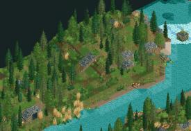
Ironclad is an I-box tracked RMC in the middle of a large valley. It includes two inversions(Zero-G Stall & Zero-G Roll) as well as many moments of airtime. While it may not have the punch of other large RMCs on the market, this one delivers great views with many twists and turns instead. Originally I was going to just have only the coaster but as I continued on it grew into a tiny theme park. The main focus is on the RMC really, not the individual rides.
Hope you all enjoy it! :P -
No fans of this park
-
Download Park
373
-
Objects
101
-
Tags
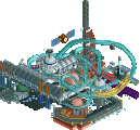
Nice coaster you've built here. The layout was decent with good flow and had good support work, and that swoop over the water is great. I wish it interacted more with the path or landscape though since at the moment the swoop by the bridge is the only real point of interaction. The queue could have looped under the lift and around the pre-lift for example. The landscape was good and I liked the little caves. The foliage was perhaps a bit too chaotic. I'd suggest trying to clump trees together more to create broad shapes and varied density rather than placing them randomly. Overall though this was solid stuff.
This was pretty solid, layout probably the best aspect, it also had some nice atmosphere. Wish the path wasn't a dead end though, could probably have flowed a bit more to make it feel like a more complete park, but that's sorta outside the scope of this. Good first solo submission though, not sure if its quite design worthy yet but you'll definitely get there if you keep building.
Awesome layout.
Reasons I don't think this deserves design:
- The foliage was a bit random and sparse. Try to clump your foliage together
- The architecture was not bad, but a bit boring. It would be cool if it had a bit more character. A distinct theme of the coaster could have helped maybe.
- I think it's a shame there isn't any interaction between the coaster and the peeps/environment/other rides. I think this is always what makes an awesome design stand out from an okay one.
Keep building though, it's definitely a pleasant submission.
Really neat layout. Only issue I have is that this is a park.. as opposed to a slice of a park with a focus on a layout. Why would RMC build in this dinky park? Just a thought.
I did enjoy the support work. The swoop next to the water was great. Looks like a fun coaster to ride.. I'm a big fan of racing through support structures.
Great submission
Thanks everyone for the suggestions/ideas!
Currently knee deep in a new project right now and this will all come in handy! Architecture isn't my strong point in Openrct(IMO it shows with this) and it is something I aim to improve. I also plan to create parks/designs that make a bit more 'sense' like Ottersalad pointed out, along with putting more thought into path interaction/general layout.
I think this coaster and its area would fit well in a larger park. The layout and the supports are very RMC, and you nailed their signature elements without taking questionable liberties. It's actually among the most beautiful attempts at this coaster type I've ever seen, and I think it's getting held back because many of its surroundings seem like an afterthought.
I agree with others about the foliage being a bit random. Open patches without trees would give the treed areas more shape, and in a hillier landscape such as this one, larger, more defined rock areas would really make this look great from a distance. Though the plants hide it moderately well, the hills are contoured very smoothly and evenly, almost like an amphitheater; more jagged edges would give these hills more definition, especially with more distinct foliage and terra-painting considerations. There are some cool details thrown in there, like the tunnels made from inverted coaster track.
I like the shape of the buildings--realistically functional without being overbearing. These are the types of buildings I prefer to build in realistic projects. The color scheme could have been more adventurous--the heavy reliance on light brown muted the coaster supports a bit--but every ride having their own matching steel roofs was one of my favorite subtle details and the type of thing I hope you take into your next works.
Looking at the path, it clearly wants to keep going beyond the spiral slide. Keep this work of art in your arsenal for a full-sized park, and it shall earn the accolade it deserves!
(I would remove the "ncso" tag since this uses custom scenery)
This is exactly my style, I love this so much. Usually RMCs pose a challenge when translating their layout styles to RCT. You did a great job doing this. The supports look crisp and I think the foliage is one of my favorites.
The use of CSO was a bold move as it shows you don't have much experience with it; most buildings are boxy, rectangled and miss things like crown mouldings and trims.
Nevertheless, this should definitely win a design accolade in my opinion. I will give it a rating of 75% and I hope that that should be enough for you to secure the accolade. Very nice work.
For a first solo release, this is really good! The layout could have used more interactions and was a bit dense, but it's still good, especially with the airtime hills. The usage of watercoaster track in an RMC definitely needs to be done more often.
The architecture is admittedly basic, but the theming works and I'm a fan of the barrel roll at the entrance. This is definitely an aesthetically pleasing park. The biggest weakness though, would be the scattered and messy trees, keeping foliage more grouped together would make the park much more cohesive. Heck, I almost think something like this would look better in a grassland.
Still, it's a nice release and I hope to see more from you in the future.
I quite like this! It looks like 5dave's Canthose Valley meets Skylands national park.
I like the foliage, but it can be improved. You used a great and fitting mix, but like Faas said, clump it together in the future. Try to form a clear distinction between forest edge - underbrush and trees.
The buildings were really nice IMO. Not overdetailed, but they served their purpose. My suggestion would be however not to make the colour of the rooves the same colour as the walls.
I also think it's a shame there's no interaction between the path and the coasters. That would've made the ride a bit more interesting IMO.
Nice work, but don't think it deserves design.
not a bad little design. I like the swooping turn over the river- that would be a good view for guests. The archy is a bit bland but its still lively. the landscaping is almost there but you could probably take a quick look at the various foliage tutorials in the ask-the-experts section- liampie in particular will teach you how to tidy it up a bit. probably not quite there for a design but good nonetheless.
I enjoyed this. There's a few things that are "not quite there" in terms of the total picture of the park; most of the time a design submission will either be a slice-of-park or somehow isolate the single focus coaster. It struck me as a strange choice to have an entire park with all the realism trim - parking lot, staff buildings, etc - just for one ride. I guess I wouldn't complain as a guest though, RMCs rule. I super loved the little pre-lift bit, the nice mine shaft scene there is a cool feature and fits nicely with the RMC approach to coaster design where every element is an opportunity to pack in the fun. Also loved the waterfalls, the setting and nice gentle elevation changes across the map, and the cute little path dead-end with the lone birch as a focal point. Very cozy with all the mild-intensity flats around it.
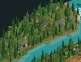
People have mentioned foliage a few times here, so I thought a demo of what people are talking about with suggestions like "clump it together" or "form a clear edge" might help. Please forgive me if this is a little forward, no disrespect intended.
Here's the park as-submitted. There's a very even coverage of trees and shrubs in a way that almost looks grid-like or as though you were afraid to leave any area empty. That's not a bad instinct, because these areas are not supposed to be the center of the viewer's attention, but the spaces between the trees make it hard to see this hillside as one solid backdrop for the park. Additionally, the fact that its all the same means this doesn't tell the viewer any story. There's no points of particular interest since it's all equally uninteresting.
Here's the same scene where all I've done is remove a few trees. What this does is creates some contours - you can juuuust about draw a boundary line of where there's "forest" versus open terrain. It's easier on the eye than a solid covering of sparse trees. It starts you thinking about why there aren't trees where there are none (maybe that sandy shoreline is bad for these pines) and why there are trees where there are (the grass comes all the way to the water over here, so the trees grow closer to the water there). That kind of "natural" change in growth patterns just feels right to a lot of viewers and prevents anything jumping out to them because you have larger patches of similar visual material - that also makes it easier to highlight something if you want to.
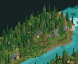
Here's the same scene with the trees deleted like before, but with the contrast between "patches" or "zones" of plants increased further. Denser tree coverage in the "forest" area creates more of a solid line, and now we can introduce a "grass" or "marsh" area that is clear and distinct. As a viewer, this tells you a story - marsh grasses grow here and interrupt the clear lines of "forest", "empty hill", and "shoreline". Neat point of interest. This isn't the only approach though!
Here's a similar strategy of "create clear lines between visual areas" that uses more dense trees plus a lot of shrubs at the foot of the "natural" treeline to make a wall of greenery.
I hope that illustrates the points a bit. Play around with it!