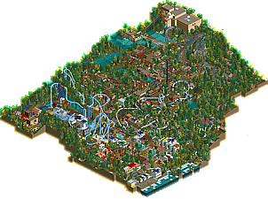
Park / Ardu Altaslia
-
 02-December 19
- Views 2,083
- Downloads 458
- Fans 1
- Comments 10
-
-
 52.00%(required: 50%) Bronze
Scoop 65% bigshootergill 55% G Force 55% Jaguar 55% RWE 55% saxman1089 55% Cocoa 50% Faas 50% Liampie 50% posix 50% CoasterCreator9 45% csw 45% 52.00% -
Description
It's DONE! I did it!
Can you believe that I released another one?
*Note: the only item of CSO are the trains for the coasters and flat rides. -
1 fan Fans of this park
-
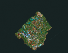
Full-Size Map
-
Download Park
458
-
Objects
286
-
Tags
Although most of the layouts were pretty cool and there were some cool buildings and spots around, I didn't find this aesthetically pleasing. The foliage and landscaping were pretty random, as well as some of the other elements like supports, etc.
I didn't really like it, but I do think it deserves low bronze because of the effort you have put into it.
Not bad. As Faas stated the layouts have been quite interesting and there are also some good small momements. My favorite area was the looping of the inverted coaster with the building and corkscrew behind. That corner showed of the composition i would have loved to see on the rest of the map since a lot of it felt a little bit put senseless together. I think you could improve your style by far when you start putting more effort into planning out your stuff and give the viewer more pleasant moments to look it.
Also i think that your foliage work could use some variety and i also agree with faas that it felt a bit random. I personally liked the landscaping though. The inactive volcano was a really nice touch that got a lot of my attention although it's simple as hell.
All in all a solid release that deserves a bronze and some good reviews in my opinion. Hoping to see more from you in the future.
I think you've got the ideas and concepts down, but the execution needs some refinement.
Your layouts are pretty good in general. A few quirks here and there but in general not bad. The invert is particularly strong in my opinion. Architecture isn't too bad in places, but in other places it becomes a bit of a difficult to read mess. A few spots seemed downright unfinished (magic carpet building...though I'm curious why you put that particular flat in a building to begin with).
I understand that you were going for "jungle" but I think it would have been much more effective with a more tailored foliage selection coupled with more purposeful placement. Density doesn't necessarily make the jungle a jungle, and pine trees definitely don't make the jungle a jungle. While still a little messy, Redlynch handled the density a little better.
Some of the trackitecture choices left me wondering too. While I appreciate the effect of the rapids for a rolling ocean, I don't think it translated as well as intended. The supporting on the wooden, although I know exactly what you were trying to do, probably wasn't executed as well as it could have been.
You're on the right track. I think you look a bit of a tentative step forward but slipped a little bit from an execution standpoint. Keep it up; the conceptual nature is there - polish those ideas and make them shine.
Glad to see a new park from you. I definitely agree with some of the comments already given. I will say the pine trees aren't terrible! I like the added texture. But damn, this park is cluttered and lacks any sort of breathing room. Faas gave good examples on discord of removing foliage and providing negative space.. try that next time!
Besides the B&M invert, all the custom supports looked terrible, sorry. The GCI was better with just wooden supports. Sonic Pulse was a big blob of trackitecture and it was hard to comprehend what I was looking at.
I like the ideas here, and its nice to see non "dirty american realism".. but perhaps focusing on lower density and less detailing would help next time.
So this is out. Happy to see another release form you, I'll try to collect my thoughts here.
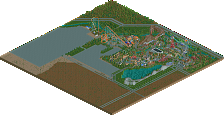
- I said it before, I still think it's a shame you blacktiled the area around the park. Having the sand around the park would've added to the atmosphere IMO.
- I found it quite difficult to make out the themes you used. The Mayan coaster doesn't really feel that Mayan. And apart from the names, it was not that easy to make out I'm afraid.
- The foliage. Too cluttered and diverse, others have talked about that before so I won't.
- I really like the ride selection and plaement in this park. They form quite a few nice little corners and there are some good viewing points for the peeps and interaction.
- I'm a fan of the coasters and layouts in here. Especially the more unique ones. The GCI with inversions is well done and a nice change from the RMCs we see all over the place recently. ALso, happy to see another Pulsar-like ride in RCT.
- Name your stalls
Overall it seems like I had quite a few bad remarks about this park, but I did like it despite of these. I just think you have room to improve. Keep it up!
You will be glad to know that my next release will have MUCH cleaner foliage and even architecture.
It seems like the coaster layouts are generally liked. The invert is what I am most proud of with this release. I am surpised that there's been less love for the GCI though.
It's okay tho. I love making layouts and always want them as good as I can get them.
There's more I will get into doing that will make my releases better, but it hasn't really shown here yet.
Thanks for the comments, all!
I think the foliage and landscaping really really lets down this park. the forests are a sort of puke-colored overload of textures and totally overshadow everything else in the park- I can barely follow the main path or see any buildings properly. The themes are confusing- way way too many textures. NCSO isn't always about stacking up tons of detailing in any way possible. Sometimes its better to make a harmony of simple, clean and atmospheric work with a bit of detail thrown in here and there for huge effect (hell, regular rct is about that too). Choose "standards" and stick to them. Eg, one fence and fence color for an area. or ___ object will always represent windows, or pipes, or walls, and never anything else. otherwise the viewer can get lost in textural mess and not know what anything means any more. I mean chaos is fun, sometimes, but it usually needs good or interesting composure to back it up.
I thought this park was lovely and I think the score it has right now is a little low maybe. My favourite bit was the GCI coaster which was very well done imo.
Although I don't think the landscaping and foliage was bad in itself persee as other have said, I do think that there was an overload of stuff in this park and everything was very full which wasn't ideal. What I thought was interesting is that all the coasters were relatively realistic while the rest of the park did not really feel realistic at all. I think this park would also have worked better if you would have left out some of the realistic aspects and just went a bit more in the fantasy direction (if that makes sense).
Overall I did enjoy this park and like I said I do think the score is a bit low, to me this is a solid silver.
This is an odd submission. I like the creativity in coaster layouts, supporting, and the coaster stations, but there are just so many strange...no (I hate to say it), bad color choices and foliage choices. bright orange and tan on the splash boats building is the biggest offender here. It looks like you used every single tree in the game for the foliage and just colored it around the edges to fill space. Same with the land textures. Some of the architecture was good, some was not. I appreciate you trying to use diverse objects, but some (the flames, tennis net wall, etc.) are just ugly objects. And there doesn't seem to be any semblance of park organization - the paths are somewhat cramped, Surge is shoehorned on top of a river, the coasters are all right on top of the paths. You had plenty of map space - let things breathe more.
This is definitely a wall of (mostly) negative comments - hopefully it's not too harsh. But I think it's more useful to you if I tell you what I didn't like instead of just saying "I didn't like the park very much". Keep building, the stuff you've shown on discord looks better already.
Cocoa's comment has the best advice - do everything he mentioned and this is an easy silver.
I figured I'd be the high vote, but I enjoyed this park a lot, so keep on building!