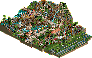
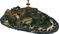
Park / Anaconda
-
 26-January 20
- Views 3,129
- Downloads 430
- Fans 1
- Comments 22
-
-
 68.50%(required: 65%) Design
posix 80% saxman1089 75% SSSammy 75% G Force 70% Liampie 70% Steve 70% bigshootergill 65% CoasterCreator9 65% csw 65% Faas 65% Scoop 65% Ling 60% 68.50% -
1 fan Fans of this park
-
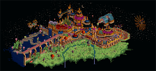
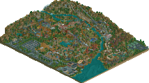
Full-Size Map
-
Download Park
430
-
Objects
219
-
Tags
Similar Parks
-
The Child's Dream
-
Timber Valley Theme park
-
Lost World
-
Ombezi Basin National Preserve
-
Stardust Jubilee
-
Coors East
Two critiques: Monster trucks seems a bit uninspired and the layout in the back corner looks unfinished and the diagonal queue awnings stand out too much. I think curved canvas awnings or bobsled awnings could blend better, texturally, with the surroundings. Other than that, a very solid design and great work all around!
Congrats on the new release RWE!
It shouldn't be a secret now that I like coasters winding up down and around steep cliffs, and I think you pulled that off nicely. Layout is nice, and I actually think the non-banked turns are kinda cool - except in one spot; the final helix. I thought it was a little funny that the park is ADA compliant *except* the rides. Really like the parallel drops with the coaster and the splash boats, with that stretch along the water being the highlight for me. I was less of a fan of the area in the corner with the monster trucks. It's rather awkward and definitely feels a bit forced. I see what you were going for, but I think you had to go more all-in with it.
Overall, really well done. I think you've learned a lot about pacing from past attempts, and this might just be the one that gets you Design.
Glad I'm not a panelist because I like the layout a lot.. the swoopy unbanked turns were nice and the interaction with the splash boats was well done. So much care and detail seems to have been made in regards to the plash boat ride and water features and I'm a fan of that. The waterfall over the queue especially. Only issue with the monster trucks was the cropping. Other than that it didn't feel too forced. Would be nice to see this win design.
I thought this looked very neat and generally well laid out. The layout looked great weaving in and out of the cliffside and with the swooping turn around the waterfall on the other side of the map. Also really liked the beige/brown ruins on top of the cliff.
Some things I was less sold on:
- The monster truck ride, as others have mentioned. Even though the interactions with the woodie and the splash boat were cool, it just looked a bit unfinished and crammed.
- The heavy use of the HP stone wall. I just think that texture is really difficult to get to work - it lacks contrast and looks quite different from other objects, and you use it in many places, so that detracted a bit for me
- The stations for the woodie and the splash boats looked too similar, which seems to me like a lost opportunity to spice things up a bit. Even just a different roof color might have done the trick.
- Layout feels just a tad short. There is still plenty of speed left when it swoops down steeply next to the lift hill, perhaps there could have been one section more to it. I kinda imagined the small cliff under the last turns could have been extended over the road (so that it went into a tunnel), and then there would have been space for the woodie to make one more swoop around some cliffs.
Overall I liked it and I think it deserves design, but perhaps narrowly.
Architecture is beautiful throughout, especially the temple structures. Layout is very nice also, in particular the beginning figure-8 turns before the main drop. Nice build-up.
In general it's lacking a bit of cohesion in terms of density and also the overall identity: Density because around the drop, station and highway it's pleasently open, wheras at the back it is cramped; Identity because the highway is a realism trope (and an unnecessary one in this release), wheras the monstertrucks tucked behind the woodie is a very H2H-style fantasy thing to do, so the overall reading is a bit confused.
Wow guys, this is some of the more constructive criticism we've seen. I'm proud of you.
Probably your best work RWE, definitely feels a lot like Toreador haha. Might like that a little more but this is still quite good.
The coaster is good for what it is but I wish the layout was a bit longer and that you added a bit more detail into the ride, just seems like the bare mininum of ride details to me.
Archy and themeing is definitely top notch though, love the layers and design of everything.
A random point, but I think you might have benefited from adding a little more context in the back around the car ride. Never really like it when rides butt up against the edge of the map like that, even in a design. Maybe preferential but perhaps consider it in the future.
As a whole, probably a 65-70 from me, with most of the deductions coming from the generally underwhelming coaster. Again not that what you had was bad in any way, for what it is the layout is nice, I just wish you added a bit more too it. Perhaps it would have made it more memorable as a whole.
As I said in my testing review:
I really love the open spaces at the bottom of them map. They really add a lot of breath and that's geat. However, it's still missing something. Maybe it's a bit too open. A single roof over the brake section where the rocks are could do the trick. Add a transfer track for the extra bit of realism. That will make it less open and a bit more interesting to see.
I'm not sure about the monster trucks interaction with the splash boats on the edge of the map. Can't figure out if it's supposed to be indoor or outdoor. At the first look I thought they were really undersupported with wooden poles who seemed to be floating. Now I see they're connected with land, but that's hard to read. Maybe some extra poles and/or a slight texture change can do the trick. This is what I would have done:
The glitching tunnels can simply be improved by covering them up with some bushes, rocks or small trees.
Other than that, a really good design. It was very pleasant to see.
Good submission. The layout has great interaction, but it's too short and has a few awkward bits with extra straight track (mainly around the waterfall). We'll call that a wash. The theming, buildings, and foliage are all good - I especially like the Malagueta building and the monster trucks station. I think the coaster station left a lot to be desired - there were more chances for interaction and theming there. And the featureless road took away from the overall atmosphere. I really like the landscaping - it's interesting but also believable. I'd give this design.
Fantastic work buddy. You've really broken through to the next level in the past year or so I think. Excellent interaction and composition throughout. Layout is sweet - although a bit short.
The only issue I have with this is how closely cropped it was. I think it could greatly benefit from a little more breathing room and surroundings. If anything holds this back from a design, that would be it.
Would love to see you either expand this, or create a full size park in the future.
Congrats on the release!
Hmmm, still looks a bit too much like Toreador for my tastes. I think Toreador had a more interesting layout, and was also better paced. I'll agree with the others saying the map is just trimmed too close - even for my tastes. The lake in the middle could have been bigger and served as more of a centerpiece - having the upper level have all the splash action and bridges and peeps moving around it seems sort of backwards. The lower area is... for guests to eat? Right next to the huge splash finale? The boats also carry quite a bit of momentum into the station. Upper level is definitely compositionally superior to the lower.
I enjoyed the layout for the most part, glad you went with the unbanked rising turns since they have a great classic vibe. It could have been longer at the end which others have mentioned already but the first half was lovely, especially the drop sitting adjacent to the splash boats drop - that's a really brilliant spot for guests.
Foliage throughout was very pretty, mostly around the station and queue area where the space was used quite strongly. Don't think you needed both the red/blue queue covers as well as the white ones though, feels a bit odd.
The cafe at the top behind the turnaround was a really nice hidden moment that I didn't notice at first but it sits nicely there and the purple umbrellas are a great choice.
I agree that the monster truck ride was poorly integrated and a bit cramped in that corner, and was probably the biggest detractor from an otherwise solid design.
Definitely reminded me of Toreador, but I think that one had a better layout. Anaconda feels a tad short. Theming is very nice. Interactions are great, I like it when people treat their queues like a tracked ride. The monster trucks were unnecessary, and it would've been better to have an actual backdrop for the coaster there, some big theming element to anchor all the little scraps of theming on the map. Atmosphere and overall aesthetics are great. Also some general sloppiness though: ugly rock work, missing fences, unfinished back facades, floating scrolling signs... I think you should've waited a little bit with submitting, all of this would've been easy to fix.
All in all great submission, and hopefully you'll make a full park in this style soon.
This is really nice! The layering is incredibly well put together from the various elevations and how all the views are framed.
+Coaster: I'm a pretty big fan of this layout. It's a reasonable length and flows through the space really well. The double underpass of the guest bridge is really lovely and again you've framed up several different drops as good viewing spots-- not just the beginning of the ride. Feels like you spent some time to think the ride out. The lack of banked corners bothers me a bit. I don't think they all need to be, but it feels missing here. And for all the lovely park details you have in here, there's no storage track which feels like a miss.
+Water ride: I find people tend to make water rides too long and I don't have the patience to sit around and watch them. But this one I did because I like how it works with the path and the other rides. Both drops have great viewing areas and there's a lot of nice over and under throughout. The bit of curves underneath the monster trucks saves it from being a big rectangle too.
+Monster Trucks: The interaction is good but it's the weakest ride here, I think. It uses the terrain well and has enough elevation changes without feeling like it's forced to do them. It goes through a pretty area overall, but it feels lacking in sort of show sets along the way. Like it's all sort of the same and I'd expect some more theming vignettes along the way. Visually the track has never looked self-supporting to me, so I'm missing some kind of structure around it, which would have helped.
Theming/Atmosphere: It's tasteful and varied enough that it feels cohesive without being repetitive. All the theming seems functional, which I appreciate. You have that nice big block of ruins on top of the hill, but the boat ride goes through it so you can envision a show scene inside. Your landscape feels strong on the whole-- dense in spots but not overly messy. I'd have maybe liked to see a larger anchor of theming presence around the coaster station since it is the main ride on your map, but the gardens do look nice.
Overall well done-- really enjoyed looking this through and I hope you'll continue to build more-- maybe tackling a larger solo project.
Yes, another RWE work! It feels totally different than what we are used to see from you... in a good way I really like the approach you went with, the coaster looks interesting and has a lot of cool interaction.
I do like the archy you went with, except for the boat station. I think it was said when you showed it in a screen already, but the roof over there is too low imo. You created a lot of cool viewing points for the peeps, great composition.
The monster trucks are kinda awkward. You didn't really need them and they feel so propped in. I think you should have given it more breathing space, or just didn't do it at all. Also one complaint I have: it's kinda glitchy... Or is it just something I experience?! It's most noticeable with the waterfalls hardly moving.
Great piece of work, I'm looking forward to see more of this from you in the future
So I still own this a review so here it goes. Imo this was a very nice design and some of your best work yet. I therefore also think the score this got is maybe a little bit low especially when compared to some of your other work.
The coaster layout is pretty cool, with my favourite part being the turn around before the first major drop. The theming here is pretty cool and the coaster uses the terrain well. Having the second drop be longer than the first drop is also a fun twist and it works really well here.
I am also glad you removed the black wall objects near the tunnels for the log flume drop and the monster trucks. Seeing the park without them I must say it looks way better and the glitching is severly reduced which is nice!
I also really like the archy and the terrace near the top section of the park near the splash zone of the splash boat ride, very atmospheric and nice looking.
I also like the umbrella colours in the queue for the coaster, although other people didn't really like those, I think they look great.
Some things I didn't like:
Like I already said in my testing review I do think the landscaping is a bit bare in some places. The most obvious offenders to me are in the corner near the monster trucks and also in the middle of the map under the two straight sections of track of the turn-around after the main drop.
I think the monster trucks are cool but I can also see the points other people brought up with them being kind of awkward.
During my testing review I also brought up that I thought the road near the "bottom" of the map could use some more details. I still believe that. I think you could have done more to give this road some more purpose and details. Maybe add some traffic lights, or some trash bins, fire hydrants or something atleast. It just feels very empty to me now although I know other people disagreed I stand by my opinion.
I also think you could have added some metal horizontal support beams for some parts of the wooden coaster/splash boats were the coaster track goes over eachother.
Overall though I think this is still a very charming design and some of your best work. Like I said before I think the score for this is maybe a little bit on the low side, but you can still be proud of this. Well done!
this is nice. Perhaps a bit small but very pleasant. I think the landscaping worked out well- the grass with taller rock outcroppings works well. And I also appreciate the texture work here- especially those creamy yellow temples with brown brickwork- nice vibe. The layout is good too, although confusingly short on banked curves IMO... its not LL! lol
I think the size of the whole presentation detracts a bit. I wanted a bit more room on the side to really frame the landscaping and wonderful terrain layout properly. The water ride and car ride were good but just so crammed up against the edge that it lost the 'mysterious lost jungle' sort of appeal it maybe needed.
But overall, this is quite lovely. As an area of a full park, it would definitely be excellent. keep it up!