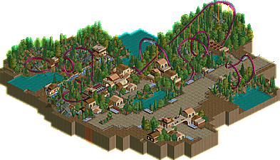
Park / Draken
-
 07-April 04
- Views 1,760
- Downloads 238
- Fans 0
- Comments 12
-
No fans of this park
-
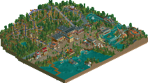
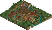
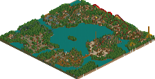
Full-Size Map
-
Download Park
238
-
Objects
107
-
Tags
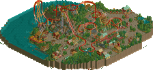
Anyway, here is something for you guys to enjoy, but don't expect to be anything amazing.
Just a lil diddy.
Draken
Sorry about the large filesize guys. I used the PT Bench :/
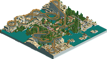
Yeah....you know you love trees.
Keep on improving and you'll rock, slob.
The coaster had a nice layout. It's a shame it wasn't submitted though. I bet it would have been one too...
The colors of the coaster were great. The classy, dark purple seems to be "in" now, so-to-speak. The architecture was fab and shows some talent, which, you obviously have. Nice work slob.
This acually seemed worthy of a place on the Designs page.
Maybe next time.
layout 7/10
archy 6.5/10
landscapeing 4/10
treeing 4/10
theming 0.5/10
keep at it tho, just next time make sure you have a theme and ideas, this was very un-motivated.