Park / Vampyre
-
 07-December 20
- Views 2,362
- Downloads 453
- Fans 1
- Comments 14
-
 72.00%(required: 65%) Design
CoasterCreator9 80% RWE 80% In:Cities 75% Liampie 75% Xtreme97 75% bigshootergill 70% inthemanual 70% posix 70% Scoop 70% WhosLeon 70% Jappy 65% chorkiel 60% 72.00% -
Description
This 'design' started off as part of a larger park using the Pro Tour 2 bench, to try and force myself to create thick atmospheres and not get too bogged down with incessant detailing.
I busted out most of this area in the space of a week or so, and then started to move to other areas, but then I started other projects and this kinda got lost in the way. Eventually, I thought this area too good to get lost in my hard drive forever, so finished up the rough edges to a reasonable level, and here it is!
There's quite a few smaller details to find in here, and I know that some people will have an issue with the shape of this given it's a design, but I hope people can look past that and enjoy it for what it is.
Also, I built this with OpenGL turned on. I didn't realise that this was even a thing, but after getting a few people to check it out without OpenGL, I can see it's quite glitchy. I've done my best to clean it up in areas, but I recommend viewing with OpenGL. Sorry. -
1 fan Fans of this park
-
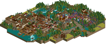
Full-Size Map
-
Download Park
453
-
Objects
280
-
Tags
I liked this project when you were advertising it, and I think I like it more now that I'm viewing it in game. Most of all, this really brings me back to the old days - when life was simple. The map reflects this, it's uncomplicated fun. Coaster is great, Nemesis-like, but also it's own thing, with the right amount of variation in the elements and theming/landscape interactions. Theming is generally good, although the density hurts the readability in some places (dark ride interior, top spin/waterfront corner). The coaster station is actually one of the weakest buildings on the map in my opinion, the village is lovely. Some nice details: the simulator queue on the walls, the vines on the toilet building, the boat ramp, and the general crunchy and lively look in the village.
You can argue about the format, it's definitely somewhere inbetween design and a park, but I think it's fine as a design due to the cut-off nature of the map. The coaster layout is excellent, so I hope this will indeed get that big red Design stamp of approval. I certainly approve! I also hope we'll see a full park by you in this style at some point in the future, I think you may be better than you've ever been.
This is quite nice. I like it a lot. I do wish there was a bit more path/space between all the buildings, because that area does feel quite cluttered.
Design makes sense, because even though the coaster is physically distinct from the town, the town area definitely supports it and underscores the theme.
The coaster is also quite well composed, with excellent framing around most of the cool elements, as well as all the structures--gift shop, queue building, and station.
Overall, I think this is a really solid design. While nothing really blew me away, the nostalgia of the bench and the overall quality of the composition made it fun to explore. Just as NCSO focuses on creatively using the base objects, I think you managed to utilize this bench in a way that feels nostalgic and throw-back-y without feeling dated or limiting. And, in a number of places you were able to marry modern and old school aesthetics in how you used the bench, which is awesome.
I really like the coaster layout, minus the places where everyone on the train is killed by fences, heh. While the overall composition of the design relative to the rest of the area does feel odd for a park, it makes sense given the theme. And, knowing this was started as part of a larger project, it really doesn't bother me.
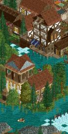
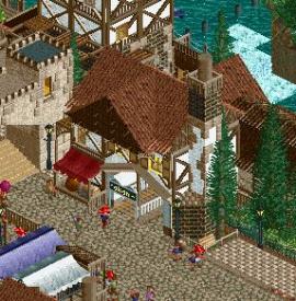
The architecture and the way you played with form are really great, particularly in the village and around the entrance to the water ride. I especially love the building to the left of Apothecary's entrance, tucked against the wall with the raised beds and trees. Something about that and the restaurant opposite it on the square are really pleasing and taking me back to H2H5.
Probably my biggest criticism is the lack in diversity of textures. With many of the buildings using the same style of roof, wall textures, and a lot of heavy wood, at times it makes things blend too much. Combined with the closeness of buildings in the village, it can feel a bit overwhelming. Personally, I like how close everything is given the theme, so I feel like changing a few textures and colors would have been nice to better differentiate things.
But, I realize the bench is a bit limited, and as part of a larger project initially, having the visual cohesion if a themed area is important.
Overall, a refreshing design to wrap up a year that has had a lot of diverse parkmaking. I really enjoyed the semi-realism nature of this, something I think NE could use more of. Congrats!
Yesterday's discord discussion motivated me to write more reviews, so let's try.
I did feel somewhat underwhelmed by this to be very honest. I thought compositionally it was quite odd to have two parts on a map that didn't really speak to each other, which made me think this actually should be a mini park, until I heard from Liam you'd requested a Design. Individually, some of the theming and design choices are nice, and based on a solid base talent you've had since basically the beginning of your time here, but which I feel you've never quite developed. I think your forte is your ability to liberate yourself of realism doctrines, despite understanding them well. You're old enough a member to know the joys of semi-realism, and you've clearly shown your appreciation of Artist or Metropole, who in some ways were a school of NE non-conformists and perhaps first ever translated LL semi-realism into a NE-style-applicable RCT2 version, which to my understanding is where your main inspiration lies, what you like best about RCT. Correct me if this is just terrible assumption making.
Just, I feel that is a brilliant and rare kind of inspiration to source from artistically, and also my understanding of the PT bench objects choice. Given how long you've taken to finish this, and your notions how you weren't actually enjoying the process too much, I would wish for you to break free and late-bloom into a style that is truly your own, honouring the oldschool, and that speaks vividly how much you love making it. I did not feel this here.
Longest queue of the year.. damn thats a hike! Very lovely though, actually would really enjoy traversing the queue and experiencing the ride area. The coaster itself is very nice, loved how it interacted with the castle, the waterfalls, and the terrain. Station was well done as well.
I agree on some of the criticism of the lack of textures.. the area around the splash boats was a bit same-y with a lot of browns. But, having said that, I did enjoy the cramped space.. really tight and well themed village that led to the water ride. Enjoyed the water ride interior too.. looks like it would be quite fun to ride as well as the coaster. Good stuff sir.
Thanks for the comments so far.
Liam/Itm - Glad you both enjoyed it for the most part. I can already see from the comments that the density is gonna be something people disagree on. I was trying to achieve a busy/unreadable look, like something from a game such as The Witcher 3, so it's good that that was achieved I guess. Maybe one day I'll finish a full scale park, but honestly I very much doubt it. I just don't have enough interest and things like this show me that my style is very much outdated sadly!
FK - Happy to hear you enjoyed it and found it fun, that was my main aim. I know I don't really have a style that correlates with being mind-blowing and game changing, so instead if I can always get maximum fun out of a release, that's good enough for me.
Really appreciate that you've pointed out a couple of buildings in the village you liked. I'm also a big fan of the buildings around the Apothecary square. Did you notice the guillotine blade above the queueline from the top spin that comes off that square?
To be honest, I definitely don't blame the lack of textures on the bench. I could have easily included more textures if I wanted to, but it just didn't feel right to me. For the most part when I was building this, it was just an area in a full park that had more textures in other areas, so I wanted to really sell this as a medieval style village. If I'd have started as a design, I probably would have tried a bit more texture somewhere, just as there's nothing to even it out across the map now, but probably not much to be honest.
Thanks for the comment, very much appreciate the more in depth look!
Posix - To be honest, this is too deep for how I play Rct. I'm not one of these people who view Rct as art or anything like that - I just want to have fun and build something that I can see in my head. When I lose that vision, I stop building because it's not fun anymore.
In terms of the two parts of the map, it is very much so because of how it started as a full park rather than a design. Before submitting it, I did get multiple people's opinions, including Liam's, who all said it works better as a design than a mini park. The whole point is it's supposed to be a Romanian Village with a vampire overlord in the castle/manor. If I built it as a design from the start, then I would have definitely had the village more involved with the coaster, but I'd rather release it as it is than have it lost on my hard drive forever.
I don't necessarily agree that I've never developed though. This was something where I wanted to move away from my more recent style as I found I was spending far too much time detailing little things that people will never notice, and because I'm a perfectionist with it, it just takes so much time that I lose interest. This was me attempting to step back from that and just create a thick atmosphere that goes across a map - think of it almost like my version of this NCSO minimalism that's taken over recently.
It did take me a long time to finish this, but that's not because of this project. It's more so because of Rct. My entire time on this website, I've played for a year, taken a year away, played for another year, taken another year away, etc. A lot of it falls down to work and my limited free time, which I tend to spend on a variety of different games. Rct comes round every few months to be the flavour of the week for a while, before I move on to another game.
It does make me pretty disappointed that you didn't feel the love of this though, and that you were overall pretty underwhelmed. When I submitted it, I thought of all the people who would get the release, you would be one of them, and it almost makes me feel as though you've just had a quick look through it rather than actually looking for all the smaller details in a park like we did back in the day. But what do I know, I definitely overestimate my own ability in this game, as is evident by the current score, so maybe I overestimate how much care and attention I put in as well. Hopefully one day I'll be able to release something that does show that.
Otter - One of my favourite things to do in Rct is queuelines. I hope I showed that in this park, with every queueline being different and a bit unique. The long coaster queueline is meant to be reminiscent of the old school parks where queuelines went forever; the motion simulator queue with the drawbridge and then it going on the walls; the indoor queueline for the water ride that has a few different areas to interact with the ride.
Glad you enjoyed it overall though. The browns were probably a bit much, but I think the peach roofs did a pretty good job of breaking it up overall!
I enjoyed it a bit. It was nice as an old school styled release. Good atmosphere but I think that the architecture was a bit more cobbled together than it could have been. If you had say, certain architectural themes around certain paths it would have made it better overall. The foliage was good. That's always been one of my weak points so I can't tell you how to improve it. It held my attention for a long time for a work without much detail, though I think a little bit more detail would have improved it a bit. Good for what is.
Hi.
It's nice to see such a work. I think this is essential in itself.
Shocking in a positive way, captivating diversity, architecture
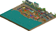
pleasure in seeing. I will not mention how many awards have been distinguished here by a unique and original character for me. The main thing is that there are such and there are many of them. Who will not take the "Vampir" will not find out everything. The path to the station itself is a rich experience. There are places that I especially like, they are unique and also fun. An interesting idea for a pharmacy theme. The docks are "mega",
Lots of views. I have many satisfied fans. Greetings.
Great to see this finally released, I've loved all the screens I've seen of the project and the old school throwback is quite refreshing in a time when the modern meta is shifting so quickly. The layout is stellar, strong nemesis vibes with a bit more oomph, especially in the speed through the first few elements but I don't find that a bad thing. The lift and drop framing is especially nice atop the landscape with the castle backdrop.
Speaking of which, the castle is some of my favourite architecture you've done. The way it's integrated into the mountain and towers over the village is brilliant, and the distinct style really stands out among the sea of peach, white and brown. And yet it doesn't feel out of place at all to me, with the brick wall running through to create that connection. The town itself is a tad difficult to read in spots but the busy style creates some strong atmosphere and feels like it would be very immersive which was your intention it seems. The peach roofs work better than I would have thought in that wood texture too.
The Apothecary ride is interesting. It's hard to make a big indoor ride box look particularly pretty, but the indoor scenery takes the focus away a bit and helps hide the scale of the building in a way. Not sure I really like the lift before the big drop, feels too plain in a way compared to the highly decorated scene before it. A tower of some sort akin to De Vliegende Hollander wouldn't have gone amiss I don't think.
Happy to see this finished, it's a quality piece of work and I'd be glad to see something in a similar old-school vein again at some point in the future.
This is really lovely, I love the interaction of the main ride (which has a great layout) - and the supporting village is a nice touch. I don't want to spoil everything, but it was fun going through and finding the little things while still being immersed in a nice macro environment.
I definitely enjoyed this, really brought me back to like the 2007 era rct2 designs, when turtle and those guys were really going at it. the bustling and dense town center impressed me the most, so much atmosphere and detailing and life. really drew me in. some of the surroundings building were a bit chunky and awkward, but on the whole still good. the layout was decent and I thought fit into the environment quite nicely. overall, love the vibe and the nostalgic feelings I get from it.
Congrats on the design. You asked for a review and since I'm the only one who voted below the design threshold I owe you one.
Let me start of by saying this was a neat little park. If you had submitted this as a park I think it would have been a deserving silver. I think you put effort in it and it certainly shows some skill.
There were a few issues for me with this park that may be why I voted this lower than others.
The first and most relevant to this not being a design for me was the coaster. It felt very shoved away in its position. If this were in a real park I can imagine people having difficulty finding where to enter the coaster. It had some nice bits of interaction with the queue, but there was basically only one piece of the coaster that could draw people from the main path towards the entrance.
The best piece of interaction on the map may have been the motion simulator queue. That felt like a missed opportunity. It would have been nice to see the coater have some interaction with the town. Particularly because the coaster could have added some color to the town as well.
The coaster had nice colors, which was something the rest of the map mostly lacked. The abundance of brown was particularly unpleasant in the town. It already looked very crammed. Combine that with the brownness and it became difficult to appreciate the detail you put in. To me the town essentially looked like a big brown flurry.
Overall this may have been a nice part of a bigger park. Although I can imagine that could also further uncover some of the bigger issues with this park.
I was quite torn on this tbh. I loved seeing a more old school NE style park, and even more so because it was a release by you since I feel like it we don't get that much releases from you...
When viewing this you def feel like this was not what was intended from the start, which relates to my biggest problem with the map. The fact that it's basically two sides. One with the big coaster, one with the vilage. This duality hurt this for me.
The coaster and the surrounding landscape and archy are very well done and nicely atmospheric. Only the yellow flowers were a bit much. I love the first drop through the castle and how it interacts with the queue!
The village is nice as well but so tightly packed that it's not that easy to see into. Especially with the brown everywhere. Nonetheless it does have some great moments, like the queue on the city walls, the tavern at the harbour and the small market in the street behind it. Lovely work.
I think the darkride is a missed opportunity since it seems like there isn't much difference between the interior and the surroundings of the ride. You see the same sort of buildings there as in the village next to it. Also the big drop feels bare and def needed something more akin to a Vliegende Hollander tower.
This review might have sounded a bit negative but I still like this quite a bit. I welcome more Trav work, especially in this style.
Trav you've clearly missed the memo, "Vampire" coasters have to be all black.
It is actually quite refreshing to see the white buildings and purple coaster here, though I think the yellow flowers are way too bright. The town has a lot more variety and nuance than the typical "Transylvania" setting, which is very nice. The gold trim on the castle? manor? is perfect use of the old-school bench to achieve some detailing.
These two are fantastic and nicely vertical, with just the right touches of unique scenery objects to hint at little stories behind the structures. There's great micro-character injected all over the town, in fact. I love "life gives you lemons," the flower trellis split-level house, and this little chimney.
Unfortunately, I can't really appreciate most of the map the same way - it's just too crowded and has too little contrast between the buildings and path. Coming from the context of a few other Vampires that have made great use of open area to create atmosphere, I have to say this feels a little over-scored for me. The castle-on-hill-above-transylvania-town formula is here, but it's a swing and a miss on a few other tropes; the waterfall segment after the first corkscrew feels like a forced feature to keep the "nemesis" feeling, much more like that section of rock was pushed up to meet the coaster than the coaster flowing naturally into it. The coaster isn't trenched or embedded like the other Vampires do so well. That isn't to say that the coaster layout and station are poor, though.
The custom supports are great, and I really like the lift up to "][22 doing vampire shit" - that, and the drawbridge, queue bridge over the main path - all very cool. I love the path view of the loop - even though it does stretch the layout a little awkwardly to achieve that, the scene-building around it is fantastic. The run-up over the creek reminds me of great bear and would be a real blast to ride.
Altogether this is sort of an awkward scoring situation for me. There's a lot of appeal to the small-scale stuff and it makes me smile. At the same time, it's not the best composed and on a macro-scale I don't think it achieves what we really idolize old PT2 projects for doing; so despite the stated goals of using the old bench to focus less on detail, it feels like you got it a little backwards. I'd still give this Design, but if I revisit it again in the future it'll be for the charming details at the small scale and not the overall aesthetics.