Park / Scream
-
 08-February 21
- Views 6,320
- Downloads 621
- Fans 9
- Comments 25
-

-
 83.00%(required: 65%) Design
Camcorder22 90% CedarPoint6 85% In:Cities 85% inthemanual 85% Liampie 85% robbie92 85% RWE 85% Scoop 85% nin 80% WhosLeon 80% CoasterCreator9 75% posix 70% 83.00% -
Description
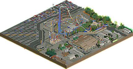
Inspired by Scream at Six Flags Magic Mountain.
-
9 fans Fans of this park
-
Full-Size Map
-
Download Park
621
-
Objects
297
-
Tags
Really impressed with how good you made a six flags parking lot coaster look in RCT, and I love the backstage area. The amount of traffic there really makes the park look busy and alive.
Im glad to see this. I happy to see that you, Louis, managed to transfer your style into the modern era. The usage of all these textural and gritty details is pretty well. It is also definitely showing the typical Louis DNA with a well executed design combined with technically and functionally focused theming. Although i dont know much about the reallife source material, i can very well imagine this being a six flags coaster in reallife. Its a bit soulless and cold, but i guess that's the point, isn't it? Probably what you cool people would call crunch these days...
As said in my testing review i would have loved to see you explore the park context of this more seeing that the little plaza of path at the entrance is the only part of theme park in this. But probably this is why this game is called Roller Coaster Tycoon and not Theme Park Tycoon, i don't know. But probably you could have elevated this more with a flat ride or a little restaurant or something like that.
But i guess its our job to judge park for what they are and how we like them and not for what we want them to be. Going on with this i think this is a design i would expect coming from a parkmaker and a worthy successor to Goliath. Glad, your spirit is back! Looking forward to see what you will show us in the future.
I feel like I owe you a review after I was so unjustly harsh about this. Its definitely not "soulless" as I described earlier.
What shocked me at first was the sheer amount of grey. This made it hard for me to feel a connection to the park because I felt it limited its atmosphere, even if it is an extremely refined design in all aspects. The bits of park are what made that better for me, and I can echo RWE in saying I would've liked there to be just a bit more of that to balance out the colours a bit more. What saves the grey sea for me is the backstage area. Its so technically refined, hyper detailed, and true to its origin, along with the rest of the design, that I can hardly fault it for being the way it is. The coaster was lovely too and after looking at the real life counterpart I can say you did a tremendous job at it.
For me this design was tough to love, but one to love nonetheless Louis. I think you did a stellar job even if its not something I'd recreate myself. I'd give it an 85%
Pretty flawless Scream recreation; as expected from Louis. Others have said what my main complaint is; it's an excellent recreation of a ride that's in a bit of an uninteresting location. That's not your fault, but there really isn't much to keep me interested besides the coaster.
You're missing a few footers and your support color is off (well, the whole thing is, now that it's dark blue and orange ), but those are minor, minor complaints. Everything is done very well, it's just a weird section of park to recreate as a feature by itself. Magic Mountain isn't the prettiest park on the planet, but I can appreciate your dedication to recreating Scream without adding half of Colossus.
You did an amazing job at recreating something that's pretty hard to recreate, that definitely deserves praise. Maybe next time give Riddler a shot.
So there already has been some talk about how this submission is soulless or that the location is boring.
I don't see it that way. I think somewhere among the awesomely themed parks, the interesting concepts and the imaginative fantasy we sometimes forget the natural elegance and simple beauty of a roller coaster just build on a field of concrete. This submission reminds me like no other of going to theme parks. Obviously what sticks out about a theme park visit is the theming, the rides, the shows. However, the glimpses of backstage, the views on the parking lot and the simplistic surroundings of some coaster belong to the theme park world just as much. This is why I love this submission. Lew could have included more of the actual park but he decided to focus on one coaster and it's immediate surroundings. Scream's surroundings aren't coasters or other things nearby. It's the parking lot and the backstage area. In a lot of ways, this submission defines the quintessential design and is highly worthy of praise. After long years of basically not building, Lew managed to show that he still got it. He is still one of the greatest Design builders this site has ever seen and he is as relevant as back when Goliath was released.
90%
please read my actual nuanced review before making subtle hints at people. Its quite obvious considering my review starts with "I feel like I owe you a review after I was so unjustly harsh about this. Its definitely not "soulless" as I described earlier.". referring to and rejecting feelings a person already came back on and wrote a detailed review about feels backhanded.
Congrats on the release. Overall, this design shows great technical skill in capturing a real-life source material and translating that into rct. The layout is spot on. There were 1 or 2 awkward blips related to the limitations of the game, and I usually lean toward finding a way to smooth that over instead of accepting it for realism, but that's me. The color choices are also impeccable on the coaster itself.
Ironically, I think it is the back stage area that really carries this for me. You've somehow managed to set up the trailers and buildings in a way that is charming and realistic to how this space would be used. There are a ton of fun details to explore and it really brings everything to life. For a community that was once obsessed with showing the backlot details of a park, this feels like the ultimate, a design that is as much parking lot and back lot as it is actual theme park. I don't have an issue with this at all, you gave us a slice of an actual theme park, and it doesn't bug me that the slice you took focused around a parking lot coaster and it's parking lot instead of the park itself. Plus, having been to Magic Mountain, there really isn't a nice way to incorporate more of the park without majorly expanding or showing awkward parts of Twisted Colossus.
The only thing that feels a little off to me is the tarmac and the different groundwork transitions you did from the parking lot to the coaster to the backlot (as well as the darker skidmarks from vehicles). This veers a bit into the world of crunch, but I'm not sure it feels natural to the macro-style of the design. In places, the different colors and textures feel spot on at creating a depth and richness. In others, the transitions and colors felt a bit jarring, like they needed more blending and more layers to give that feel of gradient and smudgy texture. But also, there were some areas that seemed like they should have a bit of blending but didn't, like the backlot with the spare vehicles or under the dive loop. To me, this gives that impression that the layer of crunch was added more as an afterthought than inherent to the style you wanted to capture. Anywho, I'm not saying this ruined the design for me or anything, overall it isn't a huge issue, but it did feel odd to me as someone who obsesses over that kind of detail.
Congrats again on the release and what I think should undoubtedly be a high scoring design.
SFMM was one of my home parks, and Scream opened at the peak of my roller coaster enthusiast days. I remember watching the construction pics of it and being eager to finally get to ride it. For some reason it was always intriguing to me that they just plopped it down in a parking lot, not even bothering to retouch the pavement. Makes for some great viewing angles from the parking lot though, in ways you normally don't get for a coaster. Once you get in line, you really do feel like you're just backstage. All these elements were captured really well here. While I can understand it being "just another parking lot coaster" for many people (I took great care to not say "a lot" of people), it really hit the mark for me.
Besides faithfulness to the source material, I think this was still a standout release that keeps up with modern parkmaking. While it is overwhelmingly grey, it is done in a tasteful way that makes great use of the palette. Where "too much grey" falls short for me is when the same shade is used and everything blends together. That never happens here, there was plenty of contrast (crunch?), the buildings never blended in with the concrete, the different types of pavement clearly distinguished from one another, and just the right amount of color was splashed in. Another thing about the palette (which might be another fun source material thing) is it makes everything feel a bit warm and hazy, which actually captures the feeling of standing on that janky station in the middle of a smoggy summer day in Santa Clarita pretty perfectly. The moving backstage was also a highlight. While I can understand it not being feasible in a full scale park, where it would use too many objects and draw too much attention, the backstage really IS the theming here so it was a good opportunity to explore this.
The coaster itself was everything I could've hoped for, and a masterclass in translating a ride to the game. Instead of focusing on perfectly replicating scale and footprint, you focused on perfectly replicating the flow and pacing instead, which is really the most important part. Just watching how it flew through the zero G roll and interlocking corkscrews felt spot on. Hell, even the pre-drop felt perfectly composed. This solidifies you as one of the all time best on this site at layouts, and I can't easily think of someone who is better.
I think there's a chance that this will get "SFWODed" in that the skill here might not be recognized by everybody until later on, but hope people take the time to dig in. While I do firmly believe it is on the builder to make something that excels outside of understanding of the source material, personally I think you succeeded with that here. 90%
You nailed the parking lot Six Flags doesn't care atmosphere. I still think somehow you added a bit too much backstage area. Slightly more park area than a few tiles of path would be better. Nice submission though, definitely design worthy.
75%
Perhaps it's not a bad thing that this park is overtly monochrome. Grey is no more boring than a design full of the same trees and grasses that we typically see. On top of that, I feel so many are jumping into them "too much grey" camp without acknowledging the many shades and hues evident in this work. Louis didn't just color everything grey and leave it at that, but nuanced it enough knowing that it was going to be fairly monochromatic.
Plus, the source relies on a lack of foliage or surface-level color to achieve it's look, and I'm more impressed he was able to make something technically appealing without reliance on the usual factors we lean on. To echo coasterbill, I feel this will absolutely be "SFWODed" by people not acknowledging what Loui's intents here were.
Excellent design, btw. If it wasn't already clear I really appreciated it's approach and think you nailed it.
RaunchyRussell Offline
Grey is usually a prominent color in real life theme parks. Tarmac, concrete, service buildings, etc. Fantastic job on this. The grittiness and realistic imperfections of this are awesome. You did a really good job of interpreting this coaster into the game without a lack of texture and "lifelessness" you would normally see in something like this. Now that 'crunch' has been somewhat adopted by rct2 culture, I feel like we will more than likely see a new era of creations like this. This is real life roller coaster stuff. It's not always pretty, but it's accurate and I can definitely appreciate that. Only complaint is the lift. It is steep looking, but that's the Rct2 cards we were dealt and it really makes sense with the scale of the rest of the layout. Like I said, Awesome job here, I am a sucker for realism in the game and this nails it.
Congrats on that quick design, lol
Really nice to see a recreation done of a coaster that's a bit underrated imo, though I have to say I found the SFMM version a bit rough. The one in SFGA wasn't and was pure fun.
The one in SFMM is also notorious imo for being so ugly, located on the parking with getto-style fences around the queue and exit path. So a bit weird to go for that one but I have to say, you managed to make the uglyness of it look interesting. The palette, the amount of details... it all works.
Glad to see topnotch work from you Louis, looking forward to more stuff coming
Really an amazing design.. great stuff Louis!
Seemed pretty tame at first, but the more I perused the design the more I liked it. I like nin hit the nail on the head, there's nuance to this in terms of colors. I think the shading an detailing on what would normally be a grey/lifeless area 2-3 years ago was done exceptionally well. But then on top of that the coaster pops really well.
Big fan of the backstage stuff. Added a lot of extra life to the area, and as others pointed out, it added the "theming" that other designs might have over this.
Good to see more work from you!
DACRACK Offline
Game crashes when I load it
Excellent comeback, Louis. And good timing considering the recent discussion surrounding the design accolade category, and the theory that design submissions need to be small parks to even be considered for high scores (80+). Granted the backstage area is a notable feature here, but the coaster is clearly the focal point and there's not too much supporting park bullshit like secondary coasters; just the coaster itself and its immediate surroundings for context.
I really like the (for the most part) clean style of realism, it's very pleasant and easy on the eyes. An exception are the skid marks on the road, I'm not a fan of those as they don't really blend in. Another thing I'm not a fan of is the little park section, the trees obscure everything too much and I think it could've benefitted from a few more tiles of context. But no big deal.
Greyness? Yes. I don't like it when parks do this, but I appreciate it as a distinct aesthetic that I think you captured well. The yellowish hue gives it the feeling of a warm, overcast day, which makes it easier for me to immerse myself. And the weather being less than perfect thematically suits the parking lot setting.
Again, great classic design. Maybe we needed the king of designs to breathe life back into the genre...
This is so good and so beautifully ugly.
You really have something special here. Not only is the aesthetic great but you have a unique approach to the layout that flows beautifully with the steep lift and some of the transitions.
A+ stuff.
my ONLY note here is the parking lot especially should feel like 110°F, everything should be melting, there should be at least one peep having a heat stroke,
On one hand this challenges the current design meta by not having any other rides or "park" content than the coaster itself. On the other, it totally plays into the current design meta by including tons of content beyond the coaster, just that it's backstage and car parking rather than more rides.
On a technical note, it's incredibly strong. I struggled to find things that seemed inaccurate. On the other hand, the source material isn't particularly pretty, inviting, or interactive, and I found myself wishing--despite the perfect recreationalism--that you'd taken a few liberties to make it a bit more interesting.
Congrats on the strong design above the coveted 80% mark, and a spot right next to your previous parking lot design on the "Top Rated" page.
Great job Lou