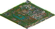
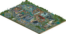
Park / Faastopia - Through the Ages
-
 21-February 21
- Views 4,066
- Downloads 643
- Fans 1
- Comments 20
-
-
 68.50%(required: 60%) Silver
bigshootergill 80% chorkiel 75% RWE 75% CoasterCreator9 70% Jappy 70% robbie92 70% WhosLeon 70% CedarPoint6 65% Liampie 65% Scoop 65% inthemanual 60% nin 60% 68.50% -
Description
Welcome to Faastopia - Through the Ages!
Follow Timey the Tiger on an epic adventure through the history of the world!
------------
*special thanks to the guys that tested the park, and to Mamarillas for making me a logo -
1 fan Fans of this park
-
Full-Size Map
-
Download Park
643
-
Objects
601
-
Tags
Similar Parks
-
National Mall of Schwarzkopf
-
Thorpe Park
-
Disneyland Mid-America
-
Pixar Animation Studios
-
Lenox Mall
-
[MM2014 R2] Hathor's Realm
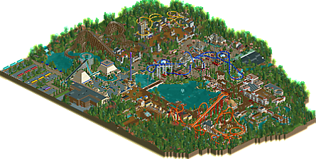
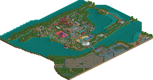
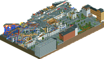
![park_3198 [MM2014 R2] Hathor's Realm](https://www.nedesigns.com/uploads/parks/3198/aerialt2802.png)
Man I love this park. Egypt area is lush. The tarmac shouldn't work as well as it does. The showbuilding for the little looping coaster is believable and very well constructed. The pillars and blue awnings at the entrance are very effective, and the royal blue motif through the land is just classy.
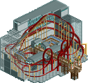
Medieval area is gorgeous as well. The drop tower integration with the suspended coaster is perfect. I love how much the moving gear scenery adds to this.
Asian area is beautiful, but feels so much busier than the other sections of the park. But man some of these structures are just so well done. I particularly love the building for Yurei Palace, and the little (koi?) pond at the entrance of the winter palace.
The Roman area architecture falls a little short of the rest of the park I think, but it's still got some excellent moments. The wooden roof is a weird choice for this area. Love the open areas with tables and white flowers - although I can't help but think that a light blue may have worked better so that the pillars stand out a bit more.
All in all some of your best work I think. Really enjoyable little park!
This is an awesome park. I said on discord that i think this is a cute version of Ancient Worlds and i definitely havent meant that in a negative way. I think its definitely one of the best NCSO work we've seen here lately. A healthy combination of realism and fun.
The asian area is probably my favorite in the park. Good unique coaster layout with very refined architecture and a strong composition game. Glad to see this centered in this park. I think the medival area doesnt live up composition- and coaster layout-wise, but the atmosphere is perfect. Loving how you played with the colors here and the drop tower is nice, obviously.
The egyptian area was the one that reminded me the most of Alex' work and ironically its also the one i enjoyed the least. But there also was not much to see here to be fair and the parking lot in behind stole the show. The roman area features an amazing and well done rapids ride. I also liked what you did with the flower colors over here and the Medusa coaster is definitely also one of the strong points of this park. One can really see you put a lot of effort into this.
All in all some good NCSO and a great show of skill. I think this is what a gold park looks like.
This is such a lovely and charming little park. The Egyptian & medieval area are my favorites here, they have the atmosphere spot on. Egypt is so luch and you nailed the composition. I also like the use of labyrinth maze here, works really well.
The integration of the woodie worked pretty good and I also dig Wyvern a lot, probably one of the best coasters I've seen from you. It also has an awesome open air station! Speaking of coasters, I thought the flying had a pretty weird first drop. The rest of it isn't too bad but let me just say that the inversion wrapped around the station looks cool but would kill its passengers...
Medusa starts off pretty good but after the Norwegian loop it gets pretty weird. But I do like the colors of the coaster a lot here. The Roman rapids are so cleanly executed, I can't do it that clean with CSO lol. If you allow me one more complaint: the entrance is really too small. Especially compared to some other structures in the park.
Overall a pretty solid silver I'd say. It has it strong points but if it would be a bit bigger and you'd put more effort into your coaster lay-outs this could've score higher imo. But let me also say that I really appreciate you building your own lay-outs and go for what you think is fun That's also a thing that needs to be appreciated imo. And oh I also love that you included my bus haha
Bit of an odd one for me, I think parts of this are extremely solid, and other parts are definitely not of the same caliber.
The entrance area is a good example of an area not as great as others. The clock is a neat idea, but hard to pull off in NCSO, and the entrance gates look like something from 2005. It kinda looks like you wanted to get a texture from every area of the park onto each building, which just makes it look a little un-cohesive. This extends to the Pizzeria too, which just looks basic and a little underdone compared to the rest of the park. Your sight lines in this area are also a little off I think. You've got this really nice vista that opens up to you as you enter through the park, but at the opposite side you've got...a top spin and the back end of the flyer? It's not a big issue of course, but I think mirroring the Japanese area would have let you have the lift hill/first drop as the backdrop for the vista, while you'd still have the cool post-inline twist sweeps to dive over the path on the other side.
Going round in a clockwise direction, Egypt is next. I think this is a fantastic little area, and as pointed out above, I'm not sure why the tarmac works, but it really does. It's very obviously inspired by Ancient Worlds, but it feels like an homage to it rather than a copy. Big fan of the hieroglyphics too, and the way the water ride drops into the area would be awesome to see in real life as you approach the area.
Medieval area is next, and while it feels more basic than Egypt, it's still solid. I think the station for Wyvern is great, and I love the drop towers. The wooden coaster has a neat layout, apart from a couple of questionable choices like the dive under the path, some nasty whiplash there. I'm also not a fan of using the houses as supports for Wyvern, but I like the idea of having something more than just usual supports. I did like the knights dotted around the area though, made it feel a bit more whimsical, especially the dragon fighting knight.
Japan is great overall, probably my favourite area of the park, but again does feel like an Ancient Worlds homage. The flying coaster has a neat layout, great colours and the station is easily one of my favourite things on the whole map. The snowy mountains are a neat NCSO trick, as is the use of signs as a trim on a couple of buildings.
Lastly, we've got the Roman area. The arena is great, as are the little buildings and rides around, such as the top spin and the Pantheon recreation. The two big points here are the coaster and the rapids ride of course; the coaster is decent and I like the layout. The station is nice, but I'm not a huge fan of the colours. I'd prefer it to be a yellow/gold mix, rather than the orange/dark orange you have currently. I think it fits with the Roman theme a little better.
The rapids ride is by far my favourite thing on the map. It's done extremely well, especially for NCSO. Very clean, believable but themed. Really well done with this.
The foliage throughout is also fantastic, really like how it compliments the landscaping, without being too thick. Means the full focus is on the architecture and rides rather than making the whole picture too busy.
I'm somewhere in between a 75% and an 80% for this. I think the vast majority of the park sits at an 80% for me, but things like the entrance area are silver quality, so it's a bit of an awkward one.
About the Ancient Worlds stuff: I was afraid people would compare this to Ancient Worlds, since there are similarities, but I must say that a lot of the stuff you mentioned as an homage Trav, are built before alex released screens of Ancient Worlds, so it's more of a coincidence than an homage. It's more that everytime alex showed stuff from Ancient Worlds I thought "f*ck I am doing something comparable". It's hard to pinpoint which things were built before and after alex showed screens of AW though.
Congrats on finishing the park! Been excited to see this in game for quite some time. I will admit when I was building Caer Hywel and Antiquita I was similarly worried about any sort of comparison to your early screenshots of this and to Alex's park.
Figured Id go thru the park area by area:
Entrance area:
As others pointed out it seems a little less up to the standard you set elsewhere, especially the Roman area and Japan. I do quite enjoy the park sign with the entertainers though. That was really cool.
Egypt:
Big fan of this area. Little tricks like the heiroglyphs throughout the park were great. The splash boat ride was well themed, and I enjoyed how lush the splashdown area was. The archy in this area was nice, my only complaint is that I wanted to see more of the coaster.
Medieval area:
This area was a bit hit or miss for me. Gringolet for the most part was a nice layout, but the underground dip/brake run bridge seemed a bit cramped. Station though was neat with the exit huts for towers. Wyvern looks like a blast to ride. I like how it weaved thru and around various structures. Seems familiar to another coaster named Wyvern
Feudal Japan:
I think many will point to this as the best area of the park. The usage of the mountains to give a sense of elevation was smart and you had a lot of variety as a result when you include the small rice fields and ponds throughout.
Rome:
Damn that was a great rapids ride. Highlight of the park for me. So atmospheric and well themed. Like Trav said, very clean. The theater was pretty cool, but I agree with Josh that the wooden walls were a bit distracting. Curious if canvas awnings would've been better? Lastly, Medusa was quite large and looming. The best part of the layout for me was probably the last bit after the pretzel loop with the flowy-ness around ruins and some nice foliage. Also, the foliage in this park is ace. Great use of those purple/pink full tile flowers.
I think overall this is quite a park to be proud of. Yet again you've shown the ability to make very atmospheric and fun parks. If I were a panelist, this would definitely be gold for me.
I'm not going to compare to Ancient Worlds because everyone else will do that for me, and it's just the most natural NCSO comparison at this time.
I'll definitely echo the other opinions on the entrance. I know you went through a few iterations of it before settling on this. Of those, I think this is the best version, but it's certainly a level below the rest of the park. I do really love the back side of it though - the sign patterns and the pizzeria are pretty neat.
I'm a bigger fan of the Roman section than I initially thought I'd be. It's very lush and pleasant. The amphitheater and rapids are major highlights. Medusa's color scheme is very bright and a stark contrast to the rest of the area. I typically avoid commenting on color choices, but I did feel it hurt the area in this case. The layout is great, it could have used a few feet to help the pacing in the latter half, however.
Ryujin is the best part of the park in my opinion, both in layout and theming. It's got amazing interactions with the path, environment, and buildings. I enjoy the subtle snowy theme combined into the landscaping and architecture. Yurei Palace and Ukemochi Cafe are my two favorite structures in the park - super well done. (Anyone who doesn't know the story behind Ukemochi should look it up, by the way.) Really no complaints here; it's a great area. Other than one chairlift support that got the Julow treatment.
The Middle Ages is elegant in its simplicity and openness once inside the area. I might've preferred the overall castle motive be more contiguous, but I think it's a nice little area. Gringolet also has some pacing issues and is a bit claustrophobic, but I love the queue and the way it's integrated into the theme. Wyvern is great.
Egypt is also quite strong for being such a small area. Everything is integrated into the theme so well. There are some nice NCSO techniques at play, and Oasis makes for a great centerpiece to the section. The entry to Ra's Quest is really cool; would have maybe liked for a bit more of the outdoor section to be visible to guests, but maybe that wasn't the intent. Cobra's Curse is placed really well, awesome location.
Little details across the park that I liked; park maps, photo spots with entertainers, picnic tables and negative space, my boat.
In general, I think my opinions align best with what Trav stated above. It'd be an easy 75% for me if the entire park was up to the same standards. Those 2-3 60-65% areas have me a bit conflicted. I think after deliberation and several revisits, the park as a whole is on the border; I could see it flipping either way - and I think my vote will reflect that.
This park is typically Faas and you can recognise your style easily in this. It's hard to pinpoint why specifically, but you just can.
Things that I liked:
-The rapids in the Roman area is such a nice piece of RCT imo. Reminiscent of your timeline park, but different enough to make it stand out. The stadium is also neatly done, but I agree that the wooden roofs here are a strange choice here instead of the (stereo)typical, ehm, Roman ones. I'm not sure if I like them or not.
- Some point to the Asian area as their favorite, I pick the Medieval one. My god this area is so much fun. I felt the excitement again from looking at RCT-Guide parks for the first time. Not that this is old-fashioned, but I felt that love for the game and atmosphere come through. The purple in-game flower beds for colour accents work so well here offset agains the grey and browns, and the yellow of the coaster is the icing on the cake for me. The little plaza inside the walls and surrounded by the wooden coaster is my favorite part in the entire park.
- Asia: again, your colour usage is commendable here, and I like how the flyer is the main focus, visible from the entire area. Winter Palace is such a fun way of integrating a small dark ride in here, big fan of that.
What I like less:
- The entrance area is a bit of a let down if I'm honest. A park like this, despite being small could've done with something a bit more grand. It's also quite messy and it could've used a clean up texturewise.
- Egypt: despite the great archy, and the cool hieroglyphs trick, this area feels a bit too chilly and cold for such an area. I think it's the combo of blue accents and grey path that does it for me and this hurts the area imo.
I'm kinda torn on the score on this one. I'm gonna have to think about it for a while.
I'm a bit disappointed this got silver, I thought it was really good.
What really makes this park for me is the amazing atmosphere throughout the park. The roman and medieval areas were particularly strong at this, and I loved things such as the medieval tower drop ride and the amphitheatre. The dark ride in the japanese area shows a level of technical refinement I don't think I've seen from you yet. Egyptian area felt perhaps a bit underwhelming, the colours don't really work for me there.
I don't really have it in me to write a full review right now that does this justice, but hope it was useful. I loved the park and I really hope to see more like this in the future.
80%
Dang, pretty rough that you missed gold by such a small margin. In my eyes it was a borderline gold park, hence my vote.
The thing I liked most about this park and about most of your work is the fun and unpretentious vibe the park has. The amosphere is strong all around and it feels very RCT, which i appreciate.
Feudal Japan is by far my favourite area and I thought the architecture was super strong there, also Ryuijin was a really cool centerpiece of the area. Loved the helixes around the mountains and the lay-down element under the wooden bridge. Some top interation there. Best building in this area and in the park overall was the Yurei palace darkride in my opinion.
The Egypt area was cool, the maze with the foilage covers on it was a nice touch and I dig the splash boat 'bridge' that goes over the drop track, very cool interaction. The path choice brings this area down a bit in my opinion, I feel like something more warm would've improved the area drastically, but I also get that you don't want to go with the obvious paths all the time and I respect wanting to do something different.
Middle Ages was nice, with as highlight the drop tower interaction with the suspended coaster. The coaster itself also had a decent layout. Opposed to that Gringolet's layout left a bit to be desired, wasn't a fan of the layout, but that might be just personal preference. The station building is nice. Overall a nice area (again a little small), would've liked to see a bit more variation in the architecture perhaps, but as a whole it does work.
My favourite part of the Roman area were the rapids, loved how flowy they were with the monorail track and the bright flowers and theming really bring it to life. The first part of the b&m was great, but after the norwegian loop it went downhill a bit. I feel like you could've done more with the ending. I felt like the architecture in this part of the park was the weakest, it felt very basic and a bit 'layer cake' at the stadium (not sure how to call it ). I did like how green the area is, the open grass is nice and makes the atmosphere really pleasant and inviting.
Overall I really like this, and I hope this review clarified why I voted what i did. I think a low gold would've been fitting for this. I am really looking forward to your future projects, especially your Tivoli park of which i am a big fan already.
This was a pretty nice park, obviously a bit overshadowed by Ancient Worlds but I think it's still strong on its own merits and executes its themes differently. The park has some really lovely moments and small ideas that work well with the themes, but it also feels too restricted by the size and scope of the map.
Starting from the entrance, there are some great little things - the entertainers by the sign, the cuckoo clock, and I liked the orange flowers. Not really digging the entrance itself, feels quite cluttered with fences and roof styles that don't really fit together. In Egypt, I think you really suffered from boxing this into a corner. The colour choices are nice (great use of dark blue), and the tarmac is quite refreshing. Also great idea with the hieroglyphs, but I think the pyramid structures are a bit basic.
I'd say the Medieval area is among the stronger parts of the park, love the use of the exit huts for tower roofs throughout. The suspended really adds that spark of life as well, nice bright colour and great interaction with the drop tower ride. Japan is another lovely part of the park, the coaster is very prominent and I love the pretzel element. However there's also a lot of texture variety that sort of hurts the cohesion. Great use of the wonton soup stall for the palace windows by the way.
The Roman area is last, I think you did a pretty good job here without mimicking past styles too much. The coaster starts off well but the middle feels a bit forced and overall it's quite short for its size. I also thought the name didn't fit, and was chosen so that you could use the medusa sign rather than for any thematic reason. (considering she's a Greek myth...) Last note would be that I loved the time booth photo op in each area.
This park lacks the typical cuteness of Faas work, but shows some growth and experimentation with some more technical grittiness and some more hacky details and ideas.
To me the big drawback with this was that it felt to me like it didn't achieve what it was set out to do. It felt cramped, densely composed, and a bit chaotic for a park that felt, based on the setting, entrance, and scale, to be something that was meant to be small, quaint, and calm. I also felt there was some roughness with the textures used, both on paths and buildings, that felt a bit haphazard.
Overall a quality work. While the layouts weren't stunning, they did their job and seemed to anchor each area well. I also appreciate that you're trying new techniques and thought that was best showcased in the egypt area.
I featured your park in a video: https://youtu.be/2FmPiFmG0Sw
Congratulations on the accolade, and more importantly on finishing/releasing the park Faas! Others have stated many of the same thoughts I had regarding the park, rides, etc so I won't bother repeating, but I will add that there were instances of unrefined ideas or lack of polish that held this back a bit for me. Unnamed signage, unclear trackitecture use, or simplistic archy or ideas that served their purpose, but perhaps could've used another iteration to further refine themselves.
That said, the park as a whole proved to be pretty enjoyable to explore, highlights for me being the tower ride in the medieval area and the rapids ride. Those offered much more character and thought compared to areas like the entrance, or some of the strange pacing on a few coasters. Overall though, as said it was a fun time, and thanks for the lil cameo! Eager to see what you build next.
Congrats on the release and the accolade. Personally, I feel like silver is where I'd expect this park to land. It had some great moments and ideas, but compared to some of the other stellar NCSO work we've seen in the past year seemed to be missing a bit of polish needed to move it above the 70% mark. Something like the unnamed rides and staff, seems so trivial but there were times that I was confused about certain bits of trackitecture and the fact it wasn't named meant I had no clarity on what the intent was (like all the bits of steeplechase between the trees).
I also agree with ITM, rather than feeling like a small park, it felt like a large park cramped onto a small map. Some of the areas felt very crowded and squished together, particularly in areas where the default objects can be a little noisier texturally. I feel that on a larger map or with a bit more distance between things you might have gotten a better balance in how areas developed.
I think my favorite areas were the rapids, the woodie station, and the flyer station. I love the flags on the woodie chainhill and the other support embellishments like the lion statues on the flyer supports. While the pacing wasn't always great for the coasters, they all had some great unique elements like the flyer's S loop around the station. I think the rapids does the best job of combining modern and classic rct in a really effective way.
Congrats again,
nice logo
I love this park. I like all the different theme areas, they are very convincing.
This park was a ton of fun. I guess I could find things to critique here and there (I maybe wish the indoor coaster either had a full interior or was cut by the end of the map to reveal some of the inside at least) but overall they’re minor and it doesn’t really change my enjoyment of the park.
The atmosphere is great, the layouts are cool, the architecture isn’t over-designed but it’s very well done... it just comes together really well for me.
faastopia - through the ages - 70%
feels so faas - magic
ancient worlds it's not - problem?
no. it's still special