Park / The Koi Pond
-
 18-January 23
- Views 6,622
- Downloads 340
- Fans 1
- Comments 24
-
1 fan Fans of this park
-
Full-Size Map
-
Download Park
340
-
Objects
1
-
Tags
Red Division
Yellow Division
Blue Division
R1
QF
SF
Surreal underwater cities, floating gemstones in a tech billionaire mansion, and Magnus competing in Micro Madness two thousand and twenty-three. Business as usual.
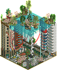
The Koi Pond
Xtreme97The Adamantino
EthanKatalun
MagnusBusiness as Usual
ChocotopianVoting Rules
I thought this round is 15 and under not 10 and under Ethan's says over 10
According to our count, it exceeded the 225 tile limit by about ten tiles.
Xtreme97 - This is so good, more people should experiment with different background colors! Just gorgeous all over
Magnus - cute entry, I think expanded this could win design. Unfortunately you came up against two monsters in this group
Choco - cool atmosphere, the palette is a fitting choice for what you're going for, I do wish there were cutaway scenes to deliver on the message
Ethan - I never thought I'd say this but how's your work-life balance? Are you okay? Because I don't think I could create something so weirdly foreign yet familiar in 3 lifetimes. You're an absolutely cracked object maker, just please don't use waterfall CTRs next round
My first place vote goes to Xtreme97. I like the surreal ambiance of a city under a koi pond. Good if not great coaster but lots of interior room detail in the buildings and such. And I like the figure eight turtle protocoaster(I'm using that term for any ride that's not a real coaster but has a track).
My second place goes to Ethan just for the nice details and what's a very good single rail coaster. Though I admit this sort of coaster is the new cool coaster and lots and lots of entries are using it. The landscaping is like lithographic for lack of a better word. Lots of intricate detail.
I had a hard time choosing between third and fourth.
I ended up going Chocotopian third and Magnus fourth. Chocotopian's entry had some interesting architecture and one of the more successful palettes. Like the others said, it could have expanded on the theatrics to communicate the theme better.
Magnus' entry was quite good, the coaster being maybe the best of the match. Another one of the tricky double back before it moves on sorts. The trouble is that the surroundings were a little too sparse for me and the coaster was relied on a bit too much, I think, as the focal point, and it was just a little too minimal.
1.) The Koi Pond (Xtreme97) - geez, you just keep crushing it. Amazing as always in MM. I really liked that elevated train in the middle of the ground floor: it's so simple, but adds so much complexity and dimensionality to the city street. You also managed to create some beautiful green spaces above and within the city. Looking forward to more of your micros in future rounds!
2.) The Adamantino (Ethan) - maybe the most beautiful building in all of MM so far? Between the water and rockwork and foliage, that big mansion is just framed so well and so interesting. It feels like Mystic Manor meets Jersey Devil to me. Only complaint is that the water really bogged down my computer. I like the effect, but it wasn't mind-blowingly good over just simple scenery waterfall. It became too distracting. Close call though between this and Xtreme's
3.) Business as Usual (Chocotopian) - Cool idea! There's some interesting geometric shapes going on here, namely lots of sharp corners and right angles to give a menacing and orderly look to things. The red roofs stand out a bit too much against the faded color scheme, in my opinion. I like the conveyor belt ride, but I wish it was paired with another big coaster perhaps. I think if this was MM2 or MM3, this would be a very competitive entry.
4.) Katalun (Magnus) - wow, what a great layout! It's seriously impressive how much you filled into this map. While the coaster is great, it really felt like the only real thing of substance on the map: the bridge was lackluster, the rockwork portals seemed like randomly placed scenery in a field; and the water just seemed like it was there to break things up. Overall good, but you had some tough competition here to overcome.
1. xtreme---easily one of the best micros I've ever seen. just so compelling. somehow the choice to use white tiles may have been the most inspired thing here... but I love it so much. the water fade, the fishies, the perfect architecture. so mysterious and all I want to do is know more about it. impeccable.
2. ethan---once I deleted the unecessary waterfalls so I could actually view this, this is amazing. the architecture is crazy detailed, especially all the windows and rooflines. and easily the best use of those rocks so far, it really creates a magical space. excellent work.
3. magnus---actually a fantastic layout, one of the best of MM so far. very graceful use of the new track pieces which we are already taking for granted!
4. chocotopian---lovely little dystopic story entry. I found the peeps in the cart kinda hard to follow so it would have been good to really center the park around that narrative structure
1) Xtreme97 - Awesome stuff, just packed full of vibes and life. You could have gotten away easily with just the city scene but you had to go and make it extra cool with the koi pond idea. Excellent!
2) Ethan - Remarkable archy, and an intense vibe is present. The scene felt pretty much perfect, though I feel that it was painted with too big brushstrokes if that makes sense. The architecture is beautiful but almost takes over the rest of the screen.
3) Chocotopian - This is great! Love the vibe, super moody, and a strong sense of elevation and levels. I loved the curvy road under the bridge between buildings.
4) Magnus - Wow, you went all out on this coaster! The layout and surroundings are very nice, especially the foliage. I just wish there was more to look at here.
1. Xtreme97 : I hesitated a lot for the first place with Ethan because your two parks are so incredible. The buildings are fantastic, the colour work too. The detail inside the buildings is a real addition. The whole thing is really solid
2. Ethan : An incredible level of detail, each element is superbly worked and thought out. The work on the cliffs is a masterpiece, same for the paths! Deeply dreamlike
3. Chocotopian : The park is very good, lots of consistency, excellent choice of colour! The architecture is a bit rough and massive but it's still very good
4. Magnus : A very nice little landscape, perhaps lacking a little detail! The competition is too strong unfortunately for the first or second place but congratulations!
1) The Koi Pond by Xtreme97
-Concept:++
 (maybe could've slowed the rides/peeps down underwater) Setting that sentiment aside though, I really like what you created here. From the great transition from the little pieces of land on top of the buildings to the city scape underneath, it all looks very polished and aesthetically pleasing to the eye. The interiors are a big plus here and add so much nice content, really clever. Very nice ride movements as well, with the fishies swimming around, the little canoe on top of the pond and the coaster going though the city scape.
-Content:+++
-Quality:+++
Overall; At first I was like; 'So this is underwater, but what about gravity then'
2) The Adamantino by Ethan
-Concept:+
 But yeah, great colour scheme, nicely detailed architecture and lovely flowing coaster throughout the landscape which creates some nice movement action. Love the custom music as well!
-Content:++
-Quality:+++
Overall; Once I deleted the waterfall CTR's, it became watchable, and what a lovely piece of architecture you've created here. I take it the adamantino is used to create the architecture, mainly the roofs, and therefore the non-texturized look it has. I bet we're going to see those new deco pieces you've created being used a lot in the future as I can see some great uses for them, so thanks
3) Katalun by Magnus
-Concept:+/-
-Content:+
-Quality:++
Overall; Lovely flowing coaster, with great use of the new inversions X7 added to the game recently. Love the colour scheme (really vibrant and fresh), foliage and landscaping (great use of Fisch rocks, not overusing them as most people tend to do). The pathing will give the guests great views of the coaster and it has some splendid interaction with the inversions. Great to see some quality Magnus work again!
4) Business as Usual by Chocotopian
-Concept:+/-
-Content:+
-Quality:+/-
Overall; Took a bit of time to figure out what story you wanted to display here, but I think the 'Escape' ride kinda explains the concept of escaping the 'business as usual'? I like the industrial setting and the rides used to get some movement in and that they add to the industrial theme. The colour scheme and textures used were a bit meh for me, they clashed too much and the whole felt a bit unpolished. The sides of the land (with borders) and no music all add to the unpolished feel this has unfortunately.
Koi Pond - I always love everything you do for MM. Wonderful use of the height, the layers are well-separated enough to be independently visually interesting. Even if you didn't have the interiors I think this would be the best cityscape micro of this round. And you know how to make a quirky, interesting micro coaster layout too which helps. If I had one complaint, it hits that final element & brake run way too fast. Very much looking forward to your work in later rounds.
Katalun is a wonderful compact, punchy layout. My only complaint would maybe be the unfinished rock under the station - you could have opened it up with more wood to showcase the queue down there and let guests see the water, or had more of a rocky foundation. The framing of the bridge is great without being too flashy of a MM setpiece.
I enjoyed the dingy factory/prison aesthetic in Business as Usual. I got the impression this was maybe based on something, and that was expected to fill in some of the gaps in how literal the viewer is supposed to take what's going on. There's lots of movement but nothing seems to be getting made, you know what I mean? The escape ride is neat but was very hard to follow with how large and impenetrable most of the buildings are.
Adamantino officially brought my PC to its knees. I had to follow SF's suggestion and delete all the waterfalls and actually I don't think it loses too much without them. The little dueling moment over the waterfall was nice, but didn't seem super repeatable. There are also a few instances where the track appears to clip with itself pretty bad. Otherwise adore the layout and how it makes you look at all four views of the map. The architecture is stunningly original.
Big fan of Katalun, would love to see more of this type of parkmaking in MM!
x97: Gorgeous set-building, but I didn't really pick up much cohesion through it all. The technical skill really shines though!
Ethan: I got about 15fps viewing this, which seems like better than most, but it still made it a slog. The waterfalls drew my eye more than anything, and they're gorgeous, but the castle didn't live up to the same level of the natural landscaping.
Choco: I always love seeing your work and I was happy my chains made an appearance!
Xtreme97: A wild concept done in a fun way, loved all the small details like the staff scene and those building interiors.
Ethan: Amazing setting, nice coaster layout that winds through everything, the custom music is nice too. Enjoyable to look through even if my computer really didn't like running it.
Magnus: Really enjoy the coaster layouts, tons of great interaction all through. I liked the coaster colors and station too.
Chocotopian: I like the gritty dystopian feel to this, and the CTR use adds a lot of motion to it. A fun one to look through.
Huge round here, I think we've seen the clash of two players, who could meet again and do exactly the same thing.
Xtreme97 – Slow clap for one of the best entries we've seen this round. I'm not sure if the goldfish is a new object, but I liked how you didn't overload that within the entry to get your point across. What I love the most about you, your style and your releases are the execution of your ideas. Each moment of crunch is so artfully done, that you question if there are new objects that you've used to make happen, or what the collection of objects is, because you need to use them yourself. You and Ziscor are in the same league here.
Each stall, each collection of buildings or track was just cleanly executed so in a micro (where there's a lot going on), you can just accept each idea for what it is, and it's a really beautiful viewing experience.
Your game is at the top tier of everything we're seeing; foliage, architecture, hacks etc. Whilst I had you marked to go far... an entry like this tells me you're here, and potentially going to snatch that crown, if you just keep doing what you're doing. My one piece of advice to someone that's already at the top of the hill, is concept is king. Iretonts and Robdedede's micro moments within their themes were inspiring and gave us an immersive level of storytelling that I think would really work for your next parks.
Ethan – I love your work and I know how much time you spend creating objects and architecture swatches to create these huge, big monumental compositions. I think the thing that held you back from first place (for me) was the execution in everything you were trying to do vs Xtreme. On paper, they're both incredible, but Xtreme's execution came through and stood stronger.
Your game is already there, but I think this match is a good indicator that you can create a huge monument, hack the shit out of it and place some awesome architecture on it, but if the clarity of the elements suffer, it can ruin the viewing experience. For example with the waterfall, it lagged for me, so what should've been a good peripheral detail was burdening your tiny composition with noise, so it was a detractor from the hugely detailed landscaping you'd worked on (which was awe-inspiring btw), and the flowing coasters.
The architecture was also incredible but the texture of the elements, on the swatches that you'd chosen were all similar, so it was harder to pick out some of the details. For example the roof having the texture taken away, but then the roof kinda matched the 1x16 work you were doing on the main structure, was slightly off-putting. Also the aqua you'd used for roof trims (kinda that haunting Riverview shade of Casper), was quite dominating as a roof trim colour and it appeared on a lot of the structure. Comparing that the the natural tones of landscaping you had below with the gemstones they seemed disconnected, which again felt like it was working against the concept you were building. Lastly when I opened the park, new scenery started toggling through the park messages. Crucial screen space wasted when it could've been narrative driven, or some personality injected in there.
Ethan you're the shit, and I hope the above doesn't come across negative in any way, but they're the reasons that held me back from choosing first over second place. Fix the viewing experience and execution of your big ideas and you'll be in another league. Thoroughly enjoyed this entry, thank you.
---
Magnus – Best coaster of the first round? In true Magnus style, you created a flowing layout in next-to-no space, and did the release justice. Would love to build with you in 2023! Sorry I couldn't throw a vote your way.
Chocotopian – This felt like it stayed true to your style of parkmaking and it was great to see. We just had two top ten entries in your group.
1. Ethan- This entry lags the shit out of my computer but god damn its well put together. Probably the best landscaping I've seen since H2H finals. The architecture is just really really strong in this entry also. I honestly think this is the most fresh and unique RCT I've seen in quite some time.
2. Xtreme97- Very impressive architecture. Really cool concept. I like that you chose to do the interior cutaways as well. There is so much content in this entry that it was hard to look away from. Very impressive, but I would expect nothing less from you:)
Magnus- Cool layout! I like the atmosphere you created here although I wish there was more architecture. I think it you went for a more "log cabin" style for the station it would have brought this entry together a bit more imo but overally I still really like what you came up with:)
Chocotopian- I like the concept here and I like the movement. I'm not sure how I feel about those saturated reds you used for the roofing. The architecture was also a little bit retro which was a nice change of pace. Overall, very enjoyable.
Koi Pond: Really neat, jam packed full of fun details and stuff to see. Cutaways were appreciated. Despite all the content, it was very readable.
Magnus: Loved the layout -- compact but great. I liked the simplicity of this.
Ethan: After figuring out that removing the waterfalls would allow my computer to not freeze I was able to view this. I commend your object making and world building here, but I agree with JK, it's just so busy and a lot of it seems unnecessary. Noise is a word I think describes this best - just too much going on. Beyond that, the architecture was dreamy and I wish I was this good.
Choco: Fun micro - the escape ride was neat! Enjoyed some of the minor details. CTR use was nice as well. I agree with others that there was maybe a bit of missing narrative? But overall I enjoyed this a lot.
Xtreme97 - This park kinda feels like a perfect encapsulation of so many different things that NE values, its pretty fascinating. You have a bit of theme park, a bit of urban landscape, and a bit of natural serene landscape; essentially a high art concept with a realism twist, or a realism concept with a high art twist. The execution is brilliant as ever, particularly at the street level. Personally I don't think the coaster was necessary but I also don't mind it, and It wouldn't be MM without feeling that do I/don't I pressure for getting a coaster in a tiny space. I think maybe the Koi Pond itself at the top could have used a bit more finesse to capture that sense of serenity that Japanese Gardens are so known for, but I can understand that the more you add up top the more separated it might feel from what's below, and I'm a big sucker of getting to see the intricate cityscape underneath the blue water. What really strikes me most is the textures throughout. Many feel very new and fresh compared to the tried and true we see on NE, and I'm excited to play around with some of these pieces myself.
Ethan - I'll start with the elephant in the room; I do not think the CTR waterfalls were worth the huge lag they created. I admire the dedication, but I think that reducing the amount (or just removing altogether) the CTR waterfalls would not have negatively impacted the visuals, and more, it would have greatly improved people's ability to enjoy a masterful micro (particularly the flowy coaster that gets bogged down by the sudden drop in frame rate). That being said, this micro otherwise delivers on everything people were expecting of you. A great and interesting concept with stellar architecture, and as others have said, an incredibly fresh aesthetic. I love the colors, the unique style to the archy, the fantasy and artsy flourishes, and the rockwork. Besides the waterfalls, my only criticism is that sometimes I find you get a little heavy handed with the detail of your architecture such that it becomes busy. For example, some of the rooflines I think had one or two too many patterns and textures such that they start to blend into a mess of color. Compare that to the base of the structure, which has a modern art, almost FLW-esque style to it. The difference in construction is subtle, but by holding back and using slight color changes to frame those shapes, it becomes something truly special. I think getting a firm grip on that part of your execution will elevate your game even further, which is scary.
Magnus - For me, I think this was one of the best layouts we've seen in R1. It had flow and great pacing, compact but didn't feel squished or forced into the space. The landscaping and surroundings were really pleasant, overall just a great coaster-centric micro. Unfortunately, you came up against two hugely conceptual parks in this round and I think the lack of an extra element or twist to elevate this is a challenge in a contest like MM.
Chocotopian - Overall, I like the aesthetic of this micro, it is very distinct from a wide field. The escape ride was fun, and the use of different CTRs to create movement was great. I did feel there was a bit of a push and pull between modern and more classic styles of building. In some places the structures were a bit boxy and relied on tried and true textures, but then elsewhere there were some flourishes of modern pieces that added nice detail. I do agree that a more clear narrative might have helped pull this together a bit more, and it could have benefitted from some more variation in the architectural forms.
This was a tricky one for me, as I think Ethan and Xtreme both put out masterclass micros. Xtreme's feels a bit more safe conceptually, but the execution and pure bliss of the visuals is why I'm giving it #1. Then by the narrowest of margins, I voted Ethan #2. The difference for me was the attention to detail in execution and the fact that Ethan's park made my computer lag so much, while Xtreme's was literally themed to give a greater sense of calmness my computer needed, heh. Congrats to all though, I think this was a great batch even if the scores seem a bit lopsided.
1. Xtreme97: From rising star in MM3 to Parkmaker in MM4, you've never lost your flair for kicking off a Micro Madness with a surreal Asian landscape. It's funny how such simple layers form to create something so out there; a city that's drowned and completely dry at the same time, yet little traces of the koi pond spill into the city with tangible effects. Genius. Even if this were just a plain Tokyo-themed micro without the upper layer it would be a highlight of this contest. The interiors are crazy and I can tell Tokyo Dome rubbed off on you. Obviously enough the top half is what takes it over the, well, top. Gorgeous detail and landscaping with such a calming atmosphere. The white tile background is super unique and ties it all together. Also I had no idea there was an invisible land wall! That's sick as hell and I might have to start using it. Super tight race for 1st between this and Ethan's, but the overall vision of this one just barely edged it out.
2. Ethan: LAAAAAAAAG! Outside of the insane performance hit from the waterfalls, hoooooooly cow. Was terrified to see what one of NE's newest and wildest minds would bring to Micro Madness, and looking into the finer details I'm even more terrified now. The biggest standout to me is the insane amount of objects you've created and how you utilized them. The aesthetic af spinning cones are a definite highlight, but that landscaping! 1/512 land blocks? What criminally insane kind of bastard? Going on pure aesthetics this thing is just bonkers. Pure chaos controlled by a pastel palette with some great splashes of color among the landscape. That angle with the Diamond of the Sea is one of the single coolest things I've seen in a Micro Madness. Shocked at how much length you got out of Adaman while still looking seamless. Even if I voted this 2nd, this is still pure insanity and I'm here for it. You made this really tough.
3. Magnus: Hell of a comeback! Was wondering how you'd adapt to the new meta after ten years and I can tell you're about to be a force again. Layout is really nice and what surroundings are there are beautiful. Not sure why the support flanges are magenta but that's extremely minor. While a little on the simple side, this is still lovely and it's awesome seeing you back at it. Great stuff!
4. Chocotopian: And speaking of comebacks! Love the balance of dreariness and liveliness you capture with this one with all the moving parts. Escape is a really fun centerpiece which reminds me of the classic adventure rides from way back when. Unfortunately it ends up not being as refined as the rest, which is a real shame considering how well the theme works. Great stuff!
Xtreme: Top notch work as expected. The white background really set a different atmosphere here, brilliant use. However, beyond the great archy and the interesting coaster layout, it was really the interiors that sold me. Such detail, and very fun to explore.
Ethan: Beautiful stuff, the archy is gorgeous and the landscape + waterfall are mesmerizing. I don't know the source material but overall the aesthetic is just wonderful to look at, and the coaster itself kept my attention for a long time trying to trace the layout. Looking forward to more from you in this contest!
Magnus: What a layout, this is wonderful as I expected from you. Loving these unique elements and seeing the twisted layout fold in on itself with such flow. It just needed some more oomph to the architecture and concept to elevate it.
Chocotopian: Very drab yet still a lot of movement, this was fun and I like the use of CTRs to bring the scene alive.