Park / Grapevine
-
 21-March 21
- Views 4,656
- Downloads 600
- Fans 7
- Comments 24
-

-
 75.00%(required: 65%) Design
robbie92 85% CedarPoint6 80% inthemanual 80% bigshootergill 75% chorkiel 75% In:Cities 75% RWE 75% SSSammy 75% WhosLeon 75% G Force 70% Scoop 70% Jaguar 65% 75.00% -
7 fans Fans of this park
-
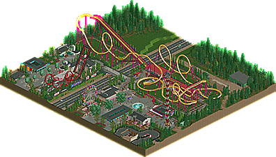
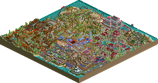
Full-Size Map
-
Download Park
600
-
Objects
373
-
Tags
What a beauty!!! Super awesome layout and I really enjoy the roof details and stairs!
This is nice and saucy. The layout is really nice and there are some nice little details throughout. I really dig the signs on the park fence and the path blending works really well too. I do wish the park as a whole were a bit bigger just to give it some breathing room. Solid 70% Oh and I may be wrong, but wasn't grapevine a standup in rct?
I love seeing classic scenario recreations, and this park really gets the look and feel of the original.
The coaster layout itself does a great job of being realistic while being instantly recognizable at the same time, and I loved the couple of references to the RCT2 prebuilt rides.
I also like the selection of buildings here, especially those restaurants, and I thought the paths and stairs were especially well laid out.
Overall a fun nostalgia trip with a lot of fun details, and a nice tribute to the game.
glad you spotted these
thanks admin team for prepping this and special thanks to bigshootergill for the great logo!
easy 80% for me, amazing as usual and the palette gave this a great touch. really shows why you're a legendary parkmaker
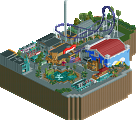
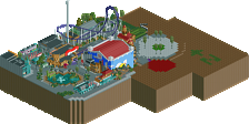
Really enjoyable layout and small park. The architecture has a lot of character and tiny details that add little pops of color. Very much feels like a roadside/county fair that has become permanent. Castle Karts was a cool little cameo along with Escape Hatch. The atmosphere here makes me wanting more.
Solid design with a nice layout and some good architecture. A lot of crunchy realism here and some very enjoyable moments, although the amount of content is a bit lower than on your usual stuff. Parts also suffered a bit from genericism to me. The overall composition is quite good tho.
All in all a nice little release right before H2H. 75%.
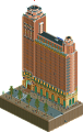
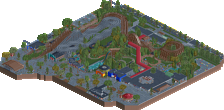
The park sign with the fallen "I" is a great feature and hints at the atmosphere of the park as a whole. The worn paths, fallen leaves, banner ads, and retro concrete + color architecture, all flesh out the somewhat shabby roadside park look.
The re-imagining of Grapevine is instantly recognizable and definitely improved. The queue line is a great of example of how to do it right. This area of the park almost feels too nice compared to the rest.
I really think the bridge over the road needs to be a bit higher. Some vehicles clip as it is, and a semi would never make it. Realism aside, I still think it would look nicer with a higher span or even arched walkway.
I always thought Defibrillator was a great coaster name, and the theming you added is so good. Best use of a scrolling sign ever.
Absolutely loved this. Palette looks nice - I swapped it out with the natural one and greatly prefer your choice.
Coaster itself is imposing and interactive - very nostalgic. The signage for defibrillator is brilliant, and the little brands and advertisement signs on the fence are a fun touch. Love the fallen 'i' haha.
Only critique is how the go karts are cut off. I get what you're trying to do, but theres no exterior contest limitations holding you back from expanding the park in order to include more of those fun surroundings!
Very solid and fun as always.
A light release from you (light meaning small ) but the content is stellar.
Crunchy Crunch: Check
Smooth Layout: Check
Throwback Styles: Check
Perfect Palette: Check
Lovely Loveliness: Check
Cool Advertisements: Check
Wonderfully Atmospheric: Check
Grape Balloons: Check
75 Percent: Check
Really liked this a lot, alex. The layout is really strong and probably the best 'standard RCT coaster spinoff' I have seen at least. Also liked how you made the generic architecture look unique and the vintage vibe all around. All the other vanilla RCT ride conversions are really tasteful and well done overall. All the signs and minimal theming throughout were just a joy to look at and you can tell that it was a lot of fun to build. Also a big fan of the contrast between the tacky 'low budget' park, and the huge ass b&m towering over it. While maybe not the most ambitious project you've done, it achieves what you intended it to perfectly, i think.
Good work!
If there's anything I love, than it's scenario reimaginings. Hell, just look at my portfolio. This fits right up my alley.
Making Funtopia a run-down, slighty grimey park works better than I expected, I love the different textures used for the path, the lights on strings and the ode to the original rides already present in the scenario. Also the little nod to Escape Hatch is fun. I love the use of the balloons for grapes at the entrance of grapevine.
What I like less is how the go karts is cut off and not an operable ride. I feel that's a bit awkward. Also the fact that this is a design and not a park is disappointing, but understandable.
So cool to see a scenario reimagining from you. Makes me excited for Evergreen Gardens!
Design Accolade: Check
Great design that captures the dingy-roadside-amusement-park vibe well, and recaptures the original scenario feel. Seriously strong attention to detail, great ideas, and a fun overall package.
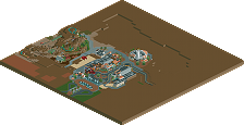
I felt there were some compositional flaws that kept me from voting higher. Namely, the edges were handled poorly with regard to the cropped go-karts and the coaster's drop visually overhanging the blacktiles. Additionally, I thought the map felt a bit unbalanced, with the coaster too neatly dividing two very distinct halves of the map with very different levels of detail and interest. Would have liked to see the cropping of the map pushed forward, so that there was less in the way of surroundings and a bit more park for a more dynamic balance of content rather than the awkward 50-50 split.
Congrats on another design win. Looking forward to what you produce in H2H!
Answer him alex.
Congrats on the design win alex, definitely felt this should have scored higher but I can understand people feeling like it was perhaps too small. Personally, I don't think size should dictate score, so I think this easily should have been 80 or higher
The lasting impression it gave to me was just a pure sense of classy parkmaking. It feels so clear in the vision of what you wanted to accomplish. Obviously paying homage to the original scenario, but also capturing that sense of 'roadside theme park just making ends meet' in such an effective way. The architecture is so simple but effective, the detailing at the right scale, the realism elements very well crafted. I love the Defibrillator station elements, the branded signage, the deco, 60s styled buildings, and of course the little bits of crunch that give it this scrappy feel. Honestly really impressive, very excited to see what's to come in H2H.
as an alex superfan, this one didn't do much for me. it got a 75 from me purely on the back of how technically competent it is. It has very little of alex's usual magical dynamism, and that's all down to the fact that it's an adaptation of a scenario.