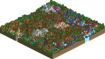
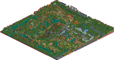
Park / Droomvlucht
-
 11-July 21
- Views 10,401
- Downloads 566
- Fans 1
- Comments 32
-
-
 73.00%(required: 70%) Gold
In:Cities 80% chorkiel 75% CoasterCreator9 75% G Force 75% Louis! 75% posix 75% WhosLeon 75% bigshootergill 70% Liampie 70% RWE 70% saxman1089 70% Scoop 70% 73.00% -
1 fan Fans of this park
-
Full-Size Map
-
Download Park
566
-
Objects
454
-
Tags
Similar Parks
-
Hallardrin's Keep
-
Erwindale Forest
-
Sunset Vista
-
[H2H8 R4] Incident at Billy Wonka's
![park_4119 [H2H8 R4] Incident at Billy Wonka's](https://www.nedesigns.com/uploads/parks/4119/aerialt3859.png)
-
[H2H8 Grand Finals] Heaven's End
![park_4178 [H2H8 Grand Finals] Heaven's End](https://www.nedesigns.com/uploads/parks/4178/aerialt3929.png)
-
Storybrook Glen
Round Robin
VS
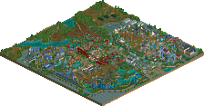
Scream Queens - Bellum Aeturnus
I kept trying to adjust the brightness of my screen when viewing this, but I eventually forgave you when I figured out what you were trying to do with the lighting. Not the most comfortable watch, but I respect it! Very ambitious, and pretty cool results. I love the light shining through the columns.
What you built here is unmistakable, the Italian architecture and the cathedral itself. I wish I could say I love the archy, as it should be right up my alley, but I found it subpar in many places. The cluster in front was rather messy. Stuff to the left, around the B&M - marvelous. There are more instances of great archy on the map, but for each great building there are two meh-ish ones. It doesn’t help that the archy in this park is glitchy as fuck. Shame! Anyway, the Cathedral roof with its domes, it does glow! This is where I started to understand the lighting idea, so well done. Great effect. Also love the gradients on the coaster. This review is going all over the place, apologies, but I’m embracing it. I guess the next logical step is to figure out the narrative. It’s not entirely clear to me, but there’s some evil creature emerging from the cathedral along with white smoke, signaling that this Nephilim is the next pope? So far so good, but there are a lot of apparent story elements on the map that I have trouble to add up. Piles of trash, sinkholes, car crashes… Blood stains on the square - or cracks in the pavement showing an evil glow from below? I think it’s the latter, but I think it lacks in execution.
Anyway, enough negativity. Love the setting, and I love the concept despite it not being executed to its fullest potential in my eyes. Digging the gloom. I’ve been nitpicky, this is one of the stronger architecture parks in the contest so far, with good use of half diagonals. Some nice new objects here and there - good job alex. Some of my favourite details are the illuminated alcoves in the cathedral facade. I quite like the coaster, and I already mentioned the unique colour scheme. Another highlight for me is the landscaped hill in the back of the map, sadly obscured by the dome. Would’ve liked to see more of that, maybe instead of the waterfront.
I’d like to mention one more observation that sounds kind of negative, whether it’s a flaw in the park is debatable. I feel like the way the park is set up implies that there’s more content to be seen using cut-away view. Most of the map surface is path square or rooftop, compared to other H2H parks there’s not a ton of content somehow. The cramped underground map edge scenes definitely made me 100% convinced there were underground satanic rituals or something. There weren’t. Missed opportunity
ATMOSPHERE
All in all: lovely map with a few drawbacks.
Logan’s Run - Droomvlucht
Taking existing theme park rides/themes and going all out in a semi-realistic or fantasy map is definitely a low key recurring H2H9 concept, and Droomvlucht is a good theme to use - it’s mostly impressions, strong impressions, rather than lore and references you need to ‘get’ as a viewer, although being familiar definitely helps understanding the choices you made.
The entrance is immediately a hit for me, love set-up with the real Droomvlucht entrance, the coaster above, and the castle backdrop. Flower motifs are also instantly noticeable, love what you did with the custom supports for the big camelback hill in that regard. There is more cool flower stuff in the rest of the park, namely the gate right after the castle, and the custom supports for the Droomvlucht ride. Excellent. All of it together sets the tone of a peaceful utopia. I’m not sure why you had to shoehorn Vogelrok in there, which is a story from 1001 nights. These references does not make sense, I would’ve preferred to see you guys add some depth to the existing themes rather than going with a weird mix of shallow references. Anyway, great landscape, and I really like the coaster!
The next ‘elf garden’ section is also nice. Lots of flowers, but no flower overload. Archy is a bit typical/cliche, but nicely done, I especially like the building with the two red turrets on the right side of the map, but Oberon’s castle is also quite beautiful, great use of that weird gazebo object. Lastly, curvy pathing along the water ride is one of the highlights of the map for me.
Love these paths. Gate perhaps a bit too massive.
Transitions are a bit muddy in this park. The awkward cluster of lush green custom trees in the center makes way for a rock, and after that, another cluster of custom trees (same design, different colour) that has no relationship to its surroundings. Whatever, I know what you’re going for here. I want to like the coasters, and I do, but not as much as you’d want. Compositionally, I think this area is a mess, everything is obscured by everything, with as a result no easy way to read the area layout or follow the coaster, nor to get a sense of space and depth. I do see cool interactions, and nicely placed troll animatronics. The double helix (brilliant dueling interactions) is another example of a non-essential reference. Great idea to reimagine the Droomvlucht helix like this.
Oh, there’s also a floating castle area. One of my favourite Droomvlucht bits, but I don’t think you captured it well. I like the castles you’ve done, and the sparkles are nice, but again, random birds, planets so small you may as well have let them out, and there’s just not enough content and/or context to make this work. There’s nothing bad about it, in fact what’s there is rather good. But with what came before it, it’s kind if a meh end.
Some general observations: cool theme, mostly done well. Music is so soft, it’s a waste of 110 MB of hard-drive space and time. Just go with ‘summer theme’ next time… Rockwork is hit or miss. I think the krypton rock formations are some of the most successful formations this H2H so far, but then there’s random bits of LOTR rocks and volcanoes that stick out like sore thumbs. Back half of the area has composition issues, and also some pretty terrible jungle bush spam. All in all, I’d say the positives definitely outweigh the negatives - enjoyable stuff guys!
LR vs SQ
It’s a pretty even match for me. I’ve been lleaning LR, but SQ is strong enough that I don’t want to make up my mind just yet. Going to sit on it, let it simmer, look at each parks again tomorrow, and maybe then make up my mind. Both parks are great, and both parks are flawed - perhaps equally flawed, in different ways.
I want to mention, in general, that if you can't hear the custom music, it's recommended that you slide down the slider of the sound effects in your Options, like this: (sorry it's in Dutch)
Early impressions:
SQ-I wasn't expecting a sequel to Sistini so soon, but since people complained it wasn't Vatican enough, I'm glad you decided to give them what they want. The aesthetic here is a dream, the incredible architecture and bits of urban cityscape with this early evening lighting is so refreshing. I'm obsessed with the light treatments and the gorgeous mix of architectural and stylized crunch. In a few places, I did feel it was missing some of those last layers of 'stuff' that turns a well designed space into a lived-in one. But that feels minor, the creative use of objects and smaller vignettes and spaces you created are great. Probably the one missed opportunity on this for me is interiors, and I say that very hesitantly. I hate the assumption nowadays that everything has to have interiors, and I don't like implying that is a negative when a builder doesn't include interiors. At the same time, it did feel like there was a suggestion of interiors with this park, particularly having a huge structure as the focal point. That seemed to suggest more was hidden beneath the surface, and then in a few places there was stuff you could only see with cutaway, so that felt a bit odd. Also a risky choice to make a park with a church at the center, didn't I already prove that doesn't work?
LR-Another incredible aesthetic and a ton of impeccable micro-details. In particular the fantasy architecture and the creative approach to landscaping and supports was really impressive. I love the wingrider with the beautiful and artistic supports, always a fan of supports that can be more than just infrastructure. The floating castle and towers with the sparkling elements is also a favorite. Overall, there are so many many ideas in this park that are just so excellent. It has that 'the more explore, the more I find' factor to it. I particularly love the custom trees, the fairy-lift for the log flume, the unique use of rides throughout. But at the same time, my main issue is that the macro seems to hinder how those ideas and smaller details are presented. Significant portions of the park, particularly the back by the duelers, are really hard to see or heavily blocked by the height of the trees and rock walls along the outside. In some places, it feels like the content and the ideas are almost buried within their surroundings, instead of enhanced by them. And the best parks, IMO, manage to frame ideas and present them for the viewer to easily consume. This felt very H2H6 or 7 to me, a ton of content but missing the structure to let that content breathe and not overwhelm itself. It also doesn't help that a lot of the outside of the map is dominated by those old heavy green bushes, that felt a bit overwhelming while interior parts of the map had a more balanced approach.
Not sure how I'll vote to be honest, neither felt like an outright winner to me, but there is so much to love about both. I'm reminded a bit of El Dorado vs. Pirates in how these two different approaches to the game stack up in this match. Congrats to all the builders, really impressive work overall and exciting to see the level is still so high even in Round 5.
Scream Queens
I opened this one first because i really liked the concept and idea. Feels like a pretty classical H2H formula to me: Take a common theme like italian city architecture and put another layer on top of it. That said viewing this i felt like the theme could have been explored a tad more. While i definitely think there are a few very nice scenes in this like the cutaway illuminati ride or the press broadcasts on the square compared to past parks following a similar formula like Billy Wonkas for example the story isnt told that much in here.
The highlight in this park is definitely the architecture. While the classical well executed italian architecture suffers a bit too much from the one window per tile disease in places for my taste the cathedral is spectacular. The lightning effect hasnt done much to me and felt a little weird in places, but i appreciate the idea and it gave this a solid atmosphere. The coaster was pretty cool too and a nice addition to the park.
All in all i think this is a quite good H2H park. Not a park of the season contender, but a nice map with a lot of great moments you can surely be proud of. Good job, Scream Queens.
Logan's Run
I know its not good to start a review with something negative, but the foliage in this park really caught my eye so much when viewing that i must mention it first: I think while the rockwork looks quite good, the foliage in my opinion - don't be angry with me, but i want to be honest - looks awful. The corner with the jungle bush spam is just something that is not pleasant to look at and for me the worst part of the map. There are also some quite nice little moments done with flowers in this... i would have wished to see more of that!
Coming to the highlights in this map i need to mention the entrance you also prominently showed with the screen. Cool moment, nice coaster, nice architecture, best part of the map easily. Also the corner with the flume ride and the blue colored roofs is really lovely, good job. Throughout this park there are a lot of hidden gems and ideas. Individually they are all quite nice. Macrowise i would have loved to see a bit more connection of these ideas though. I agree with FK that in that aspect it felt more like a H2H7 park than a H2H9 one. Not every composition needs to be readable in geometric shape but i felt like the flume drop being in the middle and the entrance being centered have been probably a good start for a better presentation of all the nice stuff you have in this, but the more and more i go thorugh this in detail, the more i feel like this park loses itself in all the ideas being clustered into a rectangle.
To conclude i think this is a nice H2H park with some good moments that partially doesnt hold up to todays standards tho.
All in all both parks are presenting some standard h2h approaches to us, one felt a bit more up to date to me than the other tho, thats why my vote went to Scream Queens.
Gonna try and knock out some reviews real quick. Man, its great to see some new parks! And these two really kick things off with a bang.
Cool to see both teams tackle European Fairytales
Night Vatican
Alright this is so cool. First impressions are very good. Absolutely love the palette. The lighting effects are hit or miss in some spots, but for the most part they work exceptionally well. The streetlights don't work as well as the windows or columns, but the effects on the basilica itself are pretty spectacular. Phenomenal idea and phenomenal execution. The coaster is cool. I'm not much of a layout guy, but the gradient color changes are beautiful. I like the name, I like the theme, I like the placement of the big elements. Well done. Cutaways are well done, if a bit sparse. As much as I don't like parks being reliant on cutaway, I do feel like this map itself is a bit of a missed opportunity to do utilize it a bit more. I can imagine how time consuming and soul sucking that would be though, so its really not that big of a deal to me - I still enjoy the park just as much. Great new custom objects! Although the colorable peep officer could have probably used another name in the object editor (Now there's two 1J Peep Officers lol). As mentioned above - some of the architecture on the outskirts was a little lackluster compared to the basilica and plaza itself. Granted, I've spent some time in this part of Rome and understand that many of the buildings around it are very blocky and rectangular haha. But I do think they could have benefitted from a bit more love. Excellent work all around though. I love the theme and I love the execution. Great call in making the Sistine Chapel the coaster station. Shows just how much excellent planning went into this map.
Also, big props for "Recurio", "Japiani", and "Capitano Dirti".
Some things:
Great work on the light shining through the windows. Also really like the (swiss?) guards stationed out front.
Beautiful little seating area. Could use some peeps though!
Well done on this! Definitely feels Italian
Love this station area. I like the giant candle on the table haha
metal af
great details like this throughout the map!
Fairyland
First off, I love that there's naked guys chasing eachother in underground tunnels. Really feels like a nice metaphor for NE. This park is gorgeous. I'm not really a fan of the fairy / european / etc theme for the most part, but i think you guys pulled this off very well. It's just not an interesting subject matter for me personally I guess haha. It was a bit cluttered in spots - most notably in the back half of the park where the duelers were. The swamp itself was great - with the rockwork and waterfalls, etc. But since i'm not much of a coaster layout person, it just didnt hold my attention. The front half of the park really was gorgeous though. I absolutely love the curvy organic coaster supports. The leaves and stems and arches are so classy. And the castle under the lift is just so picturesque. Great sense of verticality. The little sparkles throughout really add a nice polished effect throughout the park. The dudes riding the eagles around the floating houses is spectacular. Man thats such a great corner of the map. I think where this map excels is the attention to detail. For every cluttered spot, theres an equally impressive hidden nook, or micro detail. The lighting and lamp posts are so great. I like all the naked dudes swinging on the tree trunks in the forest. Also its nice to see steve in a dress. Just so much content.
Some things:
Beautiful little framed area.
I love this. The supports, the castle, the elevation, the grassy fields. So well done.
Little details like this really elevate the park for me. Nice work.
Steve has never looked better
I love this little scene. Really cool suspended ride - I'd love to ride this in real life!
Great idea to add the members as fairies!
Favorite part of the map.
This illustrates what I did and didn't like about this map. So much clutter and mess. But great little detail of the coaster doing the barrel roll over the little bridge, with the naked guy in the tree.
i've never known ziscor to be so immodest - really shameful
This was such a good idea and so well done. Nice detail with the water splashing on the lift, as well as the queue peeking through.
Best part of the coasters imo lol. Love how they exit the station with the main path between them.
Such a good idea to have the fairies lifting the vehicles
Beautiful helix. This section of the park is done so beautifully.
This vote ended up being super difficult for me. While I am so much more interested in the Vatican / Religious / Illuminati theme of the queens, the fairy park had SO much content and was absolutely packed with great new discoveries around every corner. Really continuing to elevate the game with each map! The macro view and lighting effect in the vatican park are truly incredible, and really left an amazing first impression - while the fairy park was somewhat underwhelming on first view, but reallly grew on me the more I explored.
I don't want to have to vote against either of these spectacular parks, but personally I enjoyed the theme of the Queen's park more, so thats where I'm going to leave my vote. I wish it had more content of course, but I was still impressed nonetheless!
Absolutely incredible work from you all
Scream Queens had a cool storyline with nice use of colors and stupendous architecture. Logan's Run had a fun take on the efteling with plenty of ideas and interesting rides. While I found Bellum Aeturnus beautiful, it didn't hold my attention for as long as Droomvlucht did. Droomvlucht was a bit too dense and I did not really like the rockwork, I can see myself liking this park more on each view. Both parks are great, but I ended up voting for Logan's Run. Thank you both for the matchup!
Klootzak
+ the entrance area is the highlight of the park, there's a ton going on without being overwhelming
+ vine coaster supports are super well done, very creative, I love the shapes you've created here
- the krypton rock/jungle bush combo is not working at all, the spammed jungle bushes are not good
- the back half of the map is such a chaotic nightmare, I don't know how you built in that space. I've looked at concept artwork and can see what you were going for with thick overgrown foliage, but I think your object choices hold back the execution a ton
+ the blue rooved buildings are excellent, love the truss detailing, it reminds me immediately of Rivendell and elvish fantasy architecture
+/- I love the amount of detail and content you've crammed into the space, everywhere I look there are fairies flying around and supporting rides passing through, but the back half of the map is just so unpleasant for me
Pope's Place
+ Incredible macro, you can tell immediately what it is and I find the architecture super impressive for the most part. It's difficult to create a structure that size that looks good at every level of zoom
+ Love the palette, it's spooky and sets the tone well
+/- lighting effects are a great idea, but I didn't love it overall, particularly on the buildings themselves, my brain just isn't registering the yellows as light
- the park is dead! The helicopters and spirits flying around are nice, but I don't really feel anything else happening. There are hints with the cracked pavement, but I almost feel like the idea was tacked on at the end
- the biggest drawback for the park is that it's dominated by this massive architectural structure that provides no movement while also concealing very little. The tastes of cutaway are all awesome, but I want more
Both parks are flawed with some really excellent parts. I think Dumbledore could have used a more thoughtful approach with the landscaping and foliage, it's incredibly dense without needing to be, there's so much disarray that it's impossible to take in. Vatican has the opposite problem: it's superior in planning and map layout, but it doesn't take long to feel like I've seen everything there is to see. Tough vote, but I'm going with Scream Queens this time.
Finally getting some time to review these great parks! I think I'll keep it simple with a +/- list for each park.
Bellum Aeternus
PLUS
The light effects. Honestly not because they are 100% convincing in every case - but just because you went for it on such a grand scale, and pulled it off really well in most places. That kind of ambition should be rewarded. That said, I do think Le Coeur managed to do it a little more convincingly, if not only because they chose "easier" applications such as lit up windows.
The massive dome on St. Peter's Basilica. Creating large rounded shapes is something we all know is a pain in the rear in RCT. I myself struggled a lot with this in Dragon Ball where one of the centerpieces is a large dome building. These large steep diagonal and half-diagonal pieces finally enables shapes like these without messy trackitecture. I'm really glad Alex took the time to make these objects, I have a feeling they will become very popular.
St. Peter's Basilica in general - The scale and the detail of this building is incredible, a great central visual piece. Having been (and comparing with pictures) I also feel it's very accurate. Great job.
Nephilim (looks) - As others have commented, there's something very appealing about the varied color scheme of the coaster. A very striking look, again a bold aesthetic choice that I think pays off!
NOT PLUS
Nephilim - I think it's hard to get a feel for the layout when so much of it is obscured, and I am maybe not a fan of how it is laid out on the map - I think I would perhaps have wanted it to be either more compressed into a smaller area, or spread out more. As it is, it looks a little undecidedly in-between.
Lack of interior details - The building really invites the viewer to take a peek inside, but it only reveals leftovers from the planning and construction stages of the park. A little disappointing. The real basilica is brimming with grand halls and all kinds of art, would have been nice to see an attempt at that. The cutaways that are there are nicely done though!
Overall narrative - Conceptually, I wasn's sold. There's the little message in the beginning, and there are hints at some wicked things going on, but I feel there could have been something more to reinforce the narrative, perhaps something exploding, or something more visually striking.
Droomvlucht
PLUS
The various parts of this park are all amazing with some really enchanting and unique aesthetics. The entrance is amazing with the integration of a very nice layout, and I love that support work. The flume and rafts area comes next and is also really compelling. Finally there's the dueler area which I really love, I think the unusual muted dark green colors of the trees work perfectly here.
The layouts all look strong to me. especially the dueler.
Nice density of rides! Something happening in most spots.
Love the archy style, and it's kept nicely consistent throughout the park, while not feeling repetitive.
NOT PLUS
Ok, so I feel it's important to not look at everything in this park together. Because if you do, it's a bit of a cacophony of colors, especially when it comes to the foliage. While I get that a park that leans heavily towards fantasy calls for bolder foliage, this is really crazy haha. Just about every shade of green is present, in big clusters which further adds to the contrast. I appreciate the boldness, but I think it is just a bit too much here. I would be very interested to see a version of this where the foliage is more harmonized.
Minor thing, but I feel you could easily have cleaned up some of the technical stuff, like hiding the shoestring tracks. Only takes a few seconds and leaves the park cleaner-looking (if you decide to take a look in cutaway mode).
_______________________________________________________________________________________
Both parks managed to create a unique look, and had some very strong visual ideas. Conceptually they were both a little weak, but for me, Bellum suffers a bit more from it since I feel it tried harder to sell a story without really convincing me. Droomvlucht on the other hand feels more laidback about it's ambitions story-wise, being more about providing a great magical atmosphere which I really feel it does, albeit in a somewhat disconnected fashion. For me, I think LR just about comes out top this round.
Great job both teams!
SQ:
Another lesson in architecture. Wowee guys. Immediately recognizable and thus, very fun to explore. The lighting trick was genius. Loved how you guys did the window glow and it took me a minute to realize what was going on. The coaster was fun to watch, and I have to say the wingrider here was better than fairy park. I agree with Liam that the park felt a tad empty perhaps? Lots of archy and hints to cutaway, but not much cutaway. Not a huge complaint, just parroting his comment. Really enjoyed this entry.
LR:
Busy busy. Great stuff here.. tons of fun ideas, but it wasn't exactly readable, which is ironic coming from me who built on Diagetic Underground! Josh's screenshots highlighted it for me. But the area of the map with the duelers was overkill in terms of trackitecture trees, rides, more rides, more trees. Just came across as a visual cacophony and I had a hard time as a viewer figuring out what I should focus on. Maybe if the coaster colors clashed more with the trees? Everything on the map minus the white castle structures was too complimentary. Rock work was also just a textural mess. Krypton rocks all sorted blobbed together and was not exactly readable either.
Enough of the complaining though. So much creativity here. The fairies as a lift. The fairy architecture and repeating motifs of curvy suuports/light posts/archy was nice. Very consistent and you guys stuck to the theme well.
Going with SQ on this. Just cleaner and easier to read as a viewer. Great job to both teams coming out strong after the mid season break!
On vacation, so don't have time for a lengthy review.
SQ: Thought the park was pretty good from a technical standpoint. Loved the palette and the lighting effects, and the archy was great. Unfortunately, the narrative was kinda lost on me, and it almost feels as though someone at some point said "Vatican at night isn't good enough by itself, let's add something else." There were a few scenes spread around that I didn't really get, and the park as a whole felt undercooked because of it. I also somewhat expected full interiors based on the “classic” cutaways where you could barely see anything. Those made me want to use cutaway view to see more of those scenes, but then I was disappointed to see land tiles in “planning” colors. I would've liked to see those classic cutaways made bigger and clearer, and I wouldn’t have expected interiors everywhere.
LR: Some amazing things in this park, like the entrance, coaster supports, and some of the overall vistas/scenes. Unfortunately, like others have mentioned, the rockwork/jungle bush combination really detracts from the park itself, enough that I don't find myself wanting to look any deeper. I really wish it had been further refined, and made to be less prominent overall.
Two good parks with some large weaknesses, but SQ ended up edging it out for me. Congrats to both teams for putting out great parks this deep into the contest!
Read that as On Vatican and was like LEAK! lol but you're not even on SQ
But over the last day Droomvlucht has grown and grown on me. It's dense but not super challenging to view, just packed with lovely little areas and light-hearted scenes. So pleasant to check out every inch of it. Aeternus I think is excellent, but that initial excitement has worn off and the dark spiritual/paranormal theme isn't quite as intensely delivered as I first hoped.
really didn't catch with the theme of logan's run. sorry. super busy right now so will round back to reviews later, but easy vote for me! loving the lighting on the vatican building especially. super cool.
anyway to get this topic higher up the list in the forum? It's like 13th in the list. took me a good few seconds of eyeballing to find it!
Both parks were solid and had great, interesting moments. Logan's resonated a bit more with me and took my vote.
Really liked how "what happens after the pope dies" used a lot of movement and life to add motion and interest to what otherwise might normally be a very still architectural snapshot.
Really liked the chaos and entanglement of everything in "flying rivendell" and while it wasn't quite as technically strong throughout, it held my interest a lot longer.
Wew, both parks were very refreshing. Great match!
Droomvlucht has a great Efteling-style but in a new jacket we haven't seen before. The rock formations where very overhelming, but in a good way. Loved the castles and all the single rail structures. There's so much to see. Some places were so crowded that it was a bit hard to read. The backside with all the jungle bushes couldn't sell me either. Though the archy and the overall atmosphere did really well.
Bellum Aeternus was very special as well. The yellow effects do really well. Really something small that makes the park. The cathedral was mindblowing and beautifull on a macro level. The storytelling is great and the whole map really looks like the real thing.
It was a pretty hard choice but at the end I went with Droomvlucht because it could hold my attention much longer. The map feels much bigger and it seems like there was much to see. For Bellum I think it would win for me in many other contests. It was a very close vote for me.
What I liked about Droomvlucht: the suspended vehicles, some gorgeous flat rides, the entrance, the flying castles, the staff members throughout the plot.
Aeternus has great architecture, it's immediately recognisable. Fantastic dome. I love the darkride cutouts, the lighting, the palette. The coaster is not the highlight for me but flows well throughout all the dips and turns.
In the end I voted for Aeternus. Main reason being that Droomvlucht was a little too chaotic in places. A little more serenity around the coasters and less of the repetitive jungle bushes and rockwork would probably have won me over.
Good job everyone!
Bellum Aeternus
The palette and lighting are great for atmosphere, and I didn't have any trouble with seeing things despite it being dark. Readability overall was very good for me. In addition to the excellent centerpiece (Especially that dome), I though the buildings around were clean and solid, and complimented the main area.
Droomvlucht
It helps I've at least seen POVs of the ride this is inspired by, I like the concept of expanding that into an entire park. There's just so much to look through here, it did get kind of chaotic and readability was somewhat of a problem, but too bad overall, especially one I got used to the park. There's a lot of great scenes and areas, my highlights are the entrance area and area around the main drop on the log flume.
Amazing match guys, two really incredible parks. I am starting with the cons because that’s how i like to roll.
Logan’s Run:
Cons:
Towards the back of the park is where I started to have some issues, but it’s a good thing that it still didn’t really take away the magic in the park. I think this is just one of those things that could have been a bit more refined on afterthought. Specifically, the darker trees around the red and blue coasters just were not all too readable, and left me searching for something more out of it, perhaps a centerpiece. The other main issue I had was the outside edge of the map. The bushes just did not make sense to me. Since we are looking at a cutaway slice of the inside of these rock formations, I would infer that these green bushes are underground. I would have rather seen something like vines as roots or something of that nature.
Pros:
This is a really gorgeous park! On first impression, I was so amazed by that wing coaster in the front of the park. The organic supports are done so well, and I do really like those building forms that are integrated into that area. I thought that this was the strongest part of the park and as an entrance, I enjoyed that it seemed so inviting. Going further into what is really the middle of the park, I thought that the openness of the area was very pleasing, and there were nice little details here, like the bear. The architecture was very cute and fantastical.. Another great thing this park does is feel massive, and I think that comes with great skill. I must note that there were many great details in this park, including the naming of trackitecture and vehicles that I sincerely adored.
Scream Queens:
Cons:
As much as I loved this park, there were some things I noticed that could have made it feel more polished on the whole. Some areas looked a bit clean and looked like they could have had a little more personality and crunch in there. Specifically on the streets and the roofs, but I feel this is kind of nitpicky. If there is any issue for me with this park, really it is that I wish the church had a cutaway interior, or at least the cut off buildings on the edges of the map did. I think there was a tad lack of movement around those areas.
Pros:
Wow guys. Seriously stunning presentation. This glow effect of the lights is just way too good. Is this even legal. This map is instantly recognizable and full of charming architecture. All of these buildings are so good, I wish that i built them. The roads and sidewalks are extremely well done, as well as the little scenes of vehicles and seating areas. It’s just really pleasant. I love the fountains to death. And of course the church is just insane. That dome is so intimidating and just really striking. For such a place, I would think it would be so difficult to integrate a coaster here, but you guys pulled it off fantastically. The color scheme on that coaster was something I really thought was a cool and bold choice. To top it all off, you guys added some really awesome scenes underground which are so detailed and creative! This park didn’t feel like it had much missing to me, all of it was really there. This is a park I know I will come back to in the future and is definitely memorable.