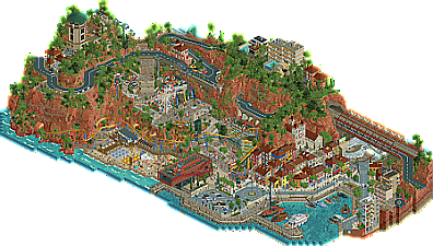
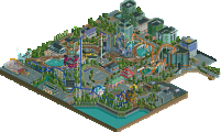
Park / Villerouge sur Mer
-
 15-July 21
- Views 10,217
- Downloads 671
- Fans 10
- Comments 25
-
-
 85.00%(required: 70%) Gold
chorkiel 90% no In:Cities 90% yes Scoop 90% no Xtreme97 90% no Camcorder22 85% no G Force 85% no saxman1089 85% no WhosLeon 85% no CoasterCreator9 80% no Louis! 80% no posix 80% no RWE 80% no 85.00% 8.33% -
10 fans Fans of this park
-
Full-Size Map
-
Download Park
671
-
Objects
616
-
Tags
Round Robin
VS
Lovely park Tile Inspectors, really feels like a concept that the builders had a real passion for. Also feels so expertly made, like easily made, like it almost built itself, everything is super well constructed and cohesive. Favorite bits are definitely the touches of modern art and design in the structures, wish we got to see more of the subway station! Only complaint is that it feels very much like a few GT parks from last year, but oh well, it definitely is superior to all of those and sets itself apart a good bit.
Lastly, kudos to guys on finally nailing the rockwork objects, these are a big improvement over anything we've seen yet and will definitely be popular going forward!
Villerouge
By far and away, the landscaping is the highlight here. Very well done. I wasn't a big fan of the breakwater rocks, I thought they could have been pulled off a little bit better, but that's a minor complaint. I was also a fan of the marina and the diagonal street scene. You've already heard it once, you're going to hear it again - this definitely feels like something pulled out of Grand Tour. I think, unfortunately, as a result it comes across as a little underwhelming outside of the landscaping. A very high quality and well made product with excellent landscaping, but perhaps a bit more of a "standard" park and town experience otherwise. I think had GT not happened, this would have felt a lot more impactful.
The marina is a charming feature. I have a few questions about the scale of your boats, and I wasn't a fan of the execution of the breakwater rockwork, but both of those are relatively minor things.
The landscaping is a clear highlight, but I also liked these little rides tucked into the cliffs. Very fun to see a functional trampoline! I think what makes the landscaping work well here is that it feels both natural but also suits the RCT aesthetic.
This diagonal section was surprisingly effective too; it has a bit of that "diagonal = flat" feeling that RCT tends to have, and I don't think the yellow building on the left is as good as the rest - but it's a nice lively street scene and I'm a big fan of that.
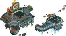
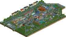
Extraction
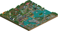
Love space themes - and this is a pretty neat riff on the topic. I really enjoy the atmosphere you've put forth. From each planet feeling distinct to the pops of life and movement on and between them, this becomes a really fun experience to view. I liked the different orientations of a lot of the spacecraft; it helped make it a little more than just stuff floating around. I was surprised that you managed to fit in two solid layouts on such small planet features, so kudos for that. The equipment and detailing is all very cool, the planet surfaces will be rather underrated here, I think. There's a surprising amount to them that one only notices if they look close. The sulfur and methane planets are my favorites. On the other hand, there's an inconsistency in the level of interest each of the planets have. I sort of felt as though the lithium and brown planets were a little easy to overlook.
Love this space station, great stuff.
Most of the planets had great surface detail and accompanying equipment. I was a little disappointed that not every planet or piece of equipment/spaceships were to the same level of detail, but that's rather minor.
Everything on the methane planet was fun, but I did really like this little dam structure.
As of posting my review; I'm undecided. Cereal Killers brought a unique and fun theme to the table (which I love), with a surprising amount of content and detail incorporated into it - but perhaps with a bit of a mixed execution. Tile Inspectors brought a landscaping masterclass to the table (which I love), coupled with a very solid park and city scene - but perhaps not as exciting or unique as some of the things we've seen so far this H2H.
I'm genuinely not leaning in either direction yet, and I imagine it will take several more viewings to come to a conclusion - if I do at all for this match.
Grand Tour vs Micro Madness over here
Went with Villerouge. Very pleasant and atmospheric town/park. Easy on the eyes but chockfull of details. The marina, the carnival rides, archy, and obviously the landscaping were top notch. Coaster reminds me a lot of what I made for the Namibia round of GT. But you guys executed the family coaster much better than me, and the landscaping is much more striking. Thus I have to appreciate this more haha.
Extraction was pretty neat, enjoyed all the various rockets, harvesting and mining equipment. Clearly some well thought out ideas of how to mine these things in deep space. It's hard though for me to overlook that this seems like the floating islands trope from micro madness that I've been guilty of in the past (in a crappy terrible entry).
Extraction: so much content. The different planets and spaceships are really cool. This was one of the most enjoyable parks of the season for me. My least favorite planet was methane which felt a bit dominated by its coaster, and not in a good way like with sulfur. Some favorite bits were the black hole, the helium planet and the ground texture of the lithium planet.
Villerouge sur Mer: honestly after extraction it should be an easy vote in a poll with the question which was my favorite. But your park is outright stunning. We've had plenty of debates about map edges and ground textures. Your park easily takes the cake. The landscaping is beautiful. Other than that I really enjoyed a lot of the details you put in. This feels like one of those parks where we'll keep discovering small bits for a long time.
Leaning towards extraction, but honestly a really difficult vote. Thank you both!
Cereal Killers – Space park
Very original and interesting ways to show these different elements and present their quality’s.
Fun little astronauts working around. Lot of great machinery.
All islands look quite flat. The park feels static. I don’t think it is, there are a ton of moving objects, but because they are so far apart from each other with a lot of negative space in between, it feels static.
Tile Inspectors - Fisch rocks France
I love that bride and groom, brilliant. Panda’s parading on the catwalk are so in baby. Tiger’s are so yesterday. There’s a Vinotheque. Now I’m craving wine. Nice boats. Yeah I could have some wine, it’s afternoon, right? Modern art pavilion looks amazing. Modern station even more. God this all looks so good. Maybe just a little bit more wine. Nets on the rocks are such a nice detail. Starting reminiscing about vacations in France years ago. Is that bottle empty, where the wine go? Big wiener stand. Giggling, because I’m just starting to get a bit daydrunk. But it’s fine. This music is really chill. I’m watching a village in France, so it’s classy to be a little drunk right? Part of the culture. Yes this has my vote.
Steve Review number three today! Man, what a wild morning. I've done more this morning than I have done all H2H so far. Including working on parks. AJ actually solo'd R1. Jene and I just sipped strawberry margaritas on his veranda the whole time. And before you ask, yeah, we're going steady and I'm not embarrassed to admit it. Sorry Xtreme had to find out like this. I'm open to something, well, open. And Faas is jerking off to lightbulbs so this probably isn't the weirdest thing you're reading today.
Anyway, check out these parks. Red Rocks France Land is looking top notch, gotta say. Whatever bullshit Tols was up to in the early rounds was thrown out the window after Stardust it seems (hey Kumba, yeah I said it). Architecture is really solid in the waterfront and the landscaping is pretty revolutionary in it's own right. Really have nothing to fault on this lil' beauty. Great atmosphere, great vibes, great food. Oh, wow, Liam is back...with a Chili's menu this time? That isn't even their slogan, man. ...I mean yeah, if you're going to bring some ribs, then, sure. ...If they're going to bring them then I'll eat them, yeah, what's the problem? ...Okay yeah we can split the bill, dude.
Speaking of Liam being a cheap piece of shit, look at this space park (just kidding Liam, but the segue was too good to pass up. Can you blame me? I'm sure you can but will I care? Probably not, but maybe I will depending on how bad you fuck with me in Round 6). Nah, it's solid! And I think that's about as good an adjective I can muster. Really solid idea with some great little things throughout and clever tricks and object usage. I did enjoy all the little moving pieces and the custom tethered space dude was honestly one of my favorite bits of the whole thing, weirdly. Might be one of the better "stuff floating in space" parks we've seen yet and for that, I give you a round of applause. Wait, no, why are you clapping now? ...Yeah I know you guys gotta do that when it's someone's birthday but it's not my-- ...Well, yeah, I'll take the lava cake but where are the ribs? ...What do you mean? No I don't-- ...Okay, yeah, just leave the cake and bring me a strawberry margarita. Jesus.
Wow Steve, rude, what happened to ´What happens at AJ´s porch, stays on AJ´s porch´. Like, my wife is reading this stuff you know. Now I have to make her strawberry margharita´s too you know. Yeah baby that´s the only thing that happened, please stop reading this forum, there´s nothing weird going on here.
Tile Inspectors:
- love the theme before I even opened the park. Big time Francophile here.
- hotel sign with palm tree T - awesome
- so now we're spending hours and hours doing insanely detailed rock cross sections? cool. I like it.
- since we moved to the US we have had way more "home sickness" from not visiting france than we have from crappy dreary england. this park brought it all back. the dotto train around the town square below the tile roofed houses just brought it all back, especially with the harmonica music in the background. fav h2h9 moment so far for me.
- boats - awesome. especially the speed boat.
- OMG the rocks on the harbor. the landscaping in this park is ridiculous.
- ugly building at the water front is SO FRENCH
- steel coaster fits so well, just wish i could see a little more of it. I can't imagine something like that actually being on the french coast though
- hordes of cyclists reminding me of the beginning of goldeneye
- harakiri - sorry, don't get it
- rotating restaurant - super cool
- sncf station complete with piano - so sweet.
- why can i see loads of toilets in the apartments? those are toilets right?
fav park of h2h9 so far. it's a personal thing. I don't imagine that's the case for most. I just really liked this.
Cereal Killers
- ok this looks too clever for me
- is that the sun?
- i really don't get what's goin on here. Let me read the readme because I never usually do that
- ok so this is like a farm in space? let me look again
- I guess I'm just not getting why there are floating discs in space
- multiple layers are never easy in RCT2. it's like you have to choose between it not being at all clear that they're one above the other rather than next to each other, or they overlap visually and you can't see the bottom one without cutaway/rotating
- I think I get it. the rides are mining stuff. Ok. It's just a bit weird. sorry.
- I really like the helium effect and the accretion disc, whatever that means. it looks really cool.
- and I like how unlike stardust, this uses a nicer a balance of native RCT2 objects so it feels like it was made in RCT2 more than object editor
- but it's just not my jam, personally
I'll look at both again, for sure, but I've seen enough to vote.
Villerouge sur Mer:
What a great opening, and a beautiful park. Great atmosphere, custom music, and a colorful and lively town. Also some very well done custom flat rides, and the flats and coaster fit very well into the terrain. Also a lot of great work on the edges, with the rockwork and cross-sectioned buildings.
Extraction:
The black hole is an interesting centerpiece, love the animated efffects, and the roaring coaster track sound actually adds to it for me. Looking around the park I'm impressed with how much action there is, and the amount of great spaceships and stations, and the variety. And the coasters themselves have great layouts.
Took another stroll through both France and Space. This was by far the closest decision I've had so far, not for the reasons I might've expected.
While Extraction will undoubtedly be one of my favorite space themed parks of all time, my last viewing of Villerouge clicked. While I haven't experienced this part of France (spent my time North); I understand this now as I do Washuzan - it's got an undeniable sense of place and the consistently high quality throughout was enough to win me over by the slightest of margins.
Extraction - Saw an overview prior to viewing and was thinking, what were they thinking? But upon viewing, I have to say is a fantastic approach to the planet idea in RCT. The limitations is too great to do spherical planets, so abstracting that into flat discs is a brilliant solution. One critique of the overall way this is done would be having a few floating higher; it sort of put it in a weird 3-dimensional space rather than playing on the plane of planets lower down. I imagine this was due to space limitations, so understandable. Rotating and viewing became a little more difficult due to it, and I think condensing down spatial dimensions to one 2-D plane would've been more congruent. The extra details could then continue to live in full dimensional space.
I fell quite in love with many bits of this park. One thing I love is parks that have depth and I want to read a Wiki about the backstory and maybe you can even theory-craft as a viewer. This had that element, especially with a lot of very sensical details like the various astronauts working, the rare earth metals, transports, etc. Without this, you'd miss any implication that what we're viewing is just the tip of the iceburg.
What was executed well was (most of) the planets compositions and the extraction methods. Some were great, others weren't up to the same level somehow - hard to put words to this. Perhaps it was the degree of texturing the surface and movement on the planet. What I felt was weak were the inclusion of a few of the coasters that I felt weren't quite fitting into a schema of the universe you're building. I wanted to be a bit more convinced that they are part of extraction machinery and such; and I don't know if the layouts were quite interesting enough to warrant them not fully falling into that. The space stations were generally great. This was a great take on a space-themed park that embraces the bounds of RCT.
Villerouge sur Mer - Great take on "new-style" landscaping. Probably the first one that hasn't been hosed by attempting to advance this. And I can actually see the shape of the land! Finally. It's great to see a team continue to push this, and you didn't drop the ball on the land sides.
I will say, this is the first park that I've succumbed to little details as a driving factor in my vote. And I have little to no interest in this theme, but you made everything feel alive and functioning. One of my goals in RCT is to make the park seem like a fully functional simulation you can sit back and watch - like a terrarium. Here, there's so many things occurring in the city/town that you can see peeps living their lives in the game. An example is watching the traffic when suddenly a group of bikers rides through. Or peeps playing soccer in the alley, or tourists waiting for a tour, or a person painting in their room, people enjoying food on the rooftop, security guards working, people parking bikes at the racks, people watching the street performer, watching the fashion show, etc, etc. It's fun to take a magnifying glass to what these fictional people are doing.
The thing that I didn't care for was the museum. Great building, I imagine it fits the theme, but it felt out of place. Somehow the town had nice, soft features, and a cohesive style; while the museum looks like a different builder altogether executed it in the way textures were scaled down, more saturation was used, and the scale seemed different. I could be wrong on builders, but there was some lack of unity with it. It was certainly cool though. There's not much to not enjoy with anything else, however, just strong parkmaking overall.
In the end, I went with Villerouge, but it was probably the hardest vote for me this season. Each time I viewed the other park I wanted to vote for it, but I found myself continuing to dig into Villerouge and there wasn't any moment I wasn't unconvinced by execution in it.
I looked at each park twice. Both were magnificent.
I really thought that Villerouge sur Mer had lots of cool details. The landscaping, the interiors of structures, the braces for the landscaping, the moving tower top, and the peep details. IThe roads were neat and while it's become somewhat standard to have customized cars driving on the roads, that was good too. The coasters had good layouts and interacted well with their environment.
Extraction was a very interesting space park. It pushes the limits of space themes the way the other park does realistic detailed landscaping. I think you took a good approach with the flat pancake planets. Personally I would have done it slightly differently. I would have done some sort of forced perspective with semi-spheres and messed around with the scale so that there's normal scale on top gradually turning into a more traditional scale on the sides. Not to criticize your choice as it works just as well, just a bit more cartoony. I really like all the different types of planets, ice and gold and so on. And whoever did it is much better at making spacecraft than I am.
This is a tough choice but I have to say that the concept of Extraction wins out for me, especially since Villerouge sur Mer was lacking a good large coaster. Good work from both teams and I'll be interested to see who gets into the semi-finals!
Villerouge sur Mer - Tile Inspectors
Wow. Everything here is top notch; this is easily one of my favorite parks of the season. I feel like this park falls under the category of "this is something I strive to build, it checks off all of the boxes I wish to do, so I automatically gravitate more towards it" park. The layering, the infrastructure, the civil engineering of the bridge on top of the town, the landscaping, the town itself, the little park crammed into the hillside, the interiors, the cliff divers, the soccer game. It's all just so well done.
I always joke about NEers saying this word, but the atmosphere is beyond believable. Very nice color choices, the diagonal stretch is great, the rock wall to break the tide looks so real, the boats are lively (especially the large, white one).
If I had one downside, I wish the themepark was just a tad larger, but I understand why you didn't overdo it, as it may take away from the rest of the map. I just wish there was an extra small coaster that hugged the cliff a bit or something.
Extraction - Cereal Killers
This was a hit and miss for me. There were some great (I'm just gonna call them planets) and some just didn't seem that great. I mainly didn't like the silver planet and the water world, they just didn't ring well with me. That and the eurofighter, which just felt a bit forced. I think it's one of the weaker layouts we've seen this contest unfortunately.
My favorite part of the entire map is the opening scene - that was brilliant! The tether, the little machine mining the various asteroids, it all felt believable.
Another highlight for me was the gold planet. The massive crane, the swooping Arrow suspended coaster hugging the terrain, the terrain itself was meshed well with the various textures. The GROUND textures were so crunchy, I loved it.
The little scenes were the best, including the Lithium tank getting shot out of a cannon and taking a brief intermission to almost get sucked into the black hole.
My vote went to the Tile Inspectors, as I just cannot ignore the amazing and layered content that they put out.
Match Conclusion
The poll is now closed.
The Tile Inspectors have won this match with a score of 42–9 .
Creators
Tile Inspectors"Villerouge sur Mer"
69%Fisch
15%Kumba
15%RobDedede
1%zxbiohazardzx (F)
Cereal Killers"Extraction"
50%mamarillas
35%RWE
10%FK+Coastermind
5%coasterbill (F)
The Tile Inspectors have used their one-time deadline extension for this match.
Extraction
+ great job mama and RWE! Was not at all expecting to see RWE on this, mama shows again some serious fantasy skill
+ the black hole looks awesome, very cool opening set piece
+ amazing use of textures, every surface feels real and distinct, super impressive
+ Love the innovative object use: pyramids, water spouts, McDonald's sign, tons of really cool track uses for heavy machinery. Some unorthodox choices but nothing feels out of place, really well done
- I think there's a bit of a composition problem. I don't think the park is meant to represent space as it exists, but instead is a collection of vignettes showing planetary operations. It's not a bad choice because full planets wouldn't have worked, but it becomes confusing when I see travel between the scenes, a black hole, but minimal backdrop to provide context
- the forms are excellent throughout, but I think there's a lack of details in some spots, particularly the spacecrafts
+ respect the balls it took to create something like this, it's basically 10 micros stitched together into one scene, something I can't recall seeing done before
Overall really great job guys! I thought the vote would be closer after spending some time in your park
Props to our guys as well, this was a super fun park to build on and color trains for (/s). Fisch was working solo for a while perfecting his awesome new rocks, and things took off like a rocket once Kumba and Rob became more involved. Hopefully they'll share more of the build process because it really turned out special, I can't believe how much time was spent perfecting every little thing
Great matchup that I thought would be much closer based on the parks.
I voted for Villerouge, but it was a close-run thing for me. I loved Villerouge overall, but a lot of it was more based on feeling that actual technical skill or enjoyment. Which i guess is a positive, you guys crafted a really believable Nice-type landscape and atmosphere.
Landscape is probably the key thing here, more than rides, coasters or anything else. The rock striation on the backside of the map was a much more well done version than the other park that did that recently (can't remember which) - it fit really well. The roads felt alive, as did the whole map. Areas I really liked were -
- Underground station
- Rotating restaurant/tower
- Waterfront section with all the boats
- Tunnel extrances
I kinda liked Extraction, but overall I felt there wasn't enough tying together the different "islands". Each one was fun to explore, and felt interesting, but the overall concept didn't come together quite as strongly as i'd have liked.
One positive that this park did way better than Villerouge was integrating a wide range of objects seamlessly - often I had to deconstruct things to work out how it was put together, because it looked so natural. Villerouge had a few places where objects stuck out like a sore thumb, but I felt that they somehow added to the overall atmosphere. Two examples of this were the pier landscaping and overall red rock landscaping. Both weren't super natural looking, but together they made a very believable atmosphere.