Park / Amusement Park
-
 06-July 22
- Views 4,219
- Downloads 448
- Fans 6
- Comments 15
-

-
 82.50%(required: 65%) Design
In:Cities 90% bigshootergill 85% G Force 85% ottersalad 85% posix 85% WhosLeon 85% Xtreme97 85% Liampie 80% RWE 80% saxman1089 80% chorkiel 75% Scoop 70% 82.50% -
6 fans Fans of this park
-
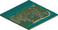
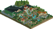
Full-Size Map
-
Download Park
448
-
Objects
1
-
Tags
Yeah this is really good, amazed at how well the diagonal splash boats turned out. Obviously get a chuckle out of the meta/commentary angle here too but bummed this isn't a full park, it is truly really innovative and boundary pushing work.
I laughed so much at the names of everything, and it's so well done. The splash boats, the go-karts, CTR use, and overall layout and atmosphere. It's a great example if "Dirty American Realism" and a lot of fun to look through.
Awesome work Walto, love the organic flow this piece has. I second G Force that it's a pity it isn't a full park, but a slice is still nice to have I guess. Maybe it's more a Design than a park this way
Also great you integrated the .wav as .parkobj! Hope this is the standard now.
The tongue-in-cheek naming is really funny as well
The (half) diagonals, architecture, color scheme, foliage/landscaping and crunch are all really good and makes the whole very aesthetically pleasing to the eye. Just wish there was more!
This stuff is textbook dirty american realism! I love it. The little jokes put a great twist onto it. This really shows how youve improved and youve developed your style in the latest years. Needed to directly look into Raptor again after seeing this.
Amazing execution throughout, there was no part of the park I looked at and didn't like. Loved it all.
Thanks for the positive comments guys, just wanted to leave some thoughts on my inspiration behind the park.
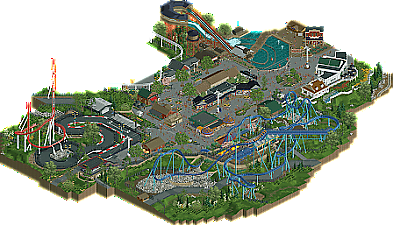
There were a few motivating factors that came together on this one. Seeing the Child's Dream go non-accolade rather than design certainly motivated me to try a more orthodox style, both in terms of concept but also aesthetic. I used a slightly modified English palette (I took the purples directly from Xtreme's Ascension micro and used a slightly warmer grayscale) and wanted to exhibit more restraint after pursuing maximalism in my recent work.
The park is obviously Cedar Fair-inspired, primarily a mash-up of three parks: Cedar Point, Dorney Park, and Hersheypark. During my freshman year of college I went on a weeklong road trip to all three, so this submission is largely built off of memories from that trip. The floorless is a Hydra clone from Dorney and the secondary coaster is loosely constructed after Steel Force from the same park. The splash boats are based on very similar rides at Dorney and Cedar Point. If I ever expand the map, I envision it resembling Hershey more than the others.
For some reason I really wanted to win a design rather than a gold, so I internalized the definition of a design and started to think in terms of ingredients: what are the exact specifications of a design and how do they contribute? That's how the names initially started, I wanted rides to be represented by their purest utilitarian function in the context of the design accolade.
Around the same time, DALL-E (AI-generated images) started to get really trendy on Discord and it got me thinking more and more about what an AI-generated park would look like in RCT. Furthermore, I started to wonder if my approach was fundamentally any different: I would typically poke around street view until I saw something I liked or recalled then try to replicate that into something new. Were my ride names just keywords defining my park? Someday we may no longer be able to tell the difference between man-made and augmented creation, maybe computers will get smarter but we may also just learn to think more mechanically. There were times when this was very comforting, it allowed me to disconnect and build to specific criteria rather than generate novel ideas in the open-ended realm of conceptualism.
Each of these motivations came together really nicely in the context of an overly generic American realism park. Naturally I chose the most generic name possible rather than try to come up with half a dozen half-assed generic names everyone would forget in 3 days. "Eh fuck it, let's just call it Amusement Park and people will come"
Anyways, thanks for reading, hope you enjoy the park
Dang, this was quite enjoyable. I think this was quite a nice meta commentary and I think your thoughts on AI-generation of parks is very interesting to read in conjunction with Amusement Park. I'd maybe disagree with you in terms of "restraint" here, purely because there is still a lot of detail and "crunch".. but it's perhaps rude to argue with the artist!
I think what you made is quite lovely. I'm a sucker for go kart tracks and this one is top notch. You've got great interaction with various rides criss crossing each other. There's some great creativity and object usage. Very clinical in a sense.
I think whatever you have next in the pipeline will be just as boundary pushing. You've done some amazing work in the past year or two and you've really spread your wings as a builder.
Really nice Walto. After reading your post, I appreciate the colors more. I thought it was a variation on what we've seen from palates before, glad to see my hunch was right. The purple really goes well with everything and is quite pleasant while making the color palate something unique to your style (of note, this is something that I really enjoyed about Ohio Stadium as well). As mentioned before by others the custom music being so seamlessly integrated is very nice, loved that upon first opening the file.
For being a realism submission, I actually have a few minor nitpicks but it comes down to taste so I don't hold them against the overall package very much.
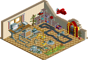
- I'm still confused about how the transfer table is supposed to function (unless I missed the sliders, which I could've).
- The final few turn pieces used at the end of the red hyper lack the flow that the rest of the map has (like there's a kink in the track there).
- Bottom of the splash boats being a long curve, would be nice to see it have a proper straight splashdown section somehow.
But enough of that. Fantastic submission. I rated it 85% in the public rating system, would easily vote 95 or 100 if some more time was spent on getting tracked ride flows finessed.
Looking forward to more!
This is too good for the theme .
.
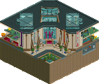
Really love this. Architecture and atmosphere are my favourite things of this submission. Only nitpick I have is that some of the half diagonals/diagonals feel a bit forced in there and it feels like they are just there for the sake of having half diagonals. The main coaster is a bit short imo but it still looks good. I also absolutely love the way you did the chair lift ride/station. The diagonal splash boats are cool but I wish you had done the run-out for the drop on the diagonal as well instead of having a turn immediately after the drop.
Overall excellent work though and I love how you are again making something that seems to fall a bit between a design and a park submission (Is that for the trolololz?), in any case this should certainly get a high score. Well done.
Lovely write-up Walt, knowing the complete artistic layer on this seemingly generic map enhances it a bit. I don't think you captured THE meta, because this is still seen through your personal lense. I think that for the archetypical design, you included too much secondary and tertiary stuff. The coaster is pushed all the way to the side, to an extent that you can argue it's not the centerpiece.
Taking it at face value, there are parts I don't like and parts that I really like. Genericness will always be somewhat boring, and some parts were just too glitchy/messy (go karts appearing to drive under the asphalt (nets)). The coaster was the highlight, I think, including its surroundings. I like how you tried to make the inversions look mid-sized, I think that was successful. Great landscaping. The water ride drop is a bit ridiculous, but it looks better than I expected. The real innovation that has tremendous potential is actually the flowing water in the lake itself. Best archy: the colonial looking buildings.
Congrats on the accolade! This is some minty realism and even more proof that you're one of the best to do it right now. That's definitely a memorable water ride alright.
amusement park winning design? monocle emoji face
finally got a chance to check this out, very funny. and obviously well-built too, although i don't super love the coaster. i do agree that the waterride and the ctr there was memorable! lovely realism. maybe the scale is all like one tick too short for me? but damn you use halfdiags like a pro. that white building is so good, and the arcade too
Never gave this the review I said I would. Overall, a lovely design that, in my mind, demonstrates a level of confidence in your parkmaking that is really deserving of the design win. I've often considered doing a park where all the names were generic (though taken in a more abstract-style then this) so it was really fun and brought a lightness to this I enjoyed. The archy, park details, and composition were really incredible, particularly the ride details. Something about the lifthill on the main coaster is just beautiful to me. Like I said elsewhere, I love the colonial-styled building with the back porch and cascade of flowers down the hill. Something about that feels so classically American theme park.
Oddly, while this is clearly a design grounded in realism, I think some of your forays into non-realistic parks are showing their impact here thru stylistic choices that make this really refreshing. The piles of rocks come to mind; they aren't quiet unrealistic, but they appear a bit more jagged and 'heavy' then what I think others might have used in their place. But ultimately, they look really cool, and capturing the aesthetic you want should be justification enough. Maybe a stretch, but I feel like you've been building with a greater sense of freedom as of late, and that's allowed you to create some really unique and refreshing work stylistically.
Congrats on the design again, and on what is shaping up to be an excellent year for the Waltos!