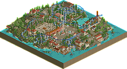
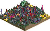
Park / Isola di Levanzo
-
 17-August 22
- Views 5,831
- Downloads 210
- Fans 0
- Comments 25
-
-
 72.00%(required: 70%) Gold
Camcorder22 75% CoasterCreator9 75% Cocoa 75% In:Cities 75% RWE 75% chorkiel 70% posix 70% saxman1089 70% Scoop 70% Terry Inferno 70% Xtreme97 70% Liampie 65% 72.00% -
No fans of this park
-
Full-Size Map
-
Download Park
210
-
Objects
1
-
Tags
Similar Parks
-
[H2H7 R2] Carreira da Índia
![park_3341 [H2H7 R2] Carreira da Índia](https://www.nedesigns.com/uploads/parks/3341/aerialt2950.png)
-
Eden
-
Acoma Pueblo
-
[H2H8 R3] Forum Caeleste
![park_4114 [H2H8 R3] Forum Caeleste](https://www.nedesigns.com/uploads/parks/4114/aerialt3853.png)
-
[H2H7 R3] The Hanging Gardens of Babylon
![park_3351 [H2H7 R3] The Hanging Gardens of Babylon](https://www.nedesigns.com/uploads/parks/3351/aerialt3058.png)
-
Riff Valley
Retracing our collective footsteps
Round 3 | Match 1
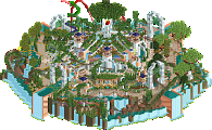
Port of Discovery
Isola di Levanzo
Ethan (98%)
Babar Tapie (2%)
ottersalad (80%)
G Force (20%)
Voting Rules
- You should only vote if you have viewed both parks in game.
- Take your time to reflect on each park. The poll stays open for three days, not three minutes.
- Everyone but players belonging to either team in the match may vote.
*Opens RCT2* Bitch I'm ready to vote!
I something wrong with my game or is Port of Discovery meant to "glitch" at many places? When looking at certain buildings objects dissapear and appear again sometimes and things are flickering. Some of it feels intended but others feel kind weird so wanted to check.
Got the problem both in the latest stable release and the dev build.
Edit: hmm....seems to be just an ordering error ... I was able to fix all the glitching by fixing the order of the objects with the tile inspector so I guess it was just some lost polish?
Great work guys - stoked to check PoD out! Detailing looks nuts. Ethan you madman
Also mad proud of Otter and G on this map. It turned out so beautifully. It was a pleasure to watch how it all came together with careful consideration and thoughtfulness. Really feels like a place full of history!
Ah apperently that fixes it. Might be usefull to add a comment somewhere to advice people to look at the park in openGL to get the right experience.
Isola di Levanzo is conceptually quite simple which I think works in its favor. The ampitheater is cool, maybe a bit out of scale for the objects used. The hedge mazes are a good consistent foliage throughline for the park. Love the oldschool white water objects, and a few of the structures are giving me strong Turtle vibes. Unfortunately I don't think Zephyrus gets the most out of the terrain, and the second half is quite compressed, although the final turn over the water is very nice framing between the buildings. I think between the two this one is more period-appropriate.
Port of Discovery... keeps crashing my game. But I am able to experience it in short bursts. The attempts to incorporate the default game station objects in to the theme are valiant and I would say... mostly successful. I am amazed you guys managed to not include a submarine. If anything maybe this park feels a little too modern, and the foliage palette is absolutely enormous. Every bush, shrub and tree you can imagine, and quite a few flowers too. Expedition Atlantis is I think the better centerpiece coaster of the two parks, though its station feels decidedly more random than a lot of the rest of the architecture in the park which feels extremely calculated.
Port of Discovery:
Great work that I really enjoyed checking out. Not sure if you nailed the classic vibe but I appreciate incorporating the entrance/exit huts and I love the emphasis on coaster interaction!
Isola:
This screams Otter, and I am loving it. The first park this contest that really nailed that classic vibe. Open spaces, architecture purely as a theming element and elaborte lift hill structures. Lovely. Only thing is I don't think it needed that pallette, that isn't very 2005 of you.
Voted for the Demigoddesses.
level island or something
- my first impression was that it all felt very familiar, though I wonder if knowing the builders influenced that
+ others have said already that this captures the vibe well, this would not feel out of place if released 15 years ago. I can see clear influence of Isole Calabria and little things like the goofy pillar supports on the lift hill sell the era well
+ lovely interactions throughout, the interior bay with trams, coaster, boats, and swinging ship was the highlight for me. Everything came together really well
+ great job guys, it never does too much but kept me interested for a long time
port disco
[] very interesting contrast here, this just feels like you played a PT2 disaster bench scenario and hardly modified your building style
+ obviously it looks awesome, object use is highly innovative and refreshing. The boat stood out, and the different ways you used argonath blocks and glass pieces were highlights throughout
- it's just so clear that this couldn't have been built in 2005. History lesson from a curmudgeon: back in the day, you had to use an external trainer called 8cars to remove clearance checks (it was still called "zero-clearancing" at the time), this was extremely glitchy and tedious. It required you to alt+tab from the game, and when you re-entered all scenery would clip, the ctrl key was dysfunctional, and it was difficult to build with precision. There's no way in hell some of these buildings would be possible because you'd have no clue what you're building and how things are coming together. I feel irrationally annoyed that those limitations aren't acknowledged in any way.. sorry that's not very leftist of me
I think port disco is more innovative and modern, but level island stays on task much more effectively. I'm glad I waited a day to look more thoroughly because my first impression was to go with the shiny new park with cool structures and fresh ideas, but after looking more it just feels like there's two different games being played here
Isola di Levanzo: Before anything, I want to say I saw the overview on my phone without seeing any names and immediately guessed Otter. Wish I had put money on it.
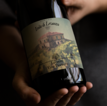
This park is gorgeous from head to toe. Peak Otter in his comfort zone; Greek theming, PT2 scenery, muted tones; all done to perfection. The architecture works very well for the setting and I can definitely see the Isole influence throughout. There's a ton I'm gonna have to study (read: steal) for the future. I love the combination storage shed for the trams and the dock for the river rafts. Zephyrus is a great centerpiece beautifully integrated with its surroundings. The spaghetti turnaround and the second drops are easy highlights. I am head over heels in love with Jacobi Winery; such a serene looking ride with great color choices. All in all a fantastic park with a plenty of classic influence.
Port of Discovery: Unfortunately this exists. While I may have voted a bit too hastily this round, this is the first park this contest that genuinely stunned me upon opening. This is insane! The trackitecture all around is so wild and wacky yet works so well for the hyper-ornate Jules Verne atmosphere. A Kaos for a gift shop? Space Rings as decorative sculptures? There's just so much I've never seen or thought of before. The rest of the archi is a little detailed for a 2005-style park but looks stunning and tickles my hyper-maximalist funnybone nonetheless. It's also kinda crazy seeing interiors throughout, and IMO they're done super well.
The selection of heavily themed dark rides really gives this park a Disney-esque feel. Expedition Atlantis is an outlier, but a cool coaster nonetheless. While I do like the dueling moments throughout, it could have used some custom supports and a lot of the ride is spent in block sections. Interestingly enough, this park still looks really good even without Expedition Atlantis as a lot of that space opens up yet doesn't lose much detail. This begs the question; is this coaster mandatory? A lot of H2H-style parks benefit from a big centerpiece coaster, but not having it hammers in the Disney atmoshpere just a tad bit more.
I'm seeing a lot of complaints about how this park doesn't exactly read classic. It is true; this level of intricacy and detail would have killed a 2005 parkmaker immediately upon opening. However, the wide expanses of tile paths really do give off a classic vibe in my opinion, as do the glass tunnels around Expedition Atlantis which remind me of Arch Angel by Titan. There's also a classic choice not many others thought of; cursed scenery and rides. It's definitely a risk pulling these out, but in cases like The Legend of Atlantis and 20,000 leagues they surprisingly work in my opinion. It surprises me how many deep cuts made it into this park considering how new Ethan is to the scene.
Overall, insane that this is technically a R2 park. Even if this park doesn't exactly fit the vibe of the contest, this level of speed and detail is practically a H2HX resume.
Note to self; don't vote immediately anymore. Even though Ethan kinda punched my head off, Otter's park has been seriously growing on me and I honestly think it's just as good now. Best round of the contest so far and either of these parks deserve to win.
Most enjoyable match in this contest so far for me.
Ethan and Babar's park is stunning in terms of architecture, details and very rich in ideas.
Otter and G Force's has a more simple, but very balanced approach, more reminiscent of classic parks, but with some more modern looking details here and there.
It came down to the atmosphere and overall feeling of the park I voted for, not really if it's more or less in the style of classic parks.
Isola di Levanzo has that natural, warm atmosphere, beautiful landscaping and foliage that I enjoy. Very classy and balanced in the way it's put together.
Port of Discovery is a bit too maximalist for my taste, even though alot of the architecture looks amazing and have very creative ways it's built with older objects. It falls a bit short in the way it's glued together in the big picture.
Isola di Levanzo:
As others have said, you nailed the classic vibe. It's understated but picturesque and atmospheric. As someone who's built a lot of LL in the past, I appreciate the skill involved in making blocky full tile structures and pathing look organic through good composition, and you did this very well.
Port of Discovery:
Great work - this had a really lively energy and lots of exciting details. Whilst I loved exploring it, I preferred the calm atmosphere of Isola. In some cases I think less could have been more, with the object palette here being a bit too varied, especially foliage.
Port of Discovery
I agree with the criticism that this park feels very modern, but the object selection ensures I can still somewhat view this through a nostalgia lens. And in your defence, not everyone built the same back then either. Maybe a mix of tyandor, Emergo and Foozy or yeshli2nuts could've come up with a park looking like this. Anyway, the park itself. It's very nice, steampunk themes can be very boring, but this park certainly isn't. Reminds me of Kinetus Seaport from Sonoma Falls, which is a great thing. The boat stands out as a positive, but also the parade - probably my favourite feature here. The area around the carousel is beautifully quaint. Atlantis is also cool, but the coaster is almost a distraction here. Seems like you tacked on the coaster late in the process, it's even missing supports in some places. Lovely launch section and station area though. Pro tip: make an elaborate outdoor queue and treat it like an adventure ride. 20,000 leagues ride is also cool. Less is more. Pick your best ideas and let them breath, and expand them as much as they allow you to.
Great stuff.
Isola di Levanzo
I love Greek themes! But I'll take Italian as well. Less is more: here we go. It's almost too little for me to buy it as an artist rip-off, but it's not fair to judge it by that metric. This is an ottersalad (+G Force) park. Colours are nice. Architecture is full of lovely familiar elements. Maze motif is nice. Coaster is nice but lacking some swing. Stylised supports though, that's definitely a plus! The ruins atop the amphitheatre are a nice touch. My favourite view:
Haven't decided on who I'm voting for. I really like both parks. Great match!!
Two great parks, credit to all the builders involved. I liked both, for different reasons.
Isole Italia definitely captured the "2005" aesthetic a little more, although it was potentially too simple... maybe i'm remembering with rose-tinted glasses, but feel like there was a little more detail in places back then. I didn't love the coaster honestly, especially the long section with only right turns. But the overall aesthetic, atmosphere and feeling felt really classic and nicely done.
Port of Steampunk had a LOT going on. Probably too much, for a 2005 throwback. But everything was interesting to look at, and I liked the theme a lot. The colors felt VERY classic, can't put my finger on why. Loved the integration of rides and architecture.
I have to apologize to the team that I don't vote for - both of the parks could have won for different reasons. I'm voting for Port of Discovery because ultimately I liked it a bit better.
Isola de Levanzo: I love the use of maze as landscaping. I particularly enjoy the bit where the train passes beneath. The integration of the volcano piece is done very well. Zephyrus is pleasant layout and I like the supports a lot. I don't see how that transfer track is going to work though... I want to see more from the G-Otter pairing!
Port of Discovery: I immediately got Discovery Bay vibes upon seeing the curve heavy architecture. That must be intentional. Very clever and effective use of the old custom flats. Love the architecture throughout. Journey to the center is a brilliant ride. Sid Kruk's Expedition Atlantis has a nice dueling moment and interacts nicely with the water. Great park.
Port of Discovery:
Really impressive architecture throughout with nice sculpture work, with some really creative object use. The coaster does kind of clip through stuff and has some fairly long un-supported sections which was the one thing that was "off" to me
Isola de Levanzo:
I absolutely love the atmosphere here, very classic and very peaceful, also very much fits the 2005 look. I also like the choice of a Virginia reel as a supporting ride, also the open air station and that impressive drop on the main coaster.
Overall a tough match with two great parks, both teams did great.
Super strong matchup here, I think both of these hit the mark in different ways.
Isola:
Definitely the most classic-feeling of the RCT2 parks we've seen in the contest so far. It still feels distinctly ottersalad however which is a great things to be able to blend your personal style. The most immediate feeling I get from this is of those classic spotlights like Isole and Ports of Magia. The center coaster is awesome, perhaps a bit too knotted in the first half before the second lift, but there's a few really beautiful moments such as that first drop over the maze/landscape - really eye-catching scene. The archi throughout is also very nice, liking the use of the lattice-behind-archway motif which feels very inspired and ties things together strongly. Very pleasant map overall, great job otter and russ!
Port of Discovery:
Damn, this is fantastic. Super dense in scenery terms which perhaps detracts from the classic vibe, but the object selection is really unique and makes great use of a lot of obscure elements (those Martropolis pieces especially). While the density and style feels modern, I think the theme and ideas on display are awesome, very reminiscent of disneysea and its rct imitators. The central coaster is cool, and has some strong setpieces such as the launch zone, and the interaction with the atlantis palace. I do agree that it's a bit shapeless overall, perhaps being lower down or interacting more with the path rather than mostly flying overhead might have helped. Also want to shout out the animal parade which is such a fun idea.
On the whole I think both parks achieve the classic vibe in different ways, though for Port it loses touch with the era a bit, but for me that's made up for with the creativity and spectacle of it all and Port won my vote in the end.
Really difficult match up. Both parks are really good.
Isola is so masterfully crafted and has such a serene vibe around it. It really gives me PT2 vibes and it also reminds me a lot of Diablo de Malaga from H2H9 which was also an ottersalad park except I think Isola is better. The coaster wraps through the landscape beautifully and I love that big bad wolf moment on the second drop. The landscape in itself was also beautifully done. I also applaud the virginia reel ride, we don't see those often so that was cool to see.
Port of Discovery was a completely different flavour of park and I love it for different reasons. It gave me a discovery land/disneySEA vibe which I think was probably intended. I just absolutely love the object usage here: the chaotic ride used as a roof for that gift shop, the super looper rides etc. I also really loved the amount of detail in this park, the architecture was absolutely stunning and I loved the parade and that little boat in the water. My only two gripes with this park are the following: I didn't really like the coaster layout. It felt a bit random and in some places it also overlapped/glitched which just seems a bit sloppy to me. My second gripe with this park is that while some areas do really have that classic vibe to it, other areas really do not imo. Some parts of the park just feel too modern imo.
Overall it was not an easy choice but I decided to go with Port of Discovery.
Isola was beautifully crafted with some great setpiece moments, really nice PT2 vibes. I love the tiered mazes and vineyards, and the coaster layout was super flowing and beautiful, definitely a design contender for me. While the macro elements are on point here, I felt the micro elements could have used a little more detailing in the archy to elevate it further, but overall it was a very classy submission.
Difficult vote, but went with Port of Discovery as it kept my attention longer and the ambition behind the park should be rewarded IMO. Great work to both teams!
Two great maps, so congrats to everyone on putting them together in the time allotted. Port of Discovery in particular is really impressive for a R2 park. Both parks do a great job of capturing their intended aesthetic. The structures in Port of Discovery are incredibly well rendered, and manage to be interesting and unique in a way that we haven't seen too often. Incredible to see this form of innovation in the game at this point. Port of Discovery feels very much like a statement piece, again showing off Ethan's skills in rct as a medium. I particularly loved the intricate nemo-esque architecture, the boat in the harbor, and the infrastructure and bridge/work throughout.
By comparison, Isola feels like the embodiment of what this contest was aiming at. Very classic rct, finding a soft balance between ideas and content to explore but with great care to composition and providing the space for everything on the map to breathe. I love the use of mazes as landscaping, the ruins that feel so true to PT2 style, and the station (I feel like this was a common but beautifully reliable form of station at the time, as it gave builders a way to cover the huts while also leaving the track visible).
I could really have gone either way on this matchup, which says a lot about their quality so hats off to both teams. What it came down to for me was the overall vibe of what I felt the builders were trying to accomplish with the style. Port of Discovery felt like a modern concept rendered in older objects, still featuring a lot of the tell-tale signs of how we build today that wasn't possible then. This isn't an issue in nearly any context but this contest, where I personally feel a classic approach to the game was the goal. And while Port of Discovery had more to explore, Isola felt spot on to what H2HC is all about. Nuanced in its approach to composition, throwback-y to a style and aesthetic of the time, and yet allowing the parkmaking to shine because it has stripped away a lot of the frills we rely on today. I think in a regular H2H I might have gone Port of Discovery, but here my vote goes to Isola for really capturing what I see H2HC to be all about.