Park / Thrill Point
-
 19-May 23
- Views 5,121
- Downloads 371
- Fans 8
- Comments 20
-
-
 86.50%(required: 80%) Spotlight
Babar Tapie 90% yes In:Cities 90% yes Jappy 90% yes RWE 90% yes bigshootergill 85% yes CoasterCreator9 85% yes Faas 85% yes Liampie 85% yes posix 85% yes Scoop 85% yes wheres_walto 85% yes Xtreme97 85% yes 86.50% 100.00% -
Description
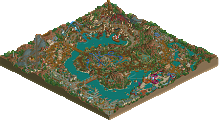
The flagship park of the European Thrill Point chain.
-
8 fans Fans of this park
-
Full-Size Map
-
Download Park
371
-
Objects
1
-
Tags
Similar Parks
-
Tectonic Clouds in Harmony
-
Tropico Horizons
-
Discovery Bay
-
Liseberg
-
Silver Valley Theme Park
-
Universal's Outrage
fine I'll be the first to comment. the thing I really love the most about this park is
Here's some little things I love about this map.
Park entrance with the coaster silhouettes and sign with the logo. Great idea - where are the cars?
Hedge maze is sick. Nice to see the bush vehicles used
Big fan of how the coaster stretches over the path. Would love to be there in real life.
Excellent helix and path placement. Again, great placemaking. Would love to visit in real life, but would hate to be on the horticulture team trying to get to those flowers.
Love the placement of the corkscrews right on top of everything. Great interaction points.
One of the best little queue entrances I've seen in game.
I just like this planter and directional sign.
The pathway to posix is a dangerous one indeed
String lights = atmosphere. Love this spot - especially the curved wood around the doorway
Pressure meter is great.
I love space things and geodesic greenhouse things are included in that
Awesome little UFOs. Your show set scenery design choices for rides are always well thought out
Love these little shows throughout
Your park definitely has a big budget for signage
City Walk 2: Belgium
Obviously i'm not a huge coaster guy, but every coaster and ride I've seen in this park so far has been top notch. Great work man - really happy to see this monstrous park released!
What a park, there's just so many little scenes and details in both the park and surroundings that add life to it, and I love how the park is placed on the map, and how the surroundings add context to it (Along with the history readme). And the pathing and layout definitely feel natural and something that got built over time as the park expanded. It all makes it that much more immersive and believable.
Also a fun choice of themes to go with, the space and Hawaii area I think are my personal favorites. Personal favorite coaster I think is Phantom, the layout, support work, theming and interaction are fantastic. I also like the choice to build a multi-dimension, a rarely built type and a great fit for the area.
A really wonderful park with a lot of immersion and a stellar ride lineup. I'm a big fan both of your choices and of your interpretation of the themes you've went for. Whenever you release a park, it's so clear how much fun you're having with the game and I think you've once again brought really interesting content to the table. The rides in your park are just absolutely top notch every time. The 4D coaster, the arrow, that wonderful multi-launcher, and the GCI are all brilliant!
Congrats on finishing this masterpiece BG. I've been honored to follow the building process from the beginning and it was very fun to follow how this park came together. I know you've put in a lot of extra work polishing the park, adding extra details and of course, the Belgian outskirts (which I really like, feels so recognazible as a Belgian). And it definitely payed off! Thrill Point really feels a level up compared to your previous parks.
Stuff I liked:
- The Barons Mansion, what a great facade and kudos for adding a haunted mansion. A ride we don't often see in this game (sadly)
- Phantom's station
- The composition in the viking area: the rapids with the GCI as a background would make such an awesome view irl
- the whole atmosphere in the Arabic zone, for sure the best zone in this park imo
- the pressure metre in the steampunk area, I also like how cramped this area is. Gives me Rookburgh vibes.
- I like how you kept the space area very realistic. I know there was a call for adding foliage but I'm glad you resisted that. The little (red) plants you did add, are subtle and could be explained as failed or beginning attempts to grow plants on Mars.
- The whole Hawaïan zone, together with the Arabic zone a favorite of mine. Great atmosphere here.
- The ride signs
And of course, as every BG park, filled with great coasters. A natural strength of yours, coaster layouts. Hard to chose a favorite, would probably say Phantom is the coaster I'd love to ride the most. I also have to say the choice for a strata coaster is ballsy, as the huge tower can be a distraction for the viewers. But you placed that really well and not from one angle it disturbs any view. And that while the tower stays visible in the map edges. A sign of great composition
Congrats BG, really awesome park and for me, your best work so far! As a fellow Belgian I do hope you get spotlight with this. Which would make the first spotlight for a Belgian. I'm sure all the Belgians here are rooting for you!
Congratulations on this huge release BG!
Here are some (fairly random) things I particularly enjoyed:
Cool cantilever roof structures, especially the coaster station. Also love the mostly grey and neutral tones here with just a few bright colour accents.
Another exciting colour combo in the space area - I'm so glad you went with green! The supports look awesome here too.
I thought this little patch of desert infront of the area gate was a tasteful design decision - a great way to make the theming transition seem not too abrupt.
I love this art deco station structure.
These tophat supports look awesome and the feeling of depth you get in this viewpoint with the low-roof backstage stuff behind is really cool.
V1 Review
V1 Seal of Approval:
+ Fantastic path level detail all across the park
+ Some very creative ideas all across, like the pressure needle
+ Amazing Entrance
+ Area behing the entrance is strong
+ Cruising Cadillacs. Maybe a bit short? But what is there is very good.
+ The Baron's Mansion is absolutely amazing, both the outdoor and indoor theming.
+ Hedge Maze
+ Viking area is just absolutely fantastic, on every level.
+ Beach area is great
+ Good park infrastructure
V1 List of Neutrality:
+/- "Mainstreet" has some strong and some weak moments
+/- Arabian area is good, but just doesn't really come together for me personally. Hard to explain exactly why I am tripping up.
+/- Industrial Area: See Arabia. Maybe a bit too busy and chaotic for me.
+/- Race section is good, but at the level the park is it's not really moving the needle one dirction or the other
+/- Path layout maybe a bit awkward?
+/- Surroundings are good, but they don't really factor into my enjoyment.
+/- would have liked to asee a show of some sort
V1 Scowl of Disapproval:
- "Mystery" section had three mansion type buildings, which is maybe one too many (especially since they are all very different from each other)
- Absolutely not a fan of the space area. I get what you went for but it's not doing anything for me.
- Since you only have one darkride it would have been cool to get at least some indoor theming, similar to the drop towers and the madhouse
V1's Opinion:
This is a weird release for me. On the one hand you clearly stepped up your game after Timber Valley but then again, Thrill Point simply did not hit my personal tastes as well. Which means that paradoxically, I myself will give this release a lower score (fully expecting that the panel will rtightfully give it a higher score). Nevertheless, it's a fantastic submission and deserving the Spotlight label it will surely get. 80%
I think this is a step up from your previous releases and definitely an enjoyable watch!
It's seems way more thought out and cohesive, while I thought your previous releases always started with some coasters and then thinking of surroundings later.
I loved the custom flatrides! While I don't think the standard flatrides are necessarily bad, and I would like to have seen them more incorporated here, I appreciate the effort made here, and it definitely enhances the theming, with stuff like the carpets, the cars and the jetskis.
I appreciate the efforts in the surroundings, while I didn't really care for them much, they could have been left out imo. But that's not a bad thing.
I liked the industrial/steam punk area a bit less, because it was a bit busy and hard to navigate.
I loved the area with the rapids and the woodie the most I think. Cool twist on the rapids theme with the ice.
Very good job otherwise! I think you deserve a spotlight with this.
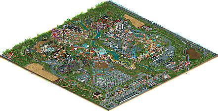
Congratulations on finishing such a massive park. I can’t believe it has been three years, it feels like it was last summer or something that you started showing bits of this on Discord.


Usually I’m one of your bigger critics. Unfinished and unrefined bits, slightly inconsistent aesthetics, a focus on gimmicky coasters with gaudy colours usually turns me off a bit despite your work being typically of very high quality otherwise. I’m mentioning this only because I think you outdid yourself and this park transcends my usual criticisms. I’ll go around the park, writing down some observations.
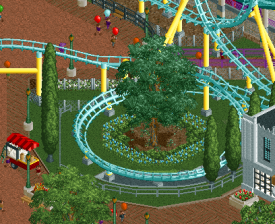
Entrance: Cool. Grand. Nice lines. The plaza behind is atmospheric, DAW-esque too. With the arrow coaster behind, reminiscent of Starpointe, this area almost feels like a reference to Pac’s body of work. Nicely illustrates the stylistic progress that has been made in the realism genre during the past decade. The helix tree has been mentioned. Pretty cool, but I think it could’ve been stronger with fewer layers of fences and things, and maybe a tree that matches the other trees in the area.
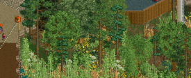
Horror area: Phantom is spectacular - the layout and the theming. Beautiful colours and I love the entrenched sections. The ghost appearance (?) near the end of the coaster is a super cool touch. The hedge maze is a bit easy, but it looks great, and the idea is great. Lovely mansion(s). What I like about this area is all the ornaments, mausoleums and gravestones. And rather than going with an overgrown/dead foliage look you’re going for lush and blooming - which also fits a graveyard well! The contrast between the lively foliage and the theme of dead and dread is nice and more immersive as an actual graveyard. Avoided the cartoonish successfully.
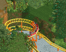
Viking area: this area has some of the weaker architecture in the park, despite some nice touches. The area makes up for it in other departments. The ice lake used by the Blizzard River is amazing looking, and I love how Raider is also positioned on this lake. This feels so believably theme park-y! The same applies to Jormungandr and the plaza in front. There’s a lot going on here and it looks great and lively. The Yak challenge is cool, but I’m not sure what a Tibetan ox is doing in Scandinavia, and why an orange human is having sex with a tan human on the floor. Nice idea to put a strongman game with a hammer here, fitting. The stone path texture works so well in this area. Oh, there are two coasters here - almost forgot. Fenrir is a fine filler ride. Huldra is more like it. Not Phantom level awesome, but it’s great nonetheless! Especially as a backdrop for Blizzard River. It’s nice to pan over to Huldra and find that the area stretches back further than I thought at first, with more details to discover. The waterfall, the rotating station platform and stuff like that is hidden almost too well.
Arabian area: this is the only area where I can’t agree with the coaster colours… Otherwise the colours here are quite nice. Soft tans and earthy tones complemented with blues and yellows. I would’ve doubled down on that aesthetic, leaving out any greens, reds and purples. Highlights here are the highly customised flat rides, the central plaza with its fully clothed belly dancers and cool looking fountains. The use of water in this area is a commendable choice in general.
City of Steam: is this the only named area? What a dense area! Perhaps you went a bit too big here, the show buildings (sometimes empty) are a bit too big for my tastes. Also not a fan of the brick texture you chose and how heavily you used it… I’m not sure I like this area over the similar area you did in Imaginaerum. Shit, was that six years ago? Anyway, on to the stuff that I do like here. The paths. Great choice. The red mess hall. The Antwerp Central dome, though ideally it’d have the same colour glass as the neighbouring building. The rusty facade next to the hangar is beautiful. The generator rides look super cool. Gravitron type?
Area 83: glad this area is also named. Another case of bold colour choices paying off here. Xeno is a great (looking) coaster and I think it’s great to see a S&S 4D coaster that is medium sized, that is unique! I’m loving all the sculptures, murals and other features that are everywhere in this area. Glad you kept this scientific and didn’t include much alien bullshit sci-fi.
Racing area: a more traditional, low theming area again! Nice change of pace actually, but it illustrates the jarring contrast with the City of Steam. Tents, food trucks, cheap steel architecture, tries… It pretty effectively creates the right atmosphere here. Slipstream is actually looking fantastic for how boring/simple the ride itself is. I can actually enjoy the technical details because of the clarity and pleasantness of how you made it look. Back half of the area (cool half diagonal bridge over drag racers!) is nice enough. I love the look of the raised paths towards the speed way. Feels theme park-y. Racer is a pretty pointless inclusion in my opinion, at least in the way you’ve done it. One of the few ugly spots on the map. The only somewhat interesting thing here is the half circle station.
Hawaii: the view on Xeno must be amazing from here. Area itself is excellent 2023 meta stuff. What grid? Colours are generally beautiful again. Area is composed beautifully. Large and open, but still dense and lively. It reminds me of what we did in Happy Valley Hangzhou. Good stuff: the colourful bright canvas awnings, checker pattern on Frisbee (and the tires below!), Tsunami queue, Surf Slide, Rip Tide sign, Rip Tide. I love B&M Hypers and Rip Tide is certainly one of the cooler layouts we’ve seen as of late. Wish its surroundings were a bit more interesting though… Which brings me to the criticisms. Green steel roofs? Why not also bright blue? I changed it and I think it looks much more striking. Trackitecture Tsunami sign is unnecessary and out of place. Orange Frisbee top clashes with the red. Dead shark strung up also seems a bit out of place in this otherwise happy and carefree beach resort looking area.
I think I’ve been everywhere now, except the surroundings. I’ll keep it short: you included enough and did it well enough to sell the idea that this park is set in Belgium, though in some spots it seems like you didn’t have the patience to make it look organic. And it would’ve been nice and fitting to see some ‘koterij’ here. Parking lot and its entrance are top tier.
My usual criticisms still apply to an extent. It looks like you put in some extra effort to polish this park, but a few spots could’ve used some extra love and care. Here are a few examples. I admit that even though I notice them during viewing, I had to look hard for them when I went back for the screens. They’re relatively rare.
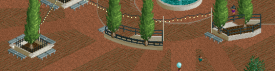
Lovely grand entrance square, but you’ve got three planters that look like they’re supposed to be in the same style. With three different fence types. Why?
The chaotic helix. Fence chaos! Count the number of different fences. Tighten it up!
Like I said earlier, the back half of the race area and the coaster ‘Racer’ itself is one of the weakest spots in the park. It looks very undercooked.
An example of a spot you missed. It looks unfinished to me. Also, those coaster colours...
You missed a spot!
You missed a lot. Very undercooked...
Had to use cut away view to take a screen showing it well from one angle. I think you forgot to do any texturing work to the land here.
This bridge is another weak spot in my opinion. The tower doesn't add anything but visual clutter, string lights are excessive, and that 2x2 half diagonal planter doesn't look organic. Too large for the space it's in.
Not impressed with the architecture here (ground level is good). Why so many wooden textures? Pick one, stick to it! This is messy, even primitive.
I wanted to include a screen of the backside of the City of Steam show building but for some reason the screen won't upload. Well, whatever. Enough criticism.
All in all this park is stellar, and I’m pretty sure you pulled it off this time: spotlight. Congratulations on whatever impressive score you’re getting. You’ve got my support and admiration! When this park receives its score, I will try and come back to post some screens of the things that stood out positively to me!
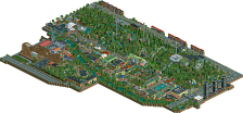
What an absolute triumph. Congratulations, dude, this is incredible. Right away I'm awestruck by the entrance area executed nearly entirely on a diagonal. As far as parking lots go, this is top tier stuff. Zooming out, this park is huge and carries 5000+ guests with ease.
Spent another 15 minutes just taking it all in, the plaza around Djinn is a definite highlight, as is the bridge over drag racers (Slipstream is quite rough and I wish the go karts were functional because the track looks great), Xeno is probably my favorite coaster in the park for the support work, Lift-Off entry building is outstanding. I'm impressed by the density of entertainment throughout, every path feels alive and busy, but in some places it approaches overload (quite fitting that the industrial area coaster is named Overload).
Most of the outskirts don't feel nearly as polished, in my opinion. I don't think they add much to the park beyond placing some geographical context. I didn't spend long looking because I didn't find much interesting to be found out there. It didn't feel like you were quite as inspired by those areas as you were by the ride and park elements.
The strongest impression for me came from the entrance, I was absolutely blown away by that area, most of the rest I found excellent but largely conventional (not a negative) with a bit more filler than I'd like. Still, to finish something on this scale is truly impressive and this is unquestionably a Spotlight winner for me
Obviously a fantastic park, and a step up in quality from you compared to your previous parks. Unfortunately (or fortunately?), the whole community has stepped up in quality in that same time period, so I feel like the score you end up getting may not be fully representative of the quality of this park compared to your previous parks.
I think the surroundings were undercooked - they needed a fair bit more work and definitely feel like an afterthought. I can tell you did not have as much fun creating the infrastructure around the park as you did creating the park. Some of the buildings do look like they would have taken 5 minutes to make. I think if you has spent some more time here, that's what could be a major difference between a high level gold and a spotlight.
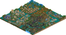
The entrance area is great. The actual ticket booths, entrance, coaster station and layout are all fantastic. The architecture feels like DAW, but not quite to the same level. Keep in mind DAW is now 10 years old, the architecture here definitely felt a little lacking compared to what today's standards can produce. The art deco stuff towards the back of this area also top quality.
Spooky area is one of my favourites. Coaster is incredible, one of my favourite inverts in a long time, and the way it interacts with it's surrounding is definitely top tier. I love the haunted mansion style building, that's done really well, and as Liam mentioned above, I like that the area feels lush and green rather than brown and dead as most of these type of themes do.
Viking area is definitely the best in the park and feels like the one you had the most fun creating. I love the interaction between the wooden coaster, the river rapids, the swinging ship and the family boomerang. That whole area feels so much like a Europa Park or Phantasialand style park, it's truly incredible. The landscaping is great, the little details are great, I like the simplicity of the architecture for the most part. The one thing that lets this area down is the chairlift station building. It's too large to be so monotonous and boring. It looks like you tried to create a stave church, and you've got the scale right, but you could have gone so much more theatrical and fantastical with it. More roof, less wood, etc.
Arabia is good too; again I love the coaster and how imposing it is. Architecture here is neat but nothing amazing. I think we've seen a lot of this style architecture over the past 3 or 4 years, and I don't think this quite hits some of those heights, but it's still good enough to get the theme across and inoffensive. Foliage in this area is lush and green, very appreciated again.
Then we go across the river. I'm not sure if I'm the only person that feels like this, but I feel like this side of the river is a big step down in quality unfortunately. The steampunk area feels old, boxy and outdated. The brick texture is possibly the worst brick texture you could have picked! The details in this area are fantastic, but overall I'd actually say I prefer your last steampunk area more, and I think that Disney Vancouver showed us what the peak of steampunk looks like right now.
The space area is very well done, but doesn't hold my interest like Viking and spooky areas do. This is possibly the most 'little detail' flush area of the park, and it almost feels like a Faas park but on a larger scale. I do like this area and I'm not sure what I'd change about it, if anything, but I feel like it just doesn't fit in with the rest of the park sadly, perhaps because of the different colour palette it uses with the landscaping.
I'll edit this with the rest of my thoughts later, gotta run for now.
Overall, a fantastic park that is a massive step up, but I don't think it quite hits the spotlight heights just yet. I'd go 85% Gold if I were scoring. I think the Viking area and Spooky area are spotlight worthy, but think some of the other areas hold the park back a bit. I think the racing area and the surroundings are high silver/low gold level, which shows quite a big disparity between the areas in one park!
I get it, but I also think it would be a shame if it's the surroundings that make the difference, if we're in agreement that the park itself is good enough. I think you can justify the density and quality decreasing towards the edge of the map. I think it's pretty common for creative works to have a fade in/out rather than a hard border. Could be practical, but you can also argue that putting the surroundings out of focus puts the central park in focus. We've seen literal map fade outs in RCT, why can't this park be treated that way? Just thinking out loud!
Intent matters, and when it's not clear I think it's fair to penalize for it.
BG, you know most of my thoughts on the park already I think. Hopefully I can fit in a review at some point but I'm very much on the edge here with a lot of stuff. Much of this definitely is an improvement, but some of it feels like a step back. From a macro view this park doesn't quite have the strong identity that Timber Valley did, which hurts it a bit, though I think the main rides are technically much better in many ways.
Don't think I'll vote as I don't have strong feelings one way or another right now.
Congrats on the big release BG. Lot of work to be proud of here. I'll begin by saying I enjoy this park more than Timber Valley and think it's a step up for you. I'll give my thoughts on each area:
Entrance:
I think the entrance was cool - always a fan of art deco. Station and layout for Neon was a highlight of this area. Love how bright it all is. One thing that holds this area back is how simple the archy is in spots. Especially the tram stop and row of shops ? infront of the Neon station. Feels underbaked in relation to the care for the coaster supports, landscaping, queue. But I do enjoy some of the small details like the popcorn cart, the height marker at the coaster queue, and the custom flat ride.
Spooky Mansions:
Phantom is great. Love the overall theming. Station has great detailing. The idea of having the mausoleums and the ornate archy was better than the usual dead trees and graves we see with spooky theming. Some bits of inconsistency here though. For example, Tombstone queue cover is 4 units tall, Ye olde broth roof is 4 units from the ground, but the first floor of the Gothic restaurant and soup is 8 units.
Vikings:
Great immersion here. I think this is the best area in terms of that. Lot of path details, and elevated theming in terms of the flat rides but also the landscaping for the rapids. Really sells the overall vibe. Huldra is a great wooden coaster as well. Good time to mention how wonderful all your coaster layouts are in this park - clearly your best strength as a parkmaker. I know I already said it, but just love the theming here - really feels like a true big budget land.
Arabian oasis area:
This is where the variation in scale stands out. Djinn is huge compared to everything else. I can see it two ways: it’s very large and looms over everything in a good way. But also, it makes the archy all feel quite small. Besides that, I like the plaza a lot. Great colors again and theres a lot of variety in what you built; each building feels unique. Happy to see a dark ride here too.
Racing:
As an auto racing fan, I appreciate this area a lot. Food trucks are cool and seem very appropriate. Hot dog truck is cool! Slipstream was simple but I think also appropriate for the theme. All the cars scattered throughout would be cool to see IRL if they were real. Area by Racer and the go kart track felt a bit lacking. Wish the go kart was peebable.
Area 83:
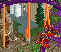
Love a good space theme. Architecture was top notch and really sold the theme well. Lot of cool details like the geodesic dome, those light posts with the yellow orb on top, the bathroom building. The lift off station/structure was cool - but I thought it was going to be a part of the coaster! To see it housing a few drop towers was a tiny bummer. Meanwhile, the coaster is a unique choice, great layout, colors go great here with the overall aesthetic but is just over dirt and rocks with a basic box station. Wish the unique Mars base archy was carried over to Zeno more. Maybe even more alien-themed considering the name.
Beach:
Love it. RipTide is great. Nice flow to the ride. Love the sign. Such a sucker for bright and tropical stuff.
Steampunk:
Lot of kineticism here which is nice. But here’s an area that scale feels off again for me. That tall brick building with the tram is just oddly proportioned when compared with the 4-height floors we see in the entrance area, spooky area, and Arabia. Having said that, Overload is great. Love the theming and how dense it all feels. The two different balloon rides were appropriate to the theme as well.
Outskirts:
Don’t love them, don’t hate them. Seem like filler to me. But I do appreciate the houses and the pickle ball courts near the parking lot. Seems “lived in”. Some bits feel off though like the exposed train tunnel thing and the short/squat bus shelter near the parking lot.
Overall there’s a lot of quality here. Definitely spotlight level work in areas. Namely the spooky and viking areas, your landscaping and foliage in the park itself, and the coaster layouts. Also, all the little theming details Josh pointed out. Those bits you’ve knocked out of the park. But then there’s some high silver gold bits in there as well. I think I’m in agreement with Trav here. Despite whatever the score/outcome is, this is a park to be proud of and clearly something that has shown your growth as a parkmaker.
I think I agree with you if it were a 95% scoring park, but for something that for me is borderline spotlight quality, I have to judge it for everything on the map. If we think of rct as art, would you not judge an art piece based on the whole thing, and by not doing so, you're doing the artist a disservice?
Doesn't matter what I think anyway. Congrats on the spotlight BG! Been a long time coming.
So this is what I told BG when I saw it:
"My three biggest takeaways in this is how much love and effort you've put into this, how consistently good this park feels, as well as how far you've come in your compositional chops. There are so many little things that really make the viewer resonate with not only how much heart you've put into this work, but the journey of ups and downs you had to get to your magnum opus. This aspect reminds me a bit of JKs last park.
You've really cleaned up your biggest flaw in your work thus far, which has been composition. You've gone out of your comfort level and gave up a lot of the tropes you held; those of which were holding your work back significantly. You started to do that with Timber Valley, but with more time passed the sweat equity of this is paying off dividends for you. Composition was one of the two things holding you back from spotlight, and thus I feel you've more than earned it with this release.
Another big improvement in this park is how consistently great it feels. Even the bits I'll criticize later in this review pale in comparison to the sad truth of having those 1-2 areas in your previous parks that really held it down for me. There is nothing here that I don't thoroughly enjoy. Some things here had true wow moments that I think for how jaded I've personally got with rct over the years is refreshing and even more meaningful.
Your theming and structures in general range from servicable-but-still-spotlight-worthy to some really incredible shit. The retro/googie 50s area of the entrance is quite spectacular, as is the viking and arabic areas. The steampunk area is slightly too busy and illegible in terms of path clutter, which unfortunately contrasts with some of the underdetailed, spartan facades in this area. That luckily is by far, in my opinion, the weakest area. A few, but not many spots in the space and racing area could have used a little more refinement. Those areas are still worth a spotlight accolade albeit for me fall around the 82-85 range.
Your ride design is impressive as always. It may be one of your most unappreciated assets in the community, I feel. The lineup in general is about on par with Timber Valley, even though your former park had "higher highs"; this time around the average feels slightly higher.
Your attention to foliage and carving out spaces using greenry is excellent. I feel that you've not only learned, but mastered tactical placement and design for planters as well as framing things compositionally with foliage.
Outside of the park does a good job of contextualizing everything and it feels tangible. The outskirts have a cursory amount of love put into them, even if in places it feels that it's lacking the personal touch and details to make them feel alive. Still, I think it's definitely "enough" and serves its purpose."
Overall I was not surprised at Spotlight (I personally was on the fence about it) but I am that it was held universally so.
What an awesome park, and a well deserved spotlight. Can't quite believe some people aren't seeing this as spotlight worthy, it's high quality, huge, and consistent throughout.
Every area has excellent ideas, the theming is believable and really well executed. I really like all the rides, potentially a few of the color schemes aren't exactly what i'd have chosen but overall it's just a really great realistic european park.
I love the surroundings, you could have had exactly none and it would still have been a great park. But the fact that you've gone above any beyond to build this park into a setting really elevates it. The farmland especially hit a chord with me, reminded me of Phantasialand in terms of the setting.
My favorite area was definitely the dark area with Phantom (great name, great coaster). Top notch setting, some great supporting rides and theming, loved it. The viking area was also great, another fantastic coaster there. Can definitely imagine entering that area, turning right and going round into that section with the wooden coaster dominating the skyline over the rapids lake. Looks so fun.
wow, congrats on an amazing park and extremely deserved spotlight. every area was filled with excellent construction and well-designed rides, with great peep sightlines and interactions. feels like such a mature and advanced version of the kind of parkmaking we already expected from you. my favorite area of all was actually the viking area, and in particular the rapids ride nestled into the woodie. completely stunning composition and themeing here, really very memorable.