- Views 1,904
- Downloads 185
- Fans 5
- Comments 14
-

-
 76.50%(required: 65%)
 Design
CoasterCreator9 85% robbie92 85% In:Cities 80% SSSammy 80% Terry Inferno 80% Babar Tapie 75% ottersalad 75% RWE 75% Xtreme97 75% Faas 70% posix 70% Scoop 70% 76.50% -
Description
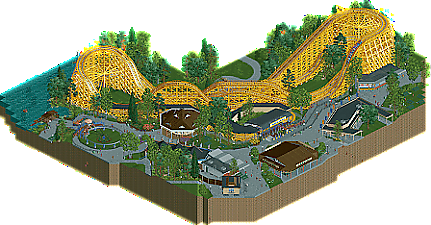
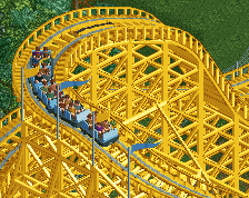
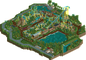
Skyliner is a Herbert Schmeck classic, built in 1930, and modified shortly thereafter, the ride packs a punch. Here it's shown as it would have appeared in its prime during the 1970s, only a handful of years after receiving it's iconic yellow paint scheme and updated station structure.
~~~
Guess I just couldn't get enough of the old school classic American park style after Mahoning, haha. But I think this is a little different, wanted to experiment a lot with half diagonals and the new colors OpenRCT now offers. This was a real joy to make, hope you enjoy! -
5 fans Fans of this park
-
Full-Size Map
-
Download Park
185
-
Objects
1
-
Tags
Similar Parks
-
[NEDC4 2/15] - Ghoul
![park_3790 [NEDC4 2/15] - Ghoul](https://www.nedesigns.com/uploads/parks/3790/aerialt3443.png)
-
Evergreen Gardens
-
Huracan
-
The Big Smoke
-
Ancient Ruins
-
expo77: Worlds Fair Houston — Entertainment Complex
This captures the feel of an older ride that's been updated over the years so well. The layout, with just the right amount of odd things for a historic coaster like this, and the bold color choices work great. Also love seeing a tumble bug recreation like that.
I loved the coaster and its colours, and the station is very effective and beatiful in a retro way. I also liked the flower planters and the amount of colour touches it provided!
What I didn't like in this submission was that I thought most half-diagonals were unnecessary and put there just for the sake of having half diagonals. The midway arcade style building could have just as well been a diagonal building, allowing you to add more detail, as well was the building outside the park near the water. I don't really like how those half diagonal shacks seem to randomly pop up in a lot of parks nowadays.
Another (nitpicky) thing is that I think the amount of fences and railings near the boat hire ride is a bit much and confusing. I would have liked to see a more conistent style there. Especially since elswhere in the submission you succeed at keeping it effectively simple.
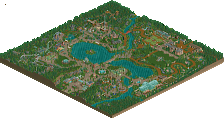
I love this, realistically the only thing holding it back is the very narrow slice. If this had wider context I would vote it even higher - though I appreciate how time consuming the angles could be
Lovely. I agree with Sammy that this is very realistic. I'd add that this feels very simple at first glance, but there's definitely some nuance that I think adds a lot of atmosphere despite the narrow slice of park.
The elevation change underneath the coaster I think make the turnarounds near the water more exciting from a rider's perspective.
Architecture-wise it was pretty simple, but seems accurate to what would've been made in the 60s and 70s. Feels spartan in a way. From seeing pictures of Euclid Beach Park right before it closed, this feels very similar to that.
awesome
Another piece of old Americana. You are really nailing the atmosphere of it but I wasn't the biggest fan of this park. Mainly because I'm conservative on wooden coaster colors, I just like them in their natural brown colors. White is ok but the yellow just didn't work for me at all.
I agree with Faas that most half diagonals were just not needed and just were there to be half diagonal. Not adding anything extra. The best buildings on this map are the station of the woodie and the dodgems. Both on the grid
I do sound harsh but that's just personal preferences speaking. I really liked other work from you, this one is just not it for me. Still looking forward to see more G Force work.
Finally got a break from the chaos to comment. Overall, this felt really mature and elegant. Well constructed, a good balance of details and modern technique with more understated elements that give it life. The historic element, the feeling that this is a little look into a bygone era, is very admirable and really harkens back to the foundation of what this game is all about. I think that is what really carries this design most of all. While I know the coaster is aiming for accuracy, I didn't find the layout overly exciting, but I don't think that is the intent of project like this and thus I don't really think of it as a requirement. The focus of this was capture a specific coaster in a specific place and at a specific time, and it that it excelled.
I thought the half diagonals were well incorporated here, natural to the composition of this real space. I don't see the fact that Chris Sawyer arbitrarily decided everything would be on a grid as some ethical standard we should adhere to 20+ years later, and I'm excited to see people continue to push the boundaries of what rct can do. Definitely design worthy in many aspects, so congrats on the release!
nice to see you finally having a breakthrough with this game
I really love this. Subdued and elegant, super natural feeling and really serene.
So I guess I understand people just not really liking them as they're a little bit of an aesthetic departure from normal objects but I really do enjoy using them and in the least bias way possible think they worked great here.
Anyways, this never was intended to be the most detailed or super maximalist etc.. just sort of a more chilled approach that was ultimately fun to build in over anything. So really glad people liked it! Going forward this is probably more sustainable as a style than some other things I've tried so maybe more will come in the future.
Bummed this isn't getting more attention. Or at least the last vote it needs...
Congrats on the Design win! This is a nice companion piece to Mahoning while adding some extra experimentation to the style. The half diagonals work well and are a successful experiment that could definitely translate to larger map. A building like the tavern wrapping around a flat, such as a partially enclosed Whip, would look great in a larger context. It also works in the subtle spots; like the curved chain link fence surrounding a more understated regional park backstage of small roads and individual outbuildings. There was also a lot of interesting object coloring using the invisible color option and I found myself using the eye dropper tool to deconstruct how you achieved some things while keeping your traditional clean and readable style.
The small 1-2 tile elevation changes with sloped concrete and stairs really add a lot as well. This type of map could look a lot more boring without that extra touch of landscaping.
Based on the screenshots I thought you had converted the layout to more of an "S" shape but this makes a lot of sense as an Idora inspired semi-recreation. It's not the most fun layout to watch and it is a shame some of the ferocity was lost in translation but that's a nitpick as it is effective and well crafted as-is.
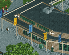
The Bug was a lot of fun to see and well executed. For a small slice of a midway there are an impressive amount of rides while keeping a very natural and open atmosphere. The carousel building was really well done and its placement inside the kinked brake run was great. I also like the small peek into interiors through glass windows and rafters, as well as the enclosed backstage areas with something new to see at each rotation angle. You had the shop staff in place but one potential extra detailing could be some crowd peeps or standing peeps at the midway games or ride exits. You used ACE's signs very effectively, it felt like they've been around for years and they work perfectly for this kind of project.
After 2 back to back releases in this style, it will be understandable if you want to mix it up. I really enjoy the subject matter and direction you have taken your style the last few years. I'm looking forward to your future projects and if you have the inspiration to do another period piece and/or regional park that would be exciting to see.
I can't wait to see more works from you!