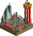
Park / Salinity
-
 13-June 23
- Views 2,186
- Downloads 202
- Fans 4
- Comments 13
-

-
 85.50%(required: 65%) Design
In:Cities 90% robbie92 90% RWE 90% Xtreme97 90% Babar Tapie 85% CoasterCreator9 85% posix 85% SSSammy 85% Terry Inferno 85% G Force 80% ottersalad 80% Scoop 80% 85.50% -
Description
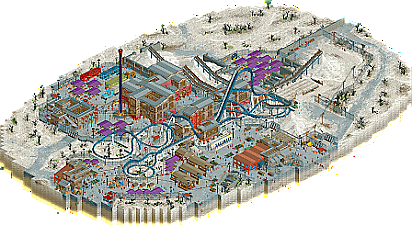
This design started as a portion of my 2nd round collab with inthemanual for the 2020 Grand Tour, but would end up cut in favor of what became the Fish Canyon Corkscrew. Continued as a side-project between contests, I chose to move it out of Namibia to a more ambiguous ‘salt flat’ locale. My intent was to focus on a heavily textured and grainy aesthetic and juxtapose the harshness of a salt-based landscape with that of an industrial factory. Rather than a strictly realistic or fantastical approach, I focused on building what felt right for the layout, theme, and aesthetic. Big thanks to ITM and JK for feedback, Gustav for the music file, and Josh for those vital fences. I hope you enjoy Salinity!
-
4 fans Fans of this park
-
Full-Size Map
-
Download Park
202
-
Objects
1
-
Tags
Really really nice FK, this feels like such a statement on what you've become as a builder, something that only you can create. Obviously the landscape and setting is the big attraction here and you nailed it. Like nin mentioned in the discord it almost feels like a 90s RPG in some bits, could totally see this being the location of a DLC for Fallout. The salt piles, machinery and equipment really were done super well too.
The coaster was very good, maybe lacking one highlight element which I kind of miss on these sort of submissions. Path interaction maybe wasn't super ideal either for a more fantasy type setting with a ride like this but still was good. Not saying every design needs optimal path interaction to be good but my preferences with a concept such as this where you can really do anything you want with are for a little more than this gave me. I do want to give you a lot of credit for the ride details, and supports themselves. That really elevated the whole ride for me, and I loved seeing it here.
Archy wise this definitely has some great bits, very homogeneous which I liked and there was a ton of atmosphere you worked in around what could have become a pretty dull scene if not handled properly. Almost looks too nice in places for being a factory haha, no problem with that though as I think it fits the whole concept.
The supporting rides were fine, nothing spectacular, but I did appreciate them. If I had one thing specifically to criticize here it's the drop tower feeling a little under baked, a little ornamentation on the tower itself would have been nice to see, just to make it stand out from the basic ride aesthetic a bit.
You've also definitely proven yourself as a master of half diagonals, they were integrated really well here. Perhaps a little heavy on the SV LED lights but I can't really talk myself.
Rating designs is always hard, but I think for me this is 80-85 range. Again it comes down to the coaster, which left me wanting a little more. For something of this type I just kind of wish there was one more element or sequence for me to remember this by, since as a whole it gets lost a little amongst the rest. But overall, super nice work, and hopefully a good preview of what we might see from you in GT.
Absolutely fantastic texture work, the bit of fantasy influenced crunch really adds to the gritty, run-down industrial feel of this. The coaster has some nice support work, especially the trackitecture and track merging around the lift.
I'd also like to say the overall presentation is great. Good map shape, the edges are well done and there's almost no flickering or glitching even in hardware mode. And a great soundtrack, that adds a lot to the atmosphere.
First words that come to mind looking at this are:
- gritty
- punchy
- bright
I think I agree with G in that the layout doesn't have a signature moment or highlight element. But, it's really short and sweet. The support work was neat, especially the simple blue arch in the figure-eight element. Lot of good flow overall and carries a lot of speed.
The highlight though is the setting which was so jam-packed with detail that my laptop really struggled to keep the framerates steady. In the sea of white/off-white sand, dirt, and salt is so much color. Really helps your architecture and details pop. I really really enjoy the electrical building with the external building supports. That was really cool.
Seeing the teaser pics awhile back in the discord gave me the impression of a more bleak environment, but this is bright and colorful and quite fun.
Safe to say I'm obsessed with this map. I don't think anyone can deny you're the queen of crunch but this takes it a step further than even your high watermarks in that aspect. There's just so much texture layered in here, so cleverly done from the parched, gritty landscaping, to the pathways fading into the salt, to the semi-derelict buildings. The theme and setting are so visually striking too, beyond just the stark white of the salt landscape but also in the dominance of the coaster colours and the smattering of purple awnings among other bold colours. The heavy industrial architecture might come across as stale or dull if approached by someone else but you've managed to inject a lot of life into it with the varied forms and pops of orange and red.
I don't disagree with G Force that the coaster could have used a larger element to strengthen it a bit, and as a result it approaches getting swallowed by its setting, perhaps a bigger detriment in a design submission than a park submission. But that felt quite insignificant to me in contrast to the achievement in aesthetic and object usage this park represents. I have zero doubt that I and probably others will come back to this, picking away at the surfaces with tile inspector to uncover how you've created them. I'd say you're definitely one of the builders I most look to in my approach to RCT, so I'm obviously ecstatic that you've released more for me to
plagiarisebe influenced by.Few more quick notes:
- The salt piles: excellent example of fisch rocks being used in another way.
- The music is so nice, ambient but also quite energetic. Like a mellower cousin of Modern Style. Great choice, very atmospheric.
- Congrats on the design win!
Grand Tour '20, the gift thats keeps on giving Amazing design here. The texturing is incredible, it's safe to say you're the king of texturing/crunch of NE.
Another highlight are the colors. Such great color use! The blue on the coaster is one of the best colors in the game, so sexy. And the purple steel roofs pop out so well. They give such a nice contrast against the plain white salt flats.
Coaster layout was also excellent. Seems like it would be a very fun coaster to ride irl and I hope we see more of these Intamin megalites in parks. Also great entanglement with its station building.
Well deserved score, congrats!
this map salty af
I opened this map after it had already been scored and when I initially opened this map my first impression was: how did this score so high? It doesn't look that special.
But as I started exploring more and more this map really started to grow on me. I think this map really takes some time to sink in but once it does it really is lovely and I appreciate all the little details. There are so many cool textures and the crunch is amazing. I really love the way you made the piles of salt. The archy while somewhat simple just works, its styleful, classy and fits in well with the vibe. All the trucks are beautifully made and you did a nice job of breaking the grid. The Salinity sign is cool as well. Overall a well deserved score and a beautiful design!
Finished GT no and I have time to comment. For me everything you touch turns to gold. Knowing how you tweak and perfect every single piece of scenery on your map makes your releases very special for me. I'm always dissecting your object choices to learn something new and see how you've created some things so effortlessly.
Unlike other people, I have no qualms with the coaster. I think it's a great layout, and one of your best – very rarely do we see a coaster that looks good from all four angles.
Pros
The salt piles
Glistening salt peaks
The foliage / salt combo on the outskirts
The amusement park touches you added within such as the food trucks, eatery sections etc.
The coaster
Music was great
Great custom ride sign
Cons (I'm scraping the barrel here)
The landscape started to become greater than the coaster, although this is so picky.
Amusement park was second to the salt mine. Backstory or some more storytelling would've been awesome. Yet again the tiniest thing.
FK you're a god when it comes to RCT. Your skill far eclipses anything I could imagine creating in this game. Now please, please get that solo out there so we can see more of your coasters and rides together on one map.
Congrats on the Design FK. Finally got around to watching this after GT23 round 1. It´s beautiful. I love the coaster, the industrial complex, the salt. So much crunch. That sign is done so tastefully. The contrast between the white/beige/grey saltfields and the strong colors of the coaster and shaders really make them pop. Those Kong stone walls are so ugly, but work perfectly. The trucks are executed perfectly. This is so next level.
fences look great
this feels completely like jk's ilmenite transposed into the present day rct2 meta. excellent little design. i adore the way you handled those satured-wood colored warehouse windows.
Okay coming out as a major FK fanboy :bottom eyes emoji:. You're the king of working within a limited colour palette. The abundance of grey never feels noticeable because you have such a command over texture. Love the way the map is slightly offset compositionally so that the upper right corner is dominated by the flat, crunched landscape. It's incredible the way you can have sections breathe while still being jam packed with objects.
The only thing I take issue with is having the base game top of the drop tower. Since it's a park that lives in infrastructure, I'd love to see what it would look like if you styled the ride infrastructure a bit more.
Also want to highlight all the little street kiosks. I've been studying the way you use them a lot. They add such nice pops of colour that tie into the colour you add to accent the buildings. Those combined with the trucks and shipments is super super inspiring.
Another summer gem from Gatorland crunchtime that I didn't get a chance to review upon its release, but I've been looking at it ever since, and 12 reviews simply does not feel like enough praise for one of the defining non-GT releases of 2023. 13 is the absolute minimum for a map like this.
Obviously the ground texturing is revolutionary, and the salt piles are still perhaps the most clever use of Fisch rocks we've seen yet (in addition to the tops being the only acceptable use of the corner pieces so far). All of the structures are expertly designed and coordinated in a lifelike manner, and it really feels as though this is a real place in the present. You've taken a setting that would ordinarily be plain and drab and breathed the maximum amount of life possible into it without turning it into something that it isn't. Color is used extremely well here to tell the story, with brown, grey and bordeaux denoting original parts of the mine and orange and purple* representing parts that were added later. I love how all the old industrial buildings are guest-accessible, with my favorite piece being the boxy steel bridge going over both the path and the coaster, and looking through the windows to see guests on rides is something I wish I could see on every map with glass windows.
Ultimately, I could have gone 85 or 90 on this one--I stand by my current vote, but had I gone higher, I would probably stand by that one as well--and I think it just boiled down to the fact that everything that blew me away about this was not the coaster itself. It's a lovely coaster--aesthetically pleasing with its picturesque curves and infections dark water color scheme (if "Best New Color" were an NE award, we'd have a unanimous winner for 2023)--and it is certainly an integral part of the map; it's just not the star of the show, and I don't see that as a criticism on a map with so much star power in the surroundings. Over the past seven months, this map has been a regular contributor to the Map Tab Club (aerials I keep open on NE while I'm building), and I keep coming back to this one for terrain ideas, the hyperrealistic industrial crunch, and the best semi trucks ever built in RCT, and I do appreciate the subtleties of the coaster a little bit more each time. One thing you did particularly well with the layout is building it in a way that shows it was constructed to fit within existing development, and that can be particularly difficult to pull of successfully.
Regardless of any existential crisis I may have over what constitutes a top-tier Design, this map is still very much in that tier, and that is the tier where you have shown on many occasions to exist as a builder, whether it be micros, contest entries (deadlines are for squares), or even building challenges. There should be no doubt in anyone's minds that a full map from you would be among the most powerfully lifelike ever made, but however many tiles are on anything you release, we are mesmerized by each one every time.
*GT '20 was when I discovered the majesty of this particular shade of purple as a steel roof color. Patagon and Salinity will forever exist in solidarity with one another as the "senior" GT entries of 2023.