Park / SolarWing Skyway
-
 10-September 23
- Views 5,160
- Downloads 445
- Fans 13
- Comments 27
-

-
 91.50%(required: 65%) Design
Liampie 95% Mulpje 95% Recurious 95% RWE 95% SSSammy 95% Babar Tapie 90% Camcorder22 90% CoasterCreator9 90% Faas 90% G Force 90% posix 85% Scoop 85% 91.50% -
Description
A reimagined version of my ill-fated MM round 3 entry. Hope you all enjoy!
-
13 fans Fans of this park
-
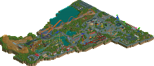
Full-Size Map
-
Download Park
445
-
Objects
1
-
Tags
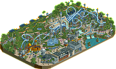
![park_2824 [PT4 R2] Drop of Doom](https://www.nedesigns.com/uploads/parks/2824/aerialt2482.png)
This is really really good.
This really is an incredible design, I love it. What sticks out to me is the unique look of the modern architecture combined with the vertical layering of the paths. Super, super impressive, and hard to pull off as well as you did it. Another highlight to me was the Eco-friendly parking lot. As for the coaster itself, it's a really nice and unique flyer layout, and I love the fast lift into the pretzel loop. I really cannot find anything bad to say about this park! If I were a panelist, I would hover between 85% and 90%. Not sure exactly which yet.
Love the atmosphere and aesthetic, the colors, the blend of modern architecture with lush foliage and natural materials, the use of curves, all so good. And the main coaster itself has a good layout, support work and a pleasant color scheme that contrasts enough to stand out and be easy to follow while fitting into the theme. It's actually pretty relaxing to look through.
Also, I like when building cut-aways are built into the edge of the map like that, gives a look inside without being distracting inside the park itself.
Absolute stunning design pants! Really makes me question where the grid is in some places. Those wavey balcony´s above the paths are amazing such a highlight for me!
I love that we get to see how a solarpunk theme would translate into RCT and you absolutly nailed that.
The building with the motion simulaters is incredible. The shape and the way it is positioned in between the 2 grey buildings really fits well. The eye catchers for me tho are the 2 glass pyramids. Such a nice way of breaking all the wavevyness!
The coaster looks great im really liking the layout and the double launch works very good here.
Only small thing I would personally change are the kryptonian rocks with Fisch rocks but thats just my opinion.
Other then that I really dig this design great job!
Oh Pants, what an inspiring release ! It’s bold and innovative, it all seems so easy, so creative, so simple for you - it's as if you could transform any architectural element in rct2 and give it incredible form. Nothing seems random, everything is perfectly in place like a clockwork mechanism, such precision and accuracy, a real joy. DisneyEarth Vancouver had a big influence on the meta, and I'm sure this one will too. Congrats !!
This was amazing. So beautiful, skilful and accessible. So many loving little details that are a joy to see and explore, and never felt piled on. For me probably the best Design this year.
The curves, the glass pyramids, the coaster layout, the architecture, the landscaping... yeah this is a banger
this might be the best design ever.
This is (again) an amazing release from you Pants. And such a fresh theme! Excellently pulled together. Complex archy, complex pathwork, lush foliage and all still so readible. Of course I echo the love for the coaster, pyramids and landscaping, but I think I love the little details even more. Like the way you designed the streetlamps, or the incorporation of foliage inside the Starlight Lounge. You really are a source of inspiration to push the boundries of RCT.
One of my favorite themes ever, just perfectly done. The coaster is great, really interesting to watch and the colors work nicely. the double hill is fantastic, and the first drop looping round under both feels like one of those things where it's meant to be.
there are so many theme choices where it's not necessarily a choice i would have made, but it feels so perfect looking at it that there's nothing i wish had been done differently. every single building is weird, interesting, fits perfectly. there's a lot of grey, but it doesn't feel sterile at all because there are these pops of color and commitment to foliage throughout that really softens it.
and the CURVES oh god the curves everywhere are just such an amazing choice. it's hard to build off-grid with curves and stuff in mind, and you've managed to make it look exactly as it should. the curvy flat garden overhangs throughout are one of those theme elements that are risky and could really mess stuff up, but feel so atmospheric and natural that i can't imagine anything different.
personal highlights - everything, obviously, but specifically: the glass path, the butterflies, the custom path lights, the custom path signs, the front of horizons with the waterfalls, coaster exit path over the water.
feel like this is my favorite ever design. there's probably some i'm forgetting, but it has to be up there.
Love the layout, love the theme, love the details - just love it all.
Call me a nerd but I really loved the support work and general detailing of the ride itself, sometime that stuff gets lost in these more high concept designs but that was absolutely not the case here. Really made it feel more tangible to me which only adds to my enjoyment. Gotta say the second highlight for me was the queue, just so good, I can picture myself standing there waiting at almost every turn, amazing.
If there was anything I didn't like it was probably some of the rather plain color choices, at the same time though I don't know if it would have came together quite as well if you did differently.
Congrats on the score dude, 3rd highest scoring design of all time and highest in the last decade. Absolutely deserved too, perfect blend of modern meta conveniences and impeccable composition with such a unique theme driving it all forward. There's not much to hate about this one, it really has it all.
Not surprised this scored so well, I was pondering a vote with my only hesitation that it's a fairly small map but more than made up for with density, layering, and a remarkably fresh aesthetic
Yowza, really wasn't expecting that score! It feels a bit silly seeing it scored over 90 when I feel like most of my work is a cribbed assemblage of other people's works and innovations in the game. Also couldn't have done it without all the amazing new curved pieces from Ethan, Xtreme and others. Thanks everyone for taking the time to view the map. I'm glad you enjoyed it and all of your kind words mean a lot.
I'm right there with you. I believe pretty staunchly in realism as one of the most satisfying ways to enact your fantasies. To ground something in the tangible details and infrastructures of the world while freeing yourself from any economic realities has been the only real prompt under which I can get anything of substance done.
Anyways, my plans for the night got cancelled so I have a some time to throw out a few WIP shots!
The kernel of this started with WestCOT and a deep dive into retro futurism. At this point, WestCOT probably won't ever see the light of day since so much of it feels too haphazardly done and I'm finding more joy out of stealing the ideas for smaller maps. RCT feels so well suited for futurism with the abundance of base blocks, and thankfully it's a style that doesn't involve too much detailing lol.
The retro futurist kick led to a more specific solarpunk theme for my MM round 3 entry, which drew on the sandstone textures and green roofs of WestCOT. It was to be a hotel built into a cliff with the coaster perched on top. On the backside would have been the infrastructure of a geothermal system used to power everything. I had to give up on the micro due to lack of time and motivation, but most of the elements from that would be refashioned in some way for this map: the palette, the satellites, the solar panels.
A few months later, I was going through old designs I had done and came across this little launched flyer. The coaster model with the colour scheme felt like it could nicely play on the micro's theme:
I liked the flow of it, but it really only looked good from the one angle. I fiddled with the layout, making it more rectangular than square to allow for more path interactions, and copied over some of the micro's buildings. Originally, the entrance for the ride was going to be more dramatic, facing the pretzel loop, but the more I built the more cramped that felt. I usually start by blocking out the rides first, and I love the idea of sinking drop towers into the ground like the original RCT scenarios, so originally the drop tower was in the middle of the coaster's turn.
The glass pyramids and waterfall facade to Horizons were pretty direct pulls from WestCOT, though it took a while to settle on actually implementing the waterfalls. At first, I thought the area I had blocked out would be far too tight for any water.
Another pull from WestCOT was this little pavilion with a cut out in the roof for a tree.
I thought the eco look would suit the map, but as I started filling in all of the foliage, the effect of the tree was dampened. It was an idea better suited for an area where the tree could be a stark focal point. I still liked the cutout in the roof, so if it wasn't going to be a tree, glass seemed like the obvious (maybe uncreative) alternative. The palette of idea wasn't too big with this map, so when in doubt, I knew I could add a waterfall, glass, solar panels, a green roof or a sandstone building lol.
Naturally, everything went through a few more permutations. I was sad to see buildings pulled from elsewhere gone unused, since actually making a structure is one of the most painful processes known to man. Here's a tribute to my little graveyard of ideas (but please let me live if I find some way to use them later on down the road). I commend all of you who are able to build entire maps worth of leftovers. Every time I build a new building it feels like I'm dwindling down the supply of buildings I was preordained for this one lifetime lol.
And that brings us to the map we have today! Hopefully I'll be back with another release in the somewhat near-ish future
Tl;dr, I think self-plagiarism is our birthright and this game is becoming even more suited for modernism and futurism. So jump in, the water's warm!
Wat an amazing release... It baffles me how you seem to include so much different organic shapes in your buildings with ease. Every building is so beautiful and I can't stop keep looking at it. Also a big fan of the waterfalls included in the buildings. This eco-futurism is a challenging theme choice but you perfected it. The green rooves are so nicely done and curved so nicely.
Also have to give kudos to how you included the simulators. I see the rct ride of it as kinda useless but you proved you can included them nicely. Great queue cut-out there as well. The coaster is so good, very flowy and a lot of cool elements. Love that you'll get launched into a pretzel loop! That must be insane for the riders Also love the colors of it.
Another fantastic Pants park. Really want to see more rct from you, you're amazing with the game.
insanely good. It's just so...smooth. the archy flows perfectly, the foliage, arches and curves and interactions, all while still feeling completely realistic. really one of the best designs in a very very long time and really encapsulates the current rct2 movement and pathos. so good
Congrats on completing such a wonderful project.. there is so much originality here. I think the first word that comes to mind when viewing this is "refreshing". Organic forms and shapes. Eco-futuristic to the max. Also the wonderful inclusion of the best ever themed motion simulator. The main coaster layout is quite fun - only gripe I have is that the second half is relatively short! Having said that, it left me wanting more. Honestly, all of this left me wanting more. Would a full scale project at this level net a 100% score? Quite possibly.
Outstanding design Pants! I enjoyed almost everything. The coaster layout was wonderful and interaction was top notch. I maxed out the Q at 780 peeps, which is insane, but I love a good/long Q! Your use of new scenery is fantastic and I love all the curves worked in. The waterfalls added a lot to already great landscape work. Those grass rooves are an amazing detail that really adds creativity all over. Love the cut-away friendly shops, mainly the central gift shop under the glass pyramids.
I think the overall theme was a bit generic. It's future techy, but did not sense much more beyond that. Some backstory and scenes could have improved that. Tho I am no expert on WestCOT. It could have used more colors to get things to pop like you did on each custom signs as some areas felt a bit repeated.
Congrats on a rare 90%+ design. Frankly, I am a little surprised my re-creation of Kumba still holds the record (92.6%) after all these years. I think this is one of the best stand-alone designs that site has seen, up there with El Encierro and Vulture. Of all NE records someone can break, I think top scoring design is most attainable. I am sure someday I will get to say "congrats" to someone when they surpass that score. Would be cool to see someone do it with a custom creation like this. I have always felt a little unworthy since I was just copying a real coaster.
Looking forward to whatever you do next!