- Views 1,438
- Downloads 103
- Fans 0
- Comments 11
-
 54.50%(required: 65%)
 Design Submission
RWE 65% In:Cities 60% Terry Inferno 60% Mulpje 55% ottersalad 55% posix 55% SSSammy 55% Xtreme97 55% pants 50% Recurious 50% Scoop 50% wheres_walto 50% 54.50% -
Description
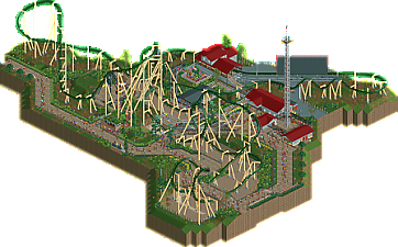
Since I'm generally quite a slow builder I wanted to challenge myself to build fast and thus finished about 95% of the design during a single hungover Sunday without ever pausing the game, clocking in at about 12 in game years. I then waited for diagonal block brakes to drop and here we are. Ride the crowned snek!
I built the layout after Luketh posted an invert inspired by Banshee on Discord back in April. I also threw in an experiment with how the "new" colours enable you to build custom supports for some flat rides. -
No fans of this park
-
Full-Size Map
-
Download Park
103
-
Objects
1
-
Tags
I'm not the biggest fan of the layout, but I applaud you for trying something a bit unconventional. The pacing is pretty solid throughout the ride, but the string of elements is a bit odd.
That aside, I just don't think there's enough here for a design accolade, which I'm not sure if that's what you were going for but that's what it feels like. The architecture is a bit bare; perhaps a different roof color for some of the structures so they stood out more? I also found the transfer to be rather large - it looks larger than the station.
The path integration is a plus here, as it provides plenty moments of interaction, which is always a positive in my book!
Glad to see you are challenging yourself as a builder, and I hope you continue to create and post your work!
This is mad impressive for 12 in-game years, I would've barely finished doing custom supports in that amount of time haha. The pacing of the coaster is pretty good and I like the ending.
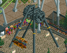
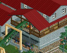
The Basilisk sign is gorgeous and I like the custom supports for the Cogsaw ride and the queue covers for the coaster. Other than that, there's sadly not much else there (which is explainable given the short amount of time put into the project). With some more time I bet the architecture could've been spiced up a bit and the foliage could've been made more lush. Solid work nonetheless!
I think you've broke the curse for being a slow builder. This at 12 in-game years is a really good effort. Nice work!
Thanks for the comments!
The Scenery Manager pulled quite a heavy load on this build and some things, like the coaster layout and frisbee concept, were already finished when I started on the save. "Speed building" like this was an interesting experiment but as you've noted some things suffered. I personally find the paths somewhat stiff and the foliage, usually my favourite thing to do, is entirely without soul.
I really like the supports and the supporting rides, definitely some nice stuff for the short build time.
An excellent layout and nice interaction and setting with the park. Overall just too basic though to warrant the accolade for me.
great work narc, great to see more stuff from you
i think this exemplifies the discussion that was taking place on one of the screens regarding how close to the map edge everything is. I think a bit more breathing room would have allowed this to work better.
keep improving like this and you will be a very scary builder
This was pretty cool, reminded me of some older designs in how the map and layout is shaped. The layout is good, could maybe have used an mcbr and extended second half after the second loop. Besides the layout, the rest shows some nice instincts (i liked the boldness of the red roof), but falls short of design for me. For what sounds like mostly a speedbuild however it's a good exercise in finishing a project and getting more used to your own style.
Nice work Narc. I think the layout is mostly solid - only thing I think could've been changed is that the cobra roll feels a bit stretched out.
The tight cropping also didn't do you any favors. I think it puts more emphasis on each object you place and thus, probably could've used more detailing to get it over the 65% threshold. Mainly the foliage seems a bit too simplistic as a result.
Thanks for a nice review Terry!
I think you're spot on about the surroundings. Your crude sketch illustrates the point perfectly and invokes a certain desire in me to return to the map and "fix" the surroundings. However, I think I will leave it as it is (we don't really celebrate Valentine's Day here I'm afraid). But I realize that this is an important concept in (RCT) composition that I have often neglected, and I will keep your comment in mind when working on future builds.