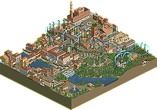
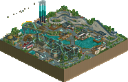
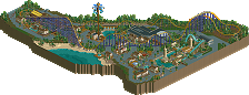
Park / Taste of Tuscany
-
 10-December 23
- Views 1,643
- Downloads 79
- Fans 4
- Comments 6
-

-
 69.00%(required: 65%) Design
In:Cities 85% Terry Inferno 75% Xtreme97 75% Mulpje 70% ottersalad 70% pants 70% Recurious 70% Jaguar 65% posix 65% Scoop 65% WhosLeon 65% RWE 60% 69.00% -
Description
Initially submitted for the flying coaster contest in DKMP (which got 3rd place scoring a 9.00)., this has since been updated based on feedback for this final NE release. It was inspired largely by different sights and places to see in Tuscany, Italy. There is a reference image included with the major points of interest within the map with their real life counterparts. Hope you enjoy!
-
4 fans Fans of this park
-
Full-Size Map
-
Download Park
79
-
Objects
2
-
Tags
![park_4808 [NEFC] Down the River Ganges](https://www.nedesigns.com/uploads/parks/4808/aerialt5009.png)
Huh, this looks strangely familiar? Wonder if I’ve seen this in a contest or something...
It’s no secret I’m a huge fan of this design. Upon seeing the initial releases, you both had me sweating right up until the end of the results video. And that’s without the revisions. To which I think were perfectly done.
This coaster is imposing. If it were real, it would be an epic experience, and easily the best flying coaster anywhere in the world. You have some serious height with the first drop. The inverted snakedive element right after is just so cool. I love how it drops into the buildings, under the ruins, and back out into the streets. A fantastic moment of interaction.
The diagonal crossover is a great transition, as it scales both the city and the terrain on the descent. The next section has all the right elements, with the pretzel loop being a great finale. In summation, the coaster is relentless. It never loses steam.
The rest of the map is extraordinary. You nailed the architecture across the board. As I said in my initial review, it’s hard to pick a favorite building, but I’d say the coaster station and the Uffizi Gallary Tour building are some standouts. The ruins however, remain my favorite. Just first class object usage that looks exactly like the real thing.
A couple points of contention:
1.) I’m not the biggest fan of the catwalk. Sure it works, but seeing what you can do with objects, I would have opted for a catwalk closer to what you’d see on a B&M flyer.
2.) The coaster layout is excellent, but I think there is a better ending in your arsenal. The flyer just goes up into a turn, some straight track, another turn, then into the station. To your credit, it looks clean.
Wonderful work to both of you. This whole park makes me want to make some pizza or pasta from scratch. My final score: 85%.
Some impressive recreations, and a lot of clever use of the invisible color and DKSO. And really like the ruins, some great use of the recolored add-on pieces to really pull off the ruined look.
This park is special - truly excellent. Favorite part is the ruins in the center of the map and how the coaster interacts with them. Incredible work - I hope the rest of the panel gives this a chance. Top tier work for me.
Thanks for sharing!
This may be one of my favorite works put out from anyone in deurklink’s community. You’ve really validated the building style as a whole with this design, taking a deep understanding and a boatload of creativity to squeeze out nearly every detail you can do without more refined custom scenery. What puts this head and shoulders above most that have achieved that level of technical virtuosity though is how composed and cohesive the finished product looks. The layout leaves some left to be desired in flow and pacing, but even the weakest link of this design is no slouch. I genuinely think this is at least green-name material on new element. 85%
Really neat. Very well composed city/town. The coaster has some cool moments as it flies up and over and under. Easy highlight here is the ruins of an old amphitheater. Little confused on the dry aqueduct and then the still running aqueduct that spills into the bathouse.. why two? I'm thinking too critically as someone who used to study Ancient Rome! The density and detail at the top of the map is perfect. Bit bummed that the bottom of the map is a bit simple in comparison. Overall consistency in detail would've made this top tier. Also, I agree with Bluetiful in regards to the comments on the layout - thus I'm going with 70%.
Bellismo! Love the attention to detail in recreating the various Italian landmarks in your DKMP style. I'm particularly a fan of the unconventional use of rides and stalls as architecture, such as the observation tower ticket booth and the cursed WW/TT stall for the fountain of the fork. The definite highlight for me is the ruins which are done unbelievably well with the WW/TT scenery and invisible wooden track. All the frozen staff scenes with the funny Italian DKMP player names got a chuckle out of me too. Love the flyer, it has some great flow and interactions but could afford to be a tad bit faster in areas. The downside of this design for me is the palette. Some colors feel a little washed out, especially the gray for the bricks and especially the blue water. 70% from me, you two are very underappreciated and I'm especially happy to see the monsterbux debut on NE. Great work!