Park / Midnight Midway
-
 28-January 24
- Views 1,948
- Downloads 205
- Fans 2
- Comments 12
-
-
 65.00%(required: 65%) Design
In:Cities 80% Terry Inferno 75% CoasterCreator9 70% Mulpje 65% pants 65% Recurious 65% RWE 65% Scoop 65% G Force 60% posix 60% Xtreme97 60% ottersalad 55% 65.00% -
Description
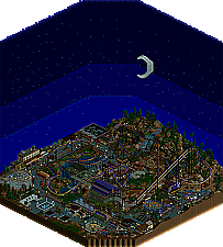
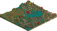
Inspired by late nights at Hersheypark, Dorney Park, and Knoebels. I wanted to capture the magic of the flashing lights, spinning rides, and sweet treats that enthralled me as a kid.
-
2 fans Fans of this park
-
Full-Size Map
-
Download Park
205
-
Objects
2
-
Tags
Similar Parks
-
80s Anemoia
-
Le Coeur du Ciel
-
Walkman Of My Brain
-
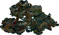
[H2H6] R3 - Hurricanes - Avatar
![park_2401 [H2H6] R3 - Hurricanes - Avatar](https://www.nedesigns.com/uploads/parks/2401/aerialt2145.png)
-
Lostileth
-
Viori Cove
To get ahead of those who may comment about this map being too dark ( I feel like I have a small authority on people complaining about dark palettes), I find that this palette is surprisingly very effective in depicting a believable nighttime scene. Especially with the backdrop - it makes for a wonderful effect once gotten used to.
The little pops of bright yellow to depict the light sources work super well for this. Brilliant idea. Especially the little string lights and trees. Very believable as trees draped in LED lights.
Funny enough, I think my favorite bits of this map are the little mowed open grass spaces around the coaster. Very tastefully done, and they do a great job highlighting the coaster itself as the main attraction.
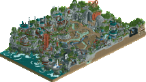
The buildings themselves show a lot of mature design intent and aesthetic consideration. Tons of great path additions - planters, seating areas, open plazas, etc. (favorite ones being the little planters in the middle of the path for the coaster supports).
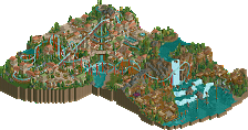
Ride design is very solid all around. The main coaster station and supports are absolutely spot on. Just feels believable! I can't speak much to the layout itself; that's not my area of expertise in the slightest. But for what it is, it feels natural and flows nicely.
I think my only criticism here would be the foliage. I dig the scrub vibe you're going for, but some sections come across as slightly messy. More clumps of the thicker tall trees would go a long way I think.
Great work as always man. Happy that more people will start to get more familiar with your work!
I second everything said by Josh. The flying coaster contest was one of the strongest we had, and this is a well-deserved podium design.
This park is the penultimate achievement in your journey as you crafted your style, and that is creating homey parks that remind us of our childhood memories and daily lives. But you make it so intriguing with your detail and object usage, that it feels a cut above the rest of similar endeavors.
Of course, we have the more obvious impressions, such as the skybox made of diagonal track on all angles. But I would like to give major props for getting a dual-loading station to function. Another underrated detail is the diagonal track for footers on certain supports. Same goes with the functional wooden coaster cutout.
A vibrant nighttime entry that had me sweating until the very last second on the results video, this an exceptional realism build. My final score: 80%
Cool layout - and the night time vibe is pleasant. Probably enjoyed it the second time viewing at night as opposed to at noon when I was eating lunch at work.
There's a lot of great object usage on display, particularly in your architecture. Some really good individual pieces here, namely the station for Raven and the bumper cars. The game booths were simple 2x2's, but realistic with the moving games inside. Really neat. As Josh said, really mature design to your realistic pavilions and midway stands.
But, I think as a whole it doesn't quite come together for me. The landscaping and foliage leaves a lot to be desired. The hillside is rough. The use of brown dirt everywhere gives a very muddy feel to everything. In terms of the macro it's a horseshoe with two deadends. In the places where it does connect to the outside park you see backstage stuff and bare dirt.
I will end by saying the path interaction with the coaster is nice - really can't miss viewing all the major elements of the ride.
I appreciate the review. To your point about the foliage, I think Josh's point about having some denser pockets of trees is a good one. On your point about the dirt, I generally find the dirt to look much more like rocks, especially outside of a mountain setting, than the gravel texture, so that's what I use. But I understand that can be visually confusing when I also use it for mulch along the paths. I'll consider ways to make that more apparent for the viewer.
This park is a great example of technical proficiency, between the working dual loading stations, custom lateral support footers, working backdrop from all angles, and the clever usage of light color from the palette. The layout is solid but i think it garners some brownie points for being a functional version of essentially two rides. Really liked the coaster train spotlights used in certain spots, and the slightly lit coaster signs look great.
I can see the reasoning behind the landscaping comments above, but i also prefer the more object heavy landscapes instead of relying on ground textures too much, so i think that is a matter of taste there. I'm always a fan of the spots of manicured grass though, so maybe i'm a bit conflicted on that thought process.
Loved this entry in the contest, got my highest score that round. The atmosphere of a warm summer night at the park is captured so well here. I think the dark palette and one-angle track backdrop are used amazingly well for that purpose, adding so much to it.
And then there's all the nice technical tricks, the impressive working duel station and all the custom shoestrung flat rides, as well as plenty of clever DKSO and invisible color use.
First of all congrats on a well deserved design! Really enjoyed the way you did the background, obviously the highlight on this map. Kudos to you for making it work nicely from every angle too.
I think the actual map was quite nice too, some classical Deurklink Server RCT. It was maybe a bit underwhelming compared to the backdrop, although it also had some great highlights for me like the flat rides or the coaster station. But i also agree with some comments seeing some room of improvement in foliage and landscaping. I think the foliage especially just feels very random at some spots and could use some more organisation and purpose.
The layout of the coaster is quite nice. I think its nothing spectacular, but it definitely works here, although the theming might have screamed for a more daring approach.
To conclude in my opinion this is a great release showing of some good talent and potential. Keep it up and make sure to look for diverse inspiration sources and im sure you will improve rapidly.
I really thought I reviewed this somewhere. Not in this timeline, apparently. Let's fix that.
Vibrant, crunchy, and full of clever details... hallmark qualities of NCSO (and DKSO) realism. It took me years to embrace expansion objects in any context since they can feel very jarring, but there is not one building on this map that I feel is awkwardly textured. The arcade block is perfect with that slide carefully perched at the top, and all of the wooden-roof structures near the coaster queue entrance are delicious; strange to describe a restroom that way, but with those Japanese fence trims, I cannot conjure a better word at this time.
And when it comes to clever object usage, there are some pretty brilliant tricks in here, such as that immaculate teapot with the coaster car handle that nobody is talking about for some reason. Both Journey and Ellie Goulding would have a field day with all of the innovating approaches to lights that exist on this map. You've got multicolored stage lights made of flying coaster cars and building streetlamps made from air-powered cars, but even the more simplistic barrel-and-gravestone light fixtures are perfectly effective. The only lighting effect I'm not fully sold on is the coaster train fixture near the initial drop, but I think with another component to it, it could certainly look less like isolated coaster trains. It seems that so much of the focus has been on the night sky backdrop that the other half of the nighttime effect--the bright lights--is getting largely overlooked, but I believe the point would have been made just as strongly without the sky simply because of how effectively you've pulled off using yellow to create the illusion of light. I really love how some of the coaster's defining elements are actually painted a slightly lighter shade of purple as if to illuminate them.
I see that the landscaping is the overarching point of criticism here. I agree with the general assessment, but I think it would help to pinpoint a few specific things that you could easily change in your approach to landscaping so that it would feel less "random".
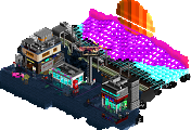
In this screen, for example, you have very visible isolated squares of dirt, and the brown flowers just add more right angles.
One of the hardest things to do in NCSO (et al) landscaping is break away from the grid, but this is necessary to create a natural-looking landscape. Sometimes, if the contrast between sand and dirt is too visible, the best approach is to simplify and let sand just be sand. If you can add texture in a way that enhances the terrain, great, but don't be afraid to do less and create larger shapes instead. The green areas around the sand are heavily forested, so the sand can be turned into very powerful negative space even without any sort of texture.
One way to eliminate the inevitable corners is to place the rocks strategically so that there are fewer hard lines and corners between the two contrasting terrain paints. I've added a few around the borders and filled in more sand in the middle to demonstrate how the sand could be used to create one large shape that allows everything around it to pop even more.
The cliff formation could have also looked more natural. They are sculpted in a very linear fashion, with each vertical face appearing as a straight, flat wall.
Larger, more deliberate shapes can bring a landscape to its full potential. Single squares of any particular terrain paint are best used sparingly, especially when the textures contrast too much to blend on a smaller scale; clusters of the same texture will always look cleaner. You've done this very well over most of the map--your mowed grass game is on point, as the hipsters say--but the forested cliff area feels a bit more random when the dirt, gravel, and sand start to mix up and then foliage joins the party.
That aside, I feel that this map comes together very well and shows a very intuitive sense for parkmaking as a whole. Yes, your object-usage ingenuity allows this map to be great fun to explore, but the way you've put the map together as a whole also feels as real and relatable as any other realism setting regardless of the bench. The lovely flat rides deserve more credit for elevating this atmosphere; why is nobody talking about the clean elegance of Calypso and the teacup ride?
In any case, this is one hell of a debut map, and NE would be privileged to be graced with more bru goodness. I know that the initial reception may have dissuaded you from submitting further works, but I do hope you reconsider someday and show us all what a bru can do.
Super impressive park, I need to pick your brains how you made the nighttime facade work from the four angles, that was great. The conviction to the detailing throughout was awesome, I wasn't sure if the brown colour plants were meant to be rubble on the floor, but in my mind it took me there, especially after seeing green foliage nearby. Atmosphere was the biggest highlight in the park for me.
Architecture was good, lots of flat roofs as to be expected with the theme, where it got really good was the arcades building itself, this was top notch architecture that I wish a few more of the buildings had the same treatment. Some building angles were completely bare and whilst this is realistic, it just looks jarring in-game. An easy fix in future that crosses over to the RCT world and would improve my viewer experience.
The coaster itself was good after the pretzel it got a little samey with the inline twist, to the turn into the same element in parallel, three inline twists throughout the ride, I think you could've mixed it up a bit more. Supports were excellent.
Talented NCSO and I can't wait to see more of your releases on NE. Thanks for bumping this on the discord.