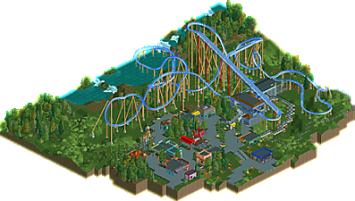
Park / Jetstream
-
 04-July 09
- Views 1,922
- Downloads 219
- Fans 0
- Comments 14
-
No fans of this park
-
Download Park
219
-
Tags
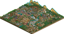
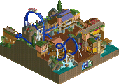
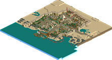
Similar Parks
-
The Child's Dream

-
Indiana Jones et le Temple du Péril

-
Southwest Adventures
-
Happy Hannukah!
-
Tempest
-
Floyd's Family Farm
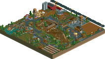
enjoy!
oh and thanks zo for making the logo....well i think you made it...
But I really loved this, so simple and beautiful.
-ACE
and don't worry there will be more comming soon
maybe something bigger?
FullMetal Offline
But who cares. It was a cool design! And I do agree with CP6: one more inversion wouldn't have hurt.
just be lucky it wasnt called blue thing