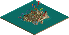
Park / Mischief - RMC'd
-
 13-April 25
- Views 601
- Downloads 112
- Fans 0
- Comments 6
-
- Johnson55%
-
Wessiesworld45%
-
Description
Build for DKMP RCC-60
RMC an existing wooden coaster blueprint. -
No fans of this park
-
Full-Size Map
-
Download Park
112
-
Objects
3
-
Tags
Park Tools
Similar Parks
-
The truth about Plato's cave
-
Dude Park
-
Fun Spot Atlanta
-
Good Knight Park
-
Kechibi
-
Troubadours et Baladins
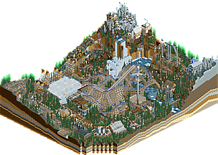
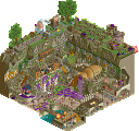
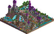
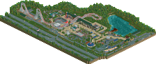
I don't remember what place we ended up with in that contest. you are only allowed to use trackitecture, DKMP recolorable vanilla objects and OpenRCT2. Mischief is quite a mess to work with.
This release is definitely not my cup of tea – but I can still appreciate some of the cool stuff hidden in the chaos: The big bridge and the architecture stood out as a nice highlight, and there are some interesting ideas tucked away in the details.
Overall though, the map feels very overloaded with all sorts of wild elements. The coaster layout itself isn’t bad, but it kind of gets lost in all the madness. Landscaping is quite rough in parts, and some of the object choices just look downright horrific. The foliage, in particular, feels like it was just thrown on top like sprinkles on a cake – without really tying into the rest of the map. It would’ve looked much better with more variety in the foliage and less in the rockwork, which currently feels a bit all over the place.
Still, credit for going all-in on such a bold and crazy map and finishing it – even if it’s not really working to be honest.
Lots of cool elements in isolation.
I like the rapids with the multidim cars, the overall verticality is nice and the layout and support structure are pretty good and demand attention.
Overall the map doesnt come together that well for me though, mostly because of the landscaping. Way too many different objects and colors mixed together for me, leading to tons of visual noise. That together with the cramped nature, tons of peep movement and the color choices make this slightly hard to look at personally.
Bit of a shame, because theres lots of cool ideas and the overall ride isnt bad either. I think with a bit of a cleaner implementation a map like this could be excellent. Looking forward to future stuff Wessie
I did the coaster, the Condor ride, a restaurant and some of the peep scenes. Condor ride was kind of the hardest thing to do in this one for sure.
When you do a project with more then 1 person, you will always have to compromise here and there.
Thank you for the feedback.
This is an interesting submission; this park demonstrates a lot of NCSO skill in isolation as TimmyTuner said, but when combined together, there's a lack of harmony. For example, the different rock textures look really good on the edge of the map and make for convincing rock strata; I can't say the same for the vertical columns of different land textures and rock objects inside the park. There are also some things that just don't work, like the neon green cattails (recoloring them to moss helps) or the termite mound rapids (the chimney/smokestack idea you had near the hotsprings might work better).
I do think as a remake/reinterpretation of Mischief, the RMC has an awesome layout, and that turn over the water with trackitecture waves just looks awesome. I think it's challenging to make a Chris Sawyer-styled layout in the context of a design submission because the in-game layouts are designed to be very compact and don't allow for a lot of interactions. Because of the compactness of the ride, it makes the center of the map unreadable.
As far as supporting rides are concerned, I think Lightning Force is very impressive; it's not easy to shoestring these kinds of rides and a commendable effort there. The additional trackitecture is also very nice.
Overall, I can appreciate this and think it demonstrates a lot of NCSO ability; but it does seem to suffer from trouble with readability and a desire to cram as many small ideas as possible into a small space, which is something that I still struggle with. I do think the coaster would work better in a much larger park, where Mischief is just one of several major attractions.