Park / [NEDC6] Met a Rebel
-
 27-April 25
- Views 0
- Downloads 78
- Fans 1
- Comments 36
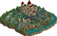
![Park_6127 [NEDC6] Met a Rebel](https://www.nedesigns.com/uploads/parks/6127/aerialm6369.png)
-
 49.50%(required: 65%)
Design Submission
49.50%(required: 65%)
Design Submission
RWE 65% CoasterCreator9 60% pants 55% Terry Inferno 55% deanosrs 50% J K 50% posix 50% SSSammy 50% Recurious 45% chorkiel 40% RobDedede 40% Turtle 40% 49.50% -
Description
A conflict between riders and a mysterious rebel. NE DC6 submission
-
1 fan Fans of this park
-
Full-Size Map
-
Download Park
78
-
Objects
1
-
Tags
![park_6136 [NEDC6] Gaudi Gardens](https://www.nedesigns.com/uploads/parks/6136/aerialt6370.png)
![park_6118 [NEDC6] Valley of Huanglong](https://www.nedesigns.com/uploads/parks/6118/aerialt6364.png)
![park_6122 [NEDC6] Farewell, For Worse Until Someday - 2025](https://www.nedesigns.com/uploads/parks/6122/aerialt6377.png)
Struggled to score this one, it's just so wildly different from the others. There's something to celebrate in that, for sure. But ultimately I just didn't vibe with the theme or the aesthetic that much, hence my score.
Love that someone can have such a different approach to the game than others though. Appreciate that.
This is perhaps the most experimental entry so far, and while I can't admit to fully understanding the narrative behind it I can appreciate it still as a window for your storytelling. The hyper-cartoonish design choice is pretty cool and I quite like the blocky, artificial shapes for what passes as the foliage. The floating sculptures of menacing disembodied Rebels are intriguing also, but ultimately I don't think there's enough to go on for me to glimpse the full intent and the details are a bit basic. I hope you don't feel too disappointed with the score as I think you're beginning to make your ideas more identifiable within the game.
I quite like the dagger wielding rebel against the black backdrop:
I'm not sure I "get" this one as it feels a little abstract but it is fun. I feel like there are references here that I don't get but it stands out from the rest of the entries, and not in a way that is bad, just different. My favorite thing are all the trees. I'd give it a 45.
I too felt a disjoint between the way the park looked and the theme.
I was expecting something like Cirque Macabre and instead it had a bauspiel feel to it.
A lot to like and the trees and foliage were doing in a very refreshing way. There's a lot of promise here, it just ultimately lacked cohesion with the theme and needed some more tieration on some of the sculptures and storytelling.
I will respond to the comments in greater depth later but I have two things to explain first.
One is that the trains got saved wrong due to the finnicky ride editor. They were supposed to be a typical twister front piece, three floorless cars, three sitdown cars, and two standup cars in the rear.
The other is behind the disjointedness between the theme and the visual style. I was hoping I wouldn't have to spell this out, but the title is a play on words. Met a Rebel for the content, Meta Rebel for the style. That isn't to blow off any criticisms but I hope it makes a certain sort of sense.
Met a Rebel is an enjoyable and engaging map that leans into abstract design, allowing viewers to form their own interpretations of the story. While this open-endedness can be a strength, fostering imagination and replayability, it occasionally leaves the narrative feeling unclear. Still, the abstract, cartoony landscaping is a visual highlight and adds a lot of charm to the experience. Overall, it's a creative and memorable submission.
I just opened up this page to write down a few thoughts and read your title explanation ge-ride. It made this map a little better somehow. I may not really resonate with this style of building and I agree with many of the points made above, I do appreciate that you stick to the way you want to play this game. There's nothing wrong with that. There are a couple of things I do like about this map. The station's shape is very interesting and my favorite thing on the map. The trains, while they may not have worked as intended, I do like the concept you were going for and still came off well enough to recognize even without the different vehicles.
I always appreciate the unique perspective you bring to the rct community. As someone who views rct as an art form, I place a lot of value in these kinds of experimentations and fringe ideas as a way to explore different directions rct could have evolved. I think this entries lacks some finesse overall, but the dedication to a unique aesthetic and recontextualizing some of the textures and objects we've seen used for decades is admirable. Glad to see an entry from you, congrats!
I thought this was pretty interesting. There was something quite eerie about it with the combination of cartoony rendering and then these severed heads and hands holding things that looked like a knife, gun, dynamite etc + the scrolling texts. It looks like you were quite heavily inspired by Taboo by ivo. It also shares the same flaws I think in that it's trying a bit too hard to be different and doesn't feel surreal in an authentic way.
I feel like you're always rushing your work, and as a result it's often extremely undercooked or illogical. I can't claim to fully understand this map, but I really appreciate that you put more effort into making a complete and detailed and cohesive thing. The sculptures are really cool. I can't identify all of them, but the guessing and figuring out is the fun part about abstract art, and you're clearning an abstract builder. Very creative stuff, I love the foliage, but I also like how the architecture fits in here, and the lift supports are also very creative and unique. Nice, man. I agree with the ranking, but I'm glad you built and submitted this!
thought this was a pretty effective abstract entry, mostly sticking with a couple visual motifs/colors like the block landscape, trees, and floating faces, which i enjoy a lot more than abstract parks that throw the kitchen sink at you. i agree with liam and i think there's a couple pretty straightforward finishing touches that would've made this design quality:
- more pathing consistency
- using something besides the default paths/queues that fits everything else a bit better
- more consistent path ornamentation/fences that make sense with the rest of the park
- the colorful grid land type just always makes things look incomplete to me and sticks out like a sore thumb when used in small amounts, using some type of base blocks under that area might of looked better
- supports could use some more... support. its tedious but goes a long way with presentation.
- archy could use a bit more finish all the way around. the forms of the building are good so they have potential!
- station could use more of an actual platform and be a bit less floaty
honestly these are all things where you can take a look at how other people are applying "finish" to their parks and do it in a couple sessions after you finish the main creative parts of the build. you have a lot of really cool ideas which is the most important part so i'd love to see what you can do with just a little bit more polish!
-Concept: **
The story is a bit complicated to comprehend. I like the concept of wealthy people sitting in the front with their feet dangling and poor people standing up at the back of the coaster. Seeing you implementing this by changing the front vehicles to floorless and the back to stand-up coaster trains was nice to see. The rebel wreaking havoc isn't really executed well here though and a bit more peep scenes to tell the story of the society would've been nice.
-Content: *
There are quite a lot of empty spaces, which could've been used to tell the story a bit more. It kinda feels like you did a speed build with this, with some bare looking areas.
-Quality: *
I get you went for a kind of cartoony aesthetic with simple forms and not that detailed architecture/landscaping, but I felt in some spots it went a bit too simple and unpolished. The sculptures also weren't that clean, so it wasn't really apparent what they were about.
Overall;
When I read the story in the readme, I was excited to check out the park with such an interesting and unique concept, but I felt the execution was a bit rushed and unpolished. I do appreciate the colourful setting and atmosphere you've created though!
So this is definitely one of the more interesting entries of of the contest, and unless there is a big surprise in the last two that are yet to be released at the point that I'm writing this review, it will remain so. I never made a secret about me not being a very artistic person, so maybe a couple of aspects of this are a little bit lost on me, but I think it's a very interesting submission. There are some things that I really like. I like the the roof made trees, the round ones a little bit weird for me, but the ones using the roofs are pretty cool.
Overall, there is some creative object use, I will say. But again, I'm kind of having problems with really understanding what the background is, because just how little I am connected to the artistic side of everything. I like the roof of the coaster station. I think the light footers for the for the supports are pretty cool. A very green map with with a lot of trees, and these abstracts place-ins for flowers, which I think are the purple things, are very interesting. Overall, it's really, really hard for me to say something definite, a 50% score is probably fair for it, I reckon.
I like your commitment to the blocky style here Ge, but count me among the others who got lost in the narrative.
I wish you had either leaned into the abstractness of it, or fleshed out the story more so that it was somewhat legible to the viewer. I'm more than happy with some narrative confusion when the atmosphere is enough to carry me away, but the details here left me feeling like there was a joke I wasn't in on. For a while I thought this was based on a video game or animation because it seemed to be rooted so firmly in an established story. I think the storytelling should have been either more concrete or hazier. Right now's it's kind of in an awkward in-between.
I think the overall composition here is strong, and there's a cohesion of style with the landscaping across the map, but it's ultimately too clumsy for me.
Recurious has yet to respond but I have kept people waiting long enough so I'll respond to the comments now. I will soon show a more complete version that has signs that were missing from the release version. I figured that it would work without them but they may help with some of the criticisms.
I see that you find parts of the design bland and empty, RWE. When I was making this I figured that people would either find the area around the coaster too jumbled or the rest of it too minimalistic but I didn't know which. Clearly your comment suggests that I should have focused more on making the minimalistic part a bit busier.
To J K, you're right that I could have made the theme clearer. I explained later that the liminal theme was only half the story but that doesn't excuse the fact that it could have been handled better.
Thanks, RCTNW for the straightforward nice comment.
CC9, I admit that though it wasn't unfinished, it was a bit underbaked. I will consider making everything more connected in the future.
Ottersalad. They are poison, a noose, and a flamethrower.
Terry. I'm surprised that it seemed so real to you. I was inspired by multiple sources, some being places nearby out of town. Also I was inspired by the movie The Night of the Hunter and some jazz age illustrations.
GG. I should have had the signs last throughout the ride. I'll try doing it without the readme. I could have had more peeps. Just had to run the game on fast mode. I'll make sure not to forget that next time.
Thanks, Lurker for the compliments on the landscaping. I could have tried something different with the architecture. If I knew what, I would have done it though so I don't know what to tell you.
Thanks for the nice comments, Jaguar.
Thanks for the comments SSSammy. As for the skeletal presentation, I admit that I kept in minimal so it wouldn't look cluttered, but I should have kept in the later signs to explain it better.
FredD. Oh well. The landscaping was inspired by Super Mario World and the architecture by places I've been in real life. It makes sense that you might like one but not the other.
Thanks for the nice comment, MTC!
BarnNID. I appreciate the idea for the blocky rocks. If I do a similar thing in the future I'll add that. Glad you liked the Shell corp. station. I'll take GG's advice and try to make the theme come across in the game itself.
Posix. It seems like you're speaking what many other people think. Thanks for leaving a comment.
RobDedede. It's a shame that you didn't get it but you're not the only one. I would say that the Lorax comparison is a good one in a way but I wasn't trying to make it look artificial in that way. It's sort of like button eyed rag dolls and how people will interpret them after watching Coraline.
Chorkiel. I can see why you'd see it that way. I hope to do better on my next design submission.
TimmyTuner. I can see why it might seem familiar. Whether it's the Super Mario World inspired landscaping, the The Night of the Hunter influences or something else. It also has some similarities to the Running Down a Dream music video with the giant head thing going on. I don't know if that was an influence or not.
Xtreme97. I understand part of what you're saying on the basicness aspect but I assume you're referring to what isn't there as much as what is?
Mr.Brightside711. Thanks. I guess it's partially my fault that I didn't make the theme clearer.
deanosrs. You have a point and I clarified that that was only part of the theme but still should have been expressed more clearly.
AmusementParker. Thanks.
Scoop. Thanks for looking on the bright side.
FK. I appreciate the comment. I admit to agreeing on the finesse but not sure how I would have gone about it.
alex. I may have been influenced by ivo but believe it or not, Taboo was not one of my sources of inspiration for this entry. I had heard of it before but hadn't thought about it for a few years. It seems that you and Terry had very different views about the authenticity of the entry. I appreciate both views even if I'm perhaps unable to accommodate both.
Liampie. You don't mince words. Thanks for the comment.
Camcorder22. Thanks for the recipe for how I could take things to the next level. I could have used a better path I suppose but my real life influences were mostly gray tarmac and rocky gray roads. I agree on the path ornamentation/fences one but I honestly don't know what I'd use. I will admit that I could have done much better on the supports and without naming names I'll just say that I listened to some bad advice.
Six Frags. Good to see your point of view even if I don't measure up too well. I didn't do a speed build but I lost a lot of time in the middle trying to figure out a direction that could have been used to make it better. Care to elaborate on this part: "The sculptures also weren't that clean so it wasn't really apparent what they were about."?
Version1. I appreciate the comment. I know that you're currently banned but I hope to see you back and getting along with other people here.
pants. I appreciate your upfront response. I would have aimed for something a bit hazier perhaps but I guess I didn't know how to pull it off.
Milo. You have a good point that I could have pushed the landscaping more so that it was all scenery. I could have and in hindsight maybe should have done more with other types of land but within the same visual parameters. Good ideas on how to expand on the theme. Good idea on the road. I suppose that the ride huts and the standard queues could have been improved but I didn't know what to do so I aimed for a sort of carnival-like informal setting.
I hope I didn't miss anybody. I will bring the improved version with the proper train types and the full set of signs tomorrow. In the meantime, thank you all for your replies and sorry it took me so long to respond. I value all your comments and hope to make better work in the future.
Ge-Ride has asked us to include an updated version to the park in the download, which has now been added.