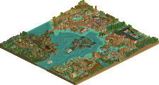
Park / [NEDC6] The Metal Moss
-
 28-April 25
- Views 787
- Downloads 175
- Fans 1
- Comments 28
![Park_6130 [NEDC6] The Metal Moss](https://www.nedesigns.com/uploads/parks/6130/aerialm6376.png)
-
![Park_6130_[NEDC6] The Metal Moss](https://www.nedesigns.com/uploads/parks/6130/logot.png)
-
 69.00%(required: 65%) Design
J K 80% SSSammy 75% chorkiel 70% CoasterCreator9 70% posix 70% Recurious 70% RobDedede 70% RWE 70% deanosrs 65% pants 65% Terry Inferno 65% Turtle 65% 69.00% -
1 fan Fans of this park
-
Full-Size Map
-
Download Park
175
-
Objects
1
-
Tags
Similar Parks
-
[NEDC6] Valley of Huanglong
![park_6118 [NEDC6] Valley of Huanglong](https://www.nedesigns.com/uploads/parks/6118/aerialt6364.png)
-
Lake of Lost Worlds
-
Smooch Hour
-
[NEDC6] The Cartographer
![park_6140 [NEDC6] The Cartographer](https://www.nedesigns.com/uploads/parks/6140/aerialt6372.png)
-
Violet Gardens
-
[NEDC6] Gaudi Gardens
![park_6136 [NEDC6] Gaudi Gardens](https://www.nedesigns.com/uploads/parks/6136/aerialt6370.png)
The theme you chose is classic but also a bit on the safe side. You executed it really well though! The buildings were cleanly designed, the coaster stood out nicely, and the other rides had great presence too, with some fun details throughout. In my opinion it's an examplar design, but a bit safe
Wait... that's the same thing I posted about Huanglong. It's funny how you also have a rapids ride. What grabbed me more in this design was just the overall composition and esthetic
Very much enjoyed the theme you chose for this. It felt like a different look for you, but still played into the classic AJ aesthetic and details you like to include. The macro shines here and your landscaping is always so beautiful. Also, thought you did a great job of creating interaction with the coaster; feel like the best NEDC entries usually excel with that as a way to differentiate themselves. A nitpick, the RMC felt unnecessary to me, I'd have rather you let the rapids and landscaping speak along that edge. Otherwise, really fun and warm entry with some OG rct vibes. Congrats on the design!
I like how simply this map looks - very easy and inviting to explore. The farmlands are a nice backdrop, and I like the fenceless queue here. Not a fan of the generic/meaningless names or the coaster colours, coaster also feels underutilised. But in the little details I find more things to like, somehow I really like the crooked house leaking water, as well as the benches under the colonnade. Simple, but very pleasant.
another aesthetically pleasing & not overwhelming hyperdetailed entry! what a treat! although trve NCSO is not up my alley as much as PT2 shit, and the grey castle wall isn't my favorite texture ever, there's still a lot to love here. the landscape and foliage sticks out to me as a big plus, something that usually seems to be lovely in your work. obligatory support review because nobody is safe: the supports look amazing on the lift and in some others spots, but the custom/default combo always bugs me out for some reason. maybe thats partially some NCSO beef i have. overall, very pretty, good interaction, lots of life
-Concept: *
Not much of a concept, other than 'medieval setting'.
-Content: *
Nice supporting rides, but not a whole lot to explore unfortunately.
-Quality: **
Good consistent quality throughout.
Overall;
Nice medieval setting with some great height variations throughout and nice landscaping/foliage. The station buildings of both coasters were the highlight for me, some great construction there.
Just wish there was more
Was really missing you during H2H so it's awesome seeing you back in full form! This design is so full of your classic boldness and identity, throwing away what feels like obvious choices in favor of what you felt worked best. Very impressive to see a build like this come about in just a few days!
+ Very good macro and composition. Colors are blocked and distinct, sections are very readable, and everything feels intentional.
+- I love a good consistent architectural motif. I just almost wish that there was one more tiny pop of color, whether it be the otherwise gray arch windows or the occasional differently colored awning.
+ Typical AJ foliage; in other words spectacular. What always gets me is the way you create big sweeping shapes and fade it into the landscape, almost like brush strokes on a canvas.
+ Great use of the haunted house and especially the crooked house as architecture.
+- Kind of a crazy color choice for the coaster. It somehow works, but I also don't think it really cuts through the surroundings very well. A big f you violet does the job, but does it really fit in with the rest of the design? Honestly I respect it.
- Station roofs felt a little thin. In general some parts of this build feel a little flimsy, likely due to how quickly it was made.
- I'd appreciate some more path-level details such as benches, garbage cans, and little market stalls here and there.
This was a tough one for me as I still dont fully understand/recognize a NCSO intended park so it seems off to me. That said, I actually like the portions outside the walls vs the inside the walls better. It just seems more work was spent on that area. I do like the map though and have provided some ideas for me that I hope to take inspiration from. Congrats on the submission and Design
Nice one, AJ! Some great composition here. Similar to Lurker, you're great at working within a personally well-established theme and iterating on it.
The coaster queue that moves through the fields is such a lovely idea, though I wish the landscaping (especially those bushes) wasn't quite so uniform. I also love how you've integrated the glass station roof with the castle theme. It's that subtle subversion you're so good at, that plays on the inherent absurdity of RCT. If roller coasters can be moving through a medieval landscape, then why not have a glass roof, eh?
I would like to see what you could do with a more polished presentation. The jokey ride and Drag Race-queen staff names feel kinda expected from you at this point, and leave me thinking "well that's AJ" when they could have been a great chance to add texture to the map's story. Your queer perspective is so distinct, and comes through in all your work, I'd be interested to see how you channel that beyond just easy references.
Really enjoyed the atmosphere in this park. I feel like the park has a certain charm and confidence to it, even if it doesn’t go big on spectacle. The supporting coaster is very nice and helps give the park some life without demanding too much attention.
Foliage is super solid across the board, and the use of the crooked house object for the rapids was a clever detail that really stood out to me. Also loved the hedge walls on the rapids lift and drop, a small detail, but it looks very atmospheric and cute. I thought the queue for the main coaster was clean and well-integrated too.
If I had one critique, it's that the park feels a little too restrained overall. There’s nothing that really pushes things to the next level or creates a big "wow" moment for me. Also noticed a bit of peep crowding here and there that disrupted the flow a bit.
Still, this is a really clean and well-executed entry with a lot of smart choices. Great work overall and an entry to be proud of!