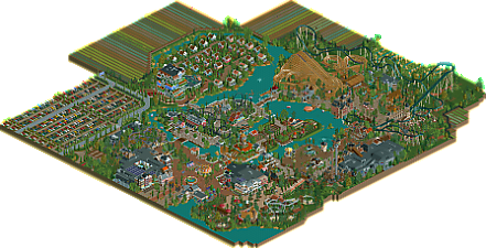
Park / Wilhelmina Wonderland
-
 18-May 25
- Views 1,261
- Downloads 213
- Fans 3
- Comments 27
-
-
 79.50%(required: 70%) Gold
ottersalad 85% CoasterCreator9 80% deanosrs 80% Milo 80% pants 80% RWE 80% SSSammy 80% Terry Inferno 80% Turtle 80% Xtreme97 80% Scoop 75% J K 70% 79.50% -
Description
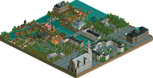
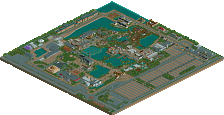
A park in the polder (-1.5m) near Schiphol airport, themed to the Netherlands. Foreign tourists can take one of the many touring cars to the park to learn about Dutch history. Domestic tourists can ride their bike to the park.
Enjoy your visit!
Groetjes! -
3 fans Fans of this park
-
Full-Size Map
-
Download Park
213
-
Objects
1
-
Tags
Similar Parks
-
Dueling Spirits
-
Scream World (Frightmare Hills)
-
Hollandsche Glorie
-
Resort Heusenhout
-
Coyote
-
Kongamato
This is like a Dutch Disneyland. I thought this was very successful at maintaining your personal style and RCT identity but elevating your execution. Had a lot of fun going through this - my only question is; which De Zeven Provincien is the ride based off?!
One of the parks I was really looking forward to seeing finished, and you certainly delivered. This map feels and breathes as Dutch as it can be. Though I could've sworn Reinaart den Vos was from Flemish origin
Architecture is phenomenal and without a doubt the best we've seen from you. Super detailed and some interesting shapes.
Coaster-wise Waterwolf is my clear favorite. Flowy and very punchy layout, everything that reminds me of a great newgen Vekoma. Karel ende Elewijt is also great, you nailed the dueling/racing aspect very well which isn't easy, good job. That said, I didn't like Iconoclasts layout, felt a bit all over the place.
Also Fabian please, for the safety of your peeps (and for realisms sake), let your coasters run on block brakes!
I liked the extra Dutch outskirts too, tullips fields were a nice way to add some color in the background. Map size doesn't bother me at all. I do think you missed an opportunity with not adding some windmills. Old or modern, they remain Dutch as peanut butter bread.
Congrats, great job on finishing this. For me, it's your best work yet and also my favorite work from you. A nice hommage to your home country.
It's interesting how this has that late 2000s Dutch parkmaking style but with modern scenery and building techniques; it's open and clean, yet it has some added details. The coasters in this park are all great but it's really the small rides that stand out to me. The theming of the swan ride and the tree drop tower, the windmills of both varieties by the car ride, and the indoor ice skating area really add to this.
The architecture is probably your strongest yet; there's so much detailing involved. The ruined cathedral station of iconoclast, the buildings around the water coaster, and the wooden ship are all standouts for me and easily h2h quality.
I think the highlight of the architecture would have to be that postmodern hotel building that looks like a bunch of houses stacked together. It's very memorable, looks just like the real thing, and I would've never expected that building to be remade in RCT but am glad that it has been.
great work faas. this is a tight project with some pleasant surroundings.
the vibes are very strong, you've leveraged composition, theme choices and micro execution to create a super pleasant viewing experience. if i were to guess i would say you have fully achieved what you set out to bring to life.
where i think it could be improved is the fact that i don't think any of it was particularly brave. i think a lot of your choices were executed to a high degree of quality, but i didn't feel surprised. it was all very safe. the hotel was an exciting moment, but it is a quote from a real life example - expanding upon this idea could have been an exciting direction for a wider section. id love for you to foster that instinct that made you select that cool building to quote.
for me, the coasters perhaps could have used one or two more drafts to hammer out some clunk, but all in all, not a bad showing.
easily your most impressive work, hope to see you bag a big green name. i just hope your next park leans more into your abundant talent with some braver decisions.
keep up the great work, faas. such a lovely viewing experience
This map is full of so many great little moments.
Highlights for me:
- The sweet pirate ship (is it a specific ship? Having just listened to a few podcasts about the VOC, would be cool if this was a nod to that time)
- The central island is a cool feature. Love the little river boats meandering past.
- You do a great job with path details, particularly planters and foliage. They really help to bring the park to life.
- Station for the hyper twister is awesome.
- The swan boat ride is beautiful. Love how it goes under the queue bridge.
- The green splashboats drop is a great moment.
I know i've mentioned it before, but my biggest gripe with this park is the map shape. Yes I understand that filling it with more tulip fields, grass, and car parks might not "add" to the park in a meaningful way. But by leaving the map shape with large chunks missing, it gives the impression that the park is incomplete. It's not so much about adding more content, it's about the perception of delivering a fully realized complete park. Unfortunately like it or not, the hyper polished parks that we're used to seeing in contests like H2H have moved the needle farther for me to where it's essentially expected to see a park as polished as it can be when sent out as a submission. Having large missing sections of the map makes sense when it's a contest park with a limit on the tile count. Or if the shape is very intentional. But when submitting a park of this scale and effort with zero time/space restrictions, it just feels haphazard. I know i've fought several people on this exact thing before, and I'll never understand the logic for pushing back so hard on it. Again, it's not about adding filler content to the map, but presenting a well-crafted, completed submission. If you're going through all of this effort to build a beautiful map to be considered for voting and reviews, why not set it up for success so that people like me don't have dumb things to nitpick about?
All that said, I do love this park and thing that it's your best work yet by a mile. Coasters were great, overall ride design was brilliant, tons of atmosphere, colors are vibrant, and the architecture is lovely.
Thanks man! I did add block brakes but maybe they don't work, I don't know. I actually thought Iconoclast was my favourite layout. An out-and-back layout with some more elements around the queue for some interaction.
It's really cool that you've highlighted Dutch culture. I don't know too much about the myths of this country except for the great intellectual and artistic figures, but seeing the names of some attractions in something other than English is a real pleasure.
It's not really my style of rct but I still enjoyed quite a few things here: the boat, the old town at the park entrance and especially this little opening with Little Ice Age inside. The whole area with the cute mushrooms and the strange but interesting architecture of ‘De Padde Stoel’ is really cool. The drop in ‘De Vergulde Draeck’ is nice too. Everything is cute and cleanly executed. The negative points for me are the borders, and perhaps a little more diversity in the shapes.
Congrats Faas!
This is a beautiful park, I very much enjoyed exploring it. It feels "traditional" and also feels like a homage to Dutch culture in a really unapologetic way, which I appreciate.
Architecture throughout was a highlight for me - everything cohesive, but also enough variation that it didn't feel "samey" and get boring. I especially enjoyed the area around the ship, and the restaurant in the middle of the path close to there - the curvy roof trim all the way around worked great.
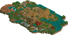
My least favorite areas were actually the 2 islands in the middle of the map.. I understand they're man-made and might be true to real life, they just felt slightly inorganic and angular when compared to the rest of the park.
Your main strength imo (and something not many people do as well as you) is showing love to the supporting rides. Too many people (myself included) build a coaster, then bang a couple of other rides in there to fill the space, and you end up not spending any time looking at those supporting rides because it's just a twist, or whatever. This map had rides everywhere, and each one deserved my attention. Particular highlight was the tree hopper ride in the middle of the swan boats, just felt like a thing a real theme park would do.
Great stuff, congrats on such a lovely park.
Congrats on another job well done, Faas. Another high quality park that we've come to expect from you.
Going around the park.. the entrance area was quite atmospheric. Some stellar archy work on display as well. Really enjoyed the carousel and the Molensteen ride. The indoor skating was quite unique as well. Really cool to see Molensteen twirl around the windmill. Ramjaar was neat as well - cool supports, lovely gardens as well.
Next we have the island with Waterwolf. I think the archy here is bright and colorful.. but the coaster here is a bit wonky in my opinion. Feels like the launch into that inversion is a bit tight. The large half loop might've been better here?
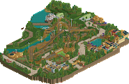
The dueling wooden coasters were really cool. You have a knack for GCI's and this one is quite memorable. This area of the park has some wonderful castle theming and feels quite immersive. The swan boat and the elevated cheshire cat are quite lovely.
Iconoclast is a nice coaster I think to round out the lineup here. Nothing super flashy, but I don't think every coaster needs to be a banger to make for a strong lineup. The drop and final section after it dips below the final brake run was a nice feature and adds some character to an otherwise simple out-and-back. The open air station is neat as well.
Continuing along, the water coaster facade is better than my Pirates of the Caribbean thats for sure! Just wish we had a little glimpse to the interiors. But man, the outside theming is cool with the bones and stuff - same too with the adjoining drop towers.
The corner with Wolvenjacht is nice and quiet. Nice central 2x2 flats and the cycle ride make for a pleasant little area. Still well themed, but a much needed breather compared to the dense architecture elsewhere on the map.
Last but not least, we got the Poldertour! What a cool little car ride - well themed too! Reminds me a bit of Hulst and the cyclocross course there. Perhaps that is a bit different than a Polder though!! Back on topic - I think this car ride encapsulates what you do best, incorporating base game rides into a more modern game. Base flats, base car ride track, no custom roads/tracks for you and that's cool with me.
Such a charming and classic style, love the architecture, especially the scale of it. Love the ride design too, especially the non-coaster rides.
I know I'm missing some of the reference at the moment but they add a lot of character to the park, The polder area especially. Also like the choice to make the ride names in Dutch.
Fass continues to up his game, including meta building methods merged with his own unique style the community has appreciated for many years. Your growth as an rct player is clearly evident in WW.
The entrance plaza is fantastic, love the tight, dense and well composed architecture, so atmospheric. There are ton of rides seamlessly included, a lot more than you might expect on first glance. Great to start to the park.
Counterclockwise:
- Fun little Faas-esque mini coaster
- Another jolt of incredible atmosphere - ship is fantastic, De Vergulde Draeck is so well themed with a ton a flat rides to support the area. The openness around the boardwalk provides a great view of the rest of the park.
- Agree with Otter, Iconoclast is sufficient coaster, but it is integrated so well with some fun peep interaction along the way
- Karel ende Elegast - duelling wooden coasters are always a fun addition, the layouts are very well done
- Waterwolf area perhaps could have used another pass of detailing before release. I'm thinking maybe because all the other areas of the park had a central plaza, but this area doesn't, it feels a bit out of place... or I'm just missing it having a bit more openness to it, that's where a lot of your rct skills shine.
- Hotel and lodges are fun, not really my cup of tea for parks in general, but I assume that's just part of the Dutch style park making
Appreciate the heart you put into your parks, clearly your still having fun with rct and your work is always a treat to the community!
I thought this was very nice, a successful Dutch realism map that shows a carefully refined and evolved style, and doesn't shy away from some more modern techniques in ride and scenery design. Entrance area is a strong highlight, beautiful and atmospheric. I appreciated the obscure Dutch references that I won't understand, adds some exoticness and authenticity to the map even if it goes over my head. The architecture overall is your best work and especially peaks around the water coaster and pirate ship, whose whole area is the high point of the park. The coasters are all fun to watch too, Iconoclast has some awesome interaction over the queue, path and enterprise at the end. The hotel and holiday bunaglows are a nice addition too, expanding on the park setting and its believability some more, same goes for the tulip fields and accompanying tourists.
Dutch-ny land! This is such a fun concept to visit as a fellow dutchy. I love all the little references in the architecture, food, historic and literary references. Most importantly, this park puts a smile on my face!
Starting off with a beautiful entrance area. I really like the archy on the left and the lake with the La Place-restaurant on the right. That tulip-fountain is just too cute. Archy in all of the park is very good. Definitely your best work yet, in my opinion. The ‘windmill’-structure at the entrance does seem to miss wings though, or maybe it’s meaned to represent something else? Also, I know it’s a nitpick, but I think those trees are to big to fit in such small barrels and the awnings on the ‘vpoffertjeskraam’ are quite low. Going forward: Americans might have ET-adventure in Orlando, but we have OV-fiets adventure at Wilhelmina Wonderland! The area right from the entrance plaza is maybe even more cute. Especially with the Klompendans and the giant mushrooms. I think the antlers on Jachthuis Beukenrode are a fun idea, but could’ve been done in a more clear way with Round Inverted Deco Trims or something. Also, changing the direction of the Klompendans cars under the blue roof would make it more dynamic from a macro perspective. Again a small nitpick, but deleting the light green tree in the OV-fiets area gives it some more room and helps the view on those beautiful small buildings you added. Wolvenjacht is awesome and that city-wall is a great way to divide the area’s. The next area is dominated by the beautiful large ship and De Vergulde Draeck in combination with some ‘old skool’ infill attractions. Amazing statement-pieces. Just great macro all around. At first I had my doubts about the AE-flat-rides, but I think you use them very well and they contribute to create a very personal ‘Faas’-Style that has one foot in the past and one foot in the present. I do think the ‘Zeven Provincien’ could’ve benefited from a more modern approach, but it’s not too distracting. Back of the park is where we find the big guns. The coasters have great layouts and the area looks great. It maybe weird to say, but the detail that stood out for me most and elevated this to a next level was the half-diagonalism in the entrance to the Vos Reynaerde-area. My only nitpick in this greater area is the location of the snackbar in relation to Slot Loevestein. Would’ve benefited with a divider (maybe a tree) in between. The presence of wolves is not only prominent in dutch news, but also in this park, because in the next area there is again a wolve-themed coaster: Waterwolf. A coaster with great flow. But it doesn’t end there. A daring rendition of the Zaandam Gemeentehuis as a hotel and a ‘vakantiepark’ as well, along with those beautiful tulip-fields make this map complete.
In conclusion Faas, I think that you succeeded in creating a park that is very realistic in it’s set-up, succeeds in creating a personal style (combining both elements from the past and the present), is overflowing with Dutch ‘gezelligheid’ and makes me wish I could visit it in real-life with my family.
nice park. stop using AI logos.
I was disappointed in the lack of windmills.
Fantastic park Faas, I don't know quite yet where it ranks among my favorite of yours but this definitely had some of the best micro of all your work. The area around the water coaster and hyper especially. If the whole park was that level you might have been looking at a spotlight contender.
Hope we see more from you in the future!
Wilhelmina Wonderland is a delightful new submission that strikes a perfect balance in size and scope. It’s large enough to feel immersive yet compact enough to explore comfortably without feeling overwhelming.
What really stood out to me was the Dutch theme, which immediately brought back memories of family vacations to Holland, Michigan. There’s a small experience/theme park there called Dutch Village, and Wilhelmina Wonderland feels like the beautiful, full-scale evolution of what I always wished that place could have become. It captures the whimsy, culture, and architecture of the Netherlands.
The entrance plaza is particularly strong, with lovely architectural details that set the tone for the rest of the park. I also really enjoyed the small cottages near the hotel. They added a cozy, authentic touch that made the resort area feel grounded and lived in.
From a ride standpoint, the dueling wooden coasters are a standout, bringing classic thrills with clever layout design. The spinner and launch coaster also delivered both in theme and execution, adding diversity to the park's offerings without feeling out of place.
Overall, Wilhelmina Wonderland is a well-executed submission that I truly enjoyed. It was a pleasure to explore, and it resonated with me on a nostalgic level. Congratulations on a fantastic submission!
I'm Glad someone said it. ( I will review this soon btw)