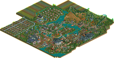
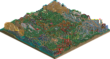
Park / Wilhelmina Wonderland
-
 18-May 25
- Views 94
- Downloads 124
- Fans 3
- Comments 27
-
-
 79.50%(required: 70%) Gold
ottersalad 85% CoasterCreator9 80% deanosrs 80% Milo 80% pants 80% RWE 80% SSSammy 80% Terry Inferno 80% Turtle 80% Xtreme97 80% Scoop 75% J K 70% 79.50% -
Description
A park in the polder (-1.5m) near Schiphol airport, themed to the Netherlands. Foreign tourists can take one of the many touring cars to the park to learn about Dutch history. Domestic tourists can ride their bike to the park.
Enjoy your visit!
Groetjes! -
3 fans Fans of this park
-
Full-Size Map
-
Download Park
124
-
Objects
1
-
Tags
Similar Parks
-
Dueling Spirits
-
Coyote
-
Scream World (Frightmare Hills)
-
Kongamato
-
Hollandsche Glorie
-
Resort Heusenhout
This is a wonderful park. To me, it deserved the 80%+ level. I was definitely split between 80-85 rather than 75-80.
This is a park that was built at the pace and style you like to build at, clearly, Faas - and I think that's always something to be celebrated.
It's like that advice to authors - write what you want to read, not what you think your audience might want.
What that results in is a map that is clearly just really well loved.
While I agree with some of the minor critiques - weird map shape (really though, does this matter that much?), some areas a little underworked, and let me just add a few too many different pathing options, putting that aside there's so much to like.
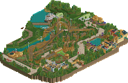
I am a big RCT hotel fan and there's a great one here. All the accomodation adds lovely context to the park without being detached from it which is the risk of going into the office building/fast food type of surroundings. What is there adds context but doesn't distract or detract all the way down to the insta-brides and their spouses on ladders, which is a great touch by the way.
I love the big bold windmills by the entrance, and I love how instantly dutch the whole thing is. Not just the flags, but the architecture and mood screams Netherlands.
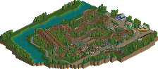
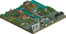
The boat, raised bridge, old town walls, it all screams exactly what it is. The way rad van beroerten is nestled inside the turnaround of iconoclast is a lovely alton towers-esque moment. That coaster by the way is my favourite in the park, its interaction with the wooden duelers is fun and the end of the ride is so well integrated with the park.
Great stuff here, I wish we would see more parks like this!
Definitely agree about the AI logo lol, that was a weird surprise.
Absolutely adore the park though! I love how your style has evolved, how you've managed to maintain the same scale but boost the level of detail. I keep going back to that row of facades around the water coaster in particular. Everything's so sophisticated and intricate, spacious while somehow still feeling cozy. Just masterful stuff there.
The hotel's another highlight for me. I'd say I prefer your version to the real life one. It's so bold, but the surrounding tulip fields and cottages help soften it, making it feel whimsical rather than just ridiculous.
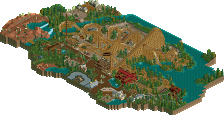
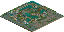
I wasn't as in love with some of the coaster layouts. The spinning one in particular had such a bizarre layout that didn't seem to match the realism of everything else. The area around Waterwolf also felt pretty blocky compared the organic flow the rest of the park layout had. Finally, I know there had been some Discord discourse about map shapes, and I think for this park I fall on the side of wishing it was more rectangular. Looking at the overview, those slabs of tulip fields really disrupt the overall composition and draw my eye more than they should.
Other highlights for me were the entrance (especially that tulip fountain), the layout of those duelling woodies, and the level of care you put into all the kids' rides. The car and bicycle ride in particular are so thoughtfully realized. Lovely lovely.
Always a big fan, Faas!
Damn wow, I was really impressed by this project. The atmosphere is so strong throughout this entire map. Right when you open the park the archy style, the windmills, and the music hits you all at once and really sucks you into the environment. The macro is great! Its always hard to go wrong with the figure 8 path haha. The outskirts were also pretty good. I thought the parking lot was really charming with the default land textures coming together quite well. I also though the little suburb was also nice! I do kinda with you went with something else for the farm land instead of the coloured flowers.
Foliage and Landscaping: I think this is probably the weakest part of the map which is saying something but the foliage and landscaping are still decent. There is actually some really nice foliage moments on this map. This little area with the purple flowers is absolutely lovley and has a lot of a character.
I liked the tree selections that you went with. I think the underbrush could have been touched up pretty much everywhere. I like that you clumped the trees together but the clumps were never really strategically used to frame anything and in a lot of areas the clumps seem to just be randomly plopped around.
The landscaping was also fine but I was wanting more from it. A few rocks and some better land texturing could have gone a long was in making the environment more interesting.
Architecture: This is probably the highlight for me. All of the architecture here is really solid. The different themes are handled so well throughout the park. Everything genuinely has its own character but also feels like it belongs in the park. The hotel is probably my favourite building on the map
I mean I'm surprised that you managed to make such a disjointed building look so good! I really have no complaints about the architecture
Everything Else: The ride design was really good throughout. I absolutely love the splash boats ride. The coaster layouts all look good to be. the Dueling wooden coaster was a fun watch. I also love all the little moments you have throughout. This slide ride is amazing for example
It blends in with the surroundings so well and adds so much to the area. The little fountain at the park entrance with the flowers was also amazing.
Overall: I'm really glad I checked this out! I rated this 85%
Thanks everyone for the replies. Much appreciated.
 .
.
I understand that the two central islands feel a bit more artificial and flat, because they are supposed to represent two artificial polders. As you can see one is drained the old fashioned way, with windmills, and the other one with steam machines, as the Dutch later did.
I wanted to give off the vibe Dutch polders have where everything seems to just be artificially plopped on top of it, I'm glad it worked
Most of this park is actually supposed to be set on artificial land, hence all the waterways, the random square slabs of fields, and why it is set at -1.5m in RCT. There is even a peat bog yet to be drained.
I also hope you found all the clog photo opportunities. One of my favourite memories was when I visited the Dutch flower park the Keukenhof with an Afghan refugee I was buddied up with, and we really wanted our picture taken in one of those giant clogs, but it was full of kids, so we just gently kicked the kids into the nose of the clog so they were out of the shot to get our picture taken.
Anyway, I' m glad it's released and I'm really proud of finishing it.
Also glad you guys liked the hotel and bungalow park (not a suburb lol) because I wasn't sure whether to include those.
Here are some images of the setting I was going for.


This park was really a joy to explore. It has a very pleasant vibe, and as a Dutch person I enjoyed some of the cultural reference jokes, such as the 'kringverjaardag' teacups ride. Lovely park!