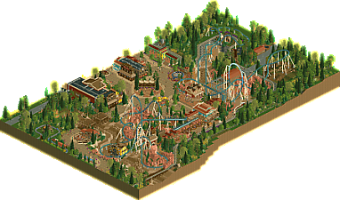
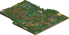
Park / Buffalo Blitz
-
 26-May 25
- Views 672
- Downloads 179
- Fans 1
- Comments 18
-

-
 82.00%(required: 65%) Design
CedarPoint6 85% deanosrs 85% Milo 85% SSSammy 85% Turtle 85% Babar Tapie 80% CoasterCreator9 80% G Force 80% J K 80% ottersalad 80% Scoop 80% pants 75% 82.00% -
Description
Welcome to the wild, wild West!
-
1 fan Fans of this park
-
Full-Size Map
-
Download Park
179
-
Objects
2
-
Tags
Similar Parks
-
Wings n Things Fun Fair
-
Rougarou
-
Wildfire
-
Erlebnispark Ochsenbach
-
[MM2014 R3] Heart of Darkness
![park_3211 [MM2014 R3] Heart of Darkness](https://www.nedesigns.com/uploads/parks/3211/aerialt2825.png)
-
Cannonball Run
If Maverick was made in 2025.. wow! This slaps. Amazing work Fred.
Strong layout.. well themed.. really solid area/land with the music, restaurants, supporting rides, etc.
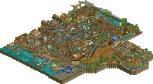
There's some really tasteful decisions worth noting.. the dried riverbed in particular. Also love the station and queue for Buffalo Blitz. Feels like a mix of BTMR and maybe Silver Dollar City? Either way, this is quite a nice bit of RCT.
First release after a full-scale park… done!
Releasing a massive project is always a turning point. After something so ambitious, the big question becomes: what next? How do you top it? How do you show growth? Buffalo Blitz answers that with confidence—and then some.
What’s immediately clear is how balanced and refined your parkmaking style has become. Everything feels like it’s clicking into place: nothing feels rushed, nothing feels underdeveloped. There’s a real maturity here.
Architecture is looking cleaner than ever. The Western theme is pulled off with strong textural work and smart detailing, striking a great balance between realism and stylisation. You’ve found the right moments to go heavy on detail, and it sells the theme beautifully without overwhelming.
Foliage Immaculate. It took me right back to the Viking and Indian areas of your solo park—where it felt like you really found your groove with plant life and landscaping. That same touch is on full display here, with a natural flow and great contrast in textures.
The Coaster is a standout—and it’s especially exciting to see it emerge as a highlight. There was a time when coaster design seemed like your hesitation point, but now it’s the heart of the park, and rightfully so. This one had flow, character, and dominance
On top of all that, you nailed the small immersive details that make parks like this feel alive. Those little touches pull us in and keep us invested.
As it stands, Buffalo Blitz feels like an all-around 80% level park to me—strong, reliable, and technically sound. But where can it go higher?
Potentially:
• Finesse. A second pass would’ve helped catch a few spots and unfinished tiles. Nothing major, but they stood out just enough to take a sliver of polish off the final result.
• Theme boldness. The Western theme is rock solid—but I found myself craving something a bit funkier, something unexpected. Just like that brilliant Indian vs. Viking section you did previously, a more unconventional or creative thematic approach could elevate future releases beyond well-executed into memorable and surprising.
You’ve shown growth across the board—from coasters to composition, from foliage to fine details. Now’s the time to take bigger swings with theme and execution in my opinion.
Agreed with the elite status. You're on an upwards trajectory.
Fantastic park once again Fred! Highlight for me is probably the architecture. That Steakhouse building that you posted a screen of before is of course fantastic and so is frontier fashion and the diagonal band stand! Lovely detailing.
The coaster layout is a beast too. I perhaps find the turnaround with the 2 corkscrews next to eachother to look a tad awkward, but it does lead to some very cool interaction.
Biggest downside for honestly is the music here. The tune itself is actually nice and obviously very fitting, but its quite repetetive and gets old for me fast. Would definitely have put in a 2nd or even 3rd different music piece to break it up a little. I felt like i was getting brainwashed there for a moment! Atleast i wont forget the name of the ride and park for a while though! Haha.
Aside from that minor critique this park is really great though and i enjoyed it a lot! Very impressed by this and by how fast you finished another great submission after your big Lake of Lost Worlds release! Keep up the work my man youre a freaking machine!
FredD, you´re on a roll. First a large scale solo with Lake of Lost Worlds and not even four months later you brighten my day with this beauty. Are you aiming to become the Belgian Babar Tapie? I hope so.
First off, the layout. I think it’s quite clear that Buffalo Blitz is the kind of coaster that any coaster-enthousiast would love to ride. It’s spread out, but with a logical form and offers a lot of variety in coaster-elements. I think the colour-change on the inverted top-hat is a beautiful accent.
Looking at the rest of the area I love the dried up riverbed with the bridge going over. Such a strong area theme-wise. I think the salmon-coloured rockwork has a good macro, but is a bit rough on a more detailed level. The blending of the Fisch-rocks and Kryptonian-rocks could’ve worked better if it was more balanced. I think your archy is very strong in this park. Like I commented on your screen; it feels Disney-esque. The combo of the curviness of the path and the curved planters around the buildings has inspo from Belle Ilse, but you really integrate it with your own style and theming. Making it feel very ‘up to date’ with the current meta.
I think what stood out in a bad way though, was the use of curves in the que-lines. That just didn’t fit with the Wild West theme at all, in my opinion. Straight lines with cattle pens would make more sense in this theme. But it’s a rather small detail.
In conclusion, I think you created a beautiful and interesting layout that fits the current meta and shows your versatility and drive as a player.
What you got cooking for September?
very much enjoyed this, what a great map. definitely a deserved design (guessing of course but should safely get there) and as some have said, a solid step up from your last park, which i already very much enjoyed.
it's pretty obvious when someone has a super solid grasp of the fundamentals that make a good looking map - the colors, the landscaping, foliage, architecture etc. oftentimes you can have these and get away with not having super strong ride design (i should know). this is not one of those times though, this ride is really strong. i would have loved to have seen one or two more areas of path interaction, the best bit was the cobra-roll-y bit (don't shoot me, coaster enthusiasts, i only learned the name of like 3 inversions). having that up against the path and right in front of the ride entrance plaza creates a super strong little section.
there are some other areas of the ride that, because of the pathing layout, feel a little isolated. the last corkscrew part, and the turnaround after the top hat (coaster enthusiasts, please refer to my message above). some planning earlier in the build to lay things out in a way that highlights more than one of two ride sections would maybe make the whole thing more special.
i'm nitpicking here, because this is great work. there's nothing to critique in terms of architecture (outstanding), foliage (perfect), support work (often overlooked but looks great). brilliant stuff. the little area with the yellow umbrellas, lights, and food cart next to the stage is really special.
loved it, i want more fredd stuff.
Really nice build here. To me it's even a step up from your full-scale release in terms of level of detail.
Highlights for me include the dry creek bed (this is inspired), the station building, and the band scene.
Lovely Fred, your best work by a good bit I think. Layout was top notch, especially the first half. Just really classy high quality design that didn't try to do too much but did more than enough to impress.
Fred, this is delicious.
+ Track recoloring on the inversion
+ Architecture all round super on theme
+ paths amazing; sure belle isle inspired but I have no issue with that
+ love the curvy queues
+ strong foliage game
+ dry creek bed
+ train bridge over it
- the areas of empty grass felt a little bare, just some weeds in there maybe or something to smooth out the flowers between the corkscrews
- for the theme, it felt like the buildings were missing a "main street" vibe; nitpick I know!
The coaster was really really great, original while still being plausibly realistic. The only part that I didn’t like was how squared off the horseshoe roll was. I liked the banking change but the result was lacking in flow as compared to the rest of the layout.
All the pathing and archi was top tier. I perhaps would have rotated the building near the entrance 90 degrees so the balcony was more to the benefit of the plaza.
I think the main thing that could have been improved was the overall macro but that would be a fairly high level improvement. The integration of all the elements at play were awesome.
Congratulations on the next step of your evolution brother!
I enjoyed this one! This is great. The influences from Belle Isle are apparent, but the way its all laid out is very clean and in a way that fits how you build. Very unique. Also as others said you let the coaster speak for itself, and I appreciate that about your macro.
Fantastic stuff Fred! This is probably my favorite work from you. I'm extremely proud of how you've been able to evolve your style in the past year since h2h. Doing solo work definitley suits you. Hopefully we can see you push yourself further and go for a full scale park in this style.
Damn Fred! This is absolutely outstanding work! The atmosphere is absolutely top notch throughout this entire entry. The colours are absolutely amazing, I love the red rocks and foliage colours. The Belle Isle pallette was a great choice here! Really outstanding macro work also, everything seems placed very intentionally. I was beyond impressed when I first opened this park. The song (AI?) was also vibey for the first playthrough but got old pretty quick lol.
Foliage and Landscaping: I really liked the landscaping on this map. I think using two different rock objects for the fake rockwork and the real little stones scattered about was a good choice. The red rock landscaping looks pretty much perfect for what it is supposed to be. The 1k rocks also work surprisingly well here. I would have liked a little more texturing in places like the dried riverbed but honestly that pretty nit picky.
The foliage was also really strong for the most part. Great bush selection and tree selection. Colour choices are also on point. The clumping was done really well, everything seems pretty intentional. I thought this area was great with the yellow highlights and the fence.
My only foliage complaint is those purple flowers look unnatural and blocky compared to everything else. I would have liked to see them coloured differently (why are the bottoms not green?) and see more flower objects mixed in to make them look better.
Architecture: No complaints here. Everything was pretty great. Ol' Japs is obviously fantastic but everything else is also right around that same level. Seriously the best archy I've ever seen from you. I really loved the yellow train station and the station for the coaster was also just really solid. The colours are so poppy and used so well. Just really impressive stuff. Even the back house buildings are done really well
Its also nice to see you building well diagonally. You've made some massive improvements to your game over the last year or two.
Everything else: The coaster layout looks super fun. I like the colour choices as well. The path details are also one of the highlights of this entry to me. That little band scene in the middle of the park was one of the best parts IMO.
Overall: I rated this 85%. Your should be really proud of this park. Super hyped to see what you make next
Congrats on yet another Design Fred? Well deserved! For me, the balance of detail for me is something Im hoping to accomplish in Phoenix and this will help keep me motivated. All the detail added has a purpose and not detail for the sake of noise.
Again, great work!