Park / Macaw
-
 16-June 25
- Views 0
- Downloads 76
- Fans 11
- Comments 23
-

-
 92.00%(required: 65%) Design
Turtle 100% deanosrs 95% hydroportal 95% ottersalad 95% SSSammy 95% Babar Tapie 90% J K 90% pants 90% RWE 90% Scoop 90% Terry Inferno 90% Mulpje 85% 92.00% -
Description
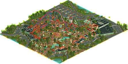
Welcome to a land where the vibrant songs of the macaw beckon you into a world alive with wonder...
Brave our B&M floorless coaster, Macaw, as it brings the exhilarating flight of the rainforest’s most colorful bird to life. Glide above the canopy, weaving through lush greenery and diving through misty waterfalls for a ride that’s as wild as the jungle itself.
Embark on the mysterious Oscura’s Odyssey, a shadowy dark ride that takes you on an unforgettable journey through the secrets of the rainforest. Next, let your spirit soar on the Grand Tiovivo, our breathtaking carousel that captures the majesty of the jungle’s creatures in motion.
Our land is more than just an adventure—it’s also a testament to our commitment to wildlife conservation. Don’t miss our Pampas Deer and Flamingo exhibits, where these graceful creatures find refuge and remind us of the delicate balance we share with the natural world.
Ready to relax? Savor tropical flavors at Tres Caminos, where every bite echoes the boldness of the rainforest, and wander through charming market stalls brimming with hand-crafted treasures inspired by the jungle’s natural beauty. -
11 fans Fans of this park
-
Full-Size Map
-
Download Park
76
-
Objects
1
-
Tags
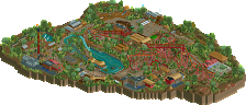
![park_4086 [H2H8 R1] Tahendo Zoo](https://www.nedesigns.com/uploads/parks/4086/aerialt3817.png)
This map feels like Steve giving everyone the middle finger by doing all of the expected "steve things", and doing them incredibly well.
Is it a subtropical theme with nice looking water, rocks, a big b&m, waterfalls, and a handful of lombardy trees mixed with a beige dominated hardscape? Yes. And nobody does it better.
Top tier work as always - this would be the easy NEDC winner for me had it made the deadline.
While I was wondering why you didn't submit this for NEDC, seeing as it would likely have won, it seems like it was the best choice. This goes past the file size and 60x60 limit; and the surroundings really provide this coaster with a lot of context and life.
I also agree with In:Cities that this is basically filled with all the Steve tropes, but it executes them all to perfection. The foliage in particular is really nice, and the path layout, sprawling and complicated as it is, looks so, so good. This park also has a lot of crunch; probably some of the best I've seen. There's so much texture in the walls and landscaping, and it's still easy to read.
The peep scenes also really elevate this. I chuckled at the misplaced dragon car among all the cars and vans, and the mechanic next to it saying "supposed to get us elite." Hopefully the mechanic is right, because I think you're going to get a red name very soon.
First initial reaction is wow, seems like you've unlocked another step in your parkmaking style. Excited to give this a full review and see a score this is surely deserving. Great work man!
F* what an stunning work here, The level of detail is insane, bringing the park to life in an incredibly realistic way.
The indoor/backstage section is really good, a real lesson in how to integrate backstage properly. It's the kind of park that you're constantly opening to find little ideas here and there.
Great job Steve!
Benchmark type build I'm guessing, the details are so on point.
I love The blue and green shipping containers, the roofing and the a/c plumbing is perfect.
so sick, well done mate.
son of lemuria
so complete and rich with life and verisimilitude. a mastery of the half diagonals pioneered in belle isle and redoubled upon here to create complex forms which feel incredibly natural and inevitable. because it is steve i wanted desperately to find something to hate but was left screaming into my pile of squishmellows.
if i could criticise one thing it is that the crunch, for my taste, was a bit too deepfried in areas. i think there's a happier medium a little back from this level of crunch.
outstanding work on that inside-L viewing angle. watching that car come screaming though as you queue over the cobra roll would be fucking wild.
I'm by no means a veteran around here but i'd like to think I am starting to get a feel for the styles of some established NE members, and even I can tell that this park smells like Steve in all the good ways.
I think it's quite impressive how the park feels lush, dense and truly tropical without the need for any super large landmarks or setpieces. Yes, the park has waterfalls, mountainy landscapes and a temple, but they all feel suitably theme-park scaled and arent compensating for anything.
Awesome work.
Steve, I am loving this park a ton! You always ask me, "where is the grid??," but I can easily ask you the same with this bad boy right here. I absolutely love how the park is laid out. I wanted to do something similar, but Native American themed, and I found it somewhat difficult to get an organic off grid path layout that is interactive but also counteracts against the linearity of the coaster. You execute it here flawlessly.
The paths, architecture and foliage are all done so expertly. I love the texturing changes for the bridges, and the bunches of buildings across the paths from the coaster that are textured so nicely and integrate landscaping into them really well. I love how the rocks and foliage are right up right against the wall of a building, it has a very thematic element to it that reminds me of great parks in real life like Busch Gardens, and it also simply adds a nice aspect to the buildings of rooting them down to the earth and connected with everything else around. They really feel like they belong where they are. You also managed to make LOTR rocks look good again, which is particularly impressive on its own.
There are many details in this park that I will have to take note of and come back to, because it is jam packed! The backstage is particularly really well done for being what it is, and it just looks great. The road infrastructure helps a ton to add to this effect of believability, and all of the little scenes of backstage work happening near garage doors and stuff further bring this to life in areas where you cant have traffic on half diagonal roads.
Overall, I can really tell that you put in the extra mile to make this park truly a great one by skipping out on the deadline, and going for the fully fleshed out vision you have for it. Even under the time you built this, it is still pretty fast, but the park does not feel rushed at all. I loved every bit of it, and congratulations on finishing such a great design! Great work!!!
obviously i loved this. obviously it was extremely high level, gritty and realistic and interesting and aesthetically beautiful. but there are parts of this that elevate it higher than every piece of work you've done, for me.
first of all, the color scheme. it shouldn't work. it's primary colors, notoriously easy to make clash. then you've also got a ton of green, peach, teal, purple... you've got a terracotta earthy red station right next to the bright firetruck red coaster. honestly i think if anyone else (maybe 2 or 3 people could do it) tried to make this work, the colors would detract from the overall vibe. but here, i changed the coaster colors a bunch just to see, and there was nothing that i liked more. this shouldn't be overlooked, genuinely masterful work.
the off-grid work here is also fantastic, definitely a step up imo. up there with the best i've seen. it does make a difference, makes me want to boot up the game and plan some off-grid stuff myself. obviously the final product is worth it, would love to know how much extra work it was for you to build this way (i know you've done it before, but this seems more extensive).
perfect patches of density and space, some open grassy areas that somehow felt totally natural, and love the shallow sloped land. every roof was detailed and perfect. a ton of scenes all around the park to give it life, and tons of guest scenery work makes this map feel vibrant and lived-in. the foliage deserves its own shoutout - some quite unorthodox trees and bushes going on, but again everything comes together perfectly.
in conclusion, i don't think there's anyone else out there that sees aesthetics the way you do. it's beautiful. every square inch of this map feels loved, and designed, and cared for. no notes.
Great map, certainly worth the wait. The details are so densely packed but are still pretty readable. Lots of nice gridbreaking employed here. Really liked the station setup and queue line, and the bold colors on the coaster i think worked out well.
Certainly seems like the end game for the Steve theme, not sure how much room is left to improve on it. This feels like the gold standard for the lush tropical desert palette steve tree and friends type job, but contained in a nice, slightly restrained theme park setting. Congrats on the red name big fella, cant wait to see what project you tackle next.
What a monumental realeaes. Congrats on the red name Steve, its well deserved.
I think this park very well could become the new benchmark for detailing. There is stuff everywhere, from foliage to landscaping, to path and peep level detail. The amount of love put into every corner is stunning and it manages to walk the perfect line of detail vs overdone/chaotic for me.
I think taking the extra time to finish this payed off well, it seems almost perfect to me. Ill be coming back to this one a lot to study and improve my own game. Awesome work, looking forward to whats to come next.
All right, I (regrettably) don't post much these days, so big post incoming:
Before I say anything else, I have to give a huge shout out to the squad I assembled to help me out in testing the map to get it in ship-shape form: Brian, Josh, Justin, Leon, Matty, and especially Andrew. With Xtreme also building for the contest we were pitted against one another, and I often turned to Andrew to keep spirits high and keep me on track. I appreciate all you guys so much, and we are all lucky to have you around for being not only exceptional builders, but just outright exceptional humans.
Otherwise, I am overwhelmed by the response this has received. While building this, I ebbed and flowed from thinking "this is pretty good, it might be the best thing ever" to "this is dog water and I will get a 84.5." When looking at something for so long day after day, I tend to doubt myself. So to finally unleash it and to see what you all have to say here and on Discord... I'm so grateful. After about 22 years (!) of playing this game on New Element, to get to this point is just absolutely wild. You guys understandably give me a hard time for the laughs (I hope) and keep me humble, and I appreciate every one of you and what this community has done for all of us. Despite whatever ups and downs we have had together, I never want it to be lost on me and will hold it close.
I guess this map has a bit of a story behind it for only being a few months old, or at least I feel like it has some explaining to do: I was immediately smitten with Justin's layout and how it invoked early aughts-style beemers and thought it was ripe for a Busch Gardens-type map. I wanted to straddle that line of heavy theming with a level of realism. Kind of in the vein of Disney with a big coaster. I enjoy pulling things from real life, too, and there was buckets of concept art of a new Animal Kingdom area being planned out:
I didn't copy things here entirely one-for-one, but I think the inspiration was pretty heavy. Took some of the broad stroke ideas and removed the Disney IP's and introduced my own macro.
And the macro was something I wanted to get right from the beginning. After years of working on parks like Lemuria and Glow Worm and H2H maps otherwise, theme park design and the sight lines for points of interest were what I really wanted to nail down. That meant I had to place this "area" in the larger "park" in the right way. The coaster lent itself to being in the back right corner of a larger overall park, so I designed it to have two "entrances" to the area and then complete a loop around. This also allowed for more context in the back of the park for employee services and such and cement that feeling that this area exists in the back right corner of a larger map. And with the coaster placed, I knew the station was going to be a set piece and should be a main sight line along a main primary pathway, with a secondary or tertiary pathway offshooting from there. This ultimately "forced" me to build the layout of the area into a triangular shape, allowing me to put the bigger dark ride facade as another set piece for guests to be drawn to. And then, from there, allowed me to place the carousel in a central location to give me the sight line from the other area's "entrance." With my own macro in place, different from the concept art above, I was able to include the rides there comfortably of my own accord and let the pieces fall from there. It sounds confusing but it works for me in my method of madness. Basically ever since I heard nin talk about sight lines years ago, and CP6 talking about primary/secondary/tertiary pathways in parks... I always try and emphasize those to hammer home that theme park design inspiration. Here's an old screen with some of the early macro planning:
Outside of the build process itself, a lot of you have kind of touched on why I didn't submit in time. I basically built on this every day in the last three months, and the deadline approached more and more and I got more and more nervous. I jokingly asked for an extension and I legitimately didn't expect it to happen. When it did, and I realized I was still a way off from finishing... I felt awful. With the deadline arriving, I had to make a decision to rush it and submit or keep it, and do it how I wanted. The answer felt easy but somehow like I was letting myself down or the community down. I think I made the right decision in the end, because this allowed me to expand the map from 60x60 to 80x70 and spend hours in the minutiae of meticulous detailing, and redoing things, and adding things and perfecting things. It that last month after the deadline it felt grueling knowing that I had a vision and needed all these extra tiles to execute it, but I think it was for the benefit of the map. I will always and forever say that a parkmaker's greatest tool is patience. To have the patience to expand or refine or wait for a bug to be fixed, is a far greater skill than placing some trees or creating a layout. It's what's going to challenge you to become the best you can be, and I think that goes for probably most things in life (I'm a dad, I think I have some authority to make that call). Here's where the map was on deadline day, and I had a handful of facades to do still and some queue line stuff and the carousel, etc:
Anyway, I guess that's all I could share for now. Again, I am beside myself with all the love and support you guys have given for me and this release. It means the world, and I hope to keep going and excited for whatever is next.
Steve, congratulations on the well-deserved red name. You absolute GOAT. Off course this park is beautifull with all it's rich details and skillfull archy, but I think the macro is the star. You really made that pac-layout shine in such a realistic, believable way.
I loved reading about your working proces. Shows how much dedication you have to this game. You have such a personal style and influence on the meta. On a personal note, seeing that little Logan-scene felt so bittersweet. I hope you're doing well.
What great big plans are you working on next old man? I'm rooting for a Project Phoenix-style park made out of Lemuria, Glow Worm and Macaw. Call it Steve's Ultimate Coaster Kingdom, or not. It's up to you. The world is yours to take.
Well deserved on the red name Steve! It's insane how long you've been one of the best builders on this website and here proving once again how good you are.
This map was outstanding and deservedly scored as high as the top of the NEDC. What impressed me was how easy it is to imagine the rest of the park existing around it and how everything would connect to this. Other than that I really enjoyed how the ride interacted on the map and more general the music and colors.
Steve really made this?! It's very good! I think you must have had Andrew ghost build like 80% of it, I mean, it's awesome stuff. Still, after 24 hours, I guess this is not a prank... Steve made a 92% awesome design. I guess I need to comment... or do I...
From SolarWing: Congrats on a rare 90%+ design (well not as rare thanks to the NEDC6). Frankly, I am a little surprised my re-creation of Kumba still holds the record (92.6%) after all these years. I think this is one of the best stand-alone designs that the site has seen, up there with El Encierro and Vulture. Of all NE records someone can break, I think top scoring design is most attainable. I am sure someday I will get to say "congrats" to someone when they surpass that score. Would be cool to see someone do it with a custom creation like this. I have always felt a little unworthy since I was just copying a real coaster.
From Belle Isle: The indoor rides... sorry, this is where my score dropped 5%. I know it would be a lot of work to do full interiors on each ride at the level of detail you have in this park, but I think it's a must to create a fully finished/throughout park. Still, no one does interiors, not just you here. I mean, Stardust Jubilee was a full interior design/park/space thing and that was on an H2H deadline. It can be done! You could at least do cutaways. For me it's a big missing piece of the park that could add so much.