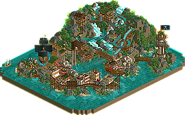
Park / Skullrock Refuge
-
 06-July 25
- Views 0
- Downloads 38
- Fans 0
- Comments 11
-
 69.50%(required: 65%) Design
Recurious 80% Mulpje 75% Terry Inferno 75% CedarPoint6 70% J K 70% Milo 70% pants 70% Scoop 70% Turtle 70% RWE 65% chorkiel 60% G Force 60% 69.50% -
Description
Somewhere in uncharted waters lies a bustling paradise for pirates of all kinds. Come and explore the pleasures and treasures that await!
-
No fans of this park
-
Full-Size Map
-
Download Park
38
-
Objects
2
-
Tags
![park_6118 [NEDC6] Valley of Huanglong](https://www.nedesigns.com/uploads/parks/6118/aerialt6364.png)
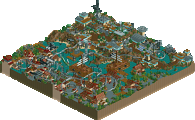
He does it again! Another big swing and another hit. Your current activity is almost the NCSO version of Babar—I always look forward to a Timmy park. Excited to see what you build next.
Super cool! I like the theme here. The pirate flags and boats are excellent. The landscaping throughout is interesting. A splashboats isn't particularly interesting for a design, but its refreshing in comparison to the focus there usually is on coasters. The waterfalls and all are nice to look at. I think some sort of continuing accent color may of elevated the map further past shades of browns and greens, but its pleasant either way.
Your park is organic, I really like your work on the little town, and same for the lighthouse!
Great work, high level of detail on architecture, now it's time to build bigger with the same level of execution ?
Agreed with Babar! Solo time Timmy!
Really nice worldbuilding. Love the diagonal ship - holy cow!
Also some cool hacks and vehicle usage throughout that I've come to expect from you.
Pirate architecture is also top notch. Feels familiar, yet unique at the same time.
Expert use of the green palm frond expansion roof in a great expose of what NCSO can do. An object that most would stick their nose up at carrying a huge load here, adding a great layer of texture and color. Love this map Timmy.
a good map with some real highlights. for a design submission, the actual ride(s) here aren't super memorable, but they're nice and fit in well. and the highlights on the map elevate this above the generic pirate theme.
fundamentally there are still a few things that could be improved, colors and textures are a little haphazard (although definitely your best outing here). foliage and landscaping here is your best that i've seen also, definitely getting strong.
favorite parts were the diagonal ship, the lighthouse (flag, obviously, so good), and the 2 buildings up on the cliffs. the green roof worked really well with the theme, you almost could have leaned even harder into that as an architectural vibe - natural rooves only... as it is the mish mash lost its way a little bit.
love to see the improvements though, this is a very good map.
Generally this was a really nice little map, I enjoyed the theming and the all the bits of archy quite a bit. The landscape was also effective.
However my vote came from the basis of the ride really not being memorable or standing or interesting enough for a higher vote. It felt more like a supporting ride than a true "E-Ticket" attraction like I feel designs really should be and have been historically. For a splash boat it really should have theming or framing or memorable aspects that truly sets it apart from just being another ride.
So ultimately while the quality was certainly there I just didn't feel like this was deserving of the design title. Hence the 60% vote.
Finally got round to looking at this properly - super impressive! Lots of very creative uses of track/vehicles to get lots of detail. You've also nailed the balance between macro/micro in my opinion - loads to see when zoomed in but when you zoom out there's a coherent layout which makes it easy to navigate. Although saying that, it was a bit unclear for me how the peeps would get to the stuff on top of/inside the mountain. Also I see how this could be kind of hard to score as a design - I kind of forgot the big boat ride existed at times because the surroundings are so good (but take that as a compliment!)
Highlights
- the flag on the lighthouse
- the tiny boat next to the big pirate ship (is the sail made out of single rail coaster cars?!)
- the windows on the pirate ship - I still can't really figure out what ride pieces they're made of
- landscaping/waterfalls/foliage are great
Going for a non-coaster design is risky but congratulations on pulling it off! For me this didn't hit design mainly for pretty much the exact same reason as G Force. If this was a part of a bigger park it would've been a great hit! For just a design I think it missed something special. The pirate theme has been done a lot, but I think you did a great rendition of it!