Park / Altus Silva
-
 21-September 25
- Views 2,146
- Downloads 92
- Fans 1
- Comments 13
-

-
 65.00%(required: 65%) Design
Terry Inferno 75% CedarPoint6 70% G Force 70% pants 70% Xtreme97 70% deanosrs 65% RobDedede 65% Scoop 65% Liampie 60% Recurious 60% RWE 55% posix 50% 65.00% -
Description
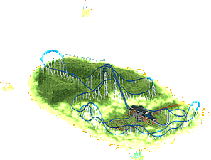
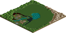
In the misty English countryside stands a lone giga coaster.
-
1 fan Fans of this park
-
Full-Size Map
-
Download Park
92
-
Objects
2
-
Tags
What can't you do?
Interesting concept and always amazed how all of you can come up with these concept. Love the support work. I can only imagine the time it took to support these design. I have mixed feeling on the station. Love the flythrough and the curved glass wall. Sadly the side of the roof blocks not matching the wall texture is a bit rough for me. I know you didnt have an option to match the wall but it really stood out to me in the wrong way.
That said, really enjoyed the design. What's next?!
Sometimes less is more, and this is one of the better examples of that in recent memory. I don't have the same issue with the station that James does, but I understand where he's coming from - you could fix that with a little invisible wall and perspective trick, perhaps.
The foliage / landscape here is a thing of beauty - I love looking at RCT like this. Never stop, Blue.
I feel so out of the loop with rct2 these days. I barely understand how you guys achieve these effects.
I loved the long layout and the station building. And that brown dirt path was a great choice. Well done.
Pretty cool. I like this overall. Reminds me a bit of Sephiroth's older stuff. The station is probably the thing that sticks out a bit to me in any negative way, but I'm not going to dwell on it. The vibes are fun and it works.
Really the closest RCT has gotten to feeling like a painting in a while. Seriously impressive how you managed to do so much with so little. Layout is impressive enough to carry the extra burden of barely having any surroundings.
I'm afraid this doesn't hit quite like your solo, but perhaps that's an unfair comparison considering the ridiculous ambition you had with Stonehenge, and the simplicity of this piece (technical details aside). The coaster has an excellent layout and I like the look of supports. The landscaping I wasn't a fan of... The fade effect looks poor in my opinion, and covering the entire land in 'green texture' makes it hard for me to wrap my head around the geometry of the space. The station and queue are nicely done, but again a bit simple. One thing that made me go 'that's clever!' was the catwalk design, but in the end it's still only a catwalk.
I'm not sure you submitted it for design, but I don't think this map offers enough. More than anything else though, this map is a vibe. A good vibe. If we had a vibes accolade category I think it would fit. I also expect to be a low vote here, so we'll see.
Very clever and creates a strong atmosphere - as I've come to expect from you! Fun to see the little nods to Stonehenge too!
I am really on the fence with this one. I really like the concept, and contrary to Liam I actually really like the landscaping and green texturing. But for me those are the only things I really liked. I think the station is a bit plain as other have mentioned. I also think the layout is actually not that strong even though other people do seem to like it, to me it feels a bit awkward and stretched in many places, and then near the end there is this small radius bend which feels out of proportion compared to the rest of the layout.
Overall I do think this has a super cool vibe and it is a really interesting concept, but I just feel like it is missing that final bit to really make it come together for me.
Was on the fence between 60% and 65% on this one, but I went for the latter due to the excellent layout, station, supports and excellent vibes. I am a sucker for this kind of dreamy, utopian, modernist realism that this map offers. I understand that for some this map might not offer enough content, but for me the primary purpose of a design is to showcase one main ride. The layout here was excellent enough that combined with the vibes I voted a borderline 65%.
Thanks everyone for commenting and voting. I've been wanting to do a giga coaster in an open, misty field for a long, long time. This is inspired off the album, Big Blue Ball. Not sure how many Peter Gabriel listeners are out there, but if you’re one or just getting into his discography, you should check it out. If you know the album, you probably recognize the name Altus Silva.
Anyways, this started as a cso project, as I was searching for smooth land pieces. I then realized you can get a similar effect with dkso, so this made my life a lot easier. It also meant I could use my layout for the recent giga coaster RCC. There's more content out there, so I understand the criticisms (I also wish I re-did the station with either the wooden wall pieces or the default wall pieces). But I wanted this to be minimal - no frills or flashes. Just a classic design with a little something more.
Super cool overall, I think others hit all the big main points such as the emptiness overall with a good layout. I think a flat ride of some sort or something supportive could of elevated it, but it goes against the spirit of the build being intentionally simplistic. For what this is, I really like it.