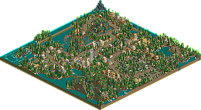
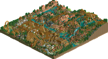
Park / The Enchanted Waters
-
 30-September 03
- Views 241,431
- Downloads 684
- Fans 0
- Comments 357
-
No fans of this park
-
Download Park
684
-
Objects
181
-
Tags
Similar Parks
-
Maui Xtreme Resort
-
Toon Town
-
Sea World Atlanta
-
Escalante River Falls
-
EverQuest: Mystic Realms
-
Comstock Dash
So basically, I can view one park, then reinstall.
So i usually only look at spotlight rct2's, club parks, and the occasional test my park thingy.
Nice looking flame.
Congrats mantis, thanks for entering.
Hi-Rollers Standings
Still, Happyland looks rushed. But its one of the cooler things I've seen in a long time.
Heh, the Radiohead rock looks killer.
To me, easily your best released work to date. I think I even like it better than what I've seen from WOMB. Whatever. I love how you are seemingly approaching a more traditional style of parkmaking. And you know I'm all after that. It reminds me very much of the classical NE style. I think it has heavy influences from x-sector, Fatha', Natelox and NeViS. However, I wouldn't call it a ripp off.
Your landscaping has very much improved and the vegetation is looking aesthetical, what it didn't in most parts of WOMB. Same for the architecture and colours. Things sort of seem to fit together now. With the nice pathlayout and overall good arrangements, you also don't fail to evoke an atmosphere.
Of course there was a lot of sloppiness and rushed things to spot but I'm sure you'll get rid of that in the future. Also, it's just a contest entry. A thing which can perfectly be used for practise and trying new styles and stuff. I think you did very well. If my entry won't come next I'm going to be pretty much surprised.
I can't wait to see new stuff from you. If you should keep the direction you went to with this park then I'm pretty sure you're going to become one of my favourite parkmakers very soon.
I also wanted to say that I loved Micool's entry. I think it should've been way higher. Oh well.
iris, is mantis entry #16 or #17? Because the news entry says #17 but I think it's already the fourth update, isn't it?
And hooray for me breaking 30 points
Really, the park is me trying to be x-sector in 2 days before the deadline. Of course that's not possible, because X would have finished three megaparks and a couple of H2H2 winners in that time, but hey, I did some buildings.
Plus i'm proud of ecstasy
Thanks iris.
Well...
I gave mantis a high score for complete originality.
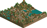
The park is nothing new as far as looks or theming goes, but the whole "mantis" overview was absolutely amazing...
...not to mention the fact that if you rotate the overhead view, it also looks like a vagina.
Raven-SDI
§
I would call it a rip-off, Posix!!!!
I love it. I mean, the mountain in the middle? bare? No, it's bald mountain all over again!
Mine was better though.
I lost a lot of enthusiasm for WOMB as I haven't heard much about it for a long while now but when I was looking over the park I found my self thinking, "wow, I can't wait to see more from Mantis now...oh yeah WOMB!!"
I'm shocked I placed higher than this, even with the Radiohead tribute (I despise them) , I liked it. Oh and Ecstasy has an amazing layout and colour scheme, I love it.
I really like the stuff you had in there and your colour matching is awesome
Ecstasy is beautiful I love the colours and the layout and those cool supports
just a shame it was a it bare
great work micool aswell the entrance to your park was great
Haven't opened the rct2 parks yet. I bet mine will be soon as its nothing amazing.
Yeesh, tough one.
...
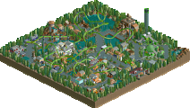
I really liked it. It sort of didn't quite have enough in it, thanks to nearly a third of the map just having water, and then a gigantic... thing in the middle, but what was there, was really nice. Had some interesting ideas, such as the elevator to the entrance, the cool looking inversions on "Ecstacy", and the theming ideas. Those really made the park better.
I can't image what 1st place is gonna be like after this being 16.
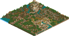
Aérôglòbe
Congrats, and thanks for entering.
Hi-Rollers Standings
Corkscrewed Offline
Ah, you fixed it.
And in reference to the earlier comments about Pyro, well, I don't think he's a tough judge...
Edited by Corkscrewed, 24 September 2003 - 12:47 AM.
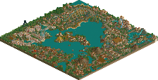
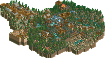
Rctfreak's park surprised me a lot. Sure he did make another adventure ride, but the architecture is a big improvement over his earlier work. The theme are wholly consistent too although both of them were a little over treed. Ultimately the one thing that caused me to grade the park down was the sheer repetition. Having two themes of this size is fine but only if there's enough 'cool stuff' in each section to keep it interesting. The theming here got a little monotonous. Some good ideas throughout though and an impressive showing of freak's potential.
I think the park looks nice but misses too many things.
Am I right that there were only the two coasters and no other rides or stalls or whatever? I guess that was done on purpose, was it?
Anyway, I think it shouldn't have. The park is too much of fantasy style for me to truly like it. However, I thought that it had nice colours and a very good tree selection in the tropical area. You didn't fail to evoke a tropical feel. But Corridor was a little strange. What's with the beginning? That was so out of place. And it needed brakes and boosters and what not. Also, there was too much use of Zero Clearances as the train shows half underground and stuff. Try to hide your hacks. The later effect is all what counts.
But anyway, the park looked nice. Even if there wasn't much to see.
The adventure ride gets sort of a rctfreak cliché. And besides, I don't like your adventure rides much. Add some banners on the way and some more happenings. Yours are just going underground or through tunnels. Also, why did it only have one train?
Anyway, architecture has improved, even if I'm not too fond of it.
Keep up improving.