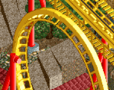
thanks there's still a lot of stuff i'm not happy with yet though, the tan building on the bottom is an example. i also can't figure out how to do the divecoaster i'm making for the park. finishing this is going to be hard but i think i can do it
It's all very skilled and neat looking, but I have a problem with the general composition. What makes the right side an entrance to a park vs the left side? To me it could go either way, so I guess just from a park standpoint it lacks clarity.
I think people are overthinking this. Yes it's linear, so was everything else we made in Rct until 2011. The linearity gives it an old school feel, which in my opinion is always a good thing. It has much more atmosphere than most stuff nowadays which tries so hard to break out of the square limits that it just looks overly complicated, messy and lacks any atmosphere.
The only thing I'm not really a fan of is the planter. That area would be perfect for a small fountain or a statue or something, but a planter screams laziness.
There are some nice textures here, and it's good to see you use a colour other than white for your buildings.
I didn't find this particularly 'linear' even though all the buildings are essentially rectangular/squares. Although a little flat, you've definitely got buildings 'popping out' and I personally don't have a problem with it.
I definitely agree with Trav, in that the planter should be a fountain or something more interesting. To have a fountain outside the park and then a planter immediately inside the park doesn't really make a lot of sense to me. You're better off having it the other way around I think.
Also, That Guy raised an important point which I agree with in that the "goodbye" sign and turnstiles are the only things I see here that indicate what you've built is a park entrance. The architecture and way in which it's built is similar on both sides and therefore there isn't really much direction or difference between what's the outside of the park and the inside. The architecture itself is quite good, but I think you really need to direct your viewer as to where the entrance is, why it's the entrance, and reinforce the key differences between the outside and inside of your park. [Just from this screen, the buildings outside of the park are too dense in my opinion; make it more sparse and I think this will almost solve the problem].
I disagree that he needs to change the buildings on either side of the entrance. I'm not being funny, but surely the flow of people would be enough to indicate what is the inside of the park and what is the outside?
It looks very much PortAventura inspired by the looks of it:
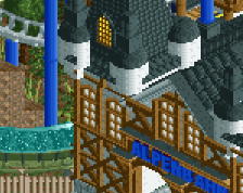
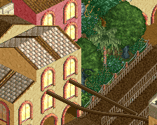
This is the outside. It doesn't give the best impression but there is a courtyard type area with numerous buildings around here. This is mainly just to show the actual architecture.
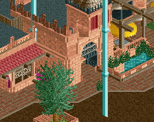
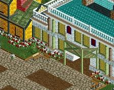
This is the inside. I'm sure you can see that the architecture its self has no distinction on the outside from the inside - the theme just carries on. The only distinction is the signs that actually give a hint as to what each building is. Perhaps that's something that gdb could add here, although as far as I know, he already has considering we can only see the facades of 3 out of 8 buildings in this screen.
As long as the buildings are obvious in their purpose (I can even see from here that the left side looks to have a ticket purchasing building) then I don't see a reason for making the buildings aesthetically different.
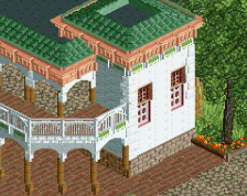
Beautiful stuff. Warm colours, neat but detailed architecture, and a nice amount of greenery. I'd echo the comments about the steel awning though. It's only minor, but it's enough to draw your eye to it.
I really like this as well, definitely your best work yet. The peach arches are my favourite detail. Good decision to not give all the trims seperate colours.
Some points for improvement:
- the planter breaks the direction of the street. It's too clumsy and large for that spot. And I think it's not urban enough to fit the surroundings
- I don't like the reds. I'd stick to earthier colours or pastel colours. Whatever looks soft. I think the red is quite harsh, at least in large surfaces like the awning and the roof. The doors should be fine
- I won't say you did bad, you didn't, but I think you should be able to define the theme a bit more. Some buildings are bordering on generic.
 22-October 14
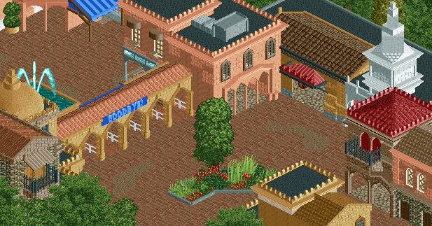
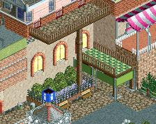
I think the red steel awning is out of place, and there's too much linearity going on. Otherwise it's a pretty good spat or architecture from you.
I don't think the linear aspect is a bad thing. But I do agree about the steel awning. Totally wrong texture.
I personally would go with the old awning (you either have the 1k version or RCT-Guide's version). It's perfect for these kind of themes.
Nice work. You always continue to surprise me.
thanks there's still a lot of stuff i'm not happy with yet though, the tan building on the bottom is an example. i also can't figure out how to do the divecoaster i'm making for the park. finishing this is going to be hard but i think i can do it
It's good quality but you need to finish something!
It's all very skilled and neat looking, but I have a problem with the general composition. What makes the right side an entrance to a park vs the left side? To me it could go either way, so I guess just from a park standpoint it lacks clarity.
I think people are overthinking this. Yes it's linear, so was everything else we made in Rct until 2011. The linearity gives it an old school feel, which in my opinion is always a good thing. It has much more atmosphere than most stuff nowadays which tries so hard to break out of the square limits that it just looks overly complicated, messy and lacks any atmosphere.
The only thing I'm not really a fan of is the planter. That area would be perfect for a small fountain or a statue or something, but a planter screams laziness.
There are some nice textures here, and it's good to see you use a colour other than white for your buildings.
I didn't find this particularly 'linear' even though all the buildings are essentially rectangular/squares. Although a little flat, you've definitely got buildings 'popping out' and I personally don't have a problem with it.
I definitely agree with Trav, in that the planter should be a fountain or something more interesting. To have a fountain outside the park and then a planter immediately inside the park doesn't really make a lot of sense to me. You're better off having it the other way around I think.
Also, That Guy raised an important point which I agree with in that the "goodbye" sign and turnstiles are the only things I see here that indicate what you've built is a park entrance. The architecture and way in which it's built is similar on both sides and therefore there isn't really much direction or difference between what's the outside of the park and the inside. The architecture itself is quite good, but I think you really need to direct your viewer as to where the entrance is, why it's the entrance, and reinforce the key differences between the outside and inside of your park. [Just from this screen, the buildings outside of the park are too dense in my opinion; make it more sparse and I think this will almost solve the problem].
I disagree that he needs to change the buildings on either side of the entrance. I'm not being funny, but surely the flow of people would be enough to indicate what is the inside of the park and what is the outside?
It looks very much PortAventura inspired by the looks of it:
This is the outside. It doesn't give the best impression but there is a courtyard type area with numerous buildings around here. This is mainly just to show the actual architecture.
This is the inside. I'm sure you can see that the architecture its self has no distinction on the outside from the inside - the theme just carries on. The only distinction is the signs that actually give a hint as to what each building is. Perhaps that's something that gdb could add here, although as far as I know, he already has considering we can only see the facades of 3 out of 8 buildings in this screen.
As long as the buildings are obvious in their purpose (I can even see from here that the left side looks to have a ticket purchasing building) then I don't see a reason for making the buildings aesthetically different.
Beautiful stuff. Warm colours, neat but detailed architecture, and a nice amount of greenery. I'd echo the comments about the steel awning though. It's only minor, but it's enough to draw your eye to it.
This is very nice... now finish something.
people are definitely overthinking this, this is lovely. just add benches, lamps (especially lamps), bins and peeps, and boom, excellent.
I really like this as well, definitely your best work yet. The peach arches are my favourite detail. Good decision to not give all the trims seperate colours.
Some points for improvement:
- the planter breaks the direction of the street. It's too clumsy and large for that spot. And I think it's not urban enough to fit the surroundings
- I don't like the reds. I'd stick to earthier colours or pastel colours. Whatever looks soft. I think the red is quite harsh, at least in large surfaces like the awning and the roof. The doors should be fine
- I won't say you did bad, you didn't, but I think you should be able to define the theme a bit more. Some buildings are bordering on generic.
Ga zo door!