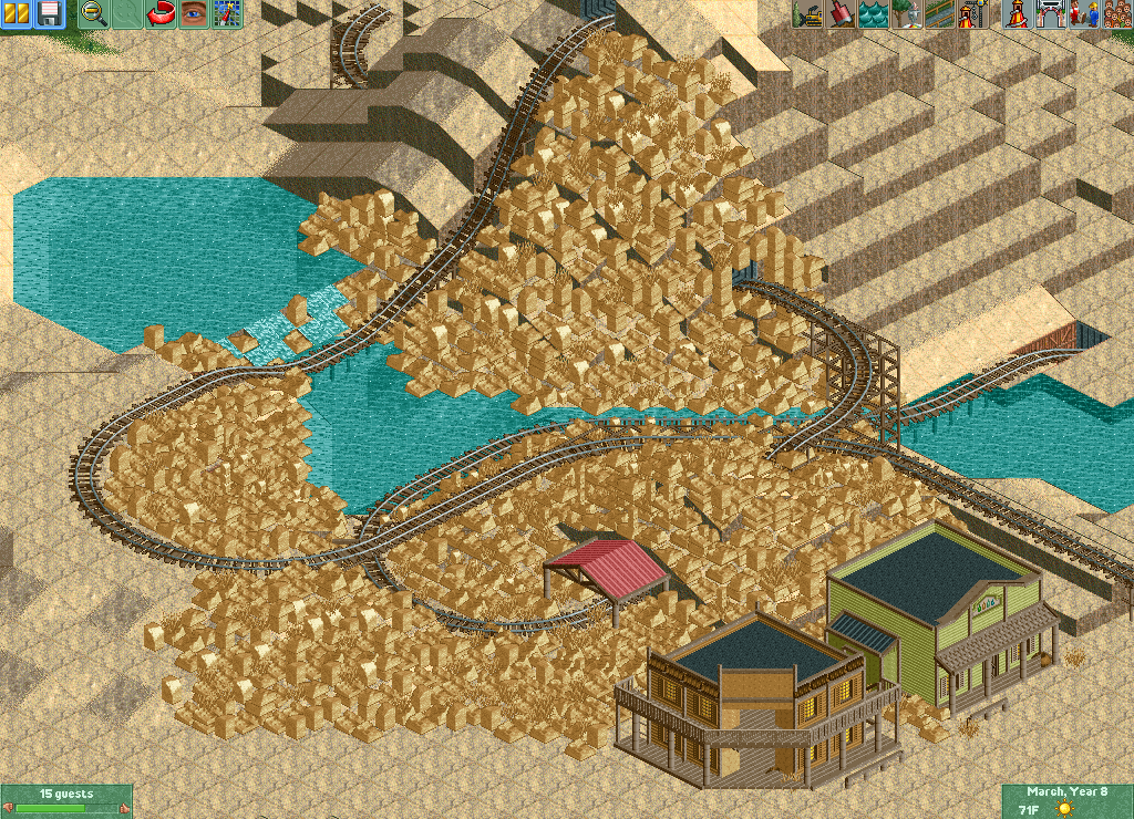
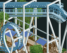
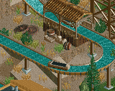
Umm...no. This in no way gives off any sort of aesthetic that's pleasing to the eye. There is a really weird height differentiation; it looks literally like a massive field of rocks that are completely out of place.
Especially in such a large area it just looks like a massive clusterfuck of random rocks. I'd spread them out much more and try to integrate 1/4 tile land blocks into it. Look at how other people have done BTMR. Although there's certainly no reason not to use the 1k ruin rocks surely even you can see that is looks like a complete mess. The colour of the rocks certainly doesn't help.
Moderate your rock usage; too much of exactly the same object in a large area is not nice to look at. Gee's screen is a great example of how to do this kind of stuff well - integrating more objects than just 1k ruins and a few dead grass objects.
I get what you're going for, but it's just not going to work like this. You need to mix it up with quarter-tile landscaping and use these as rocks, not for the entire landscape itself. Also you need some other colors.
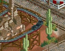
The rocks are overused and it's missing foilage. I know there aren't alot of plants in the wild west but some grass spots will do wonders. The building on the left look pretty decent though.
Overall this needs some improvements and how about some wooden bridges? I'm sure they will fit in nicely.
You've spent an afternoon filling up the space with the same objects in the same colour. That's got nothing to do with design and creation. It's like a mechanical act. You could go for that, as a very conceptual and overly mind ridden approach, but I don't think you are, and so it's not working here at all.
In order to not get lost like this you need more imagination and intention before you start building.
I wouldn't say that, posix. Firstly, there's three different objects placed in varying ways (angles, stacks and combinations), so that requires some creative decision making at least. Secondly, while it may be somewhat of a mechanical act, it's done to get an intended look. I personally think Mattk48 has attempted a new landscape texture and has done a great job of it. If it were all grey objects on a steep mountain landscape, I think this would look even better, and definitely portray the sharp, constantly rough texture of a real mountain. Needless to say, Matk48, I think you're on to something here, and utilised in different ways would look fantastic.
Hint - yeah, I agree with the others, the landscape is visible through the rocks.
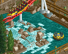
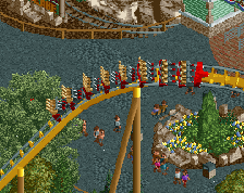
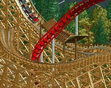
The other thing I am not to pleased about is that the ride would literally derail if it were operating. Please consider some changes to the layout to make the ride more realistic and have riders not be worried about derailments.
I like your boldness. Something I would recommend is really study what you're trying to recreate. You mentioned Big Thunder Mountain RR, so lets assume thats the direction you're going in.
BTM is based off of southwest landscapes, specifically Bryce Canyon National Park and its "hoodoos" (The tall rock formations almost looking like many scoops of ice cream on top of it).
Looking at pictures of Bryce Canyon and the attraction, I see no similarities between these examples and your work. Whats missing is any resemblance of actual form- its just a shit ton of rocks spewed everywhere. You want your work to be clear to the viewer, you want it to be obvious as to what you're trying to portray, which is those hoodoos.
A big thing that is missing is more color. It is most accurate to alternate the colors. Remember that at one time this whole area was just flat- over time the sandstone has been eroded by water and wind. However, the different sedimental "layers"have remained- each with its own different shade of pink, light red, tan, or brown. Consider this when coloring layers, the pink layer will be roughly the same tile height on each hoodoo no matter its location on the map, same with tan or brown. It will be this sort of thoughtful depth that is required to create something truly accurate and worth remembering. You're on the right track though, keep experimenting and you'll find a balance!
 30-October 14
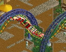
and to think they said I overused 1k ruins.
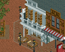
That 5% though? I really liked the buildings, the rocks seem overdone though. Why is there such a large field of them?
Im tring to get a Thunder Mountain look with the rocks
it needs a ton more 1K ruins. i can still see the land texture from here, god
Umm...no. This in no way gives off any sort of aesthetic that's pleasing to the eye. There is a really weird height differentiation; it looks literally like a massive field of rocks that are completely out of place.
Especially in such a large area it just looks like a massive clusterfuck of random rocks. I'd spread them out much more and try to integrate 1/4 tile land blocks into it. Look at how other people have done BTMR. Although there's certainly no reason not to use the 1k ruin rocks surely even you can see that is looks like a complete mess. The colour of the rocks certainly doesn't help.
Moderate your rock usage; too much of exactly the same object in a large area is not nice to look at. Gee's screen is a great example of how to do this kind of stuff well - integrating more objects than just 1k ruins and a few dead grass objects.
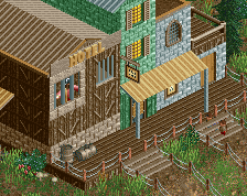
The buildings look quite nice though.
*facepalm*
I get what you're going for, but it's just not going to work like this. You need to mix it up with quarter-tile landscaping and use these as rocks, not for the entire landscape itself. Also you need some other colors.
Here's what Stoksy was referring to. Might give a bit more direction on how to do it. http://www.nedesigns...anyon-mountain/
I think some people are being a bit harsh, it isn't that bad.
Use the 1k rocks more as little additions. Still use land and add these to the land as little details. Also try using the LOTR rocks.
Vary the colours up a bit too, don't have them all the tan colour, try some brown, some pastel brown, some pink.
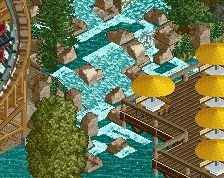
The buildings are lovely. And the little waterfall with the rocks is a nice touch.
Keep going dude! You're improving with every screen you post.
I'd never seen this done before with the ruin rocks, and I guess there's a reason for that. I don't think Ill continue this one.
I think the only time this amount of 1k ruins might work is when you're going for something like Bryce Canyon.
To me it looks distinctly like a pile of gold. Stick a dragon on top and you're all set. (Levis?)
The rocks are overused and it's missing foilage. I know there aren't alot of plants in the wild west but some grass spots will do wonders. The building on the left look pretty decent though.
Overall this needs some improvements and how about some wooden bridges? I'm sure they will fit in nicely.
Yeah intamin... Matt get rid of the river and put some arches in there and call it the desolution of smaug...
You've spent an afternoon filling up the space with the same objects in the same colour. That's got nothing to do with design and creation. It's like a mechanical act. You could go for that, as a very conceptual and overly mind ridden approach, but I don't think you are, and so it's not working here at all.
In order to not get lost like this you need more imagination and intention before you start building.
I wouldn't say that, posix. Firstly, there's three different objects placed in varying ways (angles, stacks and combinations), so that requires some creative decision making at least. Secondly, while it may be somewhat of a mechanical act, it's done to get an intended look. I personally think Mattk48 has attempted a new landscape texture and has done a great job of it. If it were all grey objects on a steep mountain landscape, I think this would look even better, and definitely portray the sharp, constantly rough texture of a real mountain. Needless to say, Matk48, I think you're on to something here, and utilised in different ways would look fantastic.
Hint - yeah, I agree with the others, the landscape is visible through the rocks.
The other thing I am not to pleased about is that the ride would literally derail if it were operating. Please consider some changes to the layout to make the ride more realistic and have riders not be worried about derailments.
The groundwork however is there.
I like your boldness. Something I would recommend is really study what you're trying to recreate. You mentioned Big Thunder Mountain RR, so lets assume thats the direction you're going in.
BTM is based off of southwest landscapes, specifically Bryce Canyon National Park and its "hoodoos" (The tall rock formations almost looking like many scoops of ice cream on top of it).
Example: http://en.wikipedia....oodoo_(geology)
Looking at pictures of Bryce Canyon and the attraction, I see no similarities between these examples and your work. Whats missing is any resemblance of actual form- its just a shit ton of rocks spewed everywhere. You want your work to be clear to the viewer, you want it to be obvious as to what you're trying to portray, which is those hoodoos.
A big thing that is missing is more color. It is most accurate to alternate the colors. Remember that at one time this whole area was just flat- over time the sandstone has been eroded by water and wind. However, the different sedimental "layers"have remained- each with its own different shade of pink, light red, tan, or brown. Consider this when coloring layers, the pink layer will be roughly the same tile height on each hoodoo no matter its location on the map, same with tan or brown. It will be this sort of thoughtful depth that is required to create something truly accurate and worth remembering. You're on the right track though, keep experimenting and you'll find a balance!