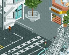
I don't get how just about everyone gets critisized for leaving places empty (like the parking lot) and you get away with it because people consider it a "style". Then again, the idea of this is very creative. I like it. But honestly, i think what you make looks too undetailed for my taste. Like Austin said, you left a big section of rock without anything added to it. It looks really plain. Just like the foliage in the down-right corner. It's just a bunch of scattered bushes and things. If i'd pull that off i would get told that i just scattered a bunch of bushes and it wasn't that good...
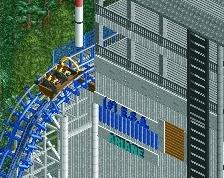
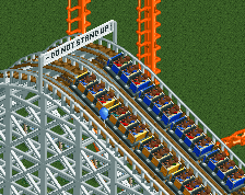
I'm liking the car ride, it's got some good potential. If the entrance looks like what I think it is, that's a cool touch with those gas pumps. I'd like to see some more details in the whole screen, a lot is left untouched, or next time make your screenshot smaller so it doesn't show a lot blank areas you haven't worked on yet.
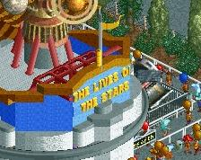
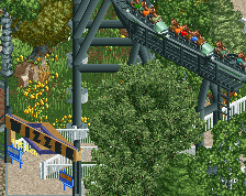
really creative ride. very old-school, classic feeling. I like it.
@wouter: whats wrong with you man? there is a difference between empty spaces and open spaces. If you use it the right way, open-ness is the way to make the more dense themed areas pop. your craving for appreciation will not get you any.
There's nothing wrong with me, i just don't like this style and i want to say what i don't like about it. Thirteen, you may be right in some aspects, but maybe you should take a look at the parking lot in Thorpe Park:
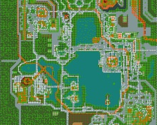
Paul's parking lot is a repetitively fenced off area with nothing but sand and a few bushes. Airtime's parking lot contains fences, roadways with lines, actual cars, paths for visitors to cross, poles so cars don't drive about the sidewalks, lampposts, furtherly detailed land with grass inbetween, information signs, even a beautiful building which i assume is a broadcasting station. It pops much more than Paul's parking lot and it still gives an open feel, particularly due to the mildly detailed grass fields and roads around it.
It's probably me, but i'm just not a fan of this overly simplistic style. It looks like something that even a beginner to RCT could make. I don't mean to offend anyone but i just don't understand this sorta stuff.
Wouter i like Thorpe Park to. And i'm to lazy to make a parkinglot such as Artime. Personally I find the carsride in the parking lot have no added value. Since they do not look nice.
About the comments of the rock. Neeltje Jans is a raised island. To protect the island from drifting away there are embankments from rocks required. I go try to make it looks nicer.
I completely disagree with Wouter. This is based on the real Deltapark Neeltje Jans. Paul made it just how it is in real life. It's a park build on the famous Deltaworks, created after the big flood of 1953, or what we call De Waternoodsramp, a disaster that killed a whole lot of people. The Deltaworks protects 90% of the Netherlands nowadays against such a thing ever happening again. You should know that, Wouter.
 06-December 14
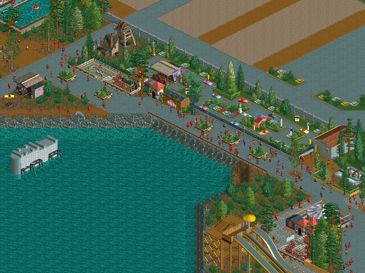
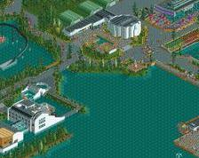
Cute as could be. I feel like the rocks sloping into the water could be more attractive (grass/folage perhaps) but good stuff.
I don't get how just about everyone gets critisized for leaving places empty (like the parking lot) and you get away with it because people consider it a "style". Then again, the idea of this is very creative. I like it. But honestly, i think what you make looks too undetailed for my taste. Like Austin said, you left a big section of rock without anything added to it. It looks really plain. Just like the foliage in the down-right corner. It's just a bunch of scattered bushes and things. If i'd pull that off i would get told that i just scattered a bunch of bushes and it wasn't that good...
Just my two cents.
I'm liking the car ride, it's got some good potential. If the entrance looks like what I think it is, that's a cool touch with those gas pumps. I'd like to see some more details in the whole screen, a lot is left untouched, or next time make your screenshot smaller so it doesn't show a lot blank areas you haven't worked on yet.
really creative ride. very old-school, classic feeling. I like it.
@wouter: whats wrong with you man? there is a difference between empty spaces and open spaces. If you use it the right way, open-ness is the way to make the more dense themed areas pop. your craving for appreciation will not get you any.
There's nothing wrong with me, i just don't like this style and i want to say what i don't like about it. Thirteen, you may be right in some aspects, but maybe you should take a look at the parking lot in Thorpe Park:
http://www.nedesigns...52/thorpe-park/
Paul's parking lot is a repetitively fenced off area with nothing but sand and a few bushes. Airtime's parking lot contains fences, roadways with lines, actual cars, paths for visitors to cross, poles so cars don't drive about the sidewalks, lampposts, furtherly detailed land with grass inbetween, information signs, even a beautiful building which i assume is a broadcasting station. It pops much more than Paul's parking lot and it still gives an open feel, particularly due to the mildly detailed grass fields and roads around it.
It's probably me, but i'm just not a fan of this overly simplistic style. It looks like something that even a beginner to RCT could make. I don't mean to offend anyone but i just don't understand this sorta stuff.
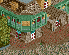
Reminds me of "Verkeerspark Assen", Looks very cool
i sort of agree with what wouter said
Wouter i like Thorpe Park to. And i'm to lazy to make a parkinglot such as Artime. Personally I find the carsride in the parking lot have no added value. Since they do not look nice.
About the comments of the rock. Neeltje Jans is a raised island. To protect the island from drifting away there are embankments from rocks required. I go try to make it looks nicer.
I completely disagree with Wouter. This is based on the real Deltapark Neeltje Jans. Paul made it just how it is in real life. It's a park build on the famous Deltaworks, created after the big flood of 1953, or what we call De Waternoodsramp, a disaster that killed a whole lot of people. The Deltaworks protects 90% of the Netherlands nowadays against such a thing ever happening again. You should know that, Wouter.
the revival bump, nice
also, this was a charming little ride. reminds me a lot of the old driving test at Legoland California (wonder if it's still up today?)