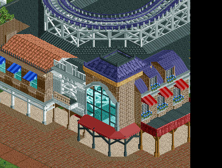
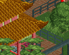
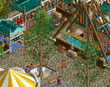
Don't really know what's happening with the white building. The big window looks off to me. And you really need to use more vibrant colours! Really like the rightmost building.
I would swap around the path types to be honest; have the off-white/cream path be the main path and use the brick under the buildings - that would make more sense to me I think.
The large glass window is better suited to the centre of a large building, not the sole facade of a small one. Unless the whole building is glass [which in a boardwalk-esque setting I assume you're going for would not fit] then it's more likely to be used for small windows instead of one large one. The building does not look like a corner building either, I think that if you rebuild it then you should make it clearly a corner building with a tower of some sort. This would also help integrate the best building [the one on the far right] more smoothly.
I think that the white building is out of place here because the white contrasts too much with the brown - I would definitely consider looking for more complementary colours [peach sticks out as an obvious one] for that building.
There's nothing strictly 'wrong' with a lot of the same colour but if you want to use a different colour for the building itself then it should blend a little with the surrounding buildings. The contrasting awnings are perfect, but generally you don't really want contrasting building colours because then things look too out of place and make people focus on a specific building when you want them to be looking at the whole collection.
If you are going to use that much glass, you need something inside the buildings for sure. Being able to see the supports is no fun.
I think the large window maybe looks awkard becuase its two floors high. Perhaps divide it in half? Not sure. It's not bad though.
I dislike how the white buildings balcony has railing on only one side.
I kinda hate that textureless awning object that you've used throughout but there's not a great alternative.
Purple roof looks great. Love the windown boxes. Love the awning on the right, the wooden fence works great. Overall I really like the screen. Can't wait to see more!
mainly posting this to get some critique, nothing major this time. not too happy about the most left building, getting some suggestions for that would be nice
 07-December 14

![screen_641_Lifthill [Update]](https://www.nedesigns.com/uploads/screens/641/641_thumb.png)
Only things off to me are the indoor paths and the thinness of the walls on the building with the large window.
Don't really know what's happening with the white building. The big window looks off to me. And you really need to use more vibrant colours! Really like the rightmost building.
I think the colours are great, I agree about the window though.
I would swap around the path types to be honest; have the off-white/cream path be the main path and use the brick under the buildings - that would make more sense to me I think.
The large glass window is better suited to the centre of a large building, not the sole facade of a small one. Unless the whole building is glass [which in a boardwalk-esque setting I assume you're going for would not fit] then it's more likely to be used for small windows instead of one large one. The building does not look like a corner building either, I think that if you rebuild it then you should make it clearly a corner building with a tower of some sort. This would also help integrate the best building [the one on the far right] more smoothly.
I think that the white building is out of place here because the white contrasts too much with the brown - I would definitely consider looking for more complementary colours [peach sticks out as an obvious one] for that building.
There's nothing strictly 'wrong' with a lot of the same colour but if you want to use a different colour for the building itself then it should blend a little with the surrounding buildings. The contrasting awnings are perfect, but generally you don't really want contrasting building colours because then things look too out of place and make people focus on a specific building when you want them to be looking at the whole collection.
If you are going to use that much glass, you need something inside the buildings for sure. Being able to see the supports is no fun.
I think the large window maybe looks awkard becuase its two floors high. Perhaps divide it in half? Not sure. It's not bad though.
I dislike how the white buildings balcony has railing on only one side.
I kinda hate that textureless awning object that you've used throughout but there's not a great alternative.
Purple roof looks great. Love the windown boxes. Love the awning on the right, the wooden fence works great. Overall I really like the screen. Can't wait to see more!