Monorail work fine as walls, They are more realistic here, working as a curved wall that a theme park would actually build.
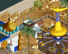
use of the blocks is a good idea for the rock scenery, to make it a bit more substantial, but you do need more of a facade of 1k rocks to make it look like something a theme park would actually put together.
I think the monorail doesn't work on the free standing wall there, the other pieces of monorail blend in perfectly I think. I don't like how the minetrain railings are black and not grey, but that may be just me being autistic.
I appreciate the skill and effort, I just don't like the rock work. It just looks like a 'pile of blocks, or scenery' to me. I think this every time I see these being made. May be it's because I haven't seen the whole picture yet of what you are going for, I don't know.
I think that the monorail as a wall only really works as an edge of something; as in a solid wall that is covered from one side [look at Fk's White Lightning micro]. So I'd consider moving the path over so it just sits on top of or next to the monorail. It'd make it look a little less like an unsupported curved wall and more like a part of the landscaping.
EDIT: Awkward, thought you were someone else, just remembered a conversation about bryce canyon in a previous screen and thought you were the same person.
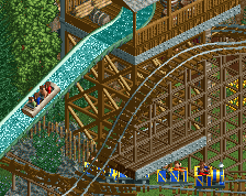
Thanks a ton for the positive feedback everyone! This is a really tough landscape to nail, some parts are rugged while other sections are smoother barrels.
We all have those moments where in our head it looks great but then everyone sees it differently so I'm glad that most tastes are aligned with my own bias.
I was experimenting with adding color variation using the pink- just like is still on the monorails. In the end I decided the solid color just looked way better as there is no better color to represent the sandstone reds and tans.
Stoksy: That wasn't my screen but I was the one with the reply about Bryce Canyon.
I think the smoother portions could use maybe a touch of color variation and a little bit of added texture, but this is a fantastic approach for this. Perhaps use Kumba's net pieces and overlay them on the flat block for a slight color change just to indicate some form of striation for the rockwork. Still, combining it with the blocks was a fantastic idea.
Thanks posix, I gotta agree. I wanted to find the balance between detail, cleanliness, and aesthetics. I believe this achieves that balance. Now the hardest part is nailing a layout that makes me as happy as the facade.
 14-December 14
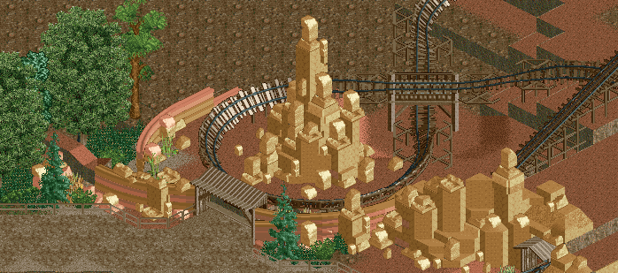
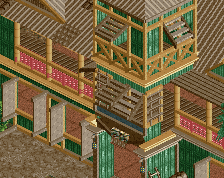
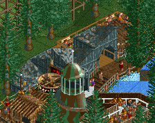
More rocks, less blocks. And I agree with Liam about the monorails. Use them when you change elevation, not just free-standing like that.
I love it. I think the monorails work, I see them as walls rather than landscaping, so in that instance I think it works.
But yeah, real good stuff from you yet again!
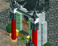
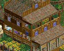
I love the roof on the gate, very nice. I'd colour the monorail walls fully brown, but i do think it works though.
Monorail work fine as walls, They are more realistic here, working as a curved wall that a theme park would actually build.
use of the blocks is a good idea for the rock scenery, to make it a bit more substantial, but you do need more of a facade of 1k rocks to make it look like something a theme park would actually put together.
honestly i like the way it is currently, you did a nice job incorporating them with the rockwork. can't wait until this is finished
I think the monorail doesn't work on the free standing wall there, the other pieces of monorail blend in perfectly I think. I don't like how the minetrain railings are black and not grey, but that may be just me being autistic.
I appreciate the skill and effort, I just don't like the rock work. It just looks like a 'pile of blocks, or scenery' to me. I think this every time I see these being made. May be it's because I haven't seen the whole picture yet of what you are going for, I don't know.
I think that the monorail as a wall only really works as an edge of something; as in a solid wall that is covered from one side [look at Fk's White Lightning micro]. So I'd consider moving the path over so it just sits on top of or next to the monorail. It'd make it look a little less like an unsupported curved wall and more like a part of the landscaping.
EDIT: Awkward, thought you were someone else, just remembered a conversation about bryce canyon in a previous screen and thought you were the same person.
Thanks a ton for the positive feedback everyone! This is a really tough landscape to nail, some parts are rugged while other sections are smoother barrels.
We all have those moments where in our head it looks great but then everyone sees it differently so I'm glad that most tastes are aligned with my own bias.
I was experimenting with adding color variation using the pink- just like is still on the monorails. In the end I decided the solid color just looked way better as there is no better color to represent the sandstone reds and tans.
Stoksy: That wasn't my screen but I was the one with the reply about Bryce Canyon.
I really like everything, I think it all works.
I think the smoother portions could use maybe a touch of color variation and a little bit of added texture, but this is a fantastic approach for this. Perhaps use Kumba's net pieces and overlay them on the flat block for a slight color change just to indicate some form of striation for the rockwork. Still, combining it with the blocks was a fantastic idea.
Whoa. Different, but good.
Good the way it is. Much more believable and less pretentious than objecting everything up.
Thanks posix, I gotta agree. I wanted to find the balance between detail, cleanliness, and aesthetics. I believe this achieves that balance. Now the hardest part is nailing a layout that makes me as happy as the facade.