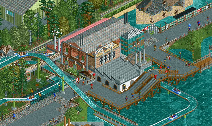
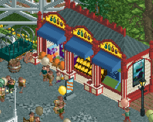
Screenshot / Haunted Harbour: the ride
-
 29-March 15
-
Avonturenpark Vossendal
-
17 of 18
- Views 2,104
- Fans 0
- Comments 9
Community Forum Software by IP.Board
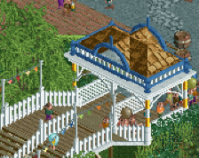
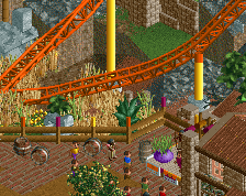
The bridge is definitely a bit awkward. That station is brilliant though.
Definitely submit this park for an accolade.
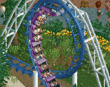
Ran a passing train . Super nice .
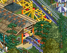
Love it as usual! But the bridge is a no go
I admit I got a bit lazy at the bridge, but this exact second I had a brainwave, and this is what I came up with:
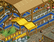
Second bridge is a lot better, but the location still feels forced to me.
I like the new bridge, but I still think it could be better. Also, I think the transition from crazy to tarmac by the flume supports could be less awkward. Sorry if others already said this, I didnt read the other comments. Other than that though I really like the screen. You're improving so much with each screen, keep it up.