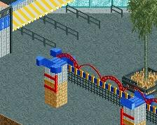
You can't see the entrance that well, Only the exit, and those buildings are detailed in the front, you see the backside of the buildings which are only employees walking in it.
Hey Guys, finally getting my rct2 skills back and I have big hopes for this next project! I started it before but game kept getting error trappers, this remake will be my first real park. Please leave your feedback if you like!
 26-September 15
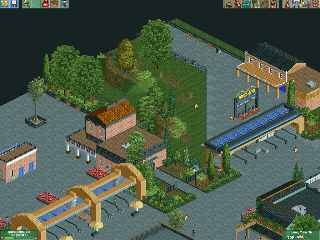
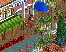

I think the buildings look a bit too simple, I mean they are the first buildings you see when entering the park. Make it a bit more welcoming!
You can't see the entrance that well, Only the exit, and those buildings are detailed in the front, you see the backside of the buildings which are only employees walking in it.
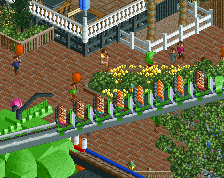
Really recommend you use a different path type.