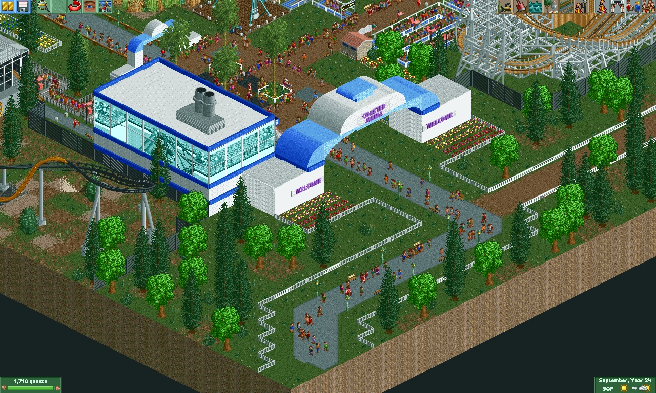
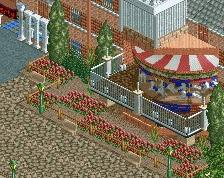
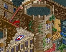
I think the bright green trees are a bit too bright, almost luminous looking. And while I appreciate the space you've given the entrance area, I think the large archway needs some more purpose (i.e. why are the white bases so large, do they house anything?), or at least more detailing to make it interesting.
I agree with Choco. With the colourable trees, the default colours are almost always your best option. Unless you are going for a cartoonish artificial look, but I doubt that here. The entrance looks nice, but it needs some more function. Some ticket booths and gates. And nice plaza in front, because in the morning and evening this will be a very crowded place. Despite my critiques I think it's a pretty nice screen/park!
Thanks for the CC. I added some plants to the entrance area, more details on the entrance arch so it appears to have some function, and hopefully will put in some ticket booths as well. I also recolored the neon trees to a softer green - I think it looks more natural now
Cool stuff. If you feel like it, you could post a picture of it here as an additional comment, if you wanted people to comment on its update. Or you can keep it a secret for later
 14-October 15
I think the bright green trees are a bit too bright, almost luminous looking. And while I appreciate the space you've given the entrance area, I think the large archway needs some more purpose (i.e. why are the white bases so large, do they house anything?), or at least more detailing to make it interesting.
Thanks for the CC. I added some plants to the entrance area, more details on the entrance arch so it appears to have some function, and hopefully will put in some ticket booths as well. I also recolored the neon trees to a softer green - I think it looks more natural now
Cool stuff. If you feel like it, you could post a picture of it here as an additional comment, if you wanted people to comment on its update. Or you can keep it a secret for later