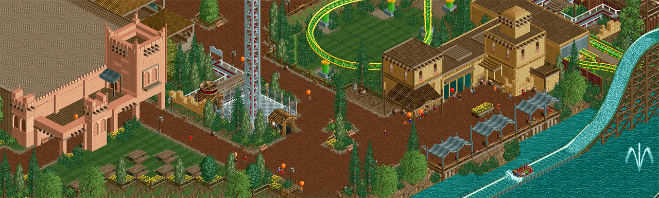
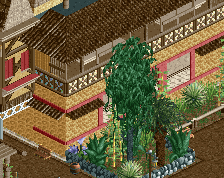
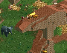
I think you forgot to adjust include foliage to the theme. Don't go all out with tropical crap but a few different trees can help setting this area apart. Or some rock formations.
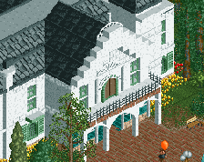
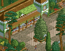
The pink structure on the left side is super nice. Really works well.
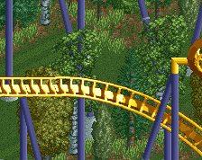
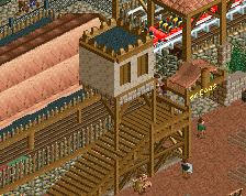
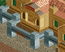
Some things though, beyond what Liam said about foliage. -Bench objects are awful. Find something else -Something needs to break up the large roof of the pink bldg -Get rid of the bushes and chain link path around the drop tower. Imagine you are on the path or ride, you'd want to see something prettier. -Bit hard to tell, but the colors on the coaster are awfully jarring and bright.
I'm adoring that peach structure to the left of the screen. The placement of the covered arcade right next to an open field is a bit odd, though; I wonder if the gesture of the towers and the arcade would benefit more with being placed up against a paved plaza. Also, I think overlaying one more decorative fence right above where the arcade openings end, just in the same peach, will add a touch of texture that will make the building pop.
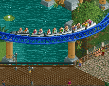
Nice architecture and atmosphere, you're improving. But I hate the coaster colours. Two different colours for the track and the same two colours for the supports just doesn't work for me. Also I think the area could benefit from some small colourful details to brighten it up a bit.
 09-June 16
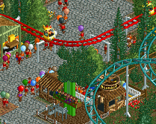
really nice and atmospheric
I really like this. Pretty unique.
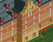
Cool textures and composition.
Some things though, beyond what Liam said about foliage.
-Bench objects are awful. Find something else
-Something needs to break up the large roof of the pink bldg
-Get rid of the bushes and chain link path around the drop tower. Imagine you are on the path or ride, you'd want to see something prettier.
-Bit hard to tell, but the colors on the coaster are awfully jarring and bright.
I'm adoring that peach structure to the left of the screen. The placement of the covered arcade right next to an open field is a bit odd, though; I wonder if the gesture of the towers and the arcade would benefit more with being placed up against a paved plaza. Also, I think overlaying one more decorative fence right above where the arcade openings end, just in the same peach, will add a touch of texture that will make the building pop.
really nice stuff. I agree with all of the above.
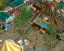
The S&S Tower feels extremely out of place. Rest is nice, just feels kind of old.