Welcome to NE! Yeah, we don't like posting all our screens here. Most of us select the best ones and posts them once in a while. This prevents creating the feeling like you've built it in 5 minutes and posted it all right after you built it.
Here is some feedback on all of your screens in one (I have other things to do today ). Your paths are very very square. Make them curve a little more. There are diagonal path objects you can use. Real life themeparks don't have paths go this straight either. Look at them and try to copy them.
Then the foliage: you put grass objects on every empty space. That might feel realistic to you, but it looks bad in rct. Try to use less of them, unevenly placed over the field.
The buildings look massive (yeah yeah, I know it's me noticing scaling problems). Please make them a bit smaller. They also need a bit more details. Some of them have huge roofs without anything breaking it up. Try to add more trims, fences, chimneys etc. and also for these: don't make them all square.
Overall I see potential though. You seem to have the motivation to build well themed areas and thats what we like. I'd say look at other screenshots or parks here. There are some good references here and there where you can get some inspiration from.
Hello! Welcome to NE. It's always nice to see some Brazilians here.
Scoop and MK are correct. Pick your best screenshot, and post those! And maybe another screeshot a few days after. You will get more feedback, and the front page will be mixed instead of just a lot of your screenshots.
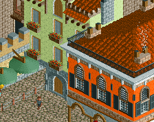
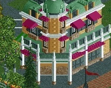
About your park... It's quite interesting! You have some cool ideas, like the buildings in this screen, and the grass everywhere. Certainly unique. What I like less are the objects you use... They're so ugly! And there's a lot of objects available that fit much better into the game.
Oh, one last thing... When you upload a screen you have to pick "RCTLL" or "RCT2". RCTLL is RCT1, which you are not playing. If you use OpenRCT2, that's RCT2.
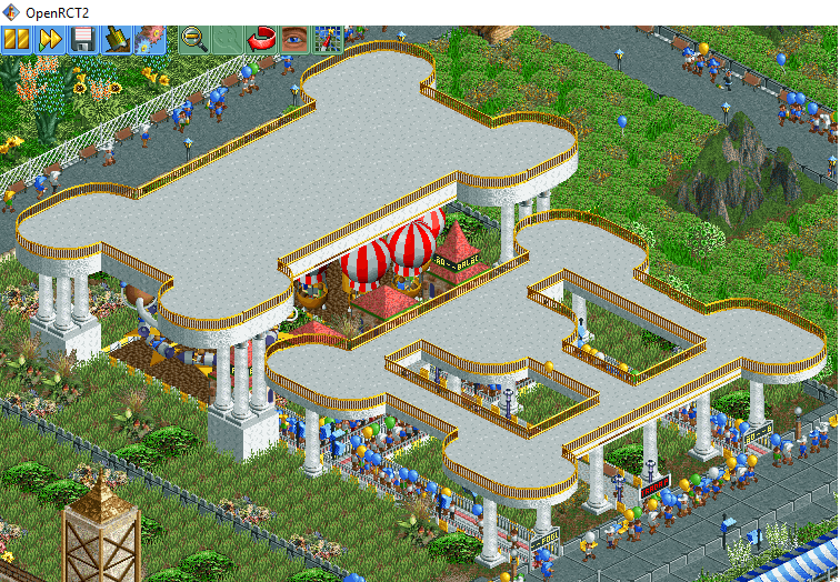
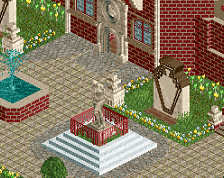
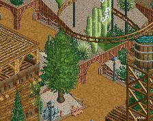
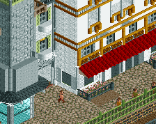
I think this one is kinda working and shows some good signs. The curved tops of the structures and the columns are nice, and there's this unique aesthetic with covering the land in tall grasses. My biggest recommendation is to not build big rectangles of path then put things inside them.
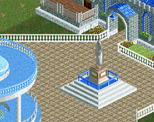
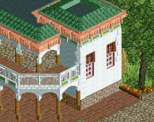
Not too shabby here either. One of your better screens - scale is for sure off, but for some reason, it feels fitting here. I don't know much else to say about it other than it is pretty good. Good work, there!
 31-May 18
please stop spamming screens on the front page. Let some time pass so your other screens can be seen and can be given feedback.
Here is some feedback on all of your screens in one (I have other things to do today
Then the foliage: you put grass objects on every empty space. That might feel realistic to you, but it looks bad in rct. Try to use less of them, unevenly placed over the field.
The buildings look massive (yeah yeah, I know it's me noticing scaling problems). Please make them a bit smaller. They also need a bit more details. Some of them have huge roofs without anything breaking it up. Try to add more trims, fences, chimneys etc. and also for these: don't make them all square.
Overall I see potential though. You seem to have the motivation to build well themed areas and thats what we like. I'd say look at other screenshots or parks here. There are some good references here and there where you can get some inspiration from.
Scoop and MK are correct. Pick your best screenshot, and post those! And maybe another screeshot a few days after. You will get more feedback, and the front page will be mixed instead of just a lot of your screenshots.
About your park... It's quite interesting! You have some cool ideas, like the buildings in this screen, and the grass everywhere. Certainly unique. What I like less are the objects you use... They're so ugly! And there's a lot of objects available that fit much better into the game.
Take a look around the parks we have in our database, maybe you'll find something inspiring.
https://www.nedesign...ag/6/spotlight/
Oh, one last thing... When you upload a screen you have to pick "RCTLL" or "RCT2". RCTLL is RCT1, which you are not playing.
MK likes things massive, don't mind him.
Welcome to NE! Glad to have you aboard!
I think this one is kinda working and shows some good signs. The curved tops of the structures and the columns are nice, and there's this unique aesthetic with covering the land in tall grasses. My biggest recommendation is to not build big rectangles of path then put things inside them.
Welcome to NE!
Not too shabby here either. One of your better screens - scale is for sure off, but for some reason, it feels fitting here. I don't know much else to say about it other than it is pretty good. Good work, there!
ops, sorry, thank you for the warning, ok, I will follow the orientation
All the screens you showed, showed one or two cool ideas and structures. Keep building to make screens and parks as a whole look good.