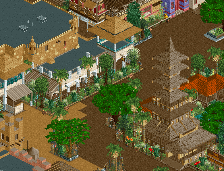
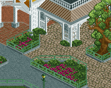
Looks fantastic once again, definitely shows a lot of improvement in terms of micro compared to the old map. Still a bit of room for improvement (mostly with the top of the facades at the bottom of the screen, but as a whole this is another great screen.
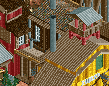
Super clean, but the dark green leaves in the middle & the brown-roofed tower against the brown path I think could potentially benefit from some color changes, and the transition from brown-to-tan path seems jagged.
Otherwise, the structure of that brown tower looks awesome, and I like the big trees. I want to scroll over towards that purple gate structure.
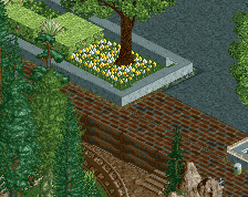
If you could fine-tune the path textures and try to break from the grid I feel like it would take this to the next level. The structures themselves are all awesome.
I don't mind the zigzag in the path where the two types meet, since that's pretty consistent with the average 'grain size' in the park. What bothers me more is that the tower on the left completely blends into the path behind it, since the colour and texture is almost identical. Not a fan of the saturated green trees either.
Speaking of 'grain size', your work did get more refined and more small scale over the years, and it's working out very well. Fantastic work.
Looks fantastic once again, definitely shows a lot of improvement in terms of micro compared to the old map. Still a bit of room for improvement (mostly with the top of the facades at the bottom of the screen, but as a whole this is another great screen.
I'm getting around to redoing those facades. There's still a lot of holdovers from the old park that I've integrated into the new stuff but haven't gotten around to updating yet.
If you could fine-tune the path textures and try to break from the grid I feel like it would take this to the next level. The structures themselves are all awesome.
I have the side on the left as tan because that is "Africa" and the dark brown on the right is "Polynesia" and "Asia" (more jungley). I unfortunately don't have any object room for diagonal paths otherwise I would implement those in a heartbeat.
I don't mind the zigzag in the path where the two types meet, since that's pretty consistent with the average 'grain size' in the park. What bothers me more is that the tower on the left completely blends into the path behind it, since the colour and texture is almost identical. Not a fan of the saturated green trees either.
Speaking of 'grain size', your work did get more refined and more small scale over the years, and it's working out very well. Fantastic work.
The tower on the left only blends with the path when looking at it from behind (like this). From the front it's part of a larger facade so it's set against a black roof. I'm still toying with it though.
I've been working on getting things more consistent so glad to hear it's paying off.
 15-April 19
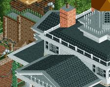
Looks fantastic once again, definitely shows a lot of improvement in terms of micro compared to the old map. Still a bit of room for improvement (mostly with the top of the facades at the bottom of the screen, but as a whole this is another great screen.
Super clean, but the dark green leaves in the middle & the brown-roofed tower against the brown path I think could potentially benefit from some color changes, and the transition from brown-to-tan path seems jagged.
Otherwise, the structure of that brown tower looks awesome, and I like the big trees. I want to scroll over towards that purple gate structure.
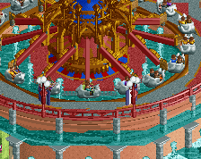
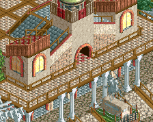
Enchanted Tiki Room looks really nice
Great, as always.
If you could fine-tune the path textures and try to break from the grid I feel like it would take this to the next level. The structures themselves are all awesome.
I don't mind the zigzag in the path where the two types meet, since that's pretty consistent with the average 'grain size' in the park. What bothers me more is that the tower on the left completely blends into the path behind it, since the colour and texture is almost identical. Not a fan of the saturated green trees either.
Speaking of 'grain size', your work did get more refined and more small scale over the years, and it's working out very well. Fantastic work.
Thanks for the compliments.
I'm getting around to redoing those facades. There's still a lot of holdovers from the old park that I've integrated into the new stuff but haven't gotten around to updating yet.
I have the side on the left as tan because that is "Africa" and the dark brown on the right is "Polynesia" and "Asia" (more jungley). I unfortunately don't have any object room for diagonal paths otherwise I would implement those in a heartbeat.
The tower on the left only blends with the path when looking at it from behind (like this). From the front it's part of a larger facade so it's set against a black roof. I'm still toying with it though.
I've been working on getting things more consistent so glad to hear it's paying off.