Screenshot / Shark Week!- Sea World Barcelona
-
 29-July 19
-
SeaWorld Barcelona
-
2 of 5
- Views 2,420
- Fans 5
- Comments 20
-
Description
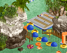
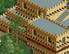
Figured I'd share a little bit of progress on this park. Hope you all enjoy! It's a little unrefined on the edges.
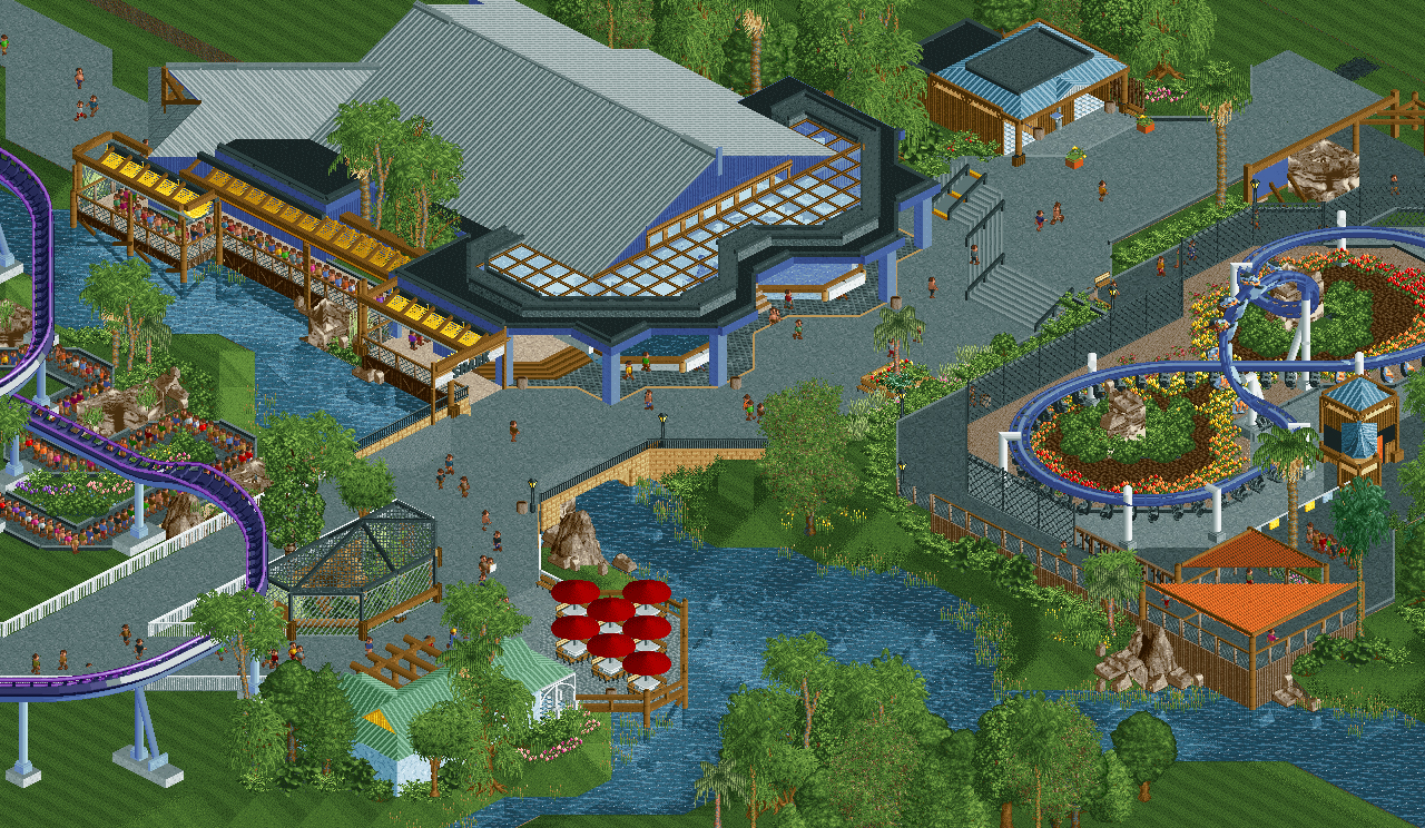
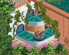
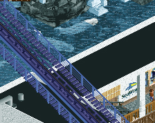
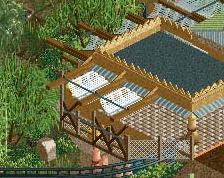
This 'Shark' section of the park features a full layout recreation of Mako from Seaworld Orlando, my take on the Shark Encounter (with the shallow shark viewing visible in this screen), a small aviary, an ice cream shop, and a Skywarp based on Tidal Twister in Seaworld San Diego. (Except mine is inverted.) Everything is peep-friendly.
Thanks for looking,
Josh -
Full-Size
-
5 fans Fans of this screenshot
-
Tags
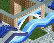
The custom flat looks great, the warm blue and the yellow-red gradient work great together. I think the colours are generally great in this park, except for Mako. Honestly it looks horrible.
I think I agree with the mako rail colors, I reckon I'd love it if they were swapped. But otherwise its really great- the foliage is fantastic and really pulls the atmosphere together. very vibrant and real-feeling
hpg Offline
Do you plan on shoestringing the Skywarp? Looks like it would be a (relatively) easy one to do and that would look even better with peeps.
Think I’m with Liam on the Mako colors though. They sort of clash with the otherwise complementary colors you have going on.
^Thanks dude. Really just wanted to try something unique that hasn't been attempted often in RCT, and doesn't take up much space.
Nice work
This looks amazing! Excellent colors, foliage and architecture. Feels very real. And a peepable Skywarp
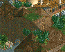
Looking at this again, the foilage is amazing, but would be even better if the palms had some variation in color
^I'll take that into consideration! I want this park to be very 'lush' but with nice open grassy spaces. I think varying the foliage colors would look nice, but I don't want to overdo it and have it looking distracting.
I'll keep messing with it!
I find that water colour strangely appealing.
yeah a couple of the paler green shade of trees, especially for palms, would look good. Same with a little sprinkle of the darker green color.
I agree with you on that. I'm going to try and 'break the grid' a bit as I move forward. I feel like I've done that in the past with Tangled in DFK and a little with my MM entries, so I hope it flows easily with this project.
Appreciate the feedback guys. Henkert, MattK, and MK98 are still building on this with me as well
The queue for the hyper could use handrails I think, or some sort of secondary fence to keep it a bit more contained. Not sure about the color scheme either, almost feel it'd look better with the track colors inverted. This is really nice though, has tons of atmosphere and fresh feeling too it.
Really lovely screen. Supports on the outside of the skywarps corners feels a bit weird but what the heck... Interested to see where this is going